



You designed a banner. The same day, you need it in five sizes and three languages, without errors.
That is what our CoDesign MCP can do for you: you point an AI assistant such as Claude at your approved design, tell it which sizes and languages you need, and it opens the file, rebuilds the layout for each format and exports production files you can hand over. MCP is the connector that lets an assistant drive a real application instead of describing one, and here the application it drives is our design engine, so what comes back is an actual editable design file rather than a picture of one.
Whether it does it well is a question you answer by measuring, rather than by showing off the runs that happened to look good. That is what an eval is: one fixed job, handed to every model under identical conditions, with automated checks that open the result afterwards and report what passed and what did not. Run the same job across a field of models and you learn which ones you can trust with real work, what each of them costs, and where they go quietly wrong.
We are still building that eval environment, so what follows is one scenario from one run, written up now because the first results turned out to be more interesting than we expected.
Three banners, one brief
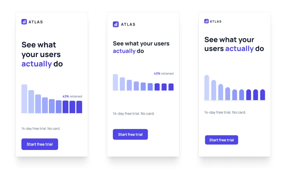
Three different models were handed the same 320×50 slot, cut from the same master creative against the same brief, and all three came back with an ad you could traffic tomorrow. Every one of them keeps the wordmark and the button, nothing is clipped, and no type is set below 11px.

The 300×250 they came from carried five things: the wordmark, the headline, a retention chart, the offer line and the button. At 320×50 the wordmark and the button survive and the chart cannot, which leaves room for exactly one line of copy, so each model had to choose between the headline and the offer.
- One dropped the headline and kept the offer, “14-day free trial”.
- One kept the headline but cut “your users” down to “users” to buy itself the line.
- One kept the headline whole across two lines and dropped the offer.
We have opinions about which of those reads best, the way any design team would. What we do not have is a way to prove one of them correct, because the choice depends on whether this campaign is selling the product or the trial, and that lives in the media brief rather than in the design. Our checks can confirm that all three are valid and that none of them are broken; they cannot tell you which one the campaign actually needed. Grading the half that has a right answer and leaving the other half to the people who own the brief is the distinction our evals are built around.
Where the design hours actually go
The obvious thing to evaluate is the thing that demos well, prompt in and poster out, but we were more interested in the work that actually fills a designer’s week, which is mostly derivative. That is not an insult: the design decisions were made once, at the master, and everything after that is a matter of carrying them faithfully into thirty other shapes. It is more technical work than creative work, which is exactly why it is worth handing to an agent, and also why we can grade it: there is something close to a right answer, and a wrong answer is often provably wrong.
What is gradeable and what is not
Ask which of the finished designs is better and you have a question with no ground truth to appeal to, since human raters disagree with each other and LLM judges reliably prefer their own output. You can get an honest answer by asking a lot of humans and ranking the results, but that is not something you can run on every build.
None of that makes quality unmeasurable, because wrong designs exist and they are wrong in ways you can query: text sitting behind another block, content off the page, type under the legibility floor. Part of design quality is judgement and part of it is fact, and what we have built grades the second part, which means everything below is an automated result rather than a design review. A model can pass every check we wrote and still make an ugly ad.
What we are doing right now
Once each evaluation scenario is completed by the model we use programmatic checks on whether it is “plausibly good”. This starts with checks like “does this run produce all necessary design artifacts/ imgly files in the correct sizes” but depends on the scenario. In localization scenarios where a design is translated into a different language we also check e.g. that the words are properly replaced.
As discussed above this is more like the “technical floor” than an actual grading. Since LLM-judges are still largely unreliable we do not yet engage in LLM-as-Judge measuring of the output quality. If it’s hard for us as designers to judge which design is “more correct” then it’s even harder for LLMs. And that means the result would just be noise.
In the future we plan to experiment more with such methodologies but we also do not want to rely on the false security of an extremely noisy grading process.
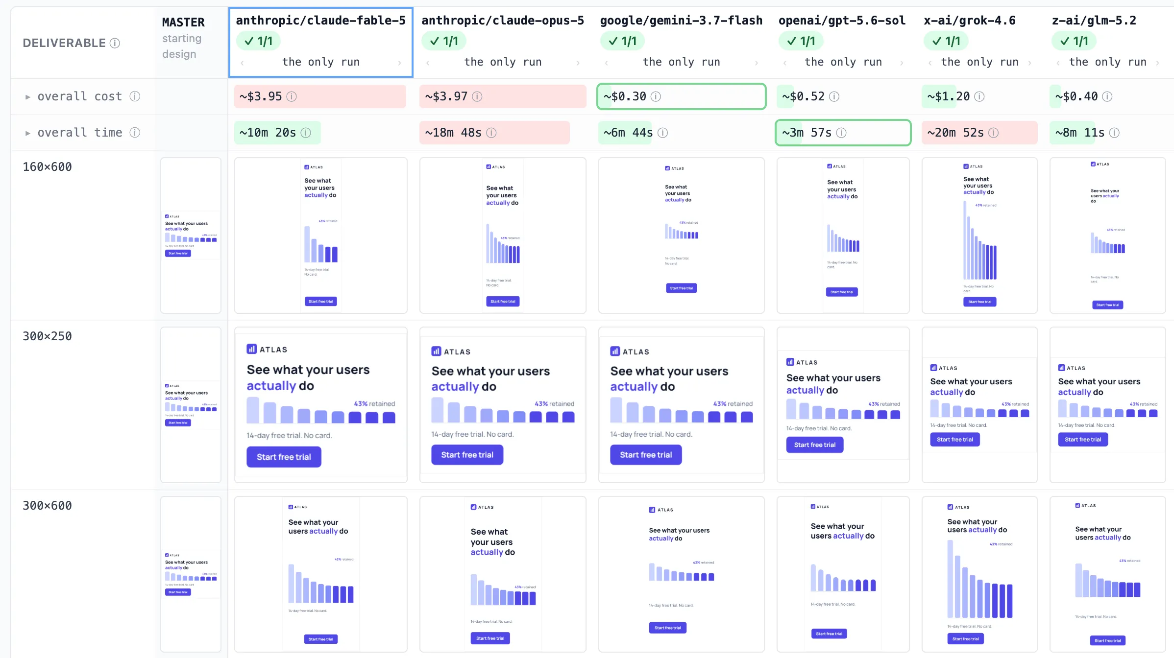
The comparison view for the display-banner matrix: cost and time sitting directly above what each model actually produced. The 1/1 counts runs, one repeat per cell, not check scores.
One master, five ad sizes
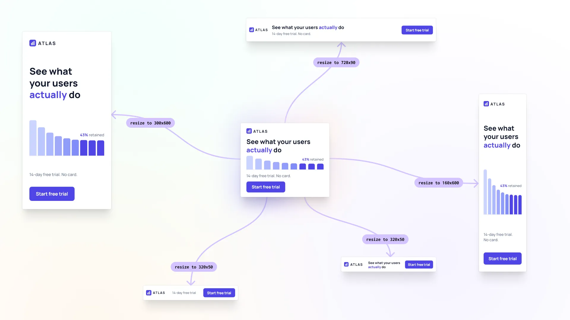
The scenario is a display campaign, because that is the version of this problem customers actually have: the same size matrix, every campaign. The master is a 300×250 MPU for ATLAS, an imaginary product-analytics SaaS running a free-trial campaign, carrying a wordmark, the headline “See what your users actually do”, a retention bar chart labelled “43% retained”, the line “14-day free trial. No card.”, and a “Start free trial” button.
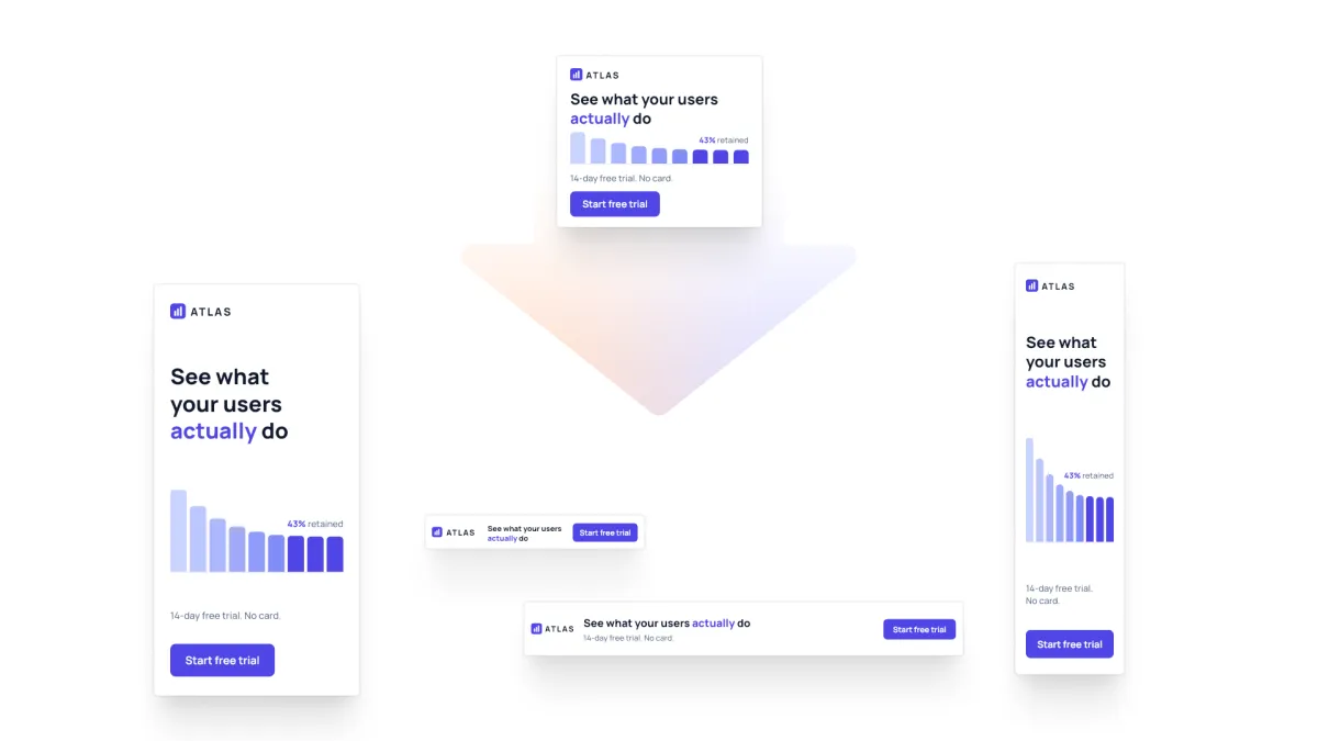
The 300×250 master at the top, and the four other sizes on the media plan cut from it. ATLAS is our own fixture, not a real customer.
The brief asks for the full matrix: 300×250, 728×90, 160×600, 300×600 and 320×50. Those sizes span a 16:1 swing in aspect ratio, so the right answer at each one is a genuinely different composition, and at some of them it means taking content out rather than shrinking it.
Ten checks grade the result and two of them do the real work. 728×90: the chart was dropped, not shrunk kills the model that squashes a bar chart into a 90-pixel strip, which satisfies every geometric constraint in the brief while being completely wrong. the five sizes are different layouts kills the model that scales one composition five ways and calls it a matrix.
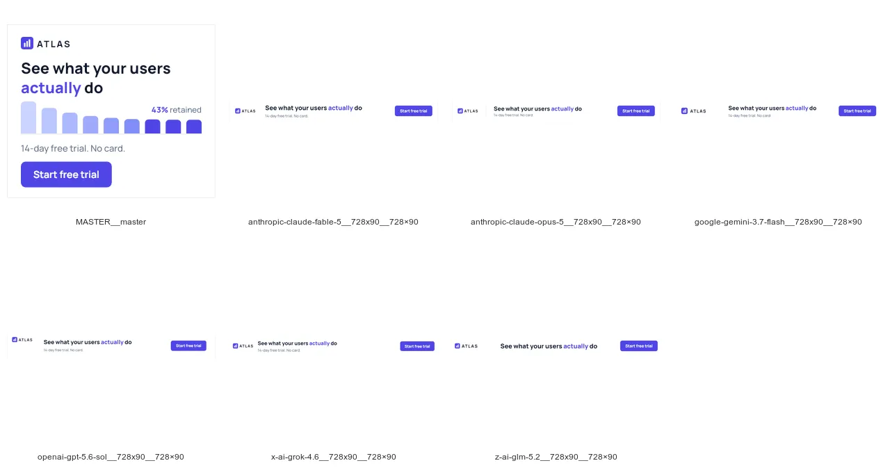
The master first, then the six 728×90 leaderboards. Every model that delivered deleted the retention chart.
Every model that delivered arrived at the same composition, wordmark left, headline across the middle, offer underneath it, button on the right and the retention chart deleted, which is six models from five different vendors reaching the same answer independently. We did not expect that, and it is still the result we find hardest to stop thinking about.
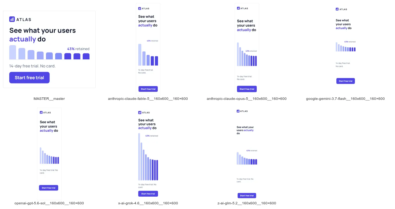
The same six at 160×600, master first. With vertical room they all kept the chart. The flat format is where the decision to drop it had to be made.
Which model is best for using with CoDesign MCP?
| # | model | checks | model spend | time | tool calls |
|---|---|---|---|---|---|
| 1 | gemini-3.7-flash | 10 / 10 | $0.30 | 6.7 min | 37 |
| 2 | glm-5.2 | 10 / 10 | $0.40 | 8.2 min | 25 |
| 3 | gpt-5.6-sol | 10 / 10 | $0.52 | 4.0 min | 35 |
| 4 | grok-4.6 | 10 / 10 | $1.20 | 20.9 min | 39 |
| 5 | claude-fable-5 | 10 / 10 | $3.95 | 10.3 min | 26 |
| 6 | claude-opus-5 | 10 / 10 | $3.97 | 18.8 min | 40 |
Running this scenario illustrates general numbers across our eval suite. The 6 models above are consistently able to follow the prompts to produce different output designs as requested in the scenario. These numbers also highlight quite the spread in model costs and time spend. What you do not see in these numbers is that glm 5.2, gpt-5.6-sol and grok 4.6 are producing suboptimal designs in our opinion. They are valid, but subjectively fable, opus and gemini 3.7 consistently across runs and across scenarios perform simply better.
The biggest surprise for us is Gemini 3.7 Flash, which produced the whole five-size matrix for $0.30 in under seven minutes. At thirty cents a designer opens six composed variants instead of a blank artboard and takes the best one further, which changes what the tool is for.
Meanwhile there were no surprises regarding Opus 5.0 and Fable 5.0, both models perform really well - but are slow and expensive.
What does it mean for CoDesign MCP
You can now resize a master design into 5 different sizes reliably for under $0.30 using Gemini 3.7 Flash and the CoDesign MCP.
If you are on a Claude Subscription plan, you might just want to continue using your Claude Code with the CoDesign MCP since it offers the best overall design quality - even if it’s slow and somewhat expensive.
We will continue to work on upgrading and improving measurements of how well CoDesign MCP works with different models, looking into other scenarios like localization (translating and changing a design for a different locality and language) as well as rebranding existing design assets.
You can install CoDesign MCP at img.ly/codesign.