

IMG.LY GenAI Benchmarks is live. 23 text-to-image models, 37 prompts taken from real design jobs, three fixed seeds each (or repeated samples for seedless APIs), 2,550 generated images, roughly 11,400 scores. Every prompt, every score, every generated image and the full methodology are public.
Why we ran it
Our customers embed image generation in products that ship physical, commercial output. Web-to-print storefronts, merch platforms, campaign tooling, template systems. When they asked us which model to use, the honest answer was a shrug and a link to a leaderboard that measures something else.
The existing arenas rank aesthetic preference by crowd vote. That’s a signal, sure, but not the one most relevant to these use cases. They want to know whether the image has a real alpha channel, or whether users got the hex they asked for and whether a word is spelled right. A 10,000-piece personalization run needs to hold the character across every variant. Those are the failures that cost you a reprint or a support ticket, and none of them show up in a preference ranking.
So we built the one that answers our customers’ question. Which model should you build on for production design work.
Why some of it is judged, not measured
Plenty of what matters here is measurable, and we measure it. Native output size, wall-clock latency and price per image come straight off the run. Transparency is a file-level check for a real alpha channel rather than a painted-on white rectangle. Color accuracy is the CIEDE2000 distance between the hex the prompt required and the color that came back.
The rest needs a judgment call. Whether an image satisfies “three blue cubes stacked on the left and one red sphere on the right” is a checklist, and something has to look at the picture and tick it off. Whether a banner leaves a clean area for a headline has a right answer, but not a computable one.
For those criteria a vision model does the judging, against a checklist written per prompt before the run. We constrain how the VLM reports a judgment, and what it is allowed to judge at all. Every judgment records a written rationale beside the score. The criterion that really does need a person, design-readiness, the “would a professional ship this with under five minutes of cleanup” question, stays out of the vision model’s hands entirely.
The rest of the protocol is the boring part that makes the numbers worth anything. Identical prompts for every model, default parameters, fixed seeds (or repeated samples for seedless APIs), no per-model prompt tuning ever, a versioned suite, and published scores that are never quietly restated. Partner models get no special treatment, and the Gateway links stay well away from the rankings.
Why we split it by use case
Average our eight criteria with equal weight and GPT Image 1.5 leads at 3.74 out of 5, while GPT Image 2, the most expensive model in the set, comes twenty-second of twenty-three at 3.04. That’s not a data error. GPT Image 2 has the best brand-color fidelity in the field and renders every required string in the suite exactly. It also costs 91 times more per image than the cheapest model and takes a median 110 seconds. An unweighted average treats all of that as equally important, so it buries the model with the best output.
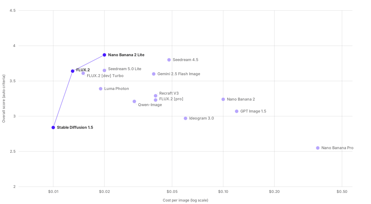
This is the chart everyone asks for, plotted for the 15 models in the first run, at the scores and per-image prices as first published, and its vertical axis is the number you should not rank on. Explore the live, interactive version, where every point links to that model’s scores.
Which is what leaderboards do. So we publish the same measurements per use case as well, with a weight matrix per job and the reasoning behind each matrix written out. Print files weight resolution and color heavily, because a 1024px generation is a 3.4-inch print and an out-of-gamut red is a reprint. Personalization at scale weights cost and adherence, because unit economics decide the run. Merch weights the alpha channel above everything else, because a sticker without a clean cutout isn’t a sticker.
Same numbers, different question, different answer. That’s why the section opens by asking what you’re building instead of handing you a ranked list.
The result that surprised us most
Reweighting moves models the length of the table.
Recraft V3 sits twentieth of twenty-three on the unweighted blend, dragged down by color accuracy and prompt adherence. Reweight for merch and stickers, where transparency carries 35 percent of the matrix, and it comes third at 2.82, seventeen places up. It’s one of only three models in the run that return an alpha channel at all. Twenty of the twenty-three return none, and a few paint a fake checkerboard into the pixels, which looks like transparency right up until it reaches a printer. Recraft V3’s successor, Recraft V4.1, scores 3.63 on the unweighted blend and outranks V3 on merch, so build on V4.1 for new work.
On a general leaderboard, a model that places third for one of our customers’ most common jobs reads as an also-ran. That’s the argument for the whole project. GPT Image 1.5 wins that job outright at 3.77, and it is the one model that returns a genuine alpha channel rather than a thin one. One caveat there: OpenAI retires it on December 1, 2026, naming gpt-image-2 as the replacement. The finding stands, the model does not.
The typography column surprised us a second time. Ideogram has the strongest public reputation for rendering text, and in our run it ranks twentieth of twenty-three on measured text accuracy, behind several general-purpose flagships that now render every required string in the suite exactly. Route typographic work to a specialist on reputation alone and you can end up with worse type than the model you already call by default.
Two more capability gaps got written up as standalone findings. Brand color, where the best model manages 4.11 out of 5 and most of the field sits below 3. And consistency, where no model holds a described character across three scenes and the ceiling is 4.86.
What this means for an editor
We build editors, so our conclusion isn’t neutral. The data still points where it points.
Read the four findings together and they describe the same problem four times. The cut-out is missing, the color is close but not the color in the brand book, the headline is right until it isn’t, and the character drifts between scenes. None of these are bugs waiting on the next model release. They’re what generation is, a probabilistic first draft. Getting from that draft to something a customer can order takes a handful of deterministic corrections, and somebody has to be able to make them.
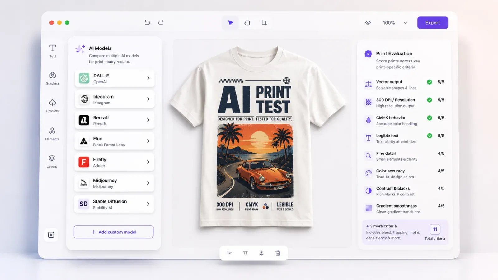
That’s an editor’s job. Background removal and edge cleanup close the transparency gap. Brand kits and exact color values close the color gap. Editable text layers turn a wrong character into a two-second fix instead of a regeneration. Reusable assets and templates carry identity that regeneration won’t. Our AI Editor gives your users those controls over whatever model produced the image, and the AI Gateway makes routing per job, which the data says you should be doing, a config change instead of another integration.
We’d rather make that case with numbers anyone can check, including the ones that make models we partner with look bad.
Caveats, and what’s next
This is a pilot dataset. Quality criteria are judged by a vision model, not yet by the blind expert panel, and design-readiness isn’t scored at all. The weight matrices are provisional. When the frozen suite lands, scores restate once and the suite version changes; after that, nothing gets restated without a clearly labeled new methodology version.
The roster will grow. Image editing and video are the obvious next modalities, and we plan to re-run the suite whenever a notable model ships.
Go pick a use case and see which model wins your job. If the numbers disagree with your own experience, the prompts and the raw images are all sitting there, and we’d like to hear about it.