
Auto-Resizer
Definition
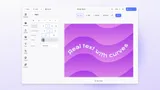
A CE.SDK Starter Kit that automatically adapts an existing design to multiple target page sizes, repositioning and scaling elements to maintain design intent across formats. This makes it the core workflow for multi-format campaign production from a single source design.
The Auto-Resizer does not simply scale the canvas. It repositions blocks, adjusts typography, and re-crops images to suit the proportions of each target format. The adaptation logic uses CE.SDK’s page and block APIs to apply layout rules per target size, producing variants that are each appropriate for their destination rather than mechanically stretched versions of the original.
Common Target Formats
The Auto-Resizer supports any target page dimensions. These are examples from typical campaign production workflows.
Instagram Post
1080 x 1080 px, 1:1
Instagram Story
1080 x 1920 px, 9:16
Facebook Landscape
1200 x 628 px, 1.91:1
Google Display
300 x 250 px, 6:5
LinkedIn Banner
1584 x 396 px, 4:1
Twitter / X Post
1600 x 900 px, 16:9
How Adaptation Works
Source Design
The user designs at one canonical size, typically the primary channel or the largest format in the campaign set.
Target Format Selection
Target sizes are selected from a predefined list or specified as custom dimensions. Each target format can have its own layout rules for how elements should be repositioned.
Automated Adaptation
CE.SDK’s headless API resizes the page, repositions blocks according to the adaptation rules, scales typography, and re-crops image fills to suit the new proportions, producing a separate page or scene for each target format.
Review & Export
Adapted variants can be reviewed in the editor before export, or exported directly in batch without review for fully automated pipelines.
Typical Use Cases
Multi-Platform Campaign Production
A marketing team designs a campaign visual once at one canonical size. The Auto-Resizer generates all platform-specific variants in a single operation (Instagram square, story, Facebook, LinkedIn, and display formats) without repeating layout work for each.
Social Media Scheduling Platforms
Users upload a single creative and the platform automatically generates correctly sized variants for each connected channel before scheduling. No manual cropping or re-exporting per platform.
Brand Template Systems
A brand team authors one master template per campaign. The Auto-Resizer produces channel-specific variants from that master, ensuring all formats share the same visual content and brand decisions. Only the dimensions and layout proportions change.
Localization at Scale
Platforms serving multiple markets combine Data Merge (text localization) with Auto-Resizer (format adaptation) to produce localized, platform-specific exports from a single source design. One pipeline produces all format and language combinations.
Web (Vanilla JS/TS, React, Vue, Angular, Svelte, SvelteKit, Next.js, Nuxt.js), Node.js (server-side via CE.SDK Renderer), Electron.
Links
Documentation and references for this concept.
Related Terms
Starter Kit
A pre-configured, production-ready CE.SDK setup for a specific use case, ready to embed, customize, and ship, providing …
Template
A pre-designed CE.SDK scene that defines a reusable layout with some elements locked for brand consistency and others op…
Page
A direct child of the scene that acts as the canvas on which all visible design elements are placed; itself a block of t…