
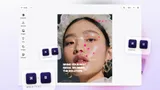
Custom Postcard UI
Built to facilitate optimal post- & greeting- card design, from changing accent colors and selecting fonts to custom messages and pictures.


Create a custom post-& greeting-card UI with the CE.SDK headless API.
The most important elements include:
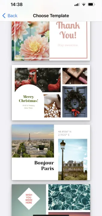
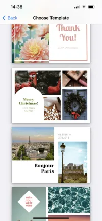
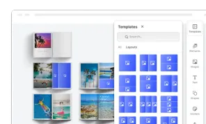
Styles
Styles are predefined templates a user can choose from. Creating adjustable templates is a great way to jump-start users’ design process and make it easier and more accessible to a broader audience.
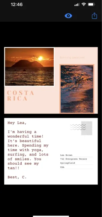
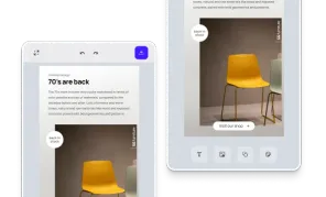
Design mode
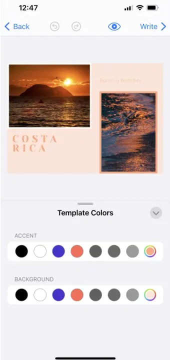
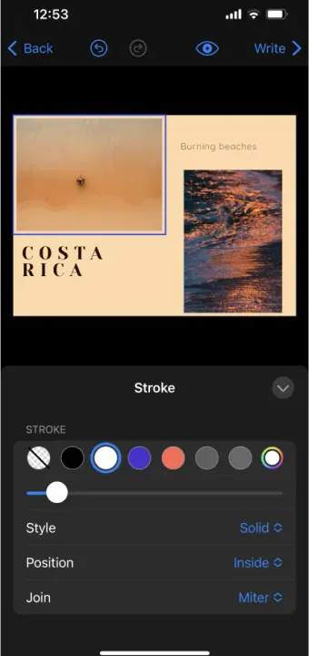
After choosing a template, the editor switches to design mode, where users can adapt the design as they wish. How and which elements can be adjusted will depend on preset constraints when the template was designed. For a template that can be fully customizable, users can choose to:
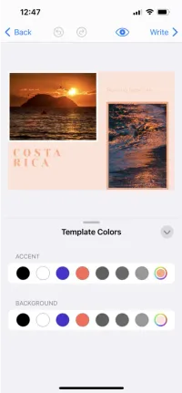
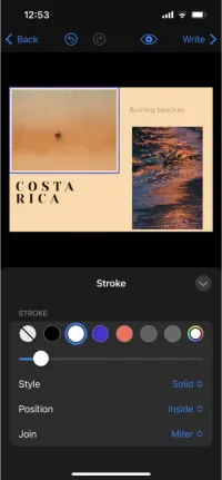
- Change accent & background color
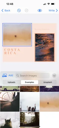
- Replace photos - choosing either from an asset library, or uploading their own
- Change headings & text - including fonts, colors, and positioning
- Add additional design elements - such as shapes or stickers
They might be able to move the elements around and change the layout completely, or just style and replace elements, depending on defined constraints.
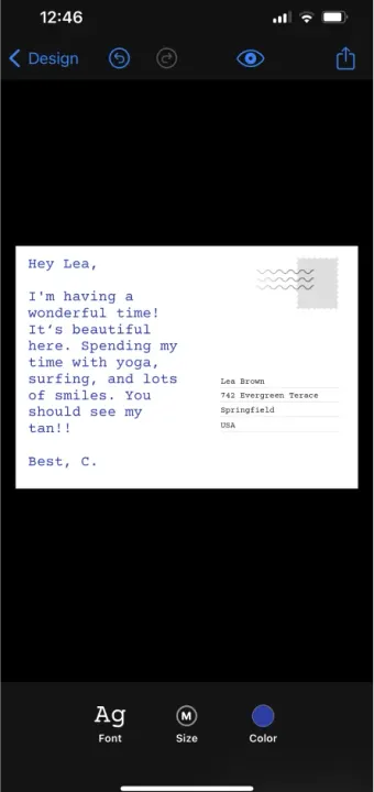
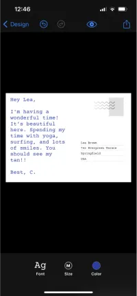
Write mode
After personalizing the front page, users can write a personal message and address the card. They can customize the font, color, and size of the text and easily export ready design.
Generating variables
It’s also possible to use variables such as {{firstname}} or {{address}}, both in the text and address fields. Adding variables and connecting the template to a data source will allow to quickly generate custom cards with personalized messages.
With the post- & greeting- card UI, users don’t have to be tech-savvy or have design skills or knowledge to quickly and easily create print-ready postcards and greeting cards, making it a great tool for any audience.
Create a custom post-& greeting-card UI with the CE.SDK headless API.
The most important elements include:
Styles
Styles are predefined templates a user can choose from. Creating adjustable templates is a great way to jump-start users’ design process and make it easier and more accessible to a broader audience.
Design mode
After choosing a template, the editor switches to design mode, where users can adapt the design as they wish. How and which elements can be adjusted will depend on preset constraints when the template was designed. For a template that can be fully customizable, users can choose to:
- Change accent & background color
- Replace photos - choosing either from an asset library, or uploading their own
- Change headings & text - including fonts, colors, and positioning
- Add additional design elements - such as shapes or stickers
They might be able to move the elements around and change the layout completely, or just style and replace elements, depending on defined constraints.
Write mode
After personalizing the front page, users can write a personal message and address the card. They can customize the font, color, and size of the text and easily export ready design.
Generating variables
It’s also possible to use variables such as {{firstname}} or {{address}}, both in the text and address fields. Adding variables and connecting the template to a data source will allow to quickly generate custom cards with personalized messages.
With the post- & greeting- card UI, users don’t have to be tech-savvy or have design skills or knowledge to quickly and easily create print-ready postcards and greeting cards, making it a great tool for any audience.
Download

Related Demos
Custom Apparel UI
Custom, mobile apparel UI for creating print-ready design.
Custom Mobile UI
Easily build custom mobile UIs and provide a seamless design editing experience for your users, on both iOS and Android.
Custom Photobook UI
Custom UI for building photo books focusing on theming, page layouts, and managing photo assets.