Stickers
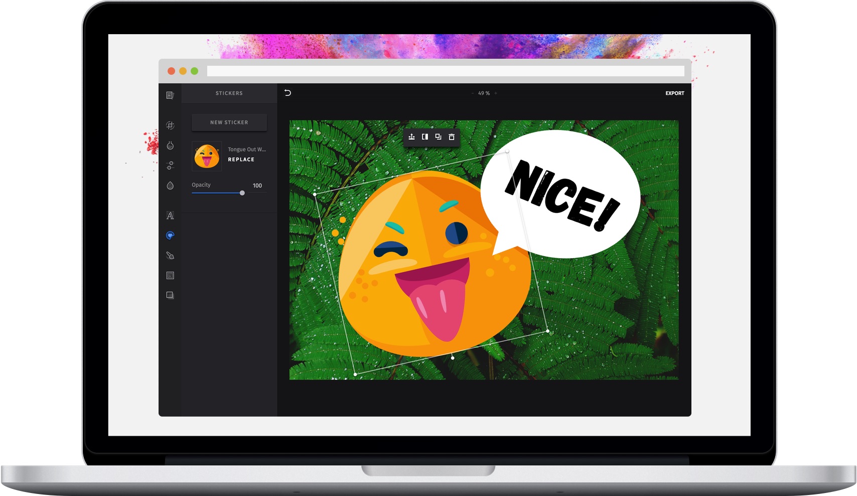
The PhotoEditor SDK ships with a categorized sticker library whose UI is optimized for exploration and discovery. You can easily leverage the API to complement the library with your custom sticker packages.
Adding custom stickers#
You can add custom sticker categories and stickers by passing them using the categories option which should follow our Stickers JSON Schema.
If replaceCategories is set to true, all default categories and stickers are removed. If it is set to false, your additional categories and stickers are appended.
const editor = new PhotoEditorSDK.UI.DesktopUI({editor: {controlsOptions: {sticker: {categories: [{identifier: 'some_category',defaultName: 'Some Category',metaData: {backgroundImage: 'stickers/background.png',},stickers: [{identifier: 'custom_sticker',defaultName: 'Custom Sticker',images: {mediaThumb: {uri: 'stickers/thumb/customsticker.png',width: 50,height: 50,},mediaBase: {uri: 'stickers/base/customsticker.png',width: 400,height: 400,},},},],},],replaceCategories: true, // `categories` replaces all other categories / stickers},},},});
Adding stickers during runtime#
There are times when you may want to add stickers to the editor while it's stil
running. For instance a user may upload customized stickers while editing an image.
You can do this on DesktopUI by calling the addStickers method of the
PhotoEditorSDK.UI.DesktopUI.Editor class. For this you must have at least one
custom sticker category added in controlsOptions.stickers, like in the
previous example. Expanding on the last snippet:
const sticker = {identifier: 'other_custom_sticker',defaultName: 'Other Custom Sticker',images: {mediaThumb: {uri: 'stickers/thumb/other_customsticker.png',width: 50,height: 50,},mediaBase: {uri: 'stickers/base/other_customsticker.png',width: 400,height: 400,},},};editor.getEditor().addSticker('some_category', sticker);
This will add a new sticker called 'Other Custom Sticker' to the 'some_category' sticker category.
Custom sticker upload by end users#
By default end users are able to upload their own images as custom stickers into the sticker tool of our editor using the "Upload" button (DesktopUI only). Once uploaded, they will all appear in a new category called "Custom" (localizable with the pesdk.sticker.asset.imgly_sticker_custom key).
You can configure the tint mode of all of these custom stickers with the sticker.customStickerTintMode controls option. You can find more information
on sticker tint modes in the Enable color customization section.
Please note that these types of custom stickers are always included in serialization files, which can increase the size of such a serialization by quite a lot.
If you don't want the custom sticker upload feature to be enabled, you can simply disable it by setting the sticker.customUploadDisabled controls option to true.
const editor = new PhotoEditorSDK.UI.DesktopUI({editor: {controlsOptions: {sticker: {customUploadDisabled: true, // false is the defaultcustomStickerTintMode: 'colorized', // 'none' is the default},},},});
Specifying the available stickers#
By default, all existing stickers (including your own) are available to the user. To make only specific stickers available to the user, use the availableStickers option.
const editor = new PhotoEditorSDK.UI.DesktopUI({editor: {controlsOptions: {sticker: {availableStickers: ['imgly_sticker_emoticons_alien','imgly_sticker_emoticons_angel','custom_sticker',],},},},});
Stickers JSON Schema#
In order to correctly use stickers in our UI, you need to follow our Stickers JSON Schema:
{"version": "2.0","categories": [{"identifier": "imgly_sticker_emoticons","defaultName": "Emoticons","metaData": {"backgroundImage": "stickers/background.png"},"stickers": [{"identifier": "imgly_sticker_emoticons_alien","defaultName": "Alien Emoticon","images": {"mediaThumb": {"uri": "https://xxxxxxxxxx","width": 100,"height": 100},"mediaMedium": {"uri": "https://xxxxxxxxxx","width": 500,"height": 500},"mediaBase": {"uri": "https://xxxxxxxxxx","width": 2136,"height": 3216}}},{"identifier": "imgly_sticker_emoticons_angel","defaultName": "Angel Emoticon","images": {"mediaThumb": {"uri": "https://xxxxxxxxxx","width": 100,"height": 100},"mediaMedium": {"uri": "https://xxxxxxxxxx","width": 500,"height": 500},"mediaBase": {"uri": "https://xxxxxxxxxx","width": 2136,"height": 3216}}}]}]}
Enable color customization#
By default, the sticker color cannot be changed in the UI. However, you can enable the option to add a tint color using the optional tintMode property of each sticker (Desktop UI only).
The possible values are none (default), solid and colorized.
Here is an example of the different tint modes (from left to right: none, solid, colorized):

const sticker = {identifier: 'imgly_sticker_emoticons_alien',defaultName: 'Alien Emoticon',tintMode: 'colorized' // Possible: 'none', 'solid', 'colorized'images: {...}}
Enable non-uniform sticker resizing#
By default, stickers keep their aspect ratio when they are being resized. However, you can also allow each individual sticker to resize freely,
by setting its resizeMode property to unrestricted (DesktopUI only):
const sticker = {identifier: 'my_custom_sticker_id',defaultName: 'My Sticker',resizeMode: 'unrestricted' // Possible: 'keepAspect', 'unrestricted'images: {...}}
It is also possible to easily override this property for the default stickers that are shipped with the PhotoEditor SDK using the editor configuration. The following example does this for our square shape, which allows it to now be resized to any arbitrary rectangle:
const editor = new PhotoEditorSDK.UI.DesktopUI({editor: {controlsOptions: {sticker: {categories: [{identifier: 'imgly_sticker_shapes',stickers: [{identifier: 'imgly_sticker_shapes_badge_01',resizeMode: 'unrestricted',},],},],},},},});
Enable smooth downscaling#
Due to the nature of WebGL, downscaling images might result in pixelated images. You can avoid that by setting smoothDownscaling to true. Please note that this might impact performance of the editor, since the Editor now uses larger textures internally:
const editor = new PhotoEditorSDK.UI.DesktopUI({editor: {controlsOptions: {sticker: {smoothDownscaling: true,},},},});
Rotation snapping#
Our UI allows the user to freely rotate stickers, which is nice, but it can be hard to hit the right rotation (e.g. exactly 90 degrees). To fix this, we added a customizable snapping feature that can be configured using the snapRotation and snapRotationTolerance options:
const editor = new PhotoEditorSDK.UI.DesktopUI({editor: {controlsOptions: {sticker: {// This value defines at what degrees rotation snapping should happensnapRotation: 90,// This value defines at what degrees *around* the `snapRotation` value snapping should happensnapRotationTolerance: 5,},},},});