Color Palettes
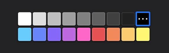
Our PhotoEditorSDK comes with a color palette of 18 default colors out of the box. Additionally, the DesktopUI allows you to easily and individually customize these color palettes for each control that uses them.
A color palette is simply an array of PhotoEditorSDK.Color instances. You customize the palette per control using the editor.controlsOptions object in the configuration options of the DesktopUI. You can specify as few or as many colors as you like.
Let's look at an example for how we can customize the color palette of the brush control:
const editor = new PhotoEditorSDK.UI.DesktopUI({editor: {controlsOptions: {brush: {colors: [new PhotoEditorSDK.Color(255, 255, 255, 1.0),new PhotoEditorSDK.Color(0, 0, 0, 1.0),new PhotoEditorSDK.Color(255, 0, 0, 1.0),],},},},});
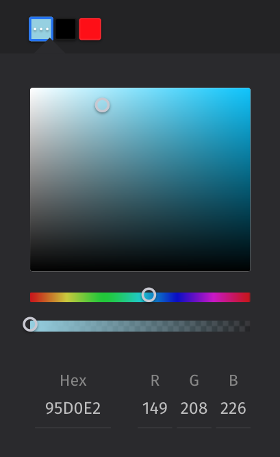
Now the brush color palette will only consist of the options white, black and red. Obviously, the user can ultimately still choose any color they like using the color picker.
You can customize all other color palettes individually as shown above. Let's see what that looks like:
const myCustomColorPalette = [new PhotoEditorSDK.Color(255, 255, 255, 1.0),... // Specify any colors you like]const editor = new PhotoEditorSDK.UI.DesktopUI({editor: {controlsOptions: {text: {colors: myCustomColorPalette},textdesign: {colors: myCustomColorPalette},sticker: {colors: myCustomColorPalette},brush: {colors: myCustomColorPalette},frame: {colors: myCustomColorPalette}}}})
The code above overwrites the default color palette with your own custom palette for each control. For the sake of simplicity we just used one custom palette here, but nothing prevents you from setting a different set of colors for each control. If you don't overwrite a colors option or use an empty array, then the default colors pictured above will be used instead.
There is one more detail to note with the text controls. If you overwrite the colors property there, this array of colors overwrites both the text and the background color palette. You can also set the backgroundColors property to separately customize this second palette. Keep in mind that you probably want to include a clear color in the backgroundColors, since this is the default background color for each text.
const editor = new PhotoEditorSDK.UI.DesktopUI({editor: {controlsOptions: {text: {colors: myCustomColorPalette,backgroundColors: [], // The default colors will be used here},},},});