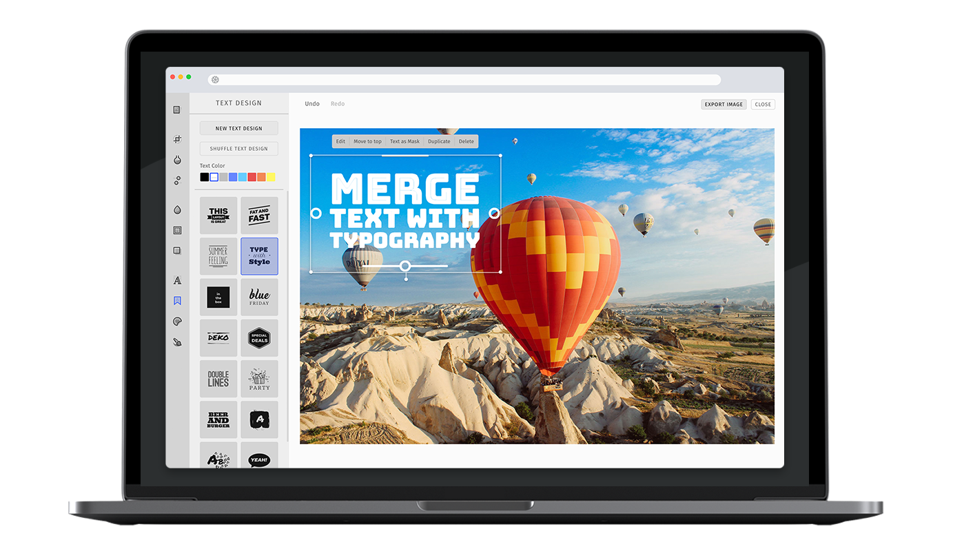
Text Design

The text design tool merges input text with typography, creating stunning designs for a multitude of use-cases. The tool lays out input text according to recipes crafted by professional designers upon a single tap. Furthermore, the creative can then be fine-tuned by choosing from 15 different text colors or by using the randomize functionality that shuffles the fonts, alignments and decorations. It’s even possible to create a mask that lets the background image shine through.
Specifying the available text design#
This example shows the default text design tool configuration.
In order to enable or disable specific text design layouts, simply pass the items option to the text design tool configuration. The items will be displayed in the order mentioned by the configuration. Here is the list of default text design items.
const editor = await PhotoEditorSDKUI.init({textdesign: {items: [{ identifier: 'imgly_text_design_blocks' },{ identifier: 'imgly_text_design_rotated' },{ identifier: 'imgly_text_design_blocks_light' },{ identifier: 'imgly_text_design_equal_width' },{ identifier: 'imgly_text_design_masked' },{ identifier: 'imgly_text_design_celebrate' },{ identifier: 'imgly_text_design_sunshine' },{ identifier: 'imgly_text_design_masked_badge' },{ identifier: 'imgly_text_design_blocks_condensed' },{ identifier: 'imgly_text_design_celebrate_simple' },{ identifier: 'imgly_text_design_equal_width_fat' },{ identifier: 'imgly_text_design_watercolor' },{ identifier: 'imgly_text_design_particles' },{ identifier: 'imgly_text_design_masked_speech_bubble' },{ identifier: 'imgly_text_design_masked_speech_bubble_comic' },{ identifier: 'imgly_text_design_multiline' },],},});
Specific text options#
Maximum Character Limit#
With maxCharacterLimit, you can limit the amount of text which can be entered in the text design tool.
const editor = await PhotoEditorSDKUI.init({textdesign: {maxCharacterLimit: 250, // number},});
Allow Emojis#
This option allows you to enable emojis in the text design input.
By default emojis will be removed from the text design since they are not cross-platform compatible.
If you use the serialization feature to share edits across different platforms, emojis will be rendered with the system's local set of emojis and will appear differently.
Some text designs are not optimized for extra tall emojis and they will be cut off at the line height.
const editor = await PhotoEditorSDKUI.init({textdesign: {allowEmojis: true, // boolean},});
Custom Default Color#
You can override the defalt color used in textdesign tool using the defaultColor option
await PhotoEditorSDKUI.init({...,textdesign: {// color is represented as a number array which encodes// as a RGBA tuple of floating point values where// each channel is defined in the range of `[0, 1]defaultColor: [1.00, 1.00, 1.00, 1],},...,})
Custom Colors#
You can override all the colors used in textdesign tool using the colors array
await PhotoEditorSDKUI.init({...,textdesign: {colors: [{// color is represented as a number array which encodes// as a RGBA tuple of floating point values where// each channel is defined in the range of `[0, 1]color: [1.00, 1.00, 1.00, 1],// name must be uniquename: "white",},{ color: [0.49, 0.49, 0.49, 1], name: "gray" },{ color: [0.00, 0.00, 0.00, 1], name: "black" },{ color: [0.40, 0.80, 1.00, 1], name: "light blue" },{ color: [0.40, 0.53, 1.00, 1], name: "blue" },{ color: [0.53, 0.40, 1.00, 1], name: "purple" },{ color: [0.87, 0.40, 1.00, 1], name: "orchid" },{ color: [1.00, 0.40, 0.80, 1], name: "pink" },{ color: [0.90, 0.31, 0.31, 1], name: "red" },{ color: [0.95, 0.53, 0.33, 1], name: "orange" },{ color: [1.00, 0.80, 0.40, 1], name: "gold" },{ color: [1.00, 0.97, 0.39, 1], name: "yellow" },{ color: [0.80, 1.00, 0.40, 1], name: "olive" },{ color: [0.33, 1.00, 0.53, 1], name: "green" },{ color: [0.33, 1.00, 0.92, 1], name: "aquamarin" },]},...,})
Prevent default text#
The textdesign tool will automatically add a default text design to the canvas if it is opened. This option lets you disable this behavior.
await PhotoEditorSDKUI.init({textdesign: {addDefaultTextOnEnter: false;},})
Toolbar Customization#
This option allows you to reorder or remove items from the ToolControlBar in the AdvancedUI.
You can find more information on this option in our Toolbar Customization section.
const editor = await PhotoEditorSDKUI.init({textdesign: {advancedUIToolControlBarOrder: [AdvancedTextDesignControlBarItem.NewTextDesignButton,AdvancedTextDesignControlBarItem.ShuffleLayoutButton,AdvancedTextDesignControlBarItem.TextDesignColorList,AdvancedTextDesignControlBarItem.Separator,AdvancedTextDesignControlBarItem.Items,],},});
Localization#
You can override all the labels used in text design tool using the custom.languages object in configuration, below are the default text design localization lables.
await PhotoEditorSDKUI.init({// ...,custom: {languages: {en: {// ...,textdesign: {title: 'Text Design',controls: {buttonNew: 'New Text Design',buttonShuffle: 'Shuffle Text Design',selectColor: 'Text Color',tabColor: 'Color',tabShuffle: 'Shuffle',},canvasControls: {placeholderText: 'Write Something',buttonSave: 'Done',buttonClose: 'Schließen',inputText: 'Text Input',},canvasActions: {buttonEdit: 'Edit',buttonInvert: 'Text as Mask',buttonDelete: 'Delete',buttonBringToFront: 'Move to top',buttonDuplicate: 'Duplicate',},history: {add: 'Text design',edit: 'Text design edit',resize: 'Text design resize',position: 'Text design position',color: 'Text design color',shuffle: 'Text design shuffle',invert: 'Text design invert',padding: 'Text design padding',order: 'Text design order',delete: 'Text design delete',},},},},},});