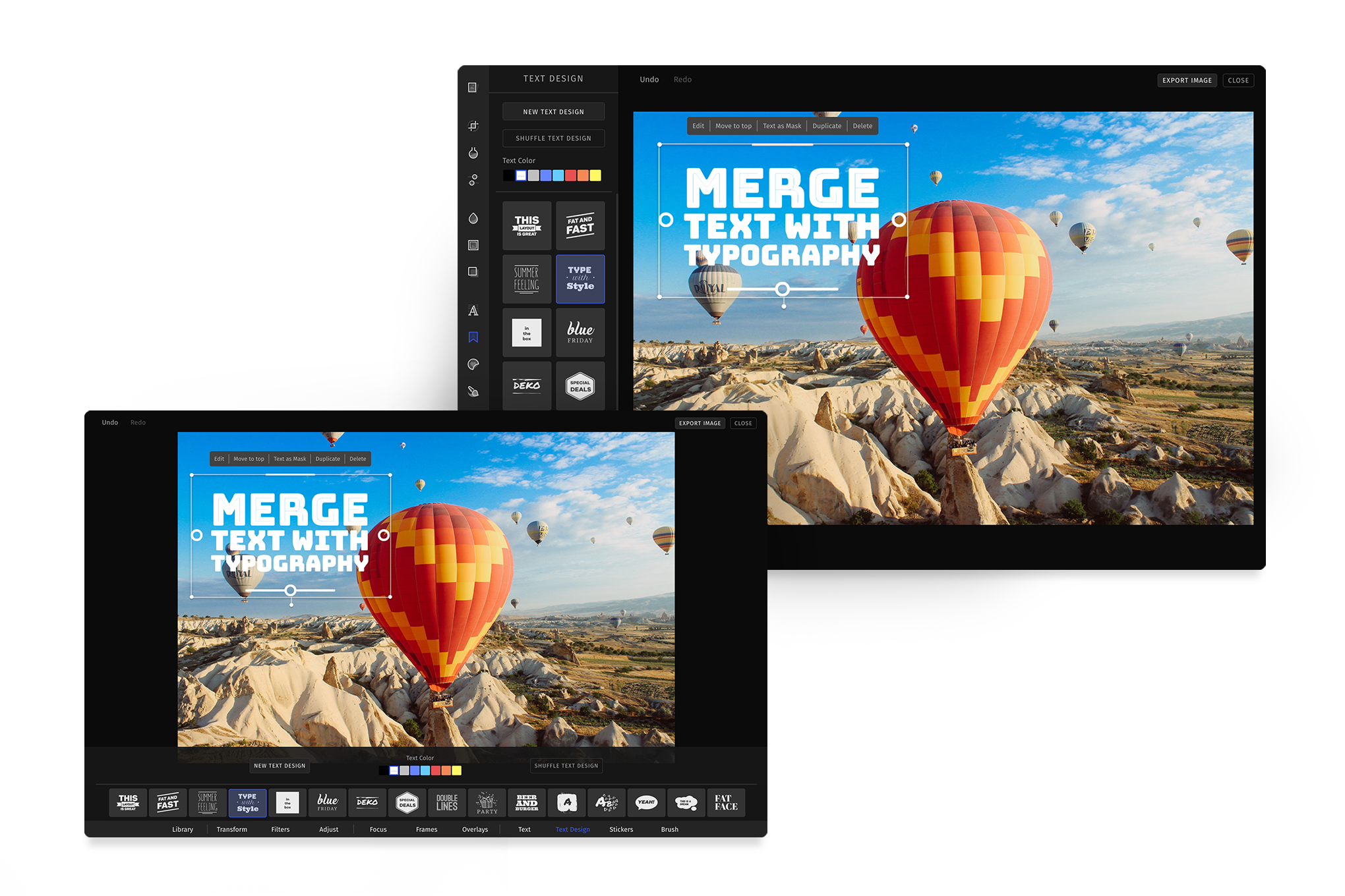
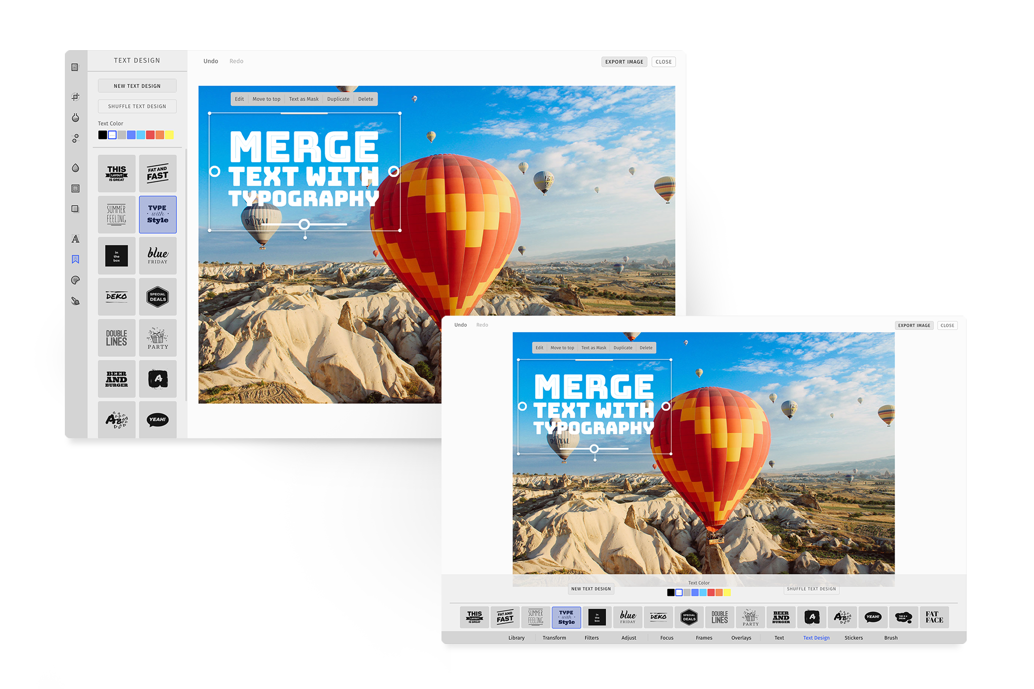
Theme


Our PhotoEditor SDK UI comes with two themes light and dark. Defaults to dark . The color palette consists of 10 default colors out of the box, from which a theme is created for the UI.
To make the integration of PhotoEditor SDK in your app seamless, the theme customizations can be done on three levels.
Colors#
You could just change the primary to get the primary color overall as accent color in the UI.
Here the color values can be web colors, hex, rgb() or rgba() in string format.
const editor = await PhotoEditorSDKUI.init({theme: 'light',custom: {themes: {light: {primary: 'palevioletred',},},},});
Additionally, the both UIs allows you to easily and individually customize each one of these colors for each section on the UI that uses them.
const editor = await PhotoEditorSDKUI.init({theme: 'light',custom: {themes: {light: {tooltip: {background: 'darkgray',},},},},});
Here is the list of all colors you can customize. Refer to the nomenclature to understand the naming convention.
{/** Base Colors *//** Overall background color. This color is used if not overriden by a component */background: '#000000',/** Overall foreground color. This color is used if not overriden by a component */foreground: '#FFFFFF',primary: '#365AFC',warning: '#FFBA5C',error: '#C2393A',success: '#39C26C',/** Portals */modal: {background: '#424242',bodyForeground: 'rgba(255, 255, 255, 0.90)',headerForeground: 'rgba(255, 255, 255, 0.60)',backdrop: 'rgba(0, 0, 0, 0.6)',},tooltip: {background: '#424242',foreground: 'rgba(255, 255, 255, 0.90)',},colorPicker: {inputBorderColor: '#424242',listBackground: '#333333',/*** According to material design* shadows are applied for dark theme* they don't really work well with light theme,* so they are customizable based on your design choices*/listShadow: `0 12px 17px 2px rgba(0,0,0,0.14),0 5px 22px 4px rgba(0,0,0,0.12),0 7px 8px -4px rgba(0,0,0,0.20)`,controlsColor: '#FFFFFF',},dropdown: {background: 'transparent',foreground: 'rgba(255, 255, 255, 0.90)',borderColor: '#333333',caretColor: 'rgba(255, 255, 255, 0.38)',listBackground: '#333333',listBorderColor: '#333333',listForeground: 'rgba(255, 255, 255, 0.60)',/*** According to material design* shadows are applied for dark theme* they don't really work well with light theme,* so they are customizable based on your design choices*/listShadow: `0 12px 17px 2px rgba(0,0,0,0.14),0 5px 22px 4px rgba(0,0,0,0.12),0 7px 8px -4px rgba(0,0,0,0.20)`,hoverBorderColor: 'rgba(255, 255, 255, 0.60)',listItemHoverBackground: '#424242',inactiveOpacity: '0.3',},/** Components *//** Scrollbar handle color, track color is transparent */scrollbar: {handleColor: 'rgba(255, 255, 255, 0.2)',},/** Button colors in different states and variations *//** Concept of button nomenclature comes from material design https://material.io/components/buttons/ */button: {/** High Emphasis button - primary variant e.g.: Export button */containedPrimaryBackground: '#365AFC',containedPrimaryForeground: 'rgba(255, 255, 255, 0.90)',/** Medium Emphasis button - primary variant e.g.: New Text, Text Design, Upload on toolControlBar */outlinedPrimaryBackground: '#242424',outlinedPrimaryForeground: 'rgba(255, 255, 255, 0.90)',/** Medium Emphasis button - secondary variant e.g.: Remove Filter, Overlay, Shuffle Text Design */outlinedSecondaryBackground: 'transparent',outlinedSecondaryForeground: 'rgba(255, 255, 255, 0.90)',outlinedInactiveOverlayColor: 'rgba(0, 0, 0, 0.3)',outlinedBorderColor: '#333333',/** Low Emphasis button - primary variant e.g.: primary button in modal */textPrimaryForeground: '#365AFC',/** Low Emphasis button - secondary variant e.g.: secondary button in modal, undo, redo, Carousel navigators, alignment buttons */textSecondaryForeground: 'rgba(255, 255, 255, 0.90)',textInactiveOpacity: '0.5',activeForeground: '#365AFC',hoverOverlayColor: 'rgba(255, 255, 255, 0.08)',},checkbox: {background: '#333333',foreground: '#FFFFFF',activeForeground: '#FFFFFF',activeBackground: '#365AFC',inactiveOpacity: '0.3',hoverOpacity: '0.8'},card: {background: '#333333',foreground: 'rgba(255, 255, 255, 0.90)',activeBorderColor: '#365AFC',activeOverlayColor: 'rgba(89, 121, 252, 0.20)',/** card in PhotoEditor SDK almost always has a label */labelBackground: 'linear-gradient(transparent, rgba(0, 0, 0, 0.6))',labelForeground: 'rgba(255, 255, 255, 0.90)',inactiveOverlayColor: 'rgba(0, 0, 0, 0.3)',hoverOverlayColor: 'rgba(255, 255, 255, 0.08)'},textInput: {foreground: 'rgba(255, 255, 255, 0.90)',hoverBorderColor: 'rgba(255, 255, 255, 0.40)',background: 'transparent',borderColor: '#333333',inactiveOpacity: '0.3',},slider: {trackColor: 'rgba(255, 255, 255, 0.4)',activeTrackColor: '#365AFC',thumbBackground: '#171717',thumbBorderColor: '#365AFC',inactiveOpacity: '0.3',hoverOpacity: '0.7',},/** Color selection list item component **/selectColor: {activeBorderColor: '#365AFC',inactiveOpacity: '0.3',},/** App sections */toolbar: {foreground: 'rgba(255, 255, 255, 0.90)',background: '#242424',activeBackground: 'transparent',activeForeground: '#365AFC',/** border between the toolbar and the toolControlBar **/borderColor: 'transparent',/** this will overwrite borderColor and apply a border of your choosing **/border: 'none',},toolControlBar: {background: 'rgba(23, 23, 23, 0.9)',/** Border between toolbar and toolControlBar **/borderColor: 'transparent',/** Separators between different sections in toolControlBar **/separatorColor: '#333333',titleForeground: 'rgba(255, 255, 255, 0.60)', // Relevant only for AdvancedUIinputLabelForeground: 'rgba(255, 255, 255, 0.60)',inputLabelInactiveOpacity: '0.3',},mainCanvasActionBar: {background: 'linear-gradient(0deg, transparent 0%, rgba(0, 0, 0, 0.6) 98%)',foreground: 'rgba(255, 255, 255, 0.90)',/** border between maincanvsActionBar and canvas container */borderColor: 'transparent',},canvasActionBar: {background: '#424242',foreground: 'rgba(255, 255, 255, 0.90)',/** separator between canvas action buttons */separatorColor: 'rgba(255, 255, 255, 0.38)',/** Optional */borderRadius: 4,},canvas: {background: '#0B0B0B',controlsOutline: 'rgba(255, 255, 255, 0.5)',controlsColor: '#FFFFFF',cropBackdrop: 'rgba(0, 0, 0, 0.5)',},colorItem: {borderRadius: '2px',margin: '1px',},webcam: {backdrop: 'rgba(0, 0, 0, 0.3)',background: '#FBFBFB',floatButton: '#FFFFFF',},/** Relevant only for BasicUI **/tabTitle: {foreground: 'rgba(255, 255, 255, 0.60)',background: 'transparent',activeBackground: 'transparent',activeBorderColor: '#365AFC',activeForeground: 'rgba(255, 255, 255, 0.90)',},snapping: {positionGuideColor: 'red',rotationGuideColor: '#0ff',}}
Typography#
you can customize the font that you load for the PhotoEditor SDK for any theme.
const editor = await PhotoEditorSDKUI.init({theme: 'dark',custom: {themes: {dark: {typography: {fontURI: './fonts/imgly_font_aleo_bold.woff', // font path relative to font assetsfontFamily: 'Aleo',format: 'woff',provider: 'file',// Most users load font while initializing their app,// In that case, you can choose to skip loading it againskipLoading: false,},},},},});
Moreover, you can load font from Google Fonts.
const editor = await PhotoEditorSDKUI.init({theme: 'light',custom: {themes: {light: {typography: {provider: 'google',fontFamily: 'Quicksand',// Most users load font while initializing their app// In that case, you can choose to skip loading it againskipLoading: false,},},},},});
Shape#
Border radius is one of the important part of any design system. To make PhotoEditor SDK UI shape similar to your design system, you can configure shape object in theme.
const editor = await PhotoEditorSDKUI.init({theme: 'dark',custom: {themes: {dark: {shape: {/*** Border Radius for small sized components,* Color Selection, Checkbox* */radiusSmall: 2,/*** Border Radius for medium sized components,* Button, Tooltip, Cards, Dropdown, Color Picker, Input* */radiusMedium: 4,/*** Border Radius for large sized components,* Modal* */radiusLarge: 4,},},},},});