Design
The UI of PhotoEditor SDK was visually & conceptually revised taking specific usability and platform guidelines into account. This has created an even more consistent and intuitive UI than before.
The component, color and font system has been completely improved offering customers a more dynamic, extensive and modifiable product. The UI can now be integrated even better into existing systems, thus creating a seamless transition from the PhotoEditor SDK UI to the rest of the UI. End users are thus offered an even better and more holistic experience.
Font System#
PhotoEditor SDK UI's new font system includes six different font categories for headlines, labels, body text and buttons, which can be displayed in three different color intensities from High Emphasis, Medium Emphasis to Low Emphasis. Primary functions within the UI can thus be visually highlighted and emphasized. Secondary and tertiary elements, on the other hand, can be displayed more discreetly, resulting in a higher-contrast overall picture. Text elements within the UI can thus be captured even faster and more perceptively.
Color System#
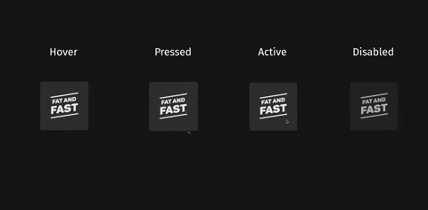
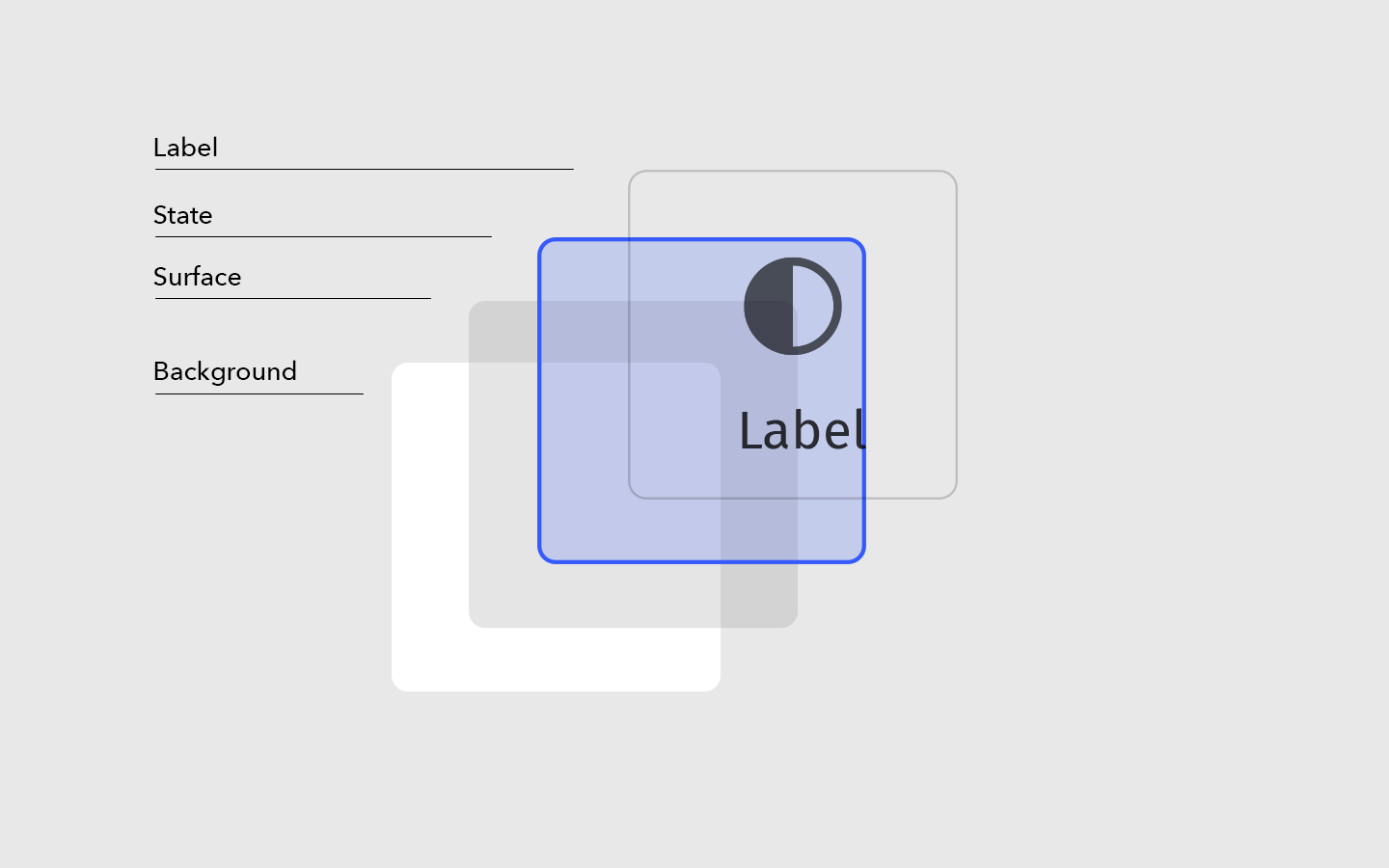
The new color system can now be displayed as a dark or light theme. In addition, it is completely customizable and therefore giving customers the opportunity to use their brand colors shaping the PhotoEditor SDK according to their Corporate Design. Overall, the new color system includes six different surface colors, three different text colors, six different UI states, four interaction colors, and one background color.
UI controls structure#
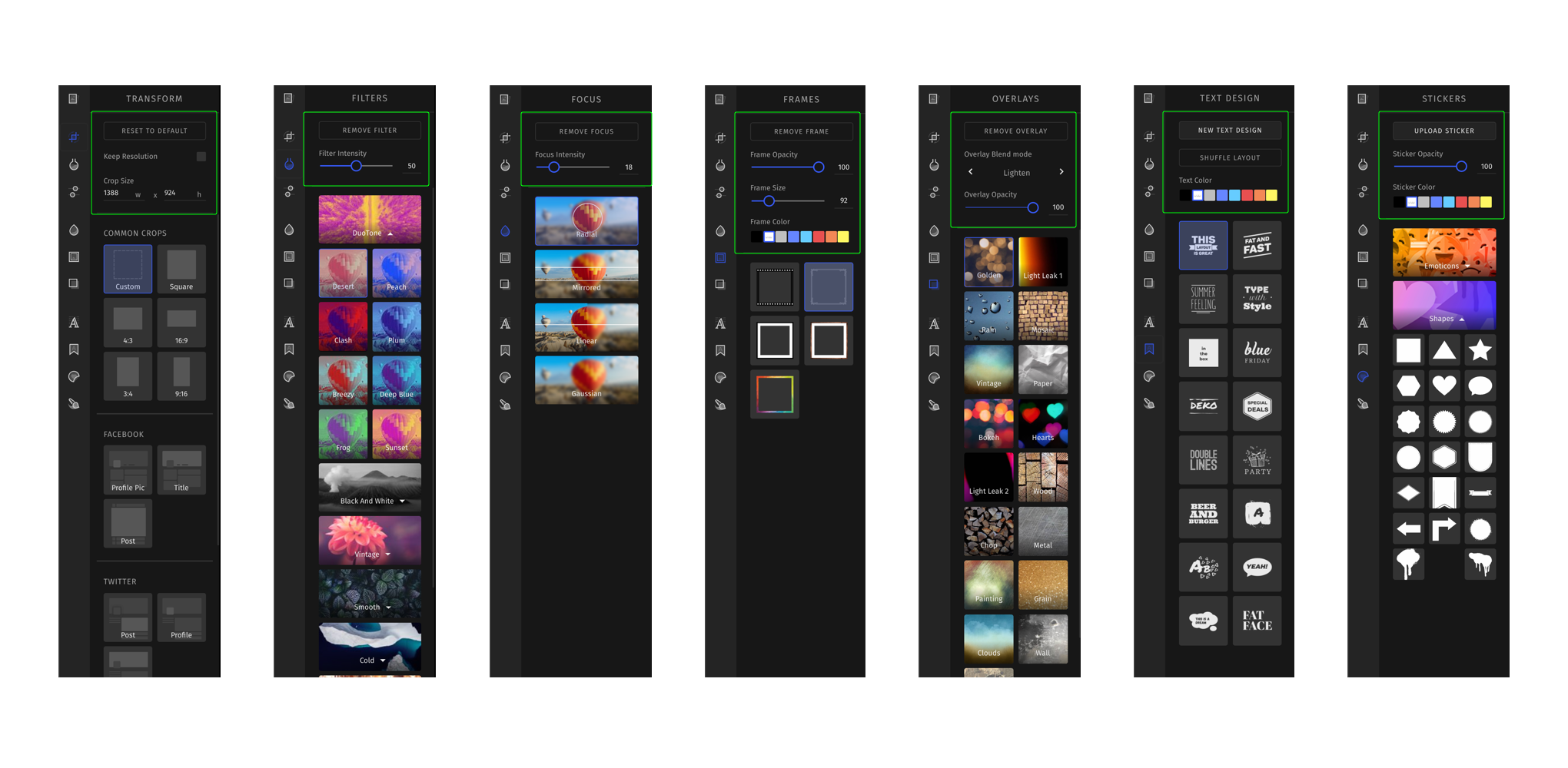
In the course of refactoring, we have standardized the UI structure and arrangement of the individual features. UI controls are now displayed according to their context to generate a minimalistic and clearer overall picture.
Clarity before brevity#
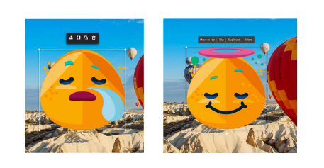
It was also very important for us to map all UI elements within the PhotoEditor SDK as clear and understandable as possible in order to create a user-friendly UI that can be used intuitively and easily by end-users. We have therefore decided to replace abstract and misinterpreted icons with labels, and to add labels to other functions to make them easier to understand.