Placeholders turn design blocks into drop-zones that users can swap content into while maintaining full control over layout and styling.
This guide covers placeholder fundamentals, checking support, enabling behavior, and configuring visual controls for graphic and text blocks.
Placeholder Fundamentals#
Placeholders convert design blocks into interactive drop-zones where users can swap content while maintaining layout and styling control.
Two Distinct Features#
Placeholder behavior enables drag-and-drop replacement and exposes scope checks for content validation.
Placeholder controls provide visual affordances: an overlay pattern and a “Replace” button for guided interaction.
Block-Level vs Fill-Level Behavior#
The key distinction in placeholder implementation depends on block type:
For graphic blocks (images/videos): Placeholder behavior is enabled on the fill, while controls are enabled on the block. This pattern reflects how graphic blocks contain fills that can be replaced.
For text blocks: Placeholder behavior and controls are both enabled directly on the block.
We can check support with supportsPlaceholderBehavior() for both blocks and fills, and supportsPlaceholderControls() for blocks.
Checking Placeholder Support#
Before enabling placeholder features, check if a block supports them:
// Step 4: Check if block/fill supports placeholder featuresconst fill1 = engine.block.getFill(block1);const supportsBehavior = engine.block.supportsPlaceholderBehavior(fill1);const supportsControls = engine.block.supportsPlaceholderControls(block1);The supportsPlaceholderBehavior() method indicates whether a block can become a drop-zone. The supportsPlaceholderControls() method shows if visual controls (overlay and button) are available.
Enabling Placeholder Behavior#
To convert a block into a placeholder drop-zone, enable placeholder behavior. The approach differs based on block type.
For Graphic Blocks (Images/Videos)#
For graphic blocks, placeholder behavior must be enabled on the fill, not the block itself:
// Enable placeholder behavior on the fill (for graphic blocks)if (supportsBehavior) { engine.block.setPlaceholderBehaviorEnabled(fill1, true);}This pattern is critical: setPlaceholderBehaviorEnabled() is called on the fill obtained from block.getFill(). This reflects the underlying architecture where graphic blocks contain replaceable fills.
For Text Blocks#
For text blocks, placeholder behavior is enabled directly on the block, as text blocks don’t use fills in the same way.
We can verify placeholder behavior state with isPlaceholderBehaviorEnabled() on the appropriate target (fill for graphics, block for text).
Enabling Adopter Mode Interaction#
Placeholder behavior alone isn’t enough - blocks must also be enabled for interaction in Adopter mode:
// Step 3: Enable placeholder behavior ("Act as a placeholder")// This makes the block interactive in Adopter modeengine.block.setPlaceholderEnabled(block1, true);The setPlaceholderEnabled() method controls whether the placeholder is interactive for users in Adopter role. CE.SDK distinguishes Creator (full access) and Adopter (replace-only) roles.
Automatic Management#
In practice, setPlaceholderEnabled() is typically managed automatically by the editor: when you enable relevant scopes (like fill/change for graphics or text/edit for text), the placeholder interaction is automatically enabled. When all scopes are disabled, placeholder interaction is automatically disabled. This automatic behavior simplifies template creation workflows.
Configuring Visual Feedback#
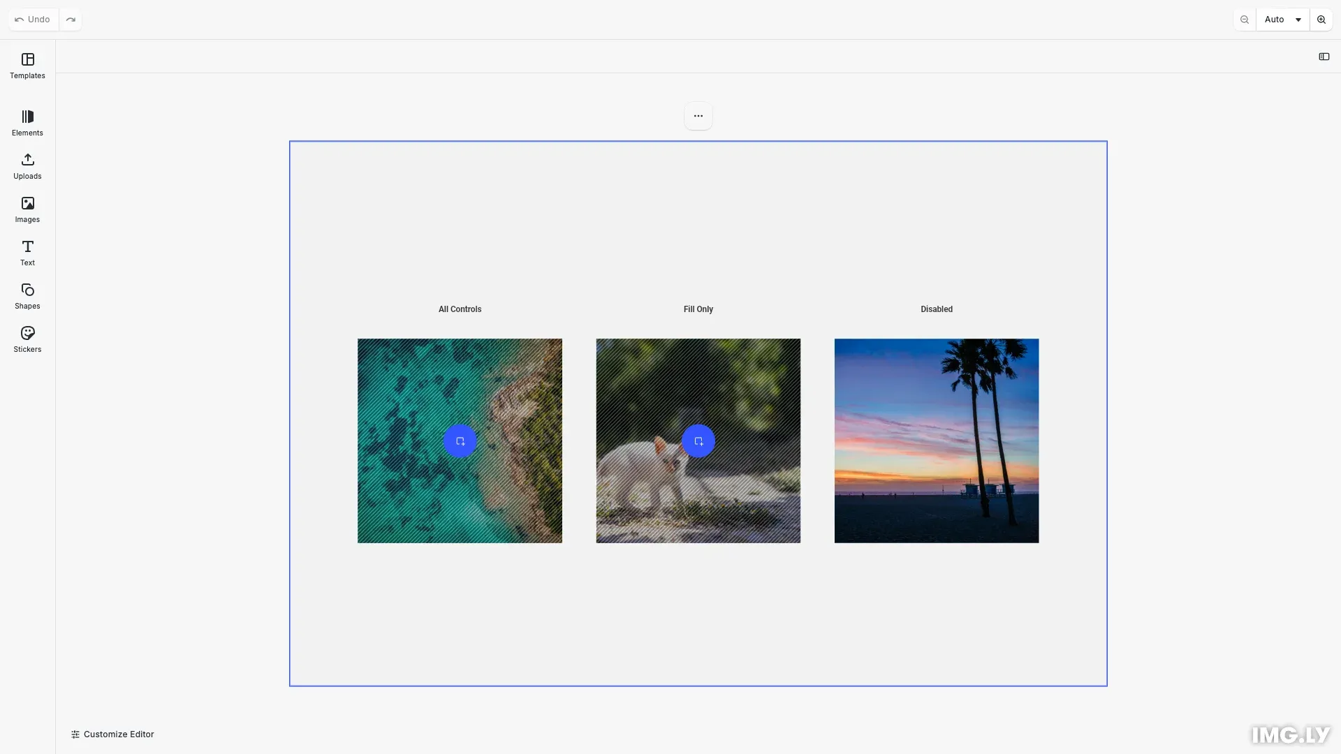
Placeholders can display visual indicators to guide users through the replacement workflow.
Combined Setup: The “Act as Placeholder” Pattern#
In the CE.SDK UI, the “Act as Placeholder” checkbox enables placeholder behavior and both visual controls simultaneously. This combined pattern is the recommended approach:
// Complete "Act as Placeholder" setupconst fillForConfig = engine.block.getFill(block1);if (engine.block.supportsPlaceholderBehavior(fillForConfig)) { engine.block.setPlaceholderBehaviorEnabled(fillForConfig, true);}if (supportsControls) { engine.block.setPlaceholderControlsOverlayEnabled(block1, true); engine.block.setPlaceholderControlsButtonEnabled(block1, true);}This pattern ensures placeholder behavior is enabled on the appropriate target (fill for graphics, block for text) along with both visual controls on the block.
Individual Control Options#
Visual controls can also be managed independently if needed:
Overlay Pattern - The overlay shows a dotted surface indicating a drop-zone:
// Enable placeholder overlay patternif (supportsControls) { engine.block.setPlaceholderControlsOverlayEnabled(block1, true);}Replace Button - The button provides a single-tap entry point for touch devices:
// Enable placeholder buttonif (supportsControls) { engine.block.setPlaceholderControlsButtonEnabled(block1, true);}Individual control is useful when you want specific visual feedback without the full placeholder workflow.
Scope Requirements and Dependencies#
Placeholders depend on specific scopes being enabled to function correctly. Understanding these dependencies prevents common configuration errors.
For graphic blocks (images/videos), the fill/change scope must be enabled before placeholder behavior will work. When you disable fill/change, the editor automatically disables placeholder behavior and controls to maintain consistency.
For text blocks, the text/edit scope must be enabled before placeholder behavior can function.
Optional related scopes that enhance placeholder functionality:
fill/changeType- Allows changing between image, video, and solid color fillslayer/crop- Enables cropping replacement imagestext/character- Allows font and character formatting for text placeholders
Working with Multiple Placeholders#
When creating templates with multiple placeholders, apply settings systematically:
// Batch operation: Apply settings to multiple blocksconst graphicBlocks = [block1, block2];graphicBlocks.forEach((block) => {  // Enable placeholder for each block  engine.block.setPlaceholderEnabled(block, true);
  const fill = engine.block.getFill(block);  if (engine.block.supportsPlaceholderBehavior(fill)) {    engine.block.setPlaceholderBehaviorEnabled(fill, true);  }});
This pattern works well for collage templates, product showcases, or any layout requiring multiple content slots.
API Reference#
| Method | Description |
|---|---|
engine.block.supportsPlaceholderBehavior() | Checks whether the block supports placeholder behavior |
engine.block.setPlaceholderBehaviorEnabled() | Enables or disables placeholder behavior for a block |
engine.block.isPlaceholderBehaviorEnabled() | Queries whether placeholder behavior is enabled |
engine.block.setPlaceholderEnabled() | Enables or disables placeholder interaction in Adopter mode |
engine.block.isPlaceholderEnabled() | Queries whether placeholder interaction is enabled |
engine.block.supportsPlaceholderControls() | Checks whether the block supports placeholder controls |
engine.block.setPlaceholderControlsOverlayEnabled() | Enables or disables the placeholder overlay pattern |
engine.block.isPlaceholderControlsOverlayEnabled() | Queries whether the overlay pattern is shown |
engine.block.setPlaceholderControlsButtonEnabled() | Enables or disables the placeholder button |
engine.block.isPlaceholderControlsButtonEnabled() | Queries whether the placeholder button is shown |
Next Steps#
- Lock the Template - Restrict editing access to specific elements or properties to enforce design rules
- Text Variables - Define dynamic text elements that can be populated with custom values