Adapt the asset library to match your application’s structure and user needs.
The asset library displays assets from registered asset sources. While sources define the data, asset library entries control how that data is presented in the UI. CE.SDK provides default entries for common asset types (images, videos, stickers, etc.), but you can create custom entries or modify existing ones to match your application’s needs.
This guide covers creating custom entries with themed icons, modifying default entries, configuring context-aware replacement behavior, and adding custom entries to the dock.
Creating Custom Entries#
We create custom asset library entries using cesdk.ui.addAssetLibraryEntry(). Each entry needs a unique id, an array of sourceIds referencing registered asset sources, and display configuration options.
In this example, we reference the built-in demo sources (ly.img.image and ly.img.sticker) to populate our custom entry. You can reference any registered source, including custom sources you create.
Theme-Aware Icons#
We can provide different icons for light and dark themes using a function for the icon property. The function receives theme (‘light’ | ‘dark’) and iconSize (‘normal’ | ‘large’) parameters:
// Create a custom asset library entry with theme-aware icons// Use existing demo sources (ly.img.image, ly.img.sticker) to populate the entrycesdk.ui.addAssetLibraryEntry({ id: 'my-custom-assets', sourceIds: ['ly.img.image', 'ly.img.sticker'], // Preview settings control the overview showing all sources previewLength: 4, previewBackgroundType: 'contain', // Grid settings control the detailed view when navigating into a source // Using 2 columns creates a distinct layout from the preview row gridColumns: 2, gridItemHeight: 'square', gridBackgroundType: 'cover', // Theme-aware icon function receives theme and iconSize parameters icon: ({ theme, iconSize }) => { if (theme === 'dark') { return iconSize === 'large' ? 'https://img.ly/static/cesdk/guides/icon-large-dark.svg' : 'https://img.ly/static/cesdk/guides/icon-normal-dark.svg'; } return iconSize === 'large' ? 'https://img.ly/static/cesdk/guides/icon-large-light.svg' : 'https://img.ly/static/cesdk/guides/icon-normal-light.svg'; }});The icon function is called each time the theme changes, ensuring the correct icon is displayed automatically.
Entry for Replace Operations#
We can create separate entries specifically for replace operations. These entries appear when users click “Replace” on a selected block:
// Create a separate entry for replace operationscesdk.ui.addAssetLibraryEntry({ id: 'my-replace-assets', sourceIds: ['ly.img.image'], previewLength: 3, gridColumns: 2, gridItemHeight: 'square', previewBackgroundType: 'contain', gridBackgroundType: 'contain'});Modifying Default Entries#
We update existing entries using cesdk.ui.updateAssetLibraryEntry(). The second parameter can be a partial entry object:
// Update the default images entry with different grid columnscesdk.ui.updateAssetLibraryEntry('ly.img.image', { gridColumns: 4});Extending Source IDs#
To extend sourceIds while preserving existing sources, we use a callback pattern with currentIds:
// Use a callback pattern with currentIds to extend sourceIdscesdk.ui.updateAssetLibraryEntry('ly.img.image', { sourceIds: ({ currentIds }) => [...currentIds, 'ly.img.upload']});The callback receives currentIds containing the entry’s existing source IDs, allowing us to append additional sources (like ly.img.upload for user uploads) without replacing the defaults.
Configuring Replace Entries#
We control which asset library entries appear when users click “Replace” on a selected block using cesdk.ui.setReplaceAssetLibraryEntries(). The callback receives context with selectedBlocks (array of block info including id, blockType, and fillType) and defaultEntryIds.
// Configure which entries appear for replace operations based on block typecesdk.ui.setReplaceAssetLibraryEntries(  ({ selectedBlocks, defaultEntryIds }) => {    // Only show replace options when exactly one block is selected    if (selectedBlocks.length !== 1) {      return [];    }
    const { fillType } = selectedBlocks[0];
    // Show custom replace entry for image fills    if (fillType === '//ly.img.ubq/fill/image') {      return [...defaultEntryIds, 'my-replace-assets'];    }
    // Return empty array to hide replace button for other fill types    return [];  });
Return an empty array to hide the replace button for specific block types. This gives you complete control over which assets can replace which blocks.
Adding Entries to the Dock#
We add custom entries to the dock using cesdk.ui.setComponentOrder({ in: 'ly.img.dock' }, order). Use cesdk.ui.getComponentOrder({ in: 'ly.img.dock' }) to get the current order and append your entry:
// Add custom entry to the top of the dock with a separatorcesdk.ui.setComponentOrder({ in: 'ly.img.dock' }, [ { id: 'ly.img.assetLibrary.dock', key: 'my-custom-assets', // Dock icons use a static URL string icon: 'https://img.ly/static/cesdk/guides/icon-normal-light.svg', label: 'libraries.my-custom-assets.label', entries: ['my-custom-assets'] }, { id: 'ly.img.separator' }, ...cesdk.ui.getComponentOrder({ in: 'ly.img.dock' })]);Each dock item uses id: 'ly.img.assetLibrary.dock' with a unique key, entries array, and optional icon and label properties. The label property references a translation key.
Localizing Entry Labels#
We provide translations for custom entries using cesdk.i18n.setTranslations(). Labels appear at three navigation levels:
libraries.<entry-id>.label— Entry label shown in the dock and panel header (entry level)libraries.<entry-id>.<source-id>.label— Source label within an entry (source level)libraries.<entry-id>.<source-id>.<group-id>.label— Group label within a source (group level)
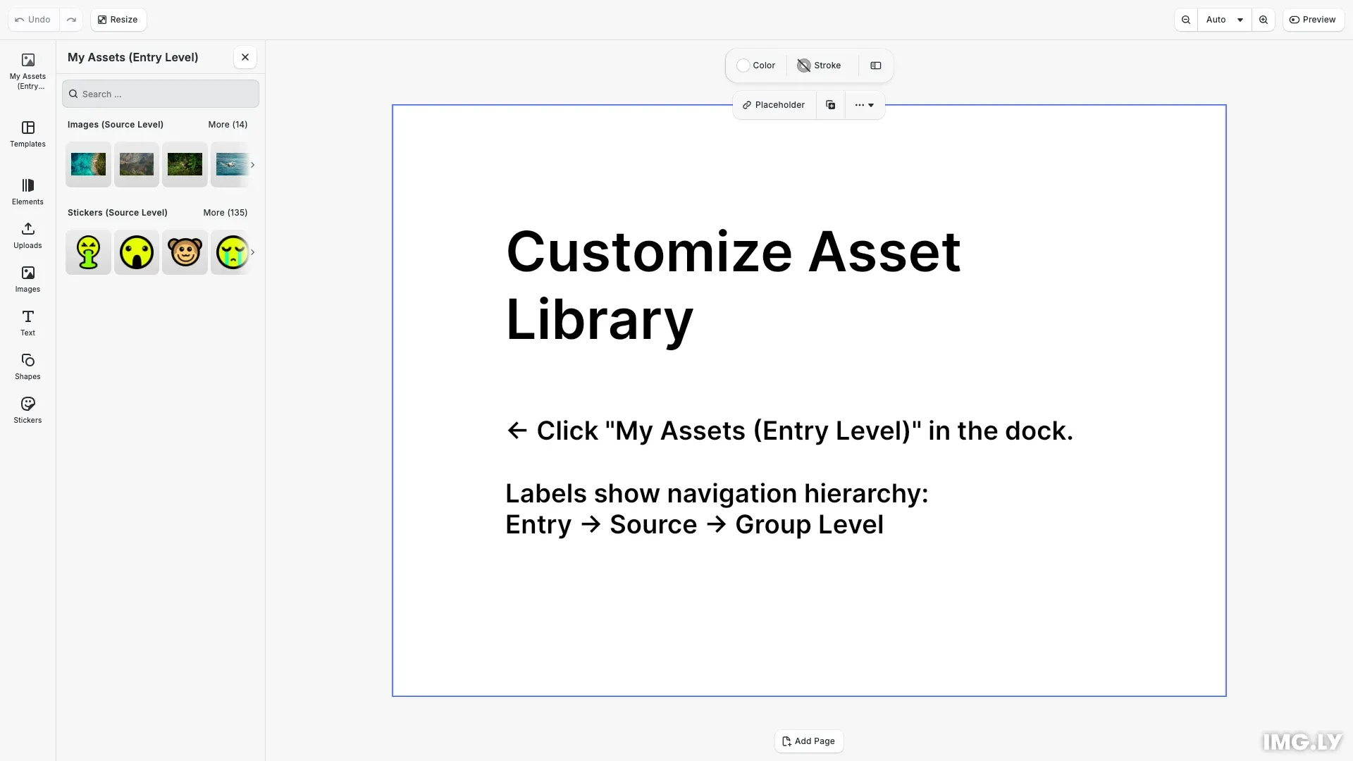
// Provide translations for custom entries before creating them// Labels appear at different navigation levels:// - Entry label: shown in dock and as panel header (sources overview)// - Source label: shown as section header and when navigating into a source// - Group label: shown when a source contains grouped assetscesdk.i18n.setTranslations({ en: { // Entry-level labels (sources overview) 'libraries.my-custom-assets.label': 'My Assets (Entry Level)', 'libraries.my-replace-assets.label': 'Replace Options', // Source-level labels within entry (overrides default source labels) 'libraries.my-custom-assets.ly.img.image.label': 'Images (Source Level)', 'libraries.my-custom-assets.ly.img.sticker.label': 'Stickers (Source Level)', // Group-level labels within sticker source (all 8 sticker categories) // Format: libraries.<entry>.<source>.<group-id>.label 'libraries.my-custom-assets.ly.img.sticker.//ly.img.cesdk.stickers.doodle/category/doodle.label': 'Doodle (Group Level)', 'libraries.my-custom-assets.ly.img.sticker.//ly.img.cesdk.stickers.emoji/category/emoji.label': 'Emoji (Group Level)', 'libraries.my-custom-assets.ly.img.sticker.//ly.img.cesdk.stickers.emoticons/category/emoticons.label': 'Emoticons (Group Level)', 'libraries.my-custom-assets.ly.img.sticker.//ly.img.cesdk.stickers.hand/category/hand.label': 'Hands (Group Level)', 'libraries.my-custom-assets.ly.img.sticker.//ly.img.cesdk.stickers.sketches/category/sketches.label': 'Sketches (Group Level)', 'libraries.my-custom-assets.ly.img.sticker.//ly.img.cesdk.stickers.3Dstickers/category/3Dstickers.label': '3D Grain (Group Level)', 'libraries.my-custom-assets.ly.img.sticker.//ly.img.cesdk.stickers.craft/category/craft.label': 'Craft (Group Level)', 'libraries.my-custom-assets.ly.img.sticker.//ly.img.cesdk.stickers.marker/category/marker.label': 'Markers (Group Level)' }});Set translations before adding entries to ensure labels are available when the UI renders. The entry label appears when viewing sources, source labels appear as section headers, and group labels appear when navigating into sources that contain grouped assets (like sticker categories).
Troubleshooting#
Entry not appearing in dock: Ensure you’ve added the entry to the dock order using setComponentOrder(). Creating an entry with addAssetLibraryEntry() only registers it—it won’t appear until added to the dock.
Replace button not showing: Verify your setReplaceAssetLibraryEntries() callback returns entry IDs (not an empty array) for the selected block type. Check the blockType and fillType values in the context.
Icon not changing with theme: Ensure your icon function returns different URLs for different theme values. The function is called each time the theme changes.
Missing labels: Check that translation keys match the pattern libraries.<entry-id>.label. Use cesdk.i18n.setTranslations() before adding entries to ensure labels are available.
API Reference#
| Method | Category | Purpose |
|---|---|---|
cesdk.ui.addAssetLibraryEntry() | UI | Register a new asset library entry |
cesdk.ui.updateAssetLibraryEntry() | UI | Modify an existing entry’s properties |
cesdk.ui.removeAssetLibraryEntry() | UI | Remove an asset library entry |
cesdk.ui.getAssetLibraryEntry() | UI | Retrieve an entry’s configuration |
cesdk.ui.findAllAssetLibraryEntries() | UI | List all registered entry IDs |
cesdk.ui.setReplaceAssetLibraryEntries() | UI | Configure context-aware replace entries |
cesdk.ui.setComponentOrder({ in: 'ly.img.dock' }, order) | UI | Set the dock component order |
cesdk.ui.getComponentOrder({ in: 'ly.img.dock' }) | UI | Get the current dock component order |
cesdk.i18n.setTranslations() | i18n | Add translation strings |
Next Steps#
- Asset Library Basics — Full reference for entry properties
- Thumbnails — Configure thumbnail display and grid layout
- Refresh Assets — Update the library when external changes occur
- Your Server — Create custom asset sources from your own backend