The CreativeEditor SDK (CE.SDK) includes a powerful, fully-integrated user interface that enables your users to create, edit, and export stunning designs—without requiring you to build a UI from scratch. Whether you’re launching a full-featured editor or embedding design tools into a larger application, CE.SDK provides everything you need to get started quickly.
Out of the box, the UI is professional, responsive, and production-ready. But it’s not a one-size-fits-all solution. You can fully customize, extend, or even replace the UI entirely with your own interface built on top of the CE.SDK engine. The SDK is designed to be as flexible as your product demands.
Launch Web DemoGet Started
Architecture#
CE.SDK’s UI is modular, declaratively configured, and tightly integrated with the core engine. At a high level, it consists of:
- Core Engine APIs — The underlying logic for manipulating scenes, blocks, assets, and rendering
- UI Components — Panels, bars, buttons, and menus that interact with the engine through configuration and callbacks
- Event System — A reactive layer that tracks user input, selections, and state transitions
This separation of concerns allows you to extend, replace, or completely rebuild the UI without impacting the rendering and scene logic handled by the engine.
Default UI#
When you initialize CE.SDK in your project, it includes a preconfigured interface with all the essential components you need:
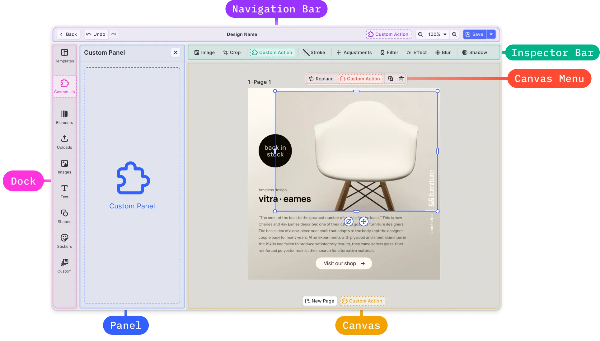
Canvas#
The canvas is the main area of the editor where the user interacts with design content. This part is completely controlled by the Creative Engine. It is basically the core of CE.SDK and the web editor is build around it. This is also the part you need to interact with if you want to create a complete custom UI and not use the web editor.
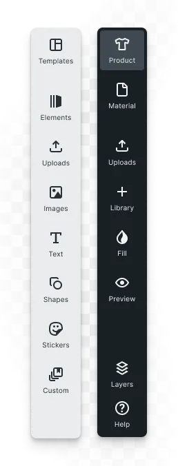
Dock#
The dock is the main entry point for user interactions not directly related to the currently selected block. It occupies a prominent place in the editor and is primarily, though not exclusively, used to open panels with asset libraries. Therefore, the default and recommended position of the asset library panel is on the side of the dock. However, depending on the use case, it might be beneficial to add other buttons and functionalities (even block-specific ones) to highlight them due to the prominence of the dock.
Canvas Menu#
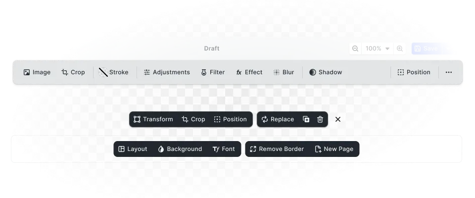
For every selected block on the canvas, the canvas menu appears either above or below the frame of the selected block. This menu provides the most important block-specific actions and settings, ensuring they are immediately visible to the user. It is recommended to add as few elements as possible to the canvas menu to keep it clean and focused.

Inspector Bar#
The main location for block-specific functionality is the inspector bar. Any action or setting available to the user for the currently selected block that does not appear in the canvas menu should be added here.
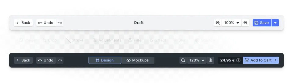
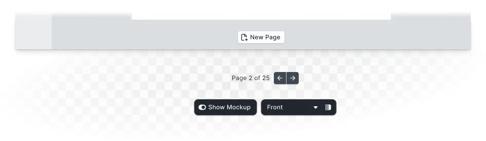
Navigation Bar#
Actions that affect browser navigation (e.g. going back or closing the editor), have global effects on the scene (e.g. undo/redo and zoom), or process the scene in some way (e.g. saving and exporting) should be placed in the navigation bar.
Canvas Bar#
The canvas bar is intended for actions that affect the canvas or scene as a whole. Undo/redo or zoom controls can be placed here as an alternative to the navigation bar.
Each of these elements can be customized, removed, rearranged, or extended using the SDK’s UI configuration and plugin APIs.
Panel#
Panels are flexible UI containers designed to support more advanced and interactive functionality within the editor. Unlike quick actions, which focus on single-click operations, panels give you the space and flexibility to build full user interfaces around complex workflows. You can use panels to:
Walk Users Through Workflows#
Use panels to guide users step by step through a process—whether it’s customizing a template, setting up a product variation, or configuring export settings. Panels help ensure clarity and structure in more involved tasks.
Connect with External APIs or AI Services#
While quick actions are great for simple integrations, some features—like AI-powered design generation or third-party content retrieval—require user input or multi-step interaction. Panels let you build richer interfaces that connect with external services and present results directly in the editor.
Gather Detailed User Input#
Panels are ideal for collecting structured input, such as text, color choices, image uploads, or toggle options. You can use them to power advanced use cases like custom theming, batch updates, or conditional logic based on user selections.
Customizing the UI#
You can tailor the editor’s interface to match your brand and use case. CE.SDK provides flexible APIs and configuration options for customizing:
Appearance#
- Change the UI theme or colors
- Use custom fonts and icons
- Localize labels and messages
Layout#
- Show or hide components based on context
- Reorder buttons or entire sections
- Rearrange dock elements or panel positions
Behavior#
- Enable or disable specific features
- Apply feature-based logic (e.g., show certain tools only for certain block types)
Extending the UI#
In addition to customizing what’s already there, you can add entirely new functionality to the UI:
- Quick Actions — One-click tools that perform fast edits (e.g., remove background)
- Custom Buttons — Add buttons to the dock, canvas menu, or canvas bar
- Custom Panels — Create complex UIs to support advanced workflows like export wizards or AI tools
- Third-Party Integrations — Connect with external APIs, such as QR generators or content management systems
Use the Plugin API to encapsulate these enhancements into portable, declarative extensions. These plugins can be dynamically loaded, reused across projects, and even distributed.
Tip: You don’t need to use the Plugin API to modify the UI—but it’s the best approach when you want to encapsulate logic, reuse it, or offer it to others.
Building Your Own UI#
While CE.SDK includes a fully-featured UI by default, you’re not locked into it. Many developers choose to build a completely custom UI on top of the CE.SDK engine. This approach gives you full control over layout, interaction patterns, and visual design.
When building your own UI, you interact directly with:
- The CE.SDK Engine — Use the core APIs to manage scenes, create or modify blocks, control playback, and export content
- Canvas Rendering — Render and manipulate the canvas area within your application shell
- State and Events — Observe selections, listen for changes, and update your UI reactively
This approach is ideal when:
- You need tight integration with a larger application or workflow
- You want to match a highly specific design system
- You’re building for a unique form factor or device
- You need to simplify the UI dramatically for a focused use case
Integrating with Custom Workflows#
The CE.SDK UI isn’t a closed system—it plays well with your broader application logic and workflows.
You can:
- Sync programmatic state — Reflect external data (e.g., product names or image URLs) directly in the editor
- Control headless rendering — Run the engine without the UI for automation or server-side rendering
- Trigger external logic — Connect UI actions (like export) to your own backend services
The UI components can be programmatically configured, replaced, or completely bypassed depending on your needs. Whether you’re creating a collaborative editor, running batch jobs, or embedding CE.SDK in a no-code platform, you have full control over how the UI interacts with your app.
Small Viewports#
By default, CreativeEditor SDK is configured to use an optimized layout for small viewports.
The UI of the CreativeEditor SDK seamlessly adjusts to the available space, much like any other modern web application, without sacrificing functionality. Moreover, it provides a certain degree of customizability, allowing you to tailor the behavior of the UI to your specific needs.
This layout changes the UI to:
- Render the dock on the bottom
- Open all panels from the bottom, taking up the bottom half of the screen
- Use the large UI scaling
All configuration options related to the panel layout are ignored in favor of the layout optimization for small viewports as described above.