CE.SDK’s color palette system allows you to replace the default colors with custom brand colors, ensuring consistent visual identity across all user-created designs. By configuring color libraries through the asset system, you can provide users with predefined color sets that match your brand guidelines, simplify color selection, and maintain design consistency.
The CE.SDK can be configured with a series of colors that can be directly used whenever a color needs to be chosen. These color libraries need to be provided as asset sources - see our guide on Custom Color Libraries for more details on how this is achieved.
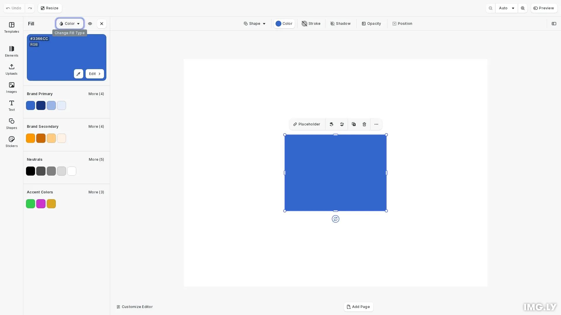
CE.SDK organizes colors using an asset-based architecture. Colors are stored as assets in asset sources, and the ly.img.colors asset library entry controls which color sources appear in the color picker UI. This separation between color storage (asset sources) and color display (asset library entry) provides flexibility in organizing and presenting colors to users.
By default, CE.SDK includes a predefined color palette accessible through the ly.img.color.palette source ID. We can replace this with custom palettes, add multiple color libraries, or combine both approaches.
Configure Internationalization#
Before creating color libraries, we set up internationalized names that will appear in the color picker UI. This ensures users see readable names for each color library in their preferred language.
// Set up internationalized names for custom color librariescesdk.i18n.setTranslations({ en: { 'libraries.brandPrimaryColors.label': 'Brand Primary', 'libraries.brandSecondaryColors.label': 'Brand Secondary', 'libraries.brandNeutralColors.label': 'Neutrals', 'libraries.accentColors.label': 'Accent Colors', },});The translation keys follow the pattern libraries.{sourceId}.label, where sourceId matches the asset source identifier we’ll create.
Create Custom Color Libraries#
We organize our brand colors into logical groups by creating separate asset sources for each category. This approach makes it easy for users to navigate between different color sets.
Brand Primary Colors#
We create the primary brand color library with the main brand color and its variations:
// Create Brand Primary color librarycesdk.engine.asset.addLocalSource('brandPrimaryColors');
// Add brand primary colorscesdk.engine.asset.addAssetToSource('brandPrimaryColors', {  id: 'brand-blue',  label: { en: 'Brand Blue' },  tags: { en: ['blue', 'primary'] },  payload: {    color: {      colorSpace: 'sRGB',      r: 0.2,      g: 0.4,      b: 0.8,    },  },});
cesdk.engine.asset.addAssetToSource('brandPrimaryColors', {  id: 'brand-blue-dark',  label: { en: 'Brand Blue Dark' },  tags: { en: ['blue', 'dark', 'primary'] },  payload: {    color: {      colorSpace: 'sRGB',      r: 0.1,      g: 0.2,      b: 0.5,    },  },});
cesdk.engine.asset.addAssetToSource('brandPrimaryColors', {  id: 'brand-blue-light',  label: { en: 'Brand Blue Light' },  tags: { en: ['blue', 'light', 'primary'] },  payload: {    color: {      colorSpace: 'sRGB',      r: 0.6,      g: 0.7,      b: 0.9,    },  },});
Each color asset includes:
- id: Unique identifier for the color
- label: Display name (internationalized)
- tags: Searchable keywords for filtering
- payload.color: The actual color data with colorSpace and RGB values
Brand Secondary Colors#
Next, we add secondary brand colors that complement the primary palette:
// Create Brand Secondary color librarycesdk.engine.asset.addLocalSource('brandSecondaryColors');
cesdk.engine.asset.addAssetToSource('brandSecondaryColors', {  id: 'brand-orange',  label: { en: 'Brand Orange' },  tags: { en: ['orange', 'secondary'] },  payload: {    color: {      colorSpace: 'sRGB',      r: 1.0,      g: 0.6,      b: 0.0,    },  },});
cesdk.engine.asset.addAssetToSource('brandSecondaryColors', {  id: 'brand-orange-dark',  label: { en: 'Brand Orange Dark' },  tags: { en: ['orange', 'dark', 'secondary'] },  payload: {    color: {      colorSpace: 'sRGB',      r: 0.8,      g: 0.4,      b: 0.0,    },  },});
Neutral Colors#
We include a set of neutral colors for backgrounds, borders, and text:
// Create Brand Neutral colors librarycesdk.engine.asset.addLocalSource('brandNeutralColors');
cesdk.engine.asset.addAssetToSource('brandNeutralColors', {  id: 'neutral-black',  label: { en: 'Black' },  tags: { en: ['black', 'neutral'] },  payload: {    color: {      colorSpace: 'sRGB',      r: 0.0,      g: 0.0,      b: 0.0,    },  },});
cesdk.engine.asset.addAssetToSource('brandNeutralColors', {  id: 'neutral-gray',  label: { en: 'Gray' },  tags: { en: ['gray', 'neutral'] },  payload: {    color: {      colorSpace: 'sRGB',      r: 0.5,      g: 0.5,      b: 0.5,    },  },});
cesdk.engine.asset.addAssetToSource('brandNeutralColors', {  id: 'neutral-white',  label: { en: 'White' },  tags: { en: ['white', 'neutral'] },  payload: {    color: {      colorSpace: 'sRGB',      r: 1.0,      g: 1.0,      b: 1.0,    },  },});
Accent Colors#
We add accent colors for special use cases:
// Create Accent Colors librarycesdk.engine.asset.addLocalSource('accentColors');
cesdk.engine.asset.addAssetToSource('accentColors', {  id: 'accent-green',  label: { en: 'Accent Green' },  tags: { en: ['green', 'accent'] },  payload: {    color: {      colorSpace: 'sRGB',      r: 0.2,      g: 0.8,      b: 0.3,    },  },});
cesdk.engine.asset.addAssetToSource('accentColors', {  id: 'accent-gold',  label: { en: 'Accent Gold' },  tags: { en: ['gold', 'accent'] },  payload: {    color: {      colorSpace: 'sRGB',      r: 0.85,      g: 0.65,      b: 0.13,    },  },});
Configure the Color Picker#
After creating all color libraries, we configure which ones appear in the color picker UI:
// Configure which color libraries appear in the color picker// The order in sourceIds determines the display order in the UIcesdk.ui.updateAssetLibraryEntry('ly.img.colors', { sourceIds: [ 'brandPrimaryColors', 'brandSecondaryColors', 'brandNeutralColors', 'accentColors', // Note: 'ly.img.color.palette' is intentionally omitted // to replace the default palette completely ],});The sourceIds array determines both which libraries appear and their order in the UI. By omitting ly.img.color.palette, we completely replace the default palette with our custom colors.
Restrict the Color Mode#
Use the colorPicker/colorMode setting to lock the color picker to a specific color mode. When set to 'RGB' or 'CMYK', the color space dropdown is hidden and only colors matching the configured mode are editable. Elements using a different color mode show disabled controls with a button to convert. Set to 'Any' (the default) to allow all color modes.
// Restrict to RGB colors onlycesdk.engine.editor.setSetting('colorPicker/colorMode', 'RGB');
// Restrict to CMYK colors onlycesdk.engine.editor.setSetting('colorPicker/colorMode', 'CMYK');
// Allow any color mode (default)cesdk.engine.editor.setSetting('colorPicker/colorMode', 'Any');| Setting | Values | Description |
|---|---|---|
colorPicker/colorMode | 'RGB' | 'CMYK' | 'Any' | Restricts the color picker to a single color mode |
Spot colors are unaffected by this setting — they always show the tint-only controls regardless of the configured color mode.
Color Format Reference#
CE.SDK supports three color formats in palette assets:
RGB Colors (sRGB)#
payload: { color: { colorSpace: 'sRGB', r: 0.2, // Red: 0.0 to 1.0 g: 0.4, // Green: 0.0 to 1.0 b: 0.8 // Blue: 0.0 to 1.0 }}CMYK Colors#
payload: { color: { c: 0.0, // Cyan: 0.0 to 1.0 m: 1.0, // Magenta: 0.0 to 1.0 y: 0.0, // Yellow: 0.0 to 1.0 k: 0.0, // Black: 0.0 to 1.0 tint: 1.0 // Tint: 0.0 to 1.0 }}Spot Colors#
// First define the spot colorengine.editor.setSpotColorRGB('BrandGold', 0.85, 0.65, 0.13);
// Then reference it in the assetpayload: {  color: {    name: 'BrandGold',    tint: 1.0,    externalReference: ''  }}
Keep the Default Palette#
If you want to keep the default palette alongside your custom colors, include it in the sourceIds array:
cesdk.ui.updateAssetLibraryEntry('ly.img.colors', { sourceIds: [ 'brandPrimaryColors', 'brandSecondaryColors', 'ly.img.color.palette', // Include default palette 'brandNeutralColors', ],});The position in the array determines where the default palette appears relative to your custom libraries.
Advanced Techniques#
Dynamic Color Loading#
You can load colors from an external API or configuration file:
async function loadBrandColors(apiUrl: string) {  const response = await fetch(apiUrl);  const brandColors = await response.json();
  cesdk.engine.asset.addLocalSource('dynamicBrandColors');
  brandColors.forEach((color: any) => {    cesdk.engine.asset.addAssetToSource('dynamicBrandColors', {      id: color.id,      label: { en: color.name },      tags: { en: color.tags },      payload: {        color: {          colorSpace: 'sRGB',          r: color.r,          g: color.g,          b: color.b,        },      },    });  });
  cesdk.ui.updateAssetLibraryEntry('ly.img.colors', {    sourceIds: ['dynamicBrandColors'],  });}
User-Specific Palettes#
Provide different color palettes based on user roles or preferences:
function setupUserPalette(userRole: string) {  const paletteMap: Record<string, string[]> = {    designer: ['fullBrandPalette', 'extendedColors'],    marketer: ['limitedBrandPalette', 'templateColors'],    viewer: ['basicColors'],  };
  cesdk.ui.updateAssetLibraryEntry('ly.img.colors', {    sourceIds: paletteMap[userRole] || ['basicColors'],  });}
API Reference#
| Method | Description | Parameters | Returns |
|---|---|---|---|
updateAssetLibraryEntry(id, config) | Controls which asset sources appear in specific UI components | id: string, config: { sourceIds: string[] } | void |
addLocalSource(sourceId) | Creates a new local asset source | sourceId: string | void |
addAssetToSource(sourceId, asset) | Adds an asset to a source | sourceId: string, asset: object | void |
setSpotColorRGB(name, r, g, b) | Defines a spot color for use in assets | name: string, r: number, g: number, b: number | void |
Next Steps#
- Explore Custom Color Libraries for advanced asset source patterns
- Learn about Spot Colors for print workflows
- Customize the overall UI with Theming