Customize the editor’s top navigation bar by replacing its items for strict control or modifying the baseline to extend it.
Navigation Bar Architecture#
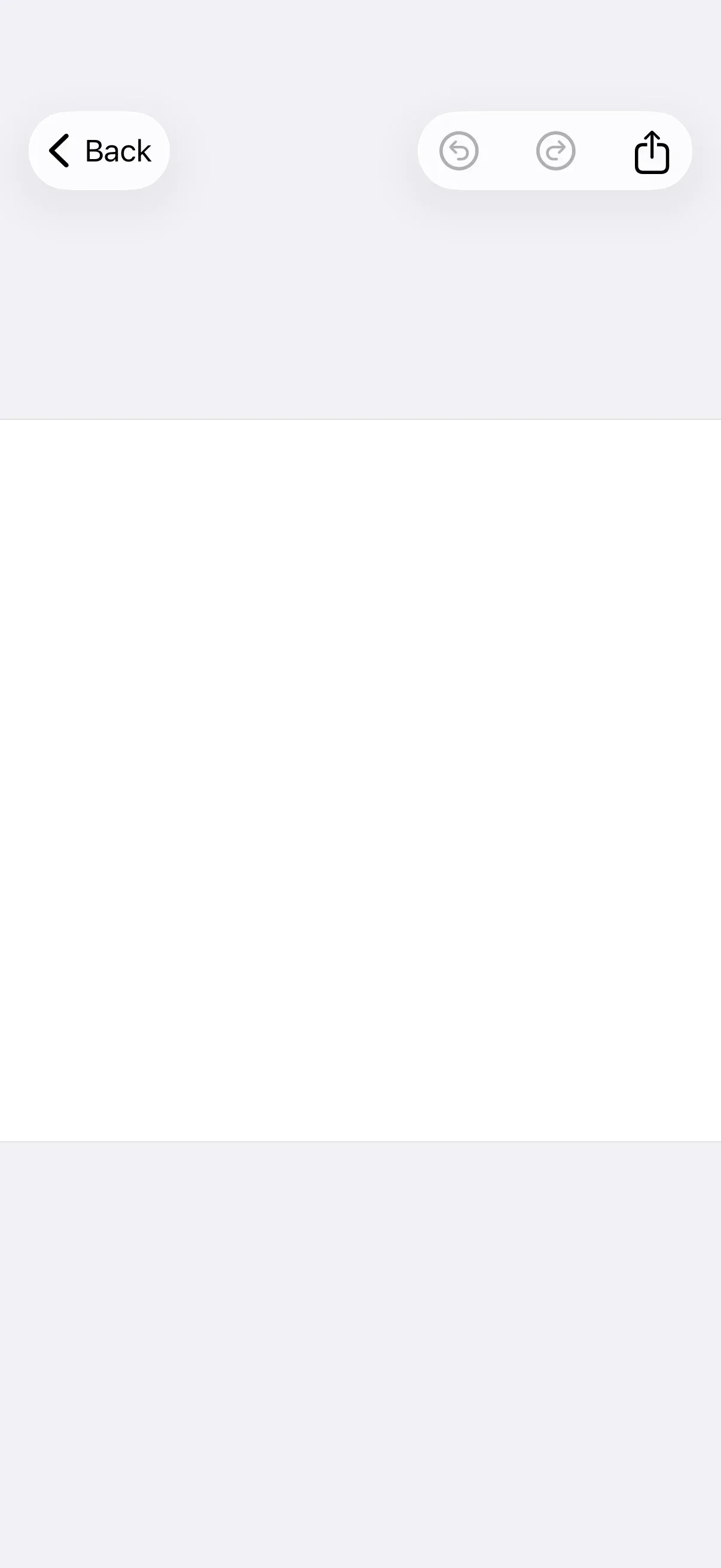
The navigation bar is the toolbar at the top of the editor. It houses session controls (close), editing operations (undo and redo), mode switching, and export, organized into three placement areas: leading, center, and trailing.
Key types:
NavigationBar.Item— the protocol every navigation bar item conforms to.NavigationBar.Button— a prebuilt item with an action and a label.NavigationBar.ItemGroup— groups items under a placement (.topBarLeading,.principal, or.topBarTrailing).NavigationBar.Context— provides the engine, editor state, and event handler for customization logic.
Configuration#
Configure the navigation bar inside the editor’s EditorConfiguration builder. Call builder.navigationBar { navigationBar in … } and pick one of two approaches:
| Approach | Method | Best for |
|---|---|---|
| Replacement | navigationBar.items | Exact control over items and order, version-safe |
| Modification | navigationBar.modify | Extending or adjusting the existing items |
These examples build on GuideEditorConfiguration, a small helper class the iOS guides repository ships as a minimal baseline — it sets a navigation bar with a close, undo, and redo button and nothing else. Substitute your own EditorConfiguration; the navigationBar(_:) builder is available on every configuration.
The Configuration guide covers how EditorConfiguration and EngineSettings set up the editor as a whole.
Declaring the Item List#
Use navigationBar.items to define the full item list from scratch, grouping items under a placement with NavigationBar.ItemGroup. This replaces the baseline entirely, so item order is guaranteed across editor versions.
navigationBar.items { _ in NavigationBar.ItemGroup(placement: .topBarLeading) { NavigationBar.Buttons.closeEditor() } NavigationBar.ItemGroup(placement: .topBarTrailing) { NavigationBar.Buttons.undo() NavigationBar.Buttons.redo() NavigationBar.Buttons.togglePagesMode() NavigationBar.Buttons.export() }}- Each
NavigationBar.ItemGroupplaces its items on the leading, center (.principal), or trailing side. - Only the items you list appear — the baseline close, undo, and redo buttons are replaced.
Modify Navigation Bar Items#
Use navigationBar.modify to adjust the existing item list without rebuilding it. The closure receives the editor context and a mutable list of items grouped by placement.
navigationBar.modify { _, items inThe list supports six operations:
| Operation | Purpose |
|---|---|
addFirst(placement:_:) | Prepend items to a placement group |
addLast(placement:_:) | Append items to a placement group |
addBefore(id:_:) | Insert before a specific item |
addAfter(id:_:) | Insert after a specific item |
replace(id:_:) | Replace an existing item |
remove(id:) | Remove an item by its ID |
Prepend or append within a placement group:
items.addFirst(placement: .topBarTrailing) { NavigationBar.Button(id: "my.package.navigationBar.button.first") { _ in print("First Button action") } label: { _ in Label("First Button", systemImage: "arrow.backward.circle") }}items.addLast(placement: .topBarLeading) { NavigationBar.Button(id: "my.package.navigationBar.button.last") { _ in print("Last Button action") } label: { _ in Label("Last Button", systemImage: "arrow.forward.circle") }}Position relative to an existing item:
items.addAfter(id: NavigationBar.Buttons.ID.undo) { NavigationBar.Button(id: "my.package.navigationBar.button.afterUndo") { _ in print("After Undo action") } label: { _ in Label("After Undo", systemImage: "arrow.forward.square") }}items.addBefore(id: NavigationBar.Buttons.ID.redo) { NavigationBar.Button(id: "my.package.navigationBar.button.beforeRedo") { _ in print("Before Redo action") } label: { _ in Label("Before Redo", systemImage: "arrow.backward.square") }}Replace or remove items by their ID:
items.replace(id: NavigationBar.Buttons.ID.closeEditor) { NavigationBar.Buttons.closeEditor( label: { _ in Label("Cancel", systemImage: "xmark") }, )}items.replace(id: NavigationBar.Buttons.ID.export) { NavigationBar.Buttons.export( label: { _ in Label("Done", systemImage: "checkmark") }, )}items.remove(id: NavigationBar.Buttons.ID.togglePagesMode)NavigationBar.Item Configuration#
Populate the navigation bar with predefined buttons, customized predefined buttons, new buttons, or fully custom items. Each item needs a unique id and lives inside a NavigationBar.ItemGroup.
Use Predefined Buttons#
Start with predefined buttons from the NavigationBar.Buttons namespace. The full set is listed in List of Available Navigation Bar Buttons.
NavigationBar.Buttons.closeEditor()Customize Predefined Buttons#
Override a predefined button’s action, label, isEnabled, or isVisible parameters to adjust its behavior. This example reproduces the default undo title and icon while dimming the label in preview mode and gating availability on whether an undo step exists.
NavigationBar.Buttons.undo( action: { context in try context.engine?.editor.undo() }, label: { context in Label { Text(.imgly.localized("ly_img_editor_navigation_bar_button_undo")) } icon: { Image.imgly.undo } .opacity(context.state.viewMode == .preview ? 0 : 1) .labelStyle(.imgly.adaptiveIconOnly) }, isEnabled: { context in try !context.state.isCreating && context.state.viewMode != .preview && context.engine?.editor.canUndo() == true }, isVisible: { _ in true },)action— the work performed when the button is triggered.label— the view describing the button. Reproduce the default localized title so translations are preserved.isEnabled— whether the button responds to taps.isVisible— whether the button is shown.
Create New Buttons#
Create a button with NavigationBar.Button(id:action:label:) when the predefined options don’t fit. Use reverse-domain notation for the id.
NavigationBar.Button( id: "my.package.navigationBar.button.newButton",) { _ in print("New Button action")} label: { _ in Label("New Button", systemImage: "star.circle")} isEnabled: { _ in true} isVisible: { _ in true}id(required) — a unique identifier for the button.action(required) — the work performed when the button is triggered.label(required) — a view describing the button. Don’t encode visibility logic here.isEnabled— whether the button responds to taps. Defaults totrue.isVisible— whether the button is shown. Defaults totrue.
Create Custom Items#
For full control over rendering, conform a type to the NavigationBar.Item protocol:
private struct CustomNavigationBarItem: NavigationBar.Item {  var id: EditorComponentID { "my.package.navigationBar.newCustomItem" }
  func body(_ context: NavigationBar.Context) throws -> some View {    ZStack {      RoundedRectangle(cornerRadius: 10)        .fill(.conicGradient(colors: [.red, .yellow, .green, .cyan, .blue, .purple, .red], center: .center))      Text("New Custom Item")        .padding(4)    }    .onTapGesture {      print("New Custom Item action")    }  }
  func isVisible(_ context: NavigationBar.Context) throws -> Bool {    true  }}
Then place the custom item inside an item group:
CustomNavigationBarItem()id(required) — a unique identifier for the item.body(_:)(required) — the item’s view. Don’t encode visibility logic here unless the layout space should be reserved when the item is hidden.isVisible(_:)— whether the item is shown. Defaults totrue.
List of Available Navigation Bar Buttons#
Each function in the NavigationBar.Buttons namespace returns a NavigationBar.Button with default parameters you can override as shown in Customize Predefined Buttons.
| Button | ID | Description |
|---|---|---|
NavigationBar.Buttons.closeEditor | NavigationBar.Buttons.ID.closeEditor | Closes the editor, invoking the configuration’s onClose callback. |
NavigationBar.Buttons.undo | NavigationBar.Buttons.ID.undo | Performs an undo via the EditorAPI.undo engine API. |
NavigationBar.Buttons.redo | NavigationBar.Buttons.ID.redo | Performs a redo via the EditorAPI.redo engine API. |
NavigationBar.Buttons.export | NavigationBar.Buttons.ID.export | Exports the design, invoking the onExport callback. |
NavigationBar.Buttons.togglePreviewMode | NavigationBar.Buttons.ID.togglePreviewMode | Toggles between edit and preview view mode. Intended for the Photo, Apparel, and Postcard editors. |
NavigationBar.Buttons.togglePagesMode | NavigationBar.Buttons.ID.togglePagesMode | Toggles between edit and pages view mode. Intended for the Design editor. |
NavigationBar.Buttons.previousPage | NavigationBar.Buttons.ID.previousPage | Navigates to the previous page. |
NavigationBar.Buttons.nextPage | NavigationBar.Buttons.ID.nextPage | Navigates to the next page. |
Next Steps#
- Dock — Customize the bottom toolbar that opens asset libraries and sheets.
- Inspector Bar — Configure the context-sensitive editing controls.
- Canvas Menu — Customize the floating selection toolbar.
- Asset Library — Configure the sources used across editor components.