
We have previously talked about the importance of taking your web-to-print app cross-platform. Whether you are operating a print-on-demand platform and you want to retain customers through a mobile app, or you are developing a physical print kiosk at your point of sale, you will not get around a native editing experience.
Relegating the user experience on mobile to the back seat of your digital strategy or simply using it as a checkout front leaves real money on the table.
Customers looking for a shopping experience on mobile will not abandon the process in order to switch to the desktop to perform design tasks.
Unfortunately, it is not as easy as dropping in a web editor into your mobile app or on your website, the editing experience on the web will be massively degraded as compared with a native mobile design editor. Gesture support is limited, and interaction patterns just do not feel native, what is more, operating within the confines of the browser imposes memory constraints and the inability to take advantage of hardware acceleration.
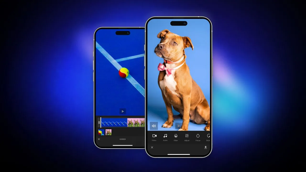
Fortunately, IMG.LY just released full cross-platform support of the CreativeEditor SDK. You can now build on IMG.LY’s engine tech on the web, Android and iOS.
We are going to explore what goes into building a unified editing experience for a particular use case across these platforms while taking into account platform-specific patterns and usage habits.
But first, we need some background on the technology powering our cross-platform solutions.
The Foundation: Platform Agnostic Graphical Engine
The primary challenge of attempting to take a graphics processing SDK cross-platform is avoiding the need to rebuild the same technology on each platform. Instead, we aim to build on previous insights and experience and reuse as much technology as possible. After four years of research and development, IMG.LY’s Creative Engine forms one core piece of software built in C++ that implements the foundational building blocks of state-of-the-art graphics processing. Crucially, the engine can be easily ported to any platform.
This “build once, port anywhere” approach allows for the rapid rolling out of new platform support while ensuring feature parity and most essentially consistency.
Ensuring Consistent Cross-Platform Output
Consistency in this context means that design templates can be shared across platforms while always rendering the exact same output. This is challenging to accomplish if your rendering engine differs from platform to platform.
Something as seemingly innocuous as consistently rendering the same text regardless of platform turns out to be notoriously difficult.
In the context of print applications, this is the biggest technical hurdle to clear.
It is imperative for designs on mobile and the web to produce the same print-ready output file, such as a PDF. Furthermore, to be effective across platforms, users expect to save work in progress and resume it on another device. Therefore, we must support the ability to serialize and deserialize in-progress designs while ensuring consistency.
In addition to interoperability during the design process, it is often necessary to re-render user-generated designs. This is the case when designs are intended to be applied to much larger media than can be rendered on a device, such as high-resolution banners or posters. In this scenario, the serialized edits must be applied to the high-resolution medium on a server, adding yet another platform into the mix.
Designing UIs - Balancing Requirements and Constraints
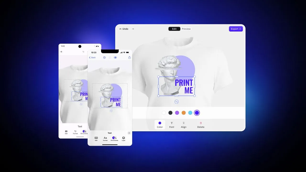
To illustrate the various platform requirements and constraints involved in designing UIs, we developed starter kit editors using the CE.SDK engine for apparel design. Our apparel designer enables users to design the front of a t-shirt for deployment on web storefronts, mobile apps (Android and iOS), and print kiosks for in-store customization.
While we could have used our default Design UI and added a t-shirt backdrop, we opted for a more specific approach that prioritizes the features necessary for an optimal t-shirt design experience. Our UI places these features front and center, while also providing guardrails to prevent bad designs and hide unnecessary complexity.
Thankfully, the CE.SDK Engine allows for the creation of entirely custom UIs using any UI framework, thanks to its image and video manipulation API.
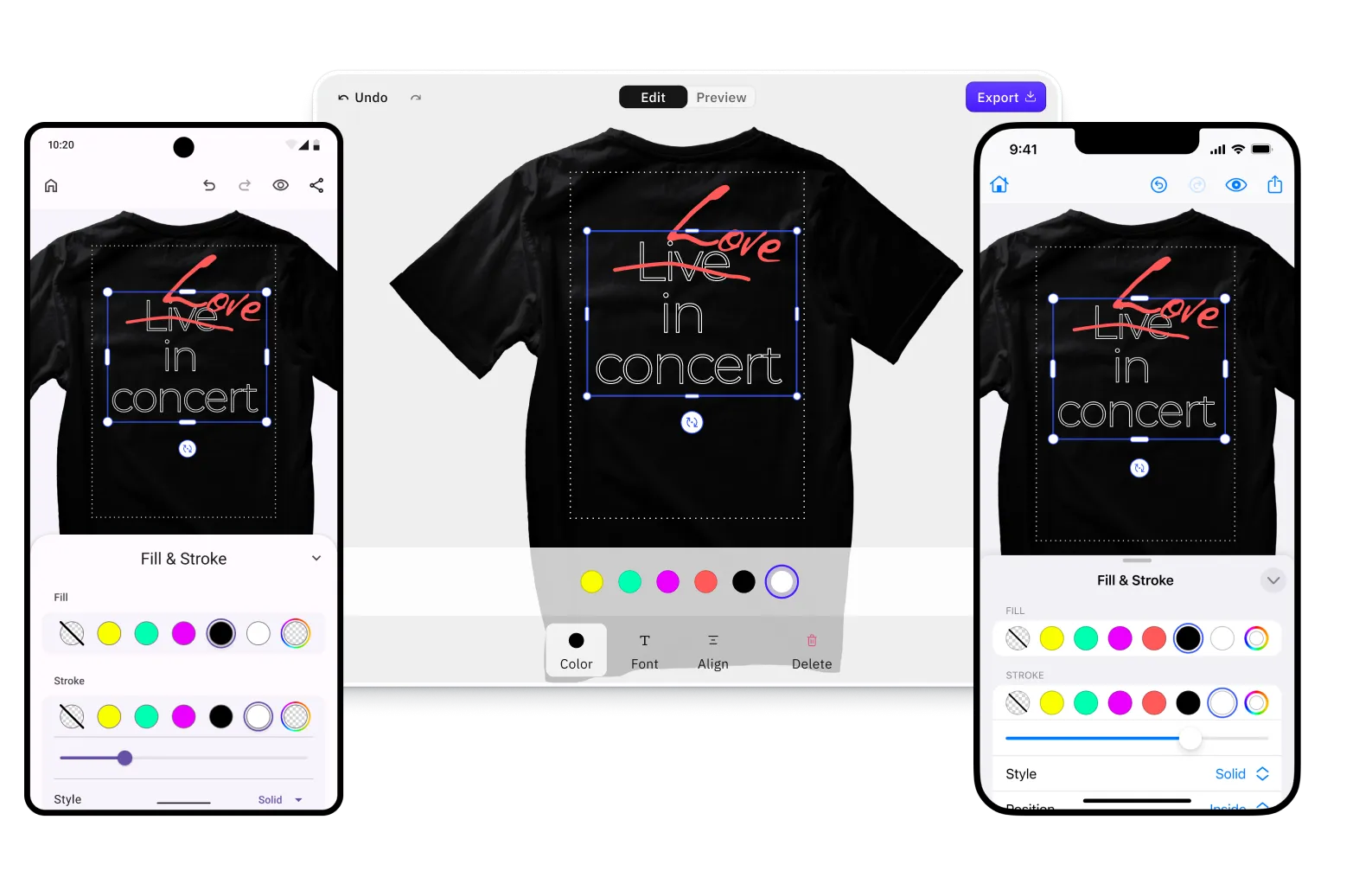
Our custom UI for editing t-shirts on the web can be used on both desktop and mobile web, as well as deployed to a print kiosk inside a web view. To create an optimal user experience, we identified the most important editing options for a t-shirt design in order of relevance: overlaying text, adding images, shapes, and stickers, and uploading new image assets.
It’s worth noting that users start from a template rather than a blank canvas. We strive to give users the best starting point for their creative journey, minimizing setup and menial work as much as possible. The same principle applies to discovering editing features. When a user selects an element, a context menu appears with essential editing options. For example, for a text element, options would include changing color, font, or alignment.
Template Creation on the Web
The most important difference between the web and mobile use cases is that templates will in almost all cases be created using the web interface, whereas users on mobile will simply adapt existing templates.
This means that in addition to the user-facing apparel UI, we also need to ship a more complex UI allowing the creation of templates. Creating templates requires more granular control over an element’s design, as well as the ability to define placeholders and design constraints.
These templates can then be deployed to the simpler adoption UIs on mobile, where the users’ design is guided by those constraints.
Mobile UIs
Designing for mobile devices presents a unique set of challenges due to the limited screen size, reliance on gestures for interaction, and hardware and bandwidth constraints. To address these constraints, we take a strict template-first approach. Most users prefer to begin their work from a template or continue working on a design they started on their desktop. Thus, the first step in the user journey is browsing and selecting designs.
In addition, we need to consider mobile interaction patterns and be even more context-sensitive than we are on the web. For instance, in a print context, the asset size is typically larger than the device’s screen size. This size limitation affects the navigation pattern, and users need to zoom in by pinching to focus on smaller elements. However, we cannot use the pinch gesture to modify an element’s size because it conflicts with the zoom gesture. Instead, users must first select the element explicitly to activate it and then change its size via a pinch gesture.

Conclusion
Creating user interfaces for designing print products on the web and mobile that allow users to be productive is a complex task. We started out by considering the technical complexities involved in bringing any cross-platform editing solution to fruition, and went on to consider both the broad strokes workflow and the minute details of individual element manipulation.
You can adapt the cross-platform apparel editor that we built in this process and integrate it into your product. Hopefully, these example UIs form a useful foundation on which to build your use case.
Designing user interfaces that allow users to create print products on web and mobile platforms is a complex task that requires a thorough understanding of technical and UX complexities. Our team embarked on this journey with a focus on bringing a cross-platform editing solution to life. We delved into the intricate details of individual element manipulation and considered the broad strokes of template-based workflow design, so you don’t have to.
Through this process, we developed a cross-platform apparel editor that can be easily adapted and integrated into your product. Our aim is to provide you with a solid foundation that will enable you to build a UI that is tailored to your use case. With our example UIs as a starting point, you can develop a product that empowers your users to create and customize print products with ease.
In conclusion, designing a user interface that allows for print product creation on web and mobile platforms is a complex undertaking. However, with the right approach and attention to detail, it is possible to create a UI that is both intuitive and efficient. Our team has provided a starting point with our cross-platform apparel editor, and we hope that it serves as a useful foundation for your own UI development efforts.
Reach out to our solutions team to explore your particular use case.