


Over the last 30 years, mobile phones have heavily influenced lifestyles across the globe. They have changed the way we communicate, spend leisure time, look for information, and shop.
Thanks to its accessibility and powerful capabilities, mobile has eclipsed the desktop. Statista reported last year, 59% of all global web traffic came from mobile, with almost five billion people accessing the internet through mobile devices. Moreover, since 2018, app usage has exceeded browser usage on mobile devices, with shopping apps noting 49% year-over-year usage increase between 2020 & 2021.
This means companies have to not only provide a seamless mobile experience if they wish to attract and convert users, but also invest in app development to stay ahead of the curve.
Market Trends
The printing industry is showing no signs of slowing down. In 2021, the global print-on-demand market was valued at $4.90 billion, and it’s projected to generate $39.40 billion in revenue by 2030, according to industry reports from Grand View Research. The report also suggests that print-on-demand is expected to grow at a compound annual growth rate of 26.1% from 2022 to 2030, indicating significant potential for further expansion.
However, print-on-demand is not the only promising sector to watch. The Print Advertising segment is projected to have ad spending worth $46.87 billion in 2023. This sector has remained resilient to the global decline in the print industry during the Covid-19 pandemic, registering an 18% revenue increase in the US between 2019 and 2020.
With the printing industry’s rapid growth, competition is likely to increase, making it essential for companies to prioritize excellence in order to attract and retain customers.
User Preference
It’s undeniable that mobile is becoming increasingly dominant in e-commerce. According to Shopify, almost 50% of all e-commerce transactions are predicted to occur via mobile devices by 2024, with an expected revenue of $620.97 billion. Being able to quickly and effectively serve customers on mobile is now essential for businesses looking to thrive. In 2022, Shopify launched shop.app, a mobile-only e-commerce platform, raising the bar for the industry. To stay competitive, other e-commerce businesses will need to develop similarly sophisticated solutions for mobile users.
Having a seamless mobile experience is also an important factor for B2B companies. Although most interactions still occur on desktop, modern working arrangements allow people to work on the go, without being limited to one device. Providing customers with flexible options is a significant advantage. For example, a web-to-print editor for print advertising should be cross-platform, providing the same experience across all devices during design creation and print validation processes. Offering agile solutions ahead of industry standards can position a company as a go-to service provider. However, an excellent editor alone is not enough; covering the basics of a good mobile experience is crucial.
Game-Changing Mobile Factors
Customers are becoming more unforgiving when it comes to poor user experience. According to Google, 61% of mobile users won’t return to a site they had trouble accessing, with 40% turning to a competitor’s site instead. For print companies relying almost exclusively on online purchases, this poses a substantial threat, hence, the need to fulfill a long list of expectations to satisfy users.
While the ultimate recommendation is to build a mobile app, customers will most likely want to check out the web page first, hence, the importance of providing a spotless web experience.
Here are some of the most prominent factors of mobile UX to optimize.
Design Editing
While for most e-commerce stores developing a smooth purchase experience is rather straightforward, many printing companies have an added layer of complication - catering to custom-made products. Once a rarity, personalization of products has proven to be a constantly growing trend many companies choose to embrace, and rightly so. The global Custom T-shirt Printing market alone was valued at $3.7 billion in 2021 and is projected to reach $6.98 billion by 2028.
With a growing demand for custom prints, follows a necessity for a web-to-print editor that will provide a seamless design process - on both desktop and mobile. Web-to-print editor simplifies artwork supply, jumpstarts the creative process, and takes care of print validation. The ideal tool should be intuitive to navigate and have a quick load time while providing a quality design experience. The same approach should be adopted by print service providers, breaching a gap between multiple software and communication channels clients have to endure.
A powerful web-to-print editor doesn’t just enhance the user experience on your website - it can also open new doors for your business, such as scaling to native mobile apps, print kiosks, and terminals. Developing separate tools for each platform can be time-consuming and costly. With ready-made solutions (as we will discover below), you can speed up the development process and achieve a seamless editing experience across all devices without starting from scratch each time.
Site Speed
In a study conducted by Deloitte, they observed that a difference of 0.1 seconds has improved conversion rate by 8% and increased purchase value by 10% in the retail sector. The highest conversion rate occurs on pages with a load time of 0-2 seconds, and as reported by Google, 53% of users abandon the page if the load time takes more than 3 seconds. Moreover, it has been estimated that slow-loading websites cost retailers $2.6 billion in lost sales every year.
It’s also worth mentioning that Core Web Vitals monitoring page speed is a Google ranking factor. Poor page speed performance will in turn take a hit on rankings - and with a loss of each position on the Search Engine Result Page, the click-through rate falls significantly.
Investing in optimizing page speed and providing a smooth user experience is a win-win on every front.
Mobile-First Design
Responsive web design is not enough anymore. Websites have to be built with a mobile-first approach in mind. What’s the difference? Responsive design ensures that a page can be viewed on all devices, changing its dimensions to fit different screen sizes. The content and the layout of the page, however, remain unchanged.
While responsive web design is just a part of the design workflow making sure a website is accessible for mobile, mobile-first defines the design approach and focuses on creating a website that is intended for mobile users. It means that every aspect of mobile interaction is taken into account when designing a page.
While the general layout of a page is important for both desktop and mobile, clickable elements of design such as buttons and navigation menus can have larger importance for mobile users. Navigating with a thumb or a finger poses more challenges than a neat computer cursor. The mobile-first design makes sure that every part of the page - content, media, navigation, and calls-to-action, feels intuitive to navigate and use. However, even the best mobile-first web design can’t compare to native mobile apps, which usability and performance are far superior.
Hence, mobile-first should be a necessity embraced by all, those who want to go a step further and provide a fully optimized user experience should turn their eyes to app development.
Payments
The simplicity of mobile payments is yet another reason why mobile purchases are on the rise. Mobile wallet solutions like Google Pay, Apple Pay, and Samsung Pay allow users to complete a transaction with just one click, removing the need for credit card input.
Nowadays, providing an easy and quick checkout experience is more important than ever. Over the last few years, the cart abandonment rate significantly increased, from 59.80% back in 2006 to 88.05% in 2020. Focusing on optimizing the checkout and payment processes could reduce the risk of not completing a purchase. A great example of a seamless payment experience is Shopify’s Shop.app with a one-tap checkout, making it as easy as possible for users to convert.
The checkout funnel is also a great space to utilize personalization hacks and recommend similar products. Instapage reported that shopping cart recommendations influence 92% of users, making it a great tool to increase basket size.
Beyond Browser - Investing in Mobile Apps
Mobile app downloads increased by over 80% since 2016, reaching a mighty 255 billion in 2022. The growing popularity of mobile apps is quite understandable, apps provide a better native experience, are easier to navigate, and usually provide personalized recommendations and remember users’ last activity (58% of users consider this important).
In-app shopping, when correctly optimized, is quick and easy, with enhanced product presentation, intuitive navigation, and no unnecessary hassle of filling in forms and adding credit card details.
Print is once again one of the industries that could leverage all advantages mobile apps have to offer. An example of a company that did it right is IMG.LY’s customer Shutterfly, which combined the emerging trends of personalization and going mobile. The company developed an app that automatically creates personalized items users can purchase. They simply ask for permission to access user’s photo gallery, identify pictures with faces and apply them to product templates. This way, customers can be presented with unique products with zero effort of creating an actual design.
Even without automatically generated custom products, an app-to-print editor provides a much smoother editing experience and interface, with native hardware acceleration, local storage, and easier access to photos or even a camera. Moreover, apps present the possibility to provide more accurate recommendations and personalized content, like in-app notifications, reminders, and activity-based discounts. Hence, developing a quality mobile app could not only boost sales, but also increase brand loyalty and customer satisfaction.
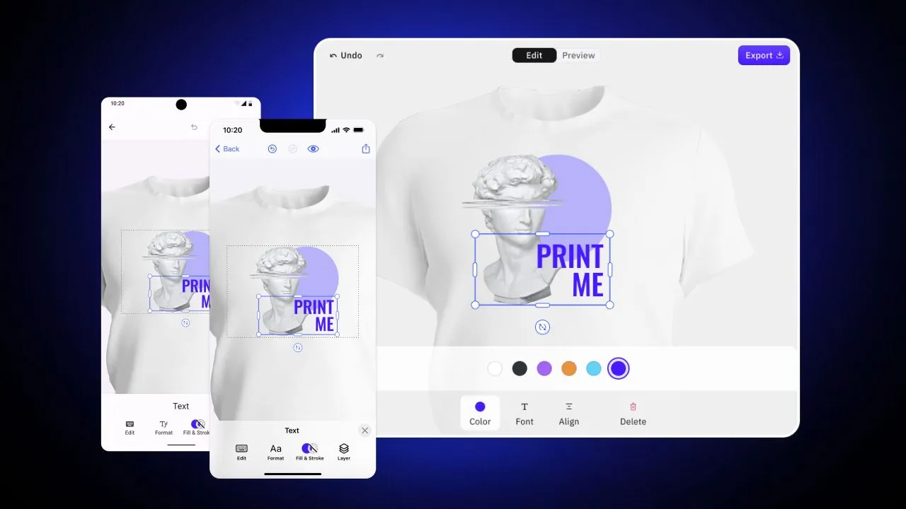
Streamlining Mobile Web-to-Print Editing with CE.SDK
With the undeniable advantages of web-to-print design tools come significant challenges in their development. However, CreativeEditor SDK offers a powerful design editor that delivers consistent experiences across all platforms. Our cross-platform engine can power any editor UI, ensuring 100% consistency in the rendered designs across different devices.
Discover how CE.SDK can streamline your mobile web-to-print process with the following capabilities:
Efficient Client-Side Encoding
Our client-side encoding ensures a smooth and fast design process, as the editor runs directly on the user’s mobile device or web browser. This not only reduces upload time and bandwidth costs, but also allows for easy scalability without incurring additional server costs.
Seamless Cross-Platform Integration
CE.SDK simplifies the process of building an application for the web, iOS, Android, and server by providing a creative engine that’s portable across all platforms. This means that you can easily integrate our solution into your existing systems, saving valuable time and resources. And with consistent design and functionality across all devices, your users can switch between platforms with ease.
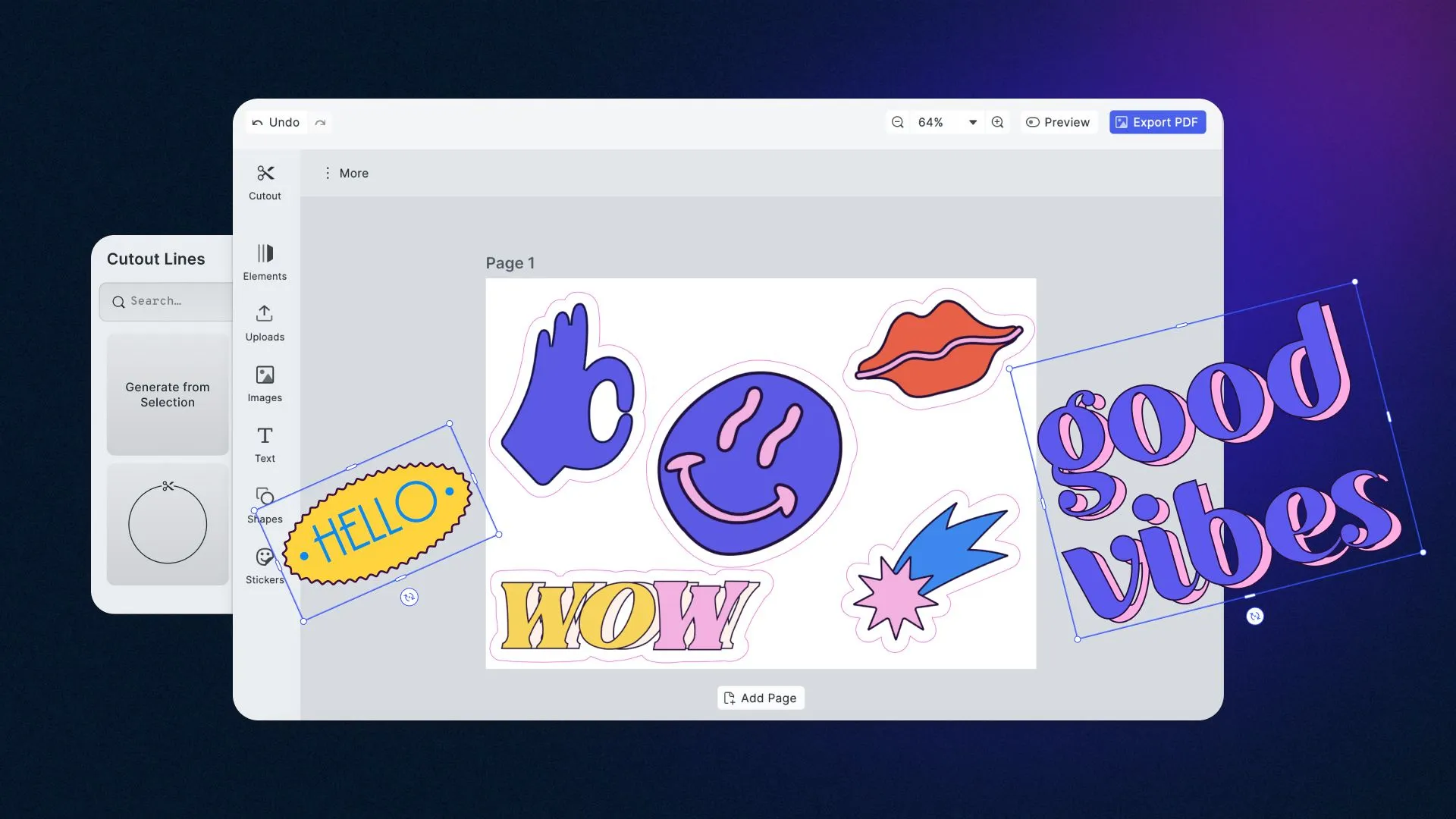
Powerful Editing Features
With CE.SDK, your users can unleash their creativity and design high-quality prints effortlessly. Take advantage of our powerful editing features, including the ability to capture and edit photos. CE.SDK also allows you to predefine the design process with adjustable placeholders and constraints, making sure that your final product meets all of the necessary print criteria.
Preview & Design Validation
Imagine being able to preview your design in real-time, ensuring your product expectations are exceeded every time. Plus, with automatic design validation, you can rest easy knowing that no element will extend beyond the bleed margins, minimizing the risk of misprints. Don’t just take our word for it, check out our showcases and see for yourself how CE.SDK can transform your design process.
Conclusion
As we navigate the ever-changing landscape of technology, it’s important to stay ahead of the curve and keep up with emerging trends. With mobile devices becoming increasingly essential in our lives, it’s an crucial time to invest in creating a delightful mobile experience for your customers. By designing an intuitive website, prioritizing fast page load times, and providing a smooth checkout process, you can create a seamless experience for your users. And for print companies, taking it a step further with an exceptional in-app custom-print design tool is a must to help users bring their dream creations to life. These investments can not only enhance customer satisfaction but also give your business a competitive edge in the market.
However, building a cross-platform editor from scratch can be a time-consuming and costly venture with numerous technical challenges. Fortunately, IMG.LY has developed a solution for those who want a quicker and more efficient option. Check out our CreativeEditor SDK, which enables seamless integration of a robust editor for web-to-print across desktop, mobile, and server.
If you’re interested in integrating CE.SDK, our documentation provides detailed information on how to get started, or you can try it out for free!
Thanks for reading. To stay in the loop, subscribe to our Newsletter
