The dock provides quick access to content libraries and editing tools, appearing at the bottom of the editor interface. This guide shows you how to customize dock items and their layout to match your app’s content strategy and user workflow. While examples use the Design Editor, the same configuration principles apply to all editor solutions.
Explore a complete code sample on GitHub.
Dock Architecture#
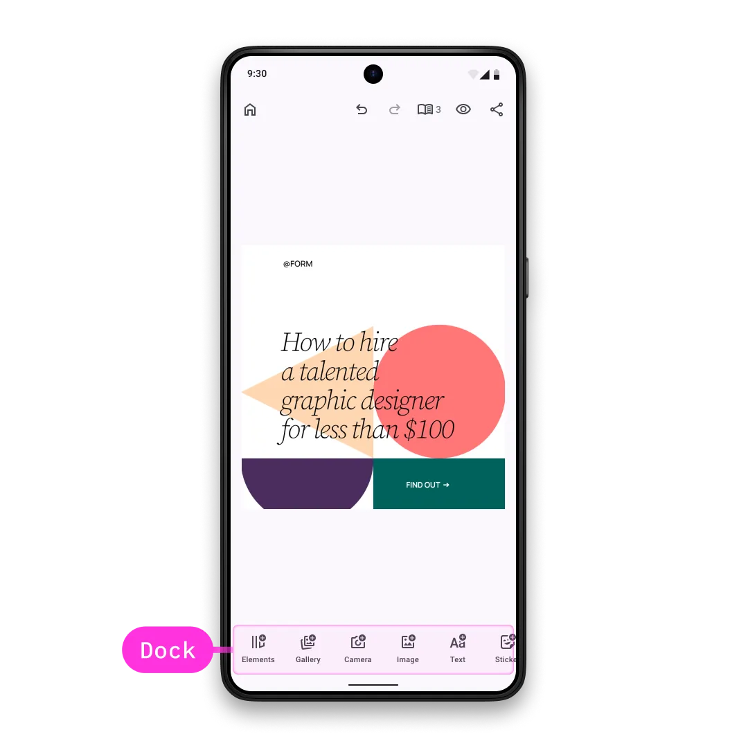
The dock displays horizontally at the bottom of the editor and provides quick access to content libraries and editing tools. It adapts its content based on the selected editor solution.
Key Components:
Dock.Item- Abstract class that all dock items inherit fromDock.Button- Pre-built button implementation with icon and textDock.Custom- Fully custom component for arbitrary content renderingDock.Scope- Provides access to the engine, event handler, and editor context
Configuration#
Dock customization is part of the EditorConfiguration, therefore, in order to configure the dock we need to configure the EditorConfiguration. Below you can find the list of available configurations of the dock. To demonstrate the default values, all parameters are assigned to their default values.
Available configuration parameters:
-
scope- the scope of this component. Every new value will trigger recomposition of all the lambda parameters below. If you need to accessEditorScopeto construct the scope, useLocalEditorScope. Consider using ComposeStateobjects in the lambda parameters below for granular recompositions over updating the scope, since scope change triggers full recomposition of the dock. Prefer updating individualDock.Items over updating the whole dock. Ideally, scope should be updated when the parent scope (scope of the parent component) is updated and when you want to observe changes from theEngine. By default the scope is updated only when the parent scope (accessed viaLocalEditorScope) is updated. -
visible- Control dock visibility. Default value is always true. -
enterTransition- Animation for when the dock appears. Default value is always no enter transition. -
exitTransition- Animation for when the dock disappears. Default value is always no exit transition. -
decoration- Apply custom styling like background, shadows, and padding. The default decoration adds background color and applies paddings to the dock. -
listBuilder- Define the complete list of dock items and their order. Items are only displayed whenvisiblereturnstrue. By default,listBuilderdoes not add anything to the dock. -
horizontalArrangement- Layout arrangement for dock items. Controls spacing and alignment of items within the dock. Default value isArrangement.SpaceEvenly. -
itemDecoration- decoration of the items in the dock. Useful when you want to add custom background, foreground, shadow, paddings etc to the items. Prefer using this decoration when you want to apply the same decoration to all the items, otherwise set decoration to individual items. Default value is always no decoration.
val editorConfiguration = EditorConfiguration.rememberForDesign( dock = { Dock.remember( scope = LocalEditorScope.current.run { remember(this) { Dock.Scope(parentScope = this) } }, visible = { true }, enterTransition = { EnterTransition.None }, exitTransition = { ExitTransition.None }, decoration = { // Also available via Dock.DefaultDecoration Box( modifier = Modifier .fillMaxWidth() .background(MaterialTheme.colorScheme.surface1.copy(alpha = 0.95f)) .padding(vertical = 10.dp), ) { it() } }, listBuilder = Dock.ListBuilder.remember { }, horizontalArrangement = { Arrangement.SpaceEvenly }, // default value is { it() } itemDecoration = { Box(modifier = Modifier.padding(2.dp)) { it() } }, ) },)ListBuilder Configuration#
You can configure the complete item list or modify the default items using two main approaches:
Available approaches:
-
Dock.ListBuilder.rememberForDesign()- Use the recommended default configuration for your editor solution (Design, Photo, Video). Each solution has optimized defaults for its workflow. -
Dock.ListBuilder.rememberForDesign().modify()- Modify the default item list by adding, replacing, or removing specific items without rebuilding the entire configuration. Use this when you want to keep most defaults but make targeted changes.
The Dock.Scope provides access to the engine, event handler, and editor context. Use this for advanced customization logic and to maintain consistency with the current editor state.
Default Dock Items#
Each editor solution has its own default dock configuration optimized for its content workflow:
These are the default items recommended to be used with the Design Editor:
@Composablefun Dock.ListBuilder.rememberForDesign() = Dock.ListBuilder.remember { add { Dock.Button.rememberElementsLibrary() } add { Dock.Button.rememberSystemGallery() } add { Dock.Button.rememberSystemCamera() } add { Dock.Button.rememberImagesLibrary() } add { Dock.Button.rememberTextLibrary() } add { Dock.Button.rememberShapesLibrary() } add { Dock.Button.rememberStickersLibrary() }}These are the default items recommended to be used with the Photo Editor:
@Composablefun Dock.ListBuilder.rememberForPhoto() = Dock.ListBuilder.remember { add { Dock.Button.rememberAdjustments() } add { Dock.Button.rememberFilter() } add { Dock.Button.rememberEffect() } add { Dock.Button.rememberBlur() } add { Dock.Button.rememberCrop() } add { Dock.Button.rememberTextLibrary() } add { Dock.Button.rememberShapesLibrary() } add { Dock.Button.rememberStickersLibrary() }}These are the default items recommended to be used with the Video Editor:
@Composablefun Dock.ListBuilder.rememberForVideo() = Dock.ListBuilder.remember { add { Dock.Button.rememberSystemGallery() } add { /* Make sure to add the gradle dependency of our camera library if you want to use the [rememberImglyCamera] button: implementation "ly.img:camera:<same version as editor>". If the dependency is missing, then [rememberSystemCamera] is used. */ val isImglyCameraAvailable = androidx.compose.runtime.remember { runCatching { CaptureVideo() }.isSuccess } if (isImglyCameraAvailable) { Dock.Button.rememberImglyCamera() } else { Dock.Button.rememberSystemCamera() } } add { Dock.Button.rememberOverlaysLibrary() } add { Dock.Button.rememberTextLibrary() } add { Dock.Button.rememberStickersLibrary() } add { Dock.Button.rememberAudiosLibrary() } add { Dock.Button.rememberReorder() }}Modify Dock Items#
Use the modify function to adjust the default item list without rebuilding the entire configuration:
listBuilder = Dock.ListBuilder.rememberForDesign().modify {Available modification operations:
addFirst- prepends newDock.Item:
addFirst { Dock.Button.remember( id = EditorComponentId("my.package.dock.button.first"), vectorIcon = null, text = { "First Button" }, onClick = {}, )}addLast- appends newDock.Item:
addLast { Dock.Button.remember( id = EditorComponentId("my.package.dock.button.last"), vectorIcon = null, text = { "Last Button" }, onClick = {}, )}addAfter- adds newDock.Itemright after the item with the provided id:
addAfter(id = Dock.Button.Id.systemGallery) { Dock.Button.remember( id = EditorComponentId("my.package.dock.button.afterSystemGallery"), vectorIcon = null, text = { "After System Gallery" }, onClick = {}, )}addBefore- adds newDock.Itemright before the item with the provided id:
addBefore(id = Dock.Button.Id.systemCamera) { Dock.Button.remember( id = EditorComponentId("my.package.dock.button.beforeSystemCamera"), vectorIcon = null, text = { "Before System Camera" }, onClick = {}, )}replace- replaces theDock.Itemwith the provided id with new item:
replace(id = Dock.Button.Id.textLibrary) { Dock.Button.remember( id = EditorComponentId("my.package.dock.button.replacedTextLibrary"), vectorIcon = null, text = { "Replaced Text Library" }, onClick = {}, )}remove- removes theDock.Itemwith the provided id:
remove(id = Dock.Button.Id.shapesLibrary)Dock.Item Configuration#
Each Dock.Item is an EditorComponent. Its id must be unique which is a requirement for proper component management.
Depending on your needs there are multiple ways to define an item. In this example, we demonstrate your options with increasing complexity.
Use Predefined Buttons#
The most basic option is to use our predefined buttons which are provided as composable functions. All available predefined buttons are listed below.
Create New Buttons#
If our predefined buttons don’t fit your needs you can create your own:
@Composablefun rememberDockButton() = Dock.Button.remember( id = EditorComponentId("my.package.dock.button.newButton"), scope = LocalEditorScope.current.run { remember(this) { Dock.ButtonScope(parentScope = this) } }, visible = { true }, enterTransition = { EnterTransition.None }, exitTransition = { ExitTransition.None }, // default value is { it() } decoration = { Surface(color = MaterialTheme.colorScheme.background) { it() } }, onClick = { editorContext.eventHandler.send(EditorEvent.Sheet.Open(SheetType.Volume())) }, // default value is null icon = { Icon( imageVector = IconPack.Music, contentDescription = null, ) }, // default value is null text = { Text( text = "Hello World", ) }, enabled = { true },)Required and optional parameters:
-
id- the id of the button. Note that it is highly recommended that every uniqueEditorComponenthas a unique id. Parameter does not have a default value. -
scope- the scope of this component. Every new value will trigger recomposition of all the lambda parameters below. If you need to accessEditorScopeto construct the scope, useLocalEditorScope. Consider using ComposeStateobjects in the lambda parameters below for granular recompositions over updating the scope, since scope change triggers full recomposition of the button. Ideally, scope should be updated when the parent scope (scope of the parent componentDock-Dock.Scope) is updated and when you want to observe changes from theEngine. By default the scope is updated only when the parent component scope (Dock.scope, accessed viaLocalEditorScope) is updated. -
visible- whether the button should be visible. Default value is always true. -
enterTransition- transition of the button when it enters the parent composable. Default value is always no enter transition. -
exitTransition- transition of the button when it exits the parent composable. Default value is always no exit transition. -
decoration- decoration of the button. Useful when you want to add custom background, foreground, shadow, paddings etc. Default value is always no decoration. -
onClick- the callback that is invoked when the button is clicked. Parameter does not have a default value. -
icon- the icon content of the button. If null, it will not be rendered. Default value is null. -
text- the text content of the button. If null, it will not be rendered. Default value is null. -
tint- the tint color of the content. If null, then no tint is applied. Default value is null. -
enabled- whether the button is enabled. Default value is always true.
Other than the main Dock.Button.remember function, there is one more convenience overload that has three differences:
iconis replaced withvectorIconlambda, that returnsVectorIconinstead of drawing the icon content.textis replaced withtextlambda, that returnsStringinstead of drawing the text content.- An extra parameter
contentDescriptionis added that is used by accessibility services to describe what the button does. Note that it is not required to provide value whentextis not null, since its value will be used by accessibility services, however having bothtextandcontentDescriptionas null will cause a crash.
Create Custom Items#
For completely custom implementations, use Dock.Custom to render arbitrary content:
@Composablefun rememberCustomItem() = Dock.Custom.remember( id = EditorComponentId("my.package.dock.newCustomItem"), scope = LocalEditorScope.current.run { remember(this) { Dock.ItemScope(parentScope = this) } }, visible = { true }, enterTransition = { EnterTransition.None }, exitTransition = { ExitTransition.None },) { Box( modifier = Modifier .fillMaxHeight() .clickable { Toast .makeText(editorContext.activity, "Hello World Clicked!", Toast.LENGTH_SHORT) .show() }, ) { Text( modifier = Modifier.align(Alignment.Center), text = "Hello World", ) }}Required and optional parameters:
-
id- the id of the custom item. Note that it is highly recommended that every uniqueEditorComponenthas a unique id. Parameter does not have a default value. -
scope- the scope of this component. Every new value will trigger recomposition of all the lambda parameters below. If you need to accessEditorScopeto construct the scope, useLocalEditorScope. Consider using ComposeStateobjects in the lambda parameters below for granular recompositions over updating the scope, since scope change triggers full recomposition of the custom item. Ideally, scope should be updated when the parent scope (scope of the parent componentDock-Dock.Scope) is updated and when you want to observe changes from theEngine. Parameter does not have a default value. -
visible- whether the custom item should be visible. Default value is always true. -
enterTransition- transition of the custom item when it enters the parent composable. Default value is always no enter transition. -
exitTransition- transition of the custom item when it exits the parent composable. Default value is always no exit transition. -
content- the content of the custom item. You are responsible for drawing it, handling clicks etc. Parameter does not have a default value.
List of Available Dock.Buttons#
As you often saw in the previous sections, there are composable functions that look like this: Dock.Button.remember{name}. All these functions return a Dock.Button, they are public and can be used in your application. Note that all the parameters of these functions have default values, therefore, you do not need to provide any values, however, if you want to modify any of the parameters, it is exactly the same as described in Create New Buttons section.
| Button | ID | Description |
|---|---|---|
Dock.Button.rememberElementsLibrary | Dock.Button.Id.elementsLibrary | Opens library sheet with elements via EditorEvent.Sheet.Open. By default, the LibraryCategory is picked from the Asset Library. |
Dock.Button.rememberOverlaysLibrary | Dock.Button.Id.overlaysLibrary | Opens library sheet with overlays via EditorEvent.Sheet.Open. By default, the LibraryCategory is picked from the Asset Library. |
Dock.Button.rememberImagesLibrary | Dock.Button.Id.imagesLibrary | Opens library sheet with images via EditorEvent.Sheet.Open. By default, the LibraryCategory is picked from the Asset Library. |
Dock.Button.rememberTextLibrary | Dock.Button.Id.textLibrary | Opens library sheet with text via EditorEvent.Sheet.Open. By default, the LibraryCategory is picked from the Asset Library. |
Dock.Button.rememberShapesLibrary | Dock.Button.Id.shapesLibrary | Opens library sheet with shapes via EditorEvent.Sheet.Open. By default, the LibraryCategory is picked from the Asset Library. |
Dock.Button.rememberStickersLibrary | Dock.Button.Id.stickersLibrary | Opens library sheet with stickers via EditorEvent.Sheet.Open. By default, the LibraryCategory is picked from the Asset Library. |
Dock.Button.rememberAudiosLibrary | Dock.Button.Id.audiosLibrary | Opens library sheet with audios via EditorEvent.Sheet.Open. By default, the LibraryCategory is picked from the Asset Library. |
Dock.Button.rememberSystemGallery | Dock.Button.Id.systemGallery | Opens the system gallery via EditorEvent.LaunchContract. |
Dock.Button.rememberSystemCamera | Dock.Button.Id.systemCamera | Opens the system camera via EditorEvent.LaunchContract. |
Dock.Button.rememberImglyCamera | Dock.Button.Id.imglyCamera | Opens the IMG.LY camera via EditorEvent.LaunchContract. Note that the button can be used only if ly.img:camera:<same version as editor> dependency is added in your build.gradle file. For more information, check the camera documentation. |
Dock.Button.rememberReorder | Dock.Button.Id.reorder | Opens reorder sheet via EditorEvent.Sheet.Open. |
Dock.Button.rememberAdjustments | Dock.Button.Id.adjustments | Opens adjustment sheet via EditorEvent.Sheet.Open. |
Dock.Button.rememberFilter | Dock.Button.Id.filter | Opens filter sheet via EditorEvent.Sheet.Open. |
Dock.Button.rememberEffect | Dock.Button.Id.effect | Opens effect sheet via EditorEvent.Sheet.Open. |
Dock.Button.rememberBlur | Dock.Button.Id.blur | Opens blur sheet via EditorEvent.Sheet.Open. |
Dock.Button.rememberCrop | Dock.Button.Id.crop | Opens crop sheet via EditorEvent.Sheet.Open. |
Dock.Button.rememberResizeAll | Dock.Button.Id.crop | Opens resize sheet via EditorEvent.Sheet.Open. |