The dock is the horizontal toolbar along the bottom of the editor. Declare its buttons from scratch for strict control, or adjust an existing list to add, replace, and remove individual entries.
Dock Architecture#
The dock is an EditorComponent that the editor renders as the horizontal toolbar at the bottom. It is selection-independent, and each item can decide its own visibility.
You assemble the dock from these component entries and related types:
Dock.Button- The built-in button implementation, with an action plus an icon and optional text.EditorComponent- The base component type for fully custom dock items.
The related Dock.Scope and Dock.ItemScope expose the editor context, event handler, and engine to dock configuration callbacks.
The dock gives users quick access to content libraries such as images, text, shapes, and stickers, plus editing tools such as crop, resize, filters, and adjustments.
For a complete product surface, start from the Design Editor Starter Kit. This guide focuses on the dock configuration that you can apply to your own editor setup.
Configuration#
Dock customization lives in EditorConfiguration. The Editor composable owns Engine startup; these snippets use the existing editor context and configure only the dock surface.
EditorConfiguration.remember { dock = { Dock.remember { scope = { remember(this) { Dock.Scope(parentScope = this) } } modifier = { Modifier } visible = { true } enterTransition = { EnterTransition.None } exitTransition = { ExitTransition.None } decoration = { Box( modifier = Modifier .fillMaxWidth() .background(MaterialTheme.colorScheme.surface1.copy(alpha = 0.95f)) .padding(vertical = 10.dp), ) { it() } } listBuilder = { Dock.ListBuilder.remember { /* Add items */ } } horizontalArrangement = { Arrangement.SpaceEvenly } itemDecoration = { Box(modifier = Modifier.padding(2.dp)) { it() } } } }}Dock.remember keeps the default visibility and decoration unless you override them, but it does not add items on its own. Assign listBuilder to populate the dock. Supplying an empty Dock.ListBuilder.remember { } hides all dock items, while visible can hide or show the whole dock component.
The Configuration guide covers editor setup more broadly; this page covers the dock portion of that setup.
Declaring the Item List#
Use Dock.ListBuilder.remember to declare the complete list of dock items. The order of add calls is the display order, and the list replaces the dock contents for this configuration.
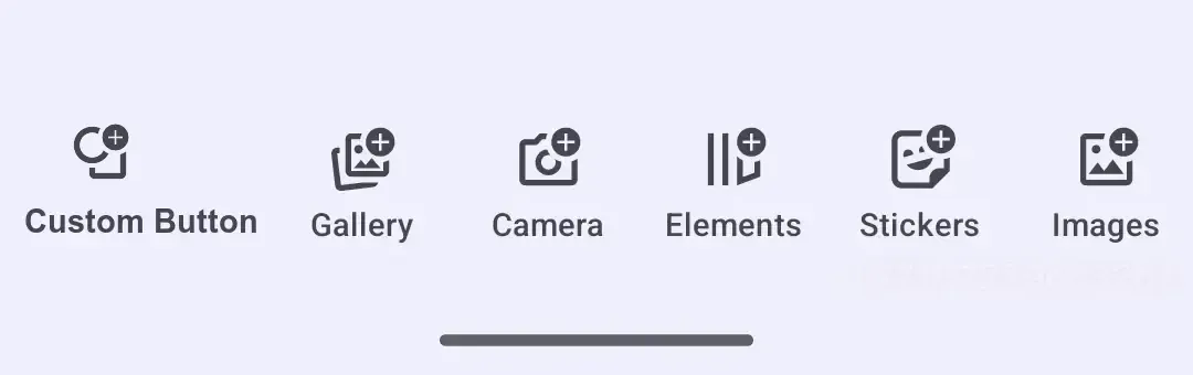
Dock.ListBuilder.remember { add { Dock.Button.remember { id = { EditorComponentId("my.package.dock.button.custom") } vectorIcon = { IconPack.AddShape } textString = { "Custom" } onClick = {} } } add { Dock.Button.rememberSystemGallery() } add { Dock.Button.rememberSystemCamera() } add { Dock.Button.rememberElementsLibrary() } add { Dock.Button.rememberStickersLibrary() } add { Dock.Button.rememberImagesLibrary() } add { Dock.Button.rememberTextLibrary() }}- Predefined buttons open common libraries, sheets, and capture flows.
- Custom buttons can sit alongside predefined items when the action belongs directly in the bottom toolbar.
- A full list is the most predictable option for product UIs that need stable ordering across editor versions.
Common predefined dock buttons are listed below.
Permissions for Device Capabilities#
Some predefined dock buttons open device capabilities. Dock.Button.rememberSystemGallery() opens the configured in-editor gallery-backed asset library, so any media permissions depend on how your asset-library integration reads device media. Dock.Button.rememberSystemCamera() uses the editor’s camera capture flow; it shows the camera permission flow only when your app declares android.permission.CAMERA.
The system camera flow writes captures through the SDK-provided ${applicationId}.ly.img.editor.fileprovider authority. Do not declare a second FileProvider for that dock button; only declare and request the Android permissions your integration actually needs.
Modify Dock Items#
Use modify when you already have a list builder and only need to add, replace, or remove a few entries. Call it on the builder instance you want to adjust.
val existingListBuilder = Dock.ListBuilder.remember { add { Dock.Button.rememberSystemGallery() } add { Dock.Button.rememberSystemCamera() } add { Dock.Button.rememberTextLibrary() } add { Dock.Button.rememberShapesLibrary() }}existingListBuilder.modify { addFirst { Dock.Button.remember { id = { EditorComponentId("my.package.dock.button.first") } vectorIcon = null textString = { "First Button" } onClick = {} } } addLast { Dock.Button.remember { id = { EditorComponentId("my.package.dock.button.last") } vectorIcon = null textString = { "Last Button" } onClick = {} } } addAfter(id = Dock.Button.Id.systemGallery, failIfNotFound = true) { Dock.Button.remember { id = { EditorComponentId("my.package.dock.button.afterSystemGallery") } vectorIcon = null textString = { "After System Gallery" } onClick = {} } } addBefore(id = Dock.Button.Id.systemCamera, failIfNotFound = true) { Dock.Button.remember { id = { EditorComponentId("my.package.dock.button.beforeSystemCamera") } vectorIcon = null textString = { "Before System Camera" } onClick = {} } } replace(id = Dock.Button.Id.textLibrary, failIfNotFound = true) { Dock.Button.remember { id = { EditorComponentId("my.package.dock.button.replacedTextLibrary") } vectorIcon = null textString = { "Replaced Text Library" } onClick = {} } } remove(id = Dock.Button.Id.shapesLibrary, failIfNotFound = true)}| Operation | Purpose |
|---|---|
addFirst |
Add an item at the beginning. |
addLast |
Add an item at the end. |
addAfter |
Insert an item after a target ID. |
addBefore |
Insert an item before a target ID. |
replace |
Replace the item with the target ID. |
remove |
Remove the item with the target ID. |
Dock.Item Configuration#
Each dock item is an EditorComponent, and its id must be unique. You can use predefined buttons, customize a predefined button, create a new button, or provide a fully custom item.
Predefined Buttons#
Start with a predefined button from Dock.Button. The full list is below.
@Composablefun rememberPredefinedDockButton() = Dock.Button.rememberImagesLibrary()Customize Predefined Buttons#
Most predefined buttons accept a Dock.ButtonBuilder block, so override only the properties you need. This example keeps the images-library behavior, changes the label and accessibility description, and shows where optional icon, enabled, and visible overrides belong.
@Composablefun rememberCustomizedDockButton() = Dock.Button.rememberImagesLibrary { textString = { "Brand Images" } vectorIcon = { IconPack.AddImageForeground } contentDescription = { "Open brand images" } enabled = { true } visible = { true }}textStringsets the visible label.vectorIconsupplies anImageVectorwhen you want to replace or explicitly set the button icon.contentDescriptionis used by accessibility services.enabledandvisiblecan be wired to state predicates; the sample leaves them always active and visible.
Create New Buttons#
Create a new Dock.Button when no predefined action fits. The button id is required and should be stable across recompositions.
@Composablefun rememberDockButton() = Dock.Button.remember { id = { EditorComponentId("my.package.dock.button.newButton") } scope = { remember(this) { Dock.ItemScope(parentScope = this) } } modifier = { Modifier } visible = { true } enterTransition = { EnterTransition.None } exitTransition = { ExitTransition.None } // Default value is { it() } decoration = { Surface(color = MaterialTheme.colorScheme.background) { it() } } onClick = { editorContext.eventHandler.send(EditorEvent.Sheet.Open(SheetType.Volume())) } icon = { Icon( imageVector = IconPack.Music, contentDescription = null, ) } text = { Text( text = "Volume", ) } enabled = { true }}ididentifies the item for rendering and latermodifyoperations.onClickruns when the user taps the button.iconandtextrender the button content. UsevectorIconandtextStringfor the simpler string/vector variants.visibleandenabledkeep state logic out of the label and icon.
Create Custom Items#
For full control over rendering, create an EditorComponent and draw your UI in decoration.
@Composablefun rememberCustomItem() = EditorComponent.remember { id = { EditorComponentId("my.package.dock.newCustomItem") } scope = { remember(this) { Dock.ItemScope(parentScope = this) } } modifier = { Modifier } visible = { true } enterTransition = { EnterTransition.None } exitTransition = { ExitTransition.None } decoration = { Box( modifier = Modifier .fillMaxHeight() .clickable { Toast .makeText(editorContext.activity, "Dock action clicked", Toast.LENGTH_SHORT) .show() }, ) { Text( modifier = Modifier.align(Alignment.Center), text = "Custom", ) } }}Use this pattern for non-button dock entries. You are responsible for layout, click handling, accessibility, and visual states inside the decoration.
List of Available Dock Buttons#
Predefined buttons are composable factory functions in the Dock.Button namespace. Most functions return a dock button with default properties that you can customize as shown in Customize Predefined Buttons. Dock.Button.rememberAssetLibrary() is the exception: it returns an EditorComponent<EditorScope> and uses EditorComponentBuilder, so customize its id, modifier, visible, or decoration instead of button-only properties such as textString and vectorIcon. Target these entries in modify operations with the matching Dock.Button.Id constant.
| Button | ID | Description |
|---|---|---|
Dock.Button.rememberAssetLibrary() |
Dock.Button.Id.assetLibrary |
Opens the full asset library sheet. |
Dock.Button.rememberElementsLibrary() |
Dock.Button.Id.elementsLibrary |
Opens the elements library. The content is sourced from the Asset Library. |
Dock.Button.rememberOverlaysLibrary() |
Dock.Button.Id.overlaysLibrary |
Opens the overlays library. |
Dock.Button.rememberImagesLibrary() |
Dock.Button.Id.imagesLibrary |
Opens the images library. |
Dock.Button.rememberTextLibrary() |
Dock.Button.Id.textLibrary |
Opens the text library. |
Dock.Button.rememberShapesLibrary() |
Dock.Button.Id.shapesLibrary |
Opens the shapes library. |
Dock.Button.rememberStickersLibrary() |
Dock.Button.Id.stickersLibrary |
Opens the stickers library. |
Dock.Button.rememberStickersAndShapesLibrary() |
Dock.Button.Id.stickersAndShapesLibrary |
Opens the combined stickers and shapes library. |
Dock.Button.rememberAudiosLibrary() |
Dock.Button.Id.audiosLibrary |
Opens the audio library. |
Dock.Button.rememberVoiceoverRecord() |
Dock.Button.Id.voiceoverRecord |
Opens the voiceover recording sheet. |
Dock.Button.rememberSystemGallery() |
Dock.Button.Id.systemGallery |
Opens system gallery content through the configured asset library. |
Dock.Button.rememberSystemCamera() |
Dock.Button.Id.systemCamera |
Captures media with the system camera. |
Dock.Button.rememberImglyCamera() |
Dock.Button.Id.imglyCamera |
Captures media with the IMG.LY camera integration. Add the camera dependency with the same version as the editor before using it. |
Dock.Button.rememberReorder() |
Dock.Button.Id.reorder |
Opens the reorder sheet. Shown only when the background track contains at least two clips. |
Dock.Button.rememberAdjustments() |
Dock.Button.Id.adjustments |
Opens the adjustments sheet when the current page allows adjustments. |
Dock.Button.rememberFilter() |
Dock.Button.Id.filter |
Opens the filter sheet when the current page allows filters. |
Dock.Button.rememberEffect() |
Dock.Button.Id.effect |
Opens the effect sheet when the current page allows effects. |
Dock.Button.rememberBlur() |
Dock.Button.Id.blur |
Opens the blur sheet when the current page allows blur. |
Dock.Button.rememberCrop() |
Dock.Button.Id.crop |
Opens the crop sheet when the current page supports crop and the layer scope allows it. |
Dock.Button.rememberResizeAll() |
Dock.Button.Id.resizeAll |
Opens the resize sheet. |
API Reference#
| API | Category | Purpose |
|---|---|---|
EditorConfiguration.remember { dock = { ... } } |
Config | Configure the dock component for an editor instance. |
Dock.remember { ... } |
Config | Create and configure a dock component. |
Dock.ListBuilder.remember { add { ... } } |
Config | Build a complete dock item list in display order. |
add { ... } |
List operation | Append an item to a new list builder. |
existingListBuilder.modify { ... } |
Config | Adjust an existing list builder without rewriting the source list. |
addFirst { ... } / addLast { ... } |
List operation | Add items at the beginning or end of the source list. |
addAfter(id=_, failIfNotFound=_) / addBefore(id=_, failIfNotFound=_) |
List operation | Insert items next to a source item id. |
replace(id=_, failIfNotFound=_) |
List operation | Replace a source item by id. |
remove(id=_, failIfNotFound=_) |
List operation | Remove a source item by id. |
Dock.Button.rememberSystemGallery() |
Item | Add the system gallery dock button. |
Dock.Button.rememberSystemCamera() |
Item | Add the system camera dock button. |
Dock.Button.rememberElementsLibrary() |
Item | Add the elements library dock button. |
Dock.Button.rememberStickersLibrary() |
Item | Add the stickers library dock button. |
Dock.Button.rememberImagesLibrary() |
Item | Add the images library dock button. |
Dock.Button.rememberTextLibrary() |
Item | Add the text library dock button. |
Dock.Button.rememberShapesLibrary() |
Item | Add the shapes library dock button. |
Dock.Button.remember { id; onClick; icon; text } |
Item | Create a custom dock button. |
EditorComponent.remember { decoration = { ... } } |
Item | Create a fully custom dock item. |
EditorComponentId("...") |
Item | Define stable ids for custom items and modify targets. |
editorContext.eventHandler.send(event=_) |
Event | Dispatch editor UI events from custom dock item actions. |
EditorEvent.Sheet.Open(type=SheetType.Volume()) |
Event | Open the volume sheet from a custom dock button action. |
Next Steps#
- Inspector Bar - Context-sensitive editing controls for the selected block.
- Navigation Bar - Configure the editor’s top bar.
- Canvas Menu - The floating toolbar for the current selection.
- Asset Library - The sources behind the dock’s library buttons.