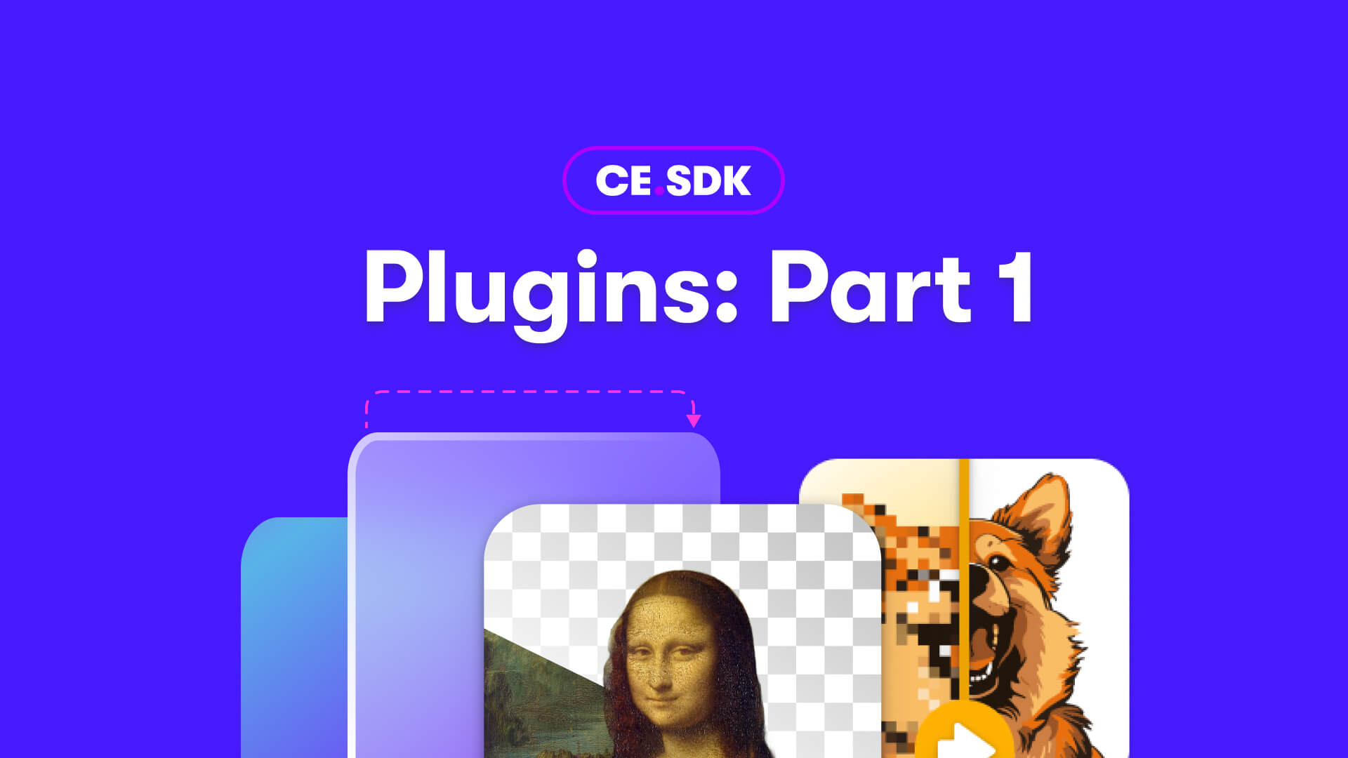
At IMG.LY we are driven by a commitment to empower creativity for end users worldwide, we do so by giving our customers the tools to build the ideal creative experience for their customers. For this reason, we are shaping our CreativeEditor SDK to be built for modification and extension. IMG.LY’s customers are not limited by our roadmap. To the contrary, plugins allow customers to not only extend editor functionality, but to also benefit from third-party plugins and open source development based on IMG.LY’s CE.SDK. This new plugin system is designed to give our customers unparalleled autonomy, allowing them to tailor the user experience to their specific needs and accelerate product innovation.
This first release of CE.SDK’s plugin API enables you to customize the UI at certain extension points and locations, as well as change the order and location of UI elements. At these points you will not only be able to change the appearance of existing features but add entirely custom features in the form of quick actions - simple one-click actions to edit canvas elements like removing an image background or vectorizing a graphic.
Extension Points in the UI
Before customizing the UI, it is crucial to understand the user experience we have designed to facilitate intuitive manipulation and creation of a range of designs. The following key locations in the editor UI are extension points for your plugins. We provide a visual example for the type of customization possible at each location:
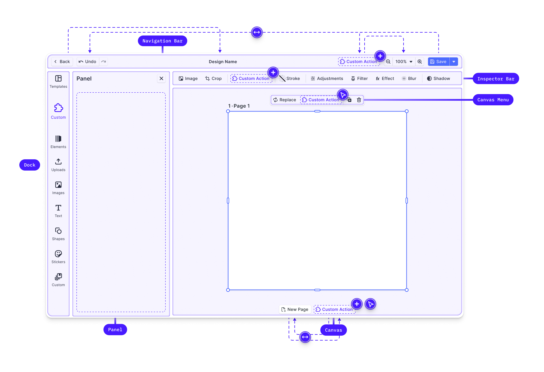
Canvas: The core interaction area for design content, controlled by the Creative Engine.
Dock: The primary entry point for user interactions not directly related to the selected block. It is primarily, though not exclusively, used to open panels with asset libraries or add elements to the canvas. This release allows you to customize the buttons in the dock. The customization of panels will be possible following the next release.
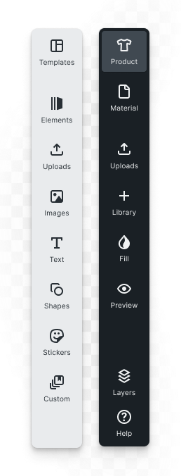
Canvas Menu: Provides block-specific settings and actions such as deletion or duplication. Here, we customized the menu by adding a background removal action and actions for layer management.

Inspector Bar: Main location for block-specific functionality. Any action or setting available for the currently selected block that does not appear in the canvas menu will be shown here.
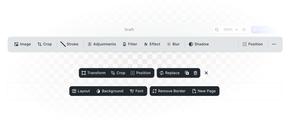
Navigation Bar: For actions affecting browser navigation and global scene effects such as zoom or undo/redo. The customization below shows more advanced navigation patterns for multi-steps designs that can be implemented via plugins.

Canvas Bar: For actions affecting the canvas or scene as a whole, such as adding pages. This is an alternative place for actions such as zoom or redo/undo.

Customizing UI Components
You can control the order and layout of components within these locations using Order APIs, which allow you to add, remove, or reorder components. We also provide special layout components like separators and spacers to help organize your custom components effectively.
Registering New Components
Beyond predefined components, you can register your own custom components using builder elements such as buttons, dropdowns, and inputs. This enables you to integrate unique behaviors and logic into the web editor seamlessly. This is how you would implement custom “quick actions” such as background removal
Feature-level Control
In addition to defining custom components, you can use the new feature API to control components on the feature level based on the current context. For instance, you might want to hide the duplicate and delete button for a new “Avatar” block type, you can use the Feature API to selectively disable these components for that specific block.
Examples: Background Removal and Cut-out lines
A straightforward example of a plugin that extends the default editor UI with a quick action that acts on an element is our image background removal plugin.
Here, we customized the canvas menu of image elements to prominently display a “BG Removal” button acting on the currently selected block. To not place so much emphasis on background removal, this feature could have been placed in the inspector bar instead.
The next example is an outlook on what is to come.
Sometimes a plugin manipulates an element but requires additional inputs from the users so that a single button click does not suffice. Such is the case for our cut-out lines plugin, allowing users to create custom cut-out or perforated line shapes on the canvas. The button is placed in the dock and a panel opens on click where the user can select shapes for the cut-out or opt for a dynamic shape that is generated from the selection.
Get Started
Start developing your own plugins by visiting our plugin documentation. We're excited to see what you'll build!
What's Next
The next plugin release will allow you to customize the UI with panels, enabling the extension of increasingly complex behaviors that require additional user input or interaction with external services.
Stay tuned for more updates, and don’t hesitate to reach out if you have any questions or need assistance. Together, we are redefining the future of creative editing.
Thank you for reading. Join 3,000+ creative professionals—subscribe to our newsletter for updates on new features, plugins, and early access.
