This article documents the most surprising insights from our journey building timeline user interface. We'll explore everything from overcoming usability challenges, visualizing data, prioritizing information, and refining touch interactions.
IMG.LY's CE.SDK for iOS now comes with a native video editor, built from scratch in SwiftUI. I was responsible for coding and polishing the timeline user interface, working with both our design team and our cross-platform engine team. When I started implementing the timeline, we had the basic design concept sketched out in Figma. However, for an advanced UI like this, nothing beats rapid prototyping and iteration between design and development to make it feel right.
I. Visualizing Time
Timelines are a well-known convention, at least to modern humans. Timelines show durations in time as segments in space, distributed along the horizontal axis, with multiple tracks for things that happen in parallel. This is a simple yet effective way of representing moments in time visually. As obvious as it may seem today, this flavor of data visualization first appeared only 250 years ago. One of the earliest known examples is Joseph Priestley’s A Chart of Biography, published in 1765. Here is Priestley’s A New Chart of History from 1769, which is even more impressive:
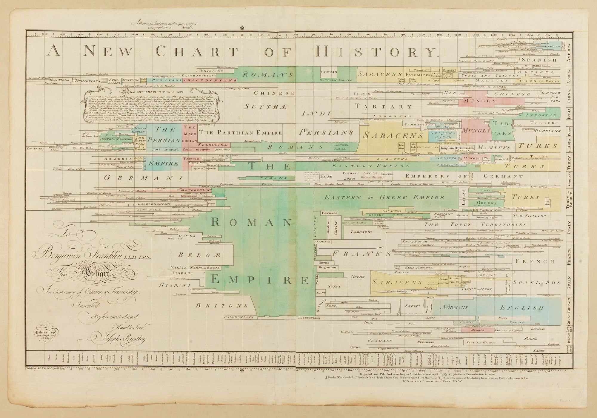
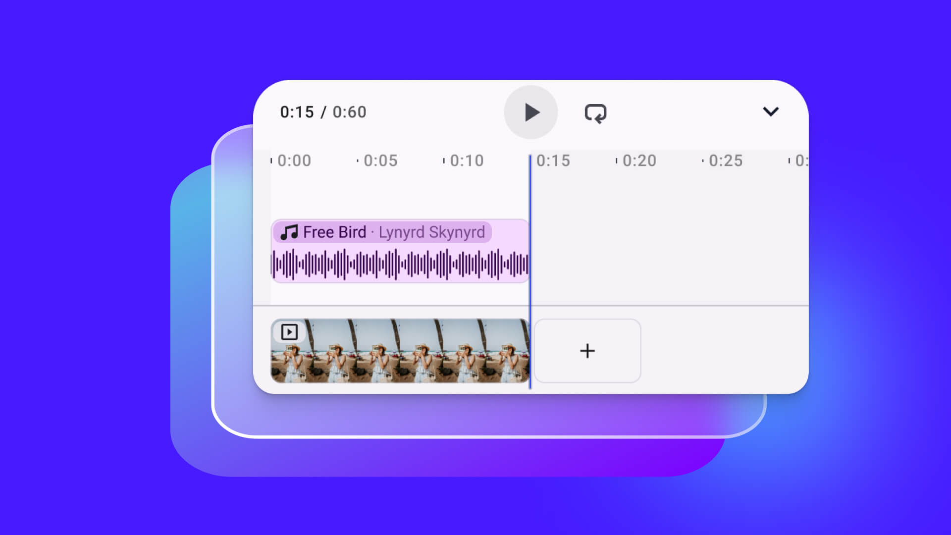
Video editing timelines are built on this exact principle of mapping time to space: A digital video composition consists of tracks for simultaneous audio and video layers. These tracks contain individual clips that can be rearranged, trimmed, and transformed. Navigating the video’s time dimension is as easy as scrolling left and right. The tracks and clips serve as landmarks for orientation, forming the mental model of what the video composition is.
Timelines map time to space
Horizontal Direction
Modern iOS user interfaces appear flipped in right-to-left languages: the buttons and controls are in different horizontal positions. The layout follows the reading direction of the language. Even the familiar drill-down navigation animates to the left when drilling deeper into the hierarchy, and the Back button sits in the upper right corner, its chevron pointing to the right. So, naturally, one of the first things we checked was whether timelines should run right-to-left in writing systems like Arabic or Hebrew. According to a trustworthy source, this is not the case: we found an old version of Apple’s developer guides stating that editor timelines in software are universally left-to-right, even if the surrounding interface layout is flipped by the operating system for right-to-left system languages.
Cognitive Load vs. Discoverability
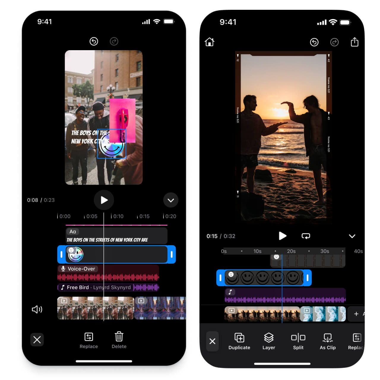
When designing our video timeline, we experimented with both the size of the clips and with the dimensions of the timeline itself. How much can you fit on a screen before it looks cluttered? How large can the controls be without being clumsy and inefficient? The only way to find out is to try it out right on the device.
Hiding features in dropdown menus is easy. Banishing them to separate screens is even easier. But hiding functionality hurts discoverability. Out of sight, out of mind. We think user interfaces in productivity apps should be the opposite. They should prioritize high information density and avoid extra navigation steps as much as possible.
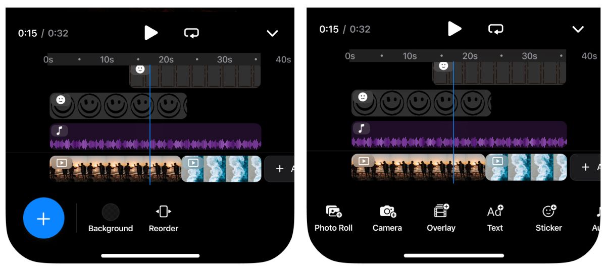
We increased the density of the toolbar that sits below the timeline: Our goal was to make all the important features easily accessible, despite the small screen. We achieved this by changing the single floating Add button from the initial designs to a more granular set of buttons to add specific asset types, like stickers and text. This not only increases efficiency for frequent users, it also makes the capabilities of the video editor more obvious and approachable.
Adaptive Height
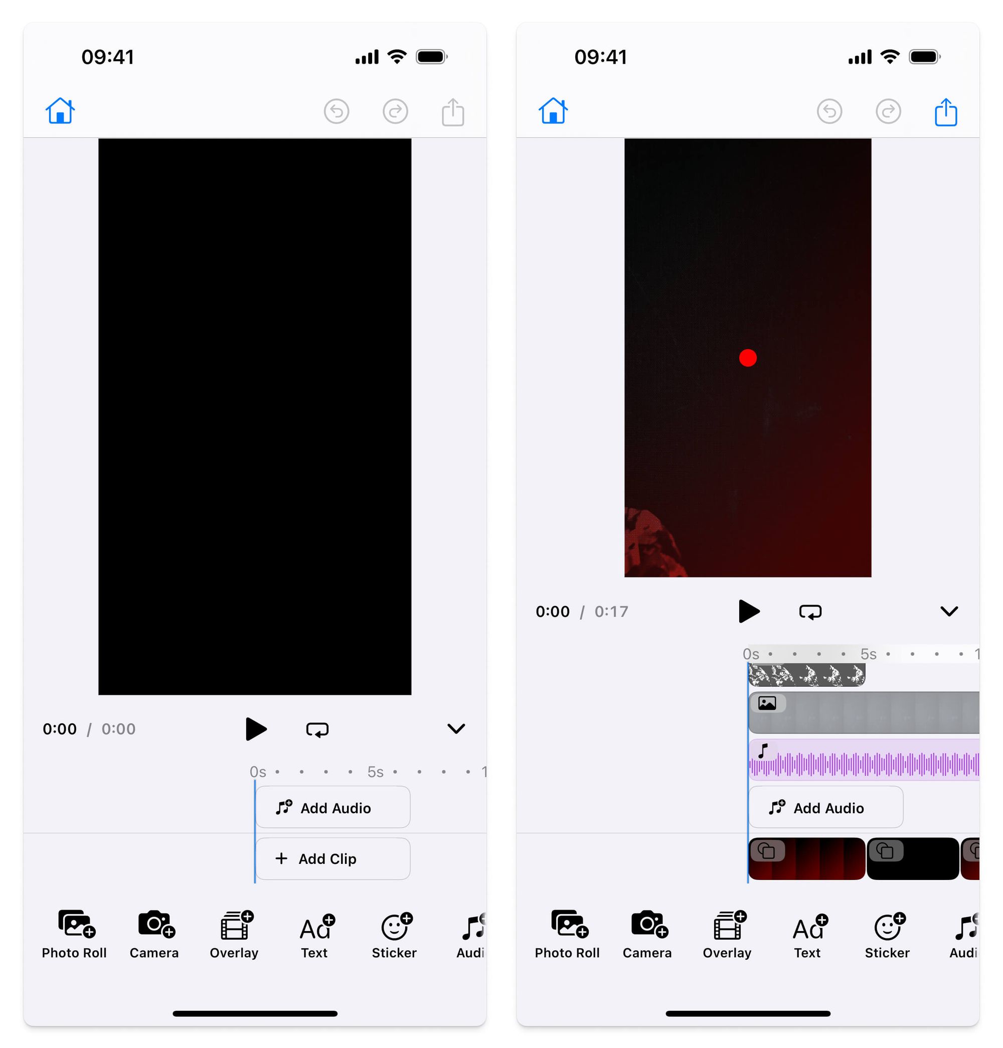
As space is at a premium on a small screen, we wanted to make the video preview as large as possible. We decided to allow the user to collapse the timeline at any time to focus on the video canvas. And even without manually minimizing the timeline, it doesn’t waste space: the timeline adjusts its height to fit snugly around its contents. It only grows as you add more clips.
Units and Scale
The numeric scale is an essential part of any timeline. It helps you see the in and out time of a clip at a glance, and the permanently visible ruler makes changes in the zoom level easy to understand. We added dots as subdivisions between the ruler’s numeric labels, which gives it a nice tool-like character. At full zoom—when the ruler shows 5-second intervals—we decided to use four dots in between, so there is one dot for each second. We think this detail adds a welcome sense of precision.
The clips themselves have a duration label when they are selected. If the duration is below 10, you get a fractional digit (e.g., 4.2s). For the ruler, we went with the same short format (5s, 10s, 30s, etc.) for all values below one minute, and the technical format (1:00, 1:30, etc.) for the rest. Of course, we use iOS’s built-in number formatters to get properly formatted and localized strings for our labels.
An important detail for the label that shows the current playback timecode: The seconds must always be rounded down. If the playhead sits between two seconds, the lower number must be displayed until the playhead crosses the indicator for the higher second. Simple rounding to the nearest integer would be confusing, because it doesn’t match our expectations when dealing with timelines. Five seconds do not count as five seconds until they have elapsed in their entirety.
II. Manipulating Time
What looks good is not guaranteed to feel good when you interact with it. A video editor timeline is more than just a visualization; it’s also a user interface. As such, it should be self-explanatory and provide constant feedback as the user manipulates it.
Fingertip-sized
The clips must be large enough to be easy to touch and at the same time detailed enough to give a decent overview. The size that can be easily tapped by most people is around one square centimeter, which matches the 44 × 44 pt default size of iPhone system controls. Our testing showed that we could go a little smaller. Editing video is a focused task, so the tap targets don’t need to be as robust as for tasks that happen while you, say, run for the bus. And all user interfaces should be scalable for accessibility anyhow, so we didn’t hard-code any sizes and we also made the dimensions adjustable. And, speaking of adapting to individual user needs: of course, all the text labels in our timeline are automatically scaled depending on your device settings.
Handles
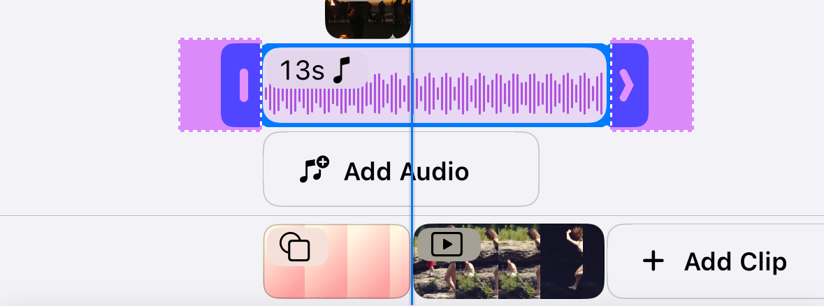
Selected clips in the timeline get a bold blue frame with large handles on either side. These handles are used to trim the clip’s length. For comfortable tapping and dragging, the handles must be larger than their visual size. In fact, we made the hit area more than twice as wide as the visual appearance suggests.
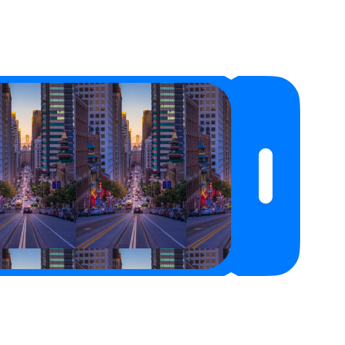
Early on in our design process, we realized that the trim handles had to sit on the outside of the clip, extending beyond the left and right edge. This made it hard to see the clip’s actual size, so we added little grooves: little triangular indents that point to the start and end of the selected clip.
Some clips in the timeline can be extended to any duration, like text or stickers. Other clips have a finite footage duration, like video and audio clips. To make this difference visible, clips with a finite footage duration reveal a ghost outline in the background while they are resized, featuring marching ants. The handle icon changes from an outward-pointing chevron to a vertical line when the clip can’t be made longer.
Scrolling and Zooming
A rather invisible detail was one of the trickiest things to get right: the coordination of all the different finger gestures on the timeline.
Horizontal Scrolling: Timeline scrolls horizontally to move in time.
Vertical Scrolling: Timeline scrolls vertically providing room for tracks.
Clip Movement: Dragging horizontally on a selected clip moves it.
Duration Adjustment: Dragging the trim handles adjusts the clip’s duration.
Pinch-to-Zoom: Pinching with two fingers changes the zoom level of the visualization.
All these gestures must behave as expected and not interfere with each other. We found it unexpectedly difficult to fine-tune and harmonize these interactions with pure SwiftUI, so we used some proven legacy iOS techniques to get it right. If you’re interested in the technical details of our solution with SwiftUIIntrospect and UIGestureRecognizers, check the source code.
Snapping
Video editing must feel precise, even on a small screen. When you trim or move clips, they should snap to other clips, to the playhead, and to the start and the end of the timeline. To show which position the selected clip snaps to, we designed animated dotted lines. We use the iPhone’s haptic engine to provide subtle feedback for snapping, which really helps to make the interaction feel natural—like a notch snapping into a detent. Something that we didn’t get right at first: Snapping should only respect those snapping points that are currently visible in the viewport. Of course! Otherwise, a partially visible clip may snap to something offscreen, which is very confusing.
Scrubbing Preview
For editing a video clip to feel precise, you need to be able to see exactly where you’re trimming. But the playback position in our mobile timeline can’t change while you’re trimming, because that would mean scrolling the timeline—which would move the very clip you’re trimming. The trim preview needs to be independent of the composition’s playback position. We solved this by adding a temporary overlay with its own playback time to the canvas. When you start dragging one of the handles on either side of the clip, the overlay shows the exact trim position of the video clip. When you release, the preview returns to the playback position.
Try it out!
“The only way to experience an experience is to experience it,” said interaction designer Bill Moggridge, and we couldn’t agree more! If you’re curious how our new video timeline feels, download our iOS app and try editing your own videos in our brand-new timeline experience.
If you’re a developer, check out the video editor documentation. With IMG.LY's SDK, you can add all of these video editing capabilities to your own apps in a breeze.

