Configure blocks to dynamically adjust their dimensions using three sizing modes: Absolute for fixed values, Percent for parent-relative sizing, and Auto for content-driven expansion.
CE.SDK provides three sizing modes for controlling block dimensions. Absolute mode uses fixed pixel values. Percent mode sizes blocks relative to their parent container. Auto mode automatically expands blocks to fit their content. You can set width and height modes independently, allowing flexible combinations like fixed width with auto height for text that wraps.
This guide covers how to set and query sizing modes, read computed frame dimensions after layout, center blocks using frame dimensions, and create responsive layouts with percentage-based sizing.
Initialize the Editor#
We start by initializing CE.SDK with a Design scene and setting up the page dimensions for our layout.
await cesdk.addPlugin(new DesignEditorConfig());
// Add asset source pluginsawait cesdk.addPlugin(new BlurAssetSource());await cesdk.addPlugin(new ColorPaletteAssetSource());await cesdk.addPlugin(new CropPresetsAssetSource());await cesdk.addPlugin(new UploadAssetSources({ include: ['ly.img.image.upload'] }));await cesdk.addPlugin(  new DemoAssetSources({    include: [      'ly.img.templates.blank.*',      'ly.img.templates.presentation.*',      'ly.img.templates.print.*',      'ly.img.templates.social.*',      'ly.img.image.*'    ]  }));await cesdk.addPlugin(new EffectsAssetSource());await cesdk.addPlugin(new FiltersAssetSource());await cesdk.addPlugin(new PagePresetsAssetSource());await cesdk.addPlugin(new StickerAssetSource());await cesdk.addPlugin(new TextAssetSource());await cesdk.addPlugin(new TextComponentAssetSource());await cesdk.addPlugin(new TypefaceAssetSource());await cesdk.addPlugin(new VectorShapeAssetSource());
await cesdk.actions.run('scene.create', {  page: { width: 800, height: 600, unit: 'Pixel' }});
const engine = cesdk.engine;const page = engine.block.findByType('page')[0];
Size Modes#
CE.SDK supports three sizing modes for block dimensions:
- Absolute: Fixed dimensions in design units. The default mode where
setWidth()andsetHeight()set exact pixel values. - Percent: Dimensions relative to parent container. A value of 80 makes the block 80% of its parent’s size.
- Auto: Content-driven sizing. The block expands or contracts to fit its content, primarily useful for text blocks.
Setting Size Modes#
Use setWidthMode() and setHeightMode() to configure how a block calculates its dimensions. Width and height modes can be set independently.
Auto Mode for Text#
Auto mode makes text blocks expand to fit their content:
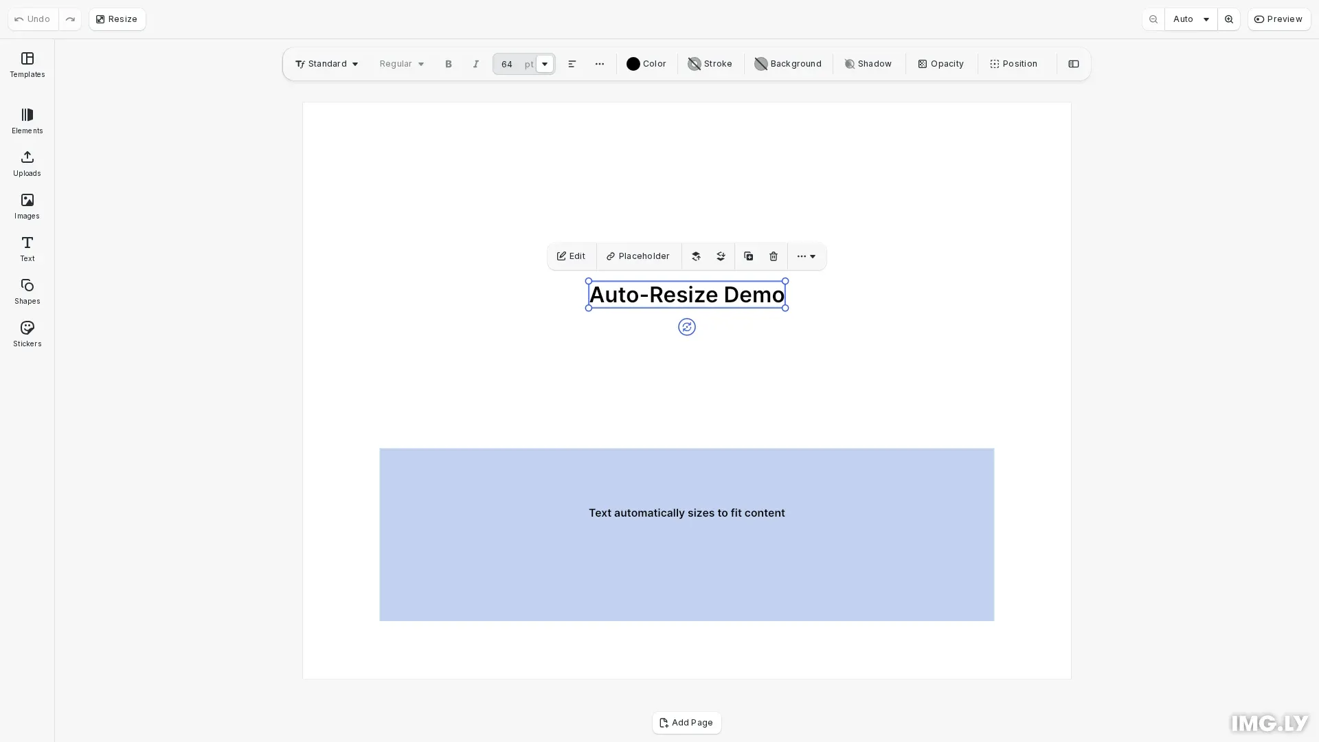
// Create a text block with Auto sizing mode// Auto mode makes the block expand to fit its contentconst titleBlock = engine.block.create('text');engine.block.replaceText(titleBlock, 'Auto-Resize Demo');engine.block.setFloat(titleBlock, 'text/fontSize', 64);
// Set width and height modes to Auto// The block will automatically size to fit the text contentengine.block.setWidthMode(titleBlock, 'Auto');engine.block.setHeightMode(titleBlock, 'Auto');engine.block.appendChild(page, titleBlock);
With Auto mode, the block’s dimensions are calculated automatically based on the content. This is useful when the text content varies and you want the block to always fit exactly.
Percent Mode for Responsive Layouts#
Percent mode sizes blocks relative to their parent:
// Create a block using Percent mode for responsive sizing// Percent mode sizes the block relative to its parentconst backgroundBlock = engine.block.create('graphic');engine.block.setShape(backgroundBlock, engine.block.createShape('rect'));const fill = engine.block.createFill('color');engine.block.setColor(fill, 'fill/color/value', {  r: 0.2,  g: 0.4,  b: 0.8,  a: 0.3});engine.block.setFill(backgroundBlock, fill);
// Set to Percent mode - values are normalized (0-1)engine.block.setWidthMode(backgroundBlock, 'Percent');engine.block.setHeightMode(backgroundBlock, 'Percent');engine.block.setWidth(backgroundBlock, 0.8); // 80% of parent widthengine.block.setHeight(backgroundBlock, 0.3); // 30% of parent height
// Center the background blockengine.block.setPositionX(backgroundBlock, pageWidth * 0.1); // 10% marginengine.block.setPositionY(backgroundBlock, pageHeight * 0.6);engine.block.appendChild(page, backgroundBlock);
Percent values represent the percentage of the parent container. A width of 80 with Percent mode means 80% of the parent’s width.
Reading Frame Dimensions#
After layout, use getFrameWidth() and getFrameHeight() to read the computed dimensions:
// Read computed frame dimensions after layout// getFrameWidth/getFrameHeight return the actual rendered sizeconst titleWidth = engine.block.getFrameWidth(titleBlock);const titleHeight = engine.block.getFrameHeight(titleBlock);
console.log(  `Title dimensions: ${titleWidth.toFixed(0)}x${titleHeight.toFixed(    0  )} pixels`);
Frame dimensions return the actual rendered size regardless of the sizing mode. This is essential when using Auto mode since you need the computed size for positioning calculations.
Centering Blocks#
Combine Auto mode with frame dimensions to center blocks based on their actual size:
// Calculate centered position using frame dimensionsconst pageWidth = engine.block.getWidth(page);const pageHeight = engine.block.getHeight(page);const centerX = (pageWidth - titleWidth) / 2;const centerY = (pageHeight - titleHeight) / 2 - 100; // Offset up for layout
// Position the title at centerengine.block.setPositionX(titleBlock, centerX);engine.block.setPositionY(titleBlock, centerY);
This pattern reads the computed dimensions after Auto sizing and calculates the centered position.
Additional Auto-Sized Content#
You can create multiple auto-sized blocks and position them relative to each other:
// Create a subtitle with Auto modeconst subtitleBlock = engine.block.create('text');engine.block.replaceText(  subtitleBlock,  'Text automatically sizes to fit content');engine.block.setFloat(subtitleBlock, 'text/fontSize', 32);engine.block.setWidthMode(subtitleBlock, 'Auto');engine.block.setHeightMode(subtitleBlock, 'Auto');engine.block.appendChild(page, subtitleBlock);
// Read computed dimensions and centerconst subtitleWidth = engine.block.getFrameWidth(subtitleBlock);const subtitleCenterX = (pageWidth - subtitleWidth) / 2;engine.block.setPositionX(subtitleBlock, subtitleCenterX);engine.block.setPositionY(subtitleBlock, pageHeight * 0.7);
Verifying Size Modes#
Query the current size modes to verify your configuration:
// Verify sizing modesconst titleWidthMode = engine.block.getWidthMode(titleBlock);const titleHeightMode = engine.block.getHeightMode(titleBlock);const bgWidthMode = engine.block.getWidthMode(backgroundBlock);const bgHeightMode = engine.block.getHeightMode(backgroundBlock);
console.log( `Title modes: width=${titleWidthMode}, height=${titleHeightMode}`);console.log( `Background modes: width=${bgWidthMode}, height=${bgHeightMode}`);Troubleshooting#
Frame dimensions return 0: Layout may not have updated yet. Read frame dimensions after all content is set and the block is attached to the scene hierarchy.
Percent mode not working: The block must have a parent container. Percent mode calculates size relative to the parent’s dimensions.
Auto mode not resizing: Auto mode works with content that has intrinsic size, primarily text blocks. Graphics require explicit dimensions.
Unexpected dimensions: Check which mode is active using getWidthMode() and getHeightMode(). The mode affects how width and height values are interpreted.
API Reference#
| Method | Description |
|---|---|
engine.block.getWidth(block) | Get block width in current mode |
engine.block.setWidth(block, value) | Set block width in current mode |
engine.block.getWidthMode(block) | Get current width mode: Absolute, Percent, or Auto |
engine.block.setWidthMode(block, mode) | Set width mode: Absolute, Percent, or Auto |
engine.block.getHeight(block) | Get block height in current mode |
engine.block.setHeight(block, value) | Set block height in current mode |
engine.block.getHeightMode(block) | Get current height mode: Absolute, Percent, or Auto |
engine.block.setHeightMode(block, mode) | Set height mode: Absolute, Percent, or Auto |
engine.block.getFrameWidth(block) | Get computed width after layout |
engine.block.getFrameHeight(block) | Get computed height after layout |
engine.block.setPositionX(block, value) | Set block X position |
engine.block.setPositionY(block, value) | Set block Y position |