CreativeEditor SDK provides a comprehensive React library designed for creating and editing rich visual designs directly within the browser.
What is CE.SDK?#
This CE.SDK configuration is highly customizable and extendible, offering a complete suite of design editing features, including templating, layouting, asset integration and many more flexibly configurable design editing features such as background removal.
Launch Web Demo
Get Started
Key Capabilities of the React Creative Editor SDK#
Transform
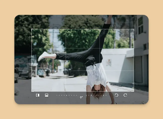
Perform operations like cropping, rotating, and resizing design elements.
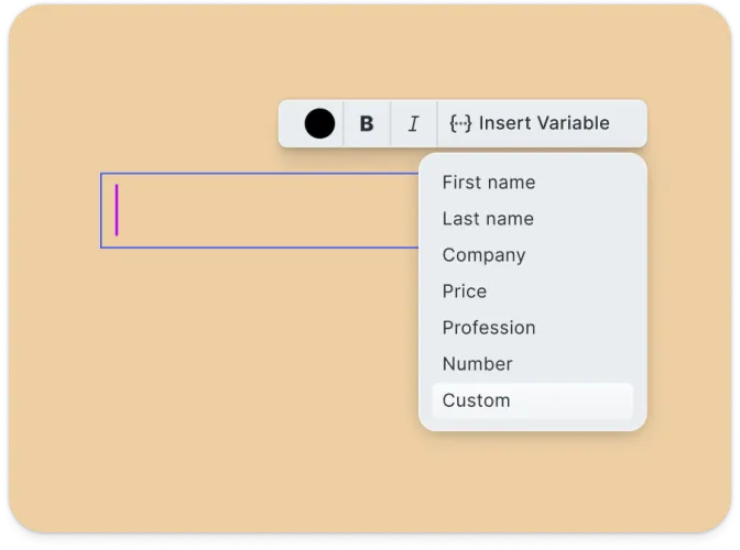
Templating
Create and apply design templates with placeholders and text variables for dynamic content.
Placeholders & Lockable Design
Constrain templates to guide your users’ design and ensure brand consistency.
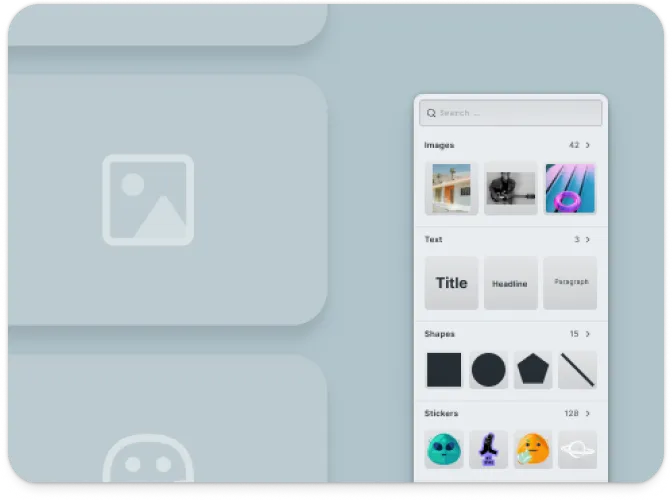
Asset Management
Import and manage images, shapes, and other assets to build your designs.
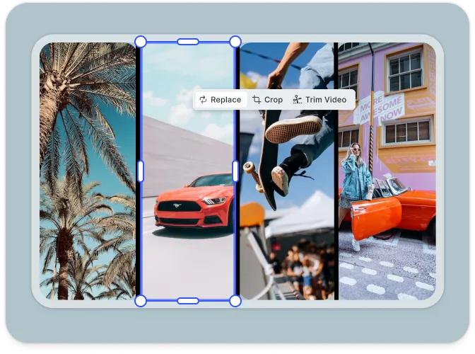
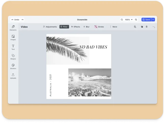
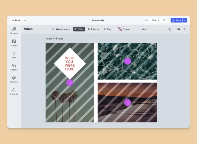
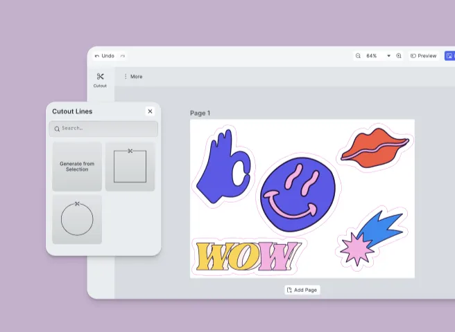
Design Collage
Arrange multiple elements on a single canvas to create complex layouts.
Text Editing
Add and style text blocks with various fonts, colors, and effects.
Client-Side Processing
All design editing operations are executed directly in the browser, with no need for server dependencies.
Headless & Automation
Programmatically edit designs within your React application using the engine API.
Extendible
Easily add new functionalities using plugins and custom scripts.
Customizable UI
Build and integrate custom UIs tailored to your application’s design needs.
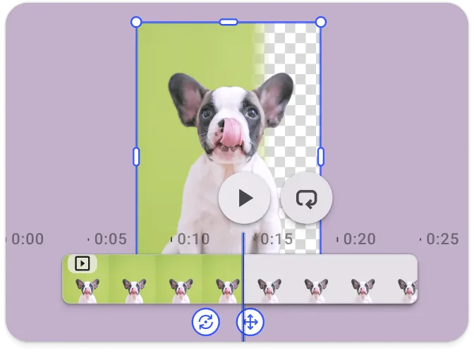
Background Removal
This plugin makes it easy to remove the background from images running entirely in the browser.
Optimized for Print
Perfect for web to print use cases supporting spot colors and cut-outs.
Browser Support#
The CE.SDK Design Editor is optimized for use in modern web browsers, ensuring compatibility with the latest versions of Chrome, Firefox, Edge, and Safari.
See the full list of supported browsers here.
Supported File Types#
CE.SDK supports a wide range of file types to ensure maximum flexibility for developers:
Importing Media#
| Category | Supported Formats |
|---|---|
| Images | .png, .jpeg, .jpg, .gif, .webp, .svg, .bmp |
| Video | .mp4 (H.264/AVC, H.265/HEVC), .mov (H.264/AVC, H.265/HEVC), .webm (VP8, VP9, AV1) |
| Audio | .mp3, .m4a, .mp4 (AAC or MP3), .mov (AAC or MP3) |
| Animation | .json (Lottie) |
Exporting Media#
| Category | Supported Formats |
|---|---|
| Images | .png (with transparency), .jpeg, .webp, .tga |
| Video | .mp4 (H.264 or H.265 on supported platforms with limited transparency support) |
.pdf (supports underlayer printing and spot colors) | |
| Scene | .scene (description of the scene without any assets) |
| Archive | .zip (fully self-contained archive that bundles the .scene file with all assets) |
Importing Templates#
| Format | Description |
|---|---|
.idml | InDesign |
.psd | Photoshop |
.scene | CE.SDK Native |
For detailed information, see the full file format support list.
Understanding CE.SDK Architecture & API#
The following sections provide an overview of the key components of the CE.SDK design editor UI and its API architecture. If you’re ready to start integrating CE.SDK into your React application, check out our Getting Started guide or dive into the guides.
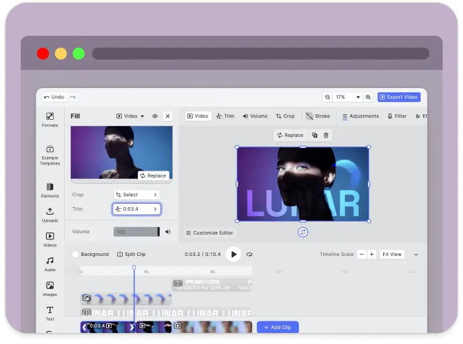
CreativeEditor Design UI#
The CE.SDK design UI is built for intuitive design creation and editing. Here are the main components and customizable elements within the UI:
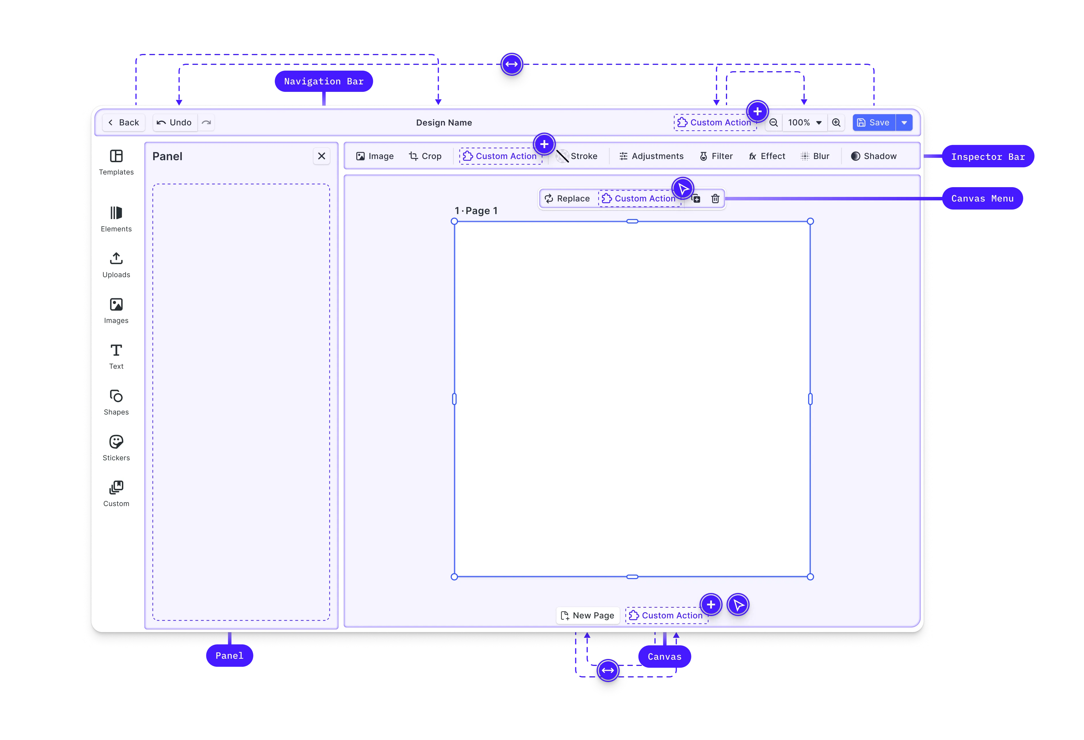
- Canvas: The core interaction area for design content.
- Dock: Entry point for interactions not directly related to the selected design block, often used for accessing asset libraries.
- Canvas Menu: Access block-specific settings like duplication or deletion.
- Inspector Bar: Manage block-specific functionalities, such as adjusting properties of the selected block.
- Navigation Bar: Handles global scene actions like undo/redo and zoom.
- Canvas Bar: Provides tools for managing the overall canvas, such as adding pages or controlling zoom.
- Layer Panel: Manage the stacking order and visibility of design elements.
Learn more about interacting with and manipulating design controls in our design editor UI guide.
CreativeEngine#
CreativeEngine is the core of CE.SDK, responsible for managing the rendering and manipulation of design scenes. It can be used in headless mode or integrated with the CreativeEditor UI.
Below are key features and APIs provided by the CreativeEngine:
- Scene Management: Create, load, save, and modify design scenes programmatically.
- Block Manipulation: Create and manage design elements, such as shapes, text, and images.
- Asset Management: Load assets like images and SVGs from URLs or local sources.
- Variable Management: Define and manipulate variables within scenes for dynamic content.
- Event Handling: Subscribe to events like block creation or updates for dynamic interaction.
API Overview#
The APIs of CE.SDK are grouped into several categories, reflecting different aspects of scene management and manipulation.
Scene API:- Creating and Loading Scenes: jsx engine.scene.create(); engine.scene.loadFromURL(url); - Zoom Control:
jsx engine.scene.setZoomLevel(1.0); engine.scene.zoomToBlock(blockId);
Block API:- Creating Blocks:
const block = engine.block.create('shapes/rectangle');-
Setting Properties:
engine.block.setColor(blockId, 'fill/color', { r: 1, g: 0, b: 0, a: 1 });engine.block.setString(blockId, 'text/content', 'Hello World'); -
Querying Properties:
const color = engine.block.getColor(blockId, 'fill/color');const text = engine.block.getString(blockId, 'text/content');Variable API: Variables allow dynamic content within scenes to programmatically create variations of a design.
-
Managing Variables:
Asset API:engine.variable.setString('myVariable', 'value');const value = engine.variable.getString('myVariable'); -
Managing Assets:
Event API:engine.asset.add('image', 'https://example.com/image.png'); -
Subscribing to Events:
// Subscribe to scene changesengine.scene.onActiveChanged(() => {const newActiveScene = engine.scene.get();});
Customizing the React Creative Editor#
CE.SDK provides extensive customization options to adapt the UI to various use cases. These options range from simple configuration changes to more advanced customizations involving callbacks and custom elements.
Basic Customizations#
-
Configuration Object: When initializing the CreativeEditor, you can pass a configuration object that defines basic settings such as the base URL for assets, the language, theme, and license key.
const config = {baseURL: `https://cdn.img.ly/packages/imgly/cesdk-js/${CreativeEditorSDK.version}/assets`,// license: 'YOUR_CESDK_LICENSE_KEY',}; -
Localization: Customize the language and labels used in the editor to support different locales.
const config = {};CreativeEditorSDK.create('#cesdk_container', config).then(async cesdk => {// Set theme using the UI APIcesdk.ui.setTheme('light'); // 'dark' | 'system'cesdk.i18n.setLocale('en');cesdk.i18n.setTranslations({en: {variables: {my_custom_variable: {label: 'Custom Label',},},},});}); -
Custom Asset Sources: Serve custom image or SVG assets from a remote URL.
UI Customization Options#
-
Theme: Choose between predefined themes such as ‘dark’, ‘light’, or ‘system’.
CreativeEditorSDK.create('#cesdk_container', config).then(async cesdk => {// Set theme using the UI APIcesdk.ui.setTheme('dark'); // 'light' | 'system'}); -
UI Components: Enable or disable specific UI components based on your requirements.
const config = {ui: {elements: {toolbar: true,inspector: false,},},};
Advanced Customizations#
Learn more about extending editor functionality and customizing its UI to your use case by consulting our in-depth customization guide.
Here is an overview of the APIs and components available to you.
Order APIs#
Customization of the web editor’s components and their order within these locations is managed through specific Order APIs, allowing the addition, removal, or reordering of elements.
These locations are configured through the unified Component Order API using setComponentOrder({ in: location }, order) with location values like 'ly.img.dock', 'ly.img.canvas.menu', 'ly.img.inspector.bar', 'ly.img.navigation.bar', and 'ly.img.canvas.bar'.
Layout Components#
CE.SDK provides special components for layout control, such as ly.img.separator for separating groups of components and ly.img.spacer for adding space between components.
Registration of New Components#
Custom components can be registered and integrated into the web editor using builder components like buttons, dropdowns, and inputs.
These components can replace default ones or introduce new functionalities, deeply integrating custom logic into the editor.
Feature API#
The Feature API enables conditional display and functionality of components based on the current context, allowing for dynamic customization.
For example, you can hide certain buttons for specific block types.
Plugins#
You can customize the CE.SDK web editor during its initialization using the APIs outlined above. For many use cases, this will be adequate.
However, there are times when you might want to encapsulate functionality for reuse. This is where plugins become useful.
Follow our guide on building your own plugins to learn more or check out one of the plugins we built using this API:
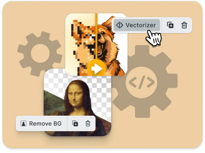
- Background Removal: Adds a button to the canvas menu to remove image backgrounds.
- Vectorizer: Adds a button to the canvas menu to quickly vectorize a graphic.
Ready to get started?
With a free trial and pricing that fits your needs, it's easy to find the best solution for your product.
500M+