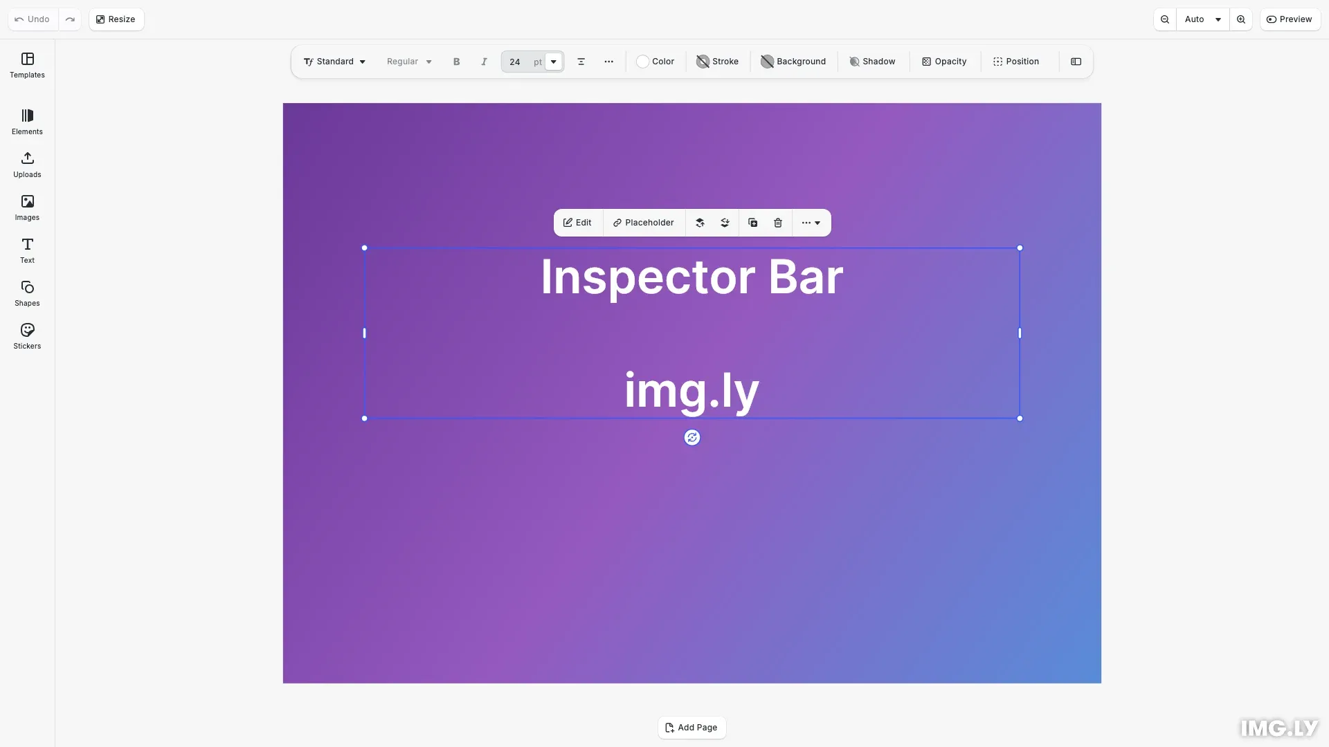
The inspector bar is the contextual toolbar that appears over the canvas when a block is selected. This guide covers inspector bar-specific features like view modes, edit mode contexts, and how the bar adapts to different block types.
For general component manipulation (reordering, inserting, removing), see the Component Order API Reference.
This guide covers switching between view modes, setting up edit mode-specific layouts, understanding how the inspector bar adapts to selected block types, and viewing the default component order.
Show or Hide the Inspector Bar#
Use the Feature API to control inspector bar visibility:
// Hide the inspector barcesdk.feature.disable('ly.img.inspector.bar');
// Show the inspector bar (default)cesdk.feature.enable('ly.img.inspector.bar');
// Hide the advanced inspector panel togglecesdk.feature.disable('ly.img.inspector.toggle');
For more on the Feature API, see Show/Hide Components.
Bar Position#
By default the inspector bar floats over the top of the canvas. Move it to the bottom with setInspectorBarPosition:
cesdk.ui.setInspectorBarPosition('bottom');
// Read the current positioncesdk.ui.getInspectorBarPosition(); // 'top' | 'bottom'
The inspector bar floats over the canvas, so it draws above the canvas bar on the same edge. Keep that edge’s canvas bar empty, or move one of the two, when both hold controls. At the bottom the inspector bar sits above the video timeline when the timeline is shown.
Call this after adding your editor configuration plugin. resetEditor() restores the default placement, and every editor configuration calls it while initializing.
View Modes#
CE.SDK offers two view modes that control how the inspector displays. The 'default' view shows a compact inspector bar over the canvas, while 'advanced' shows a full inspector panel to the side. Use cesdk.ui.setView() to switch between them.
// Switch between default and advanced view modes// 'default' shows the inspector bar above the canvas// 'advanced' shows the full inspector panel to the sidecesdk.ui.setView('default');| View Mode | Behavior |
|---|---|
'default' |
Compact inspector bar over the canvas |
'advanced' |
Full inspector panel to the side of the canvas |
The ly.img.inspectorToggle.inspectorBar component provides a button that lets users switch to the advanced view. Include it in your component order to give users access to both views.
Edit Mode Context#
The inspector bar supports different component orders for different edit modes. Use the when option in setComponentOrder to define layouts that activate only in a specific mode. The following example sets a focused text editing toolbar for Text edit mode and a simplified layout for Crop mode.
// Set a custom inspector bar order for Text edit modecesdk.ui.setComponentOrder(  { in: 'ly.img.inspector.bar', when: { editMode: 'Text' } },  [    'ly.img.text.typeFace.inspectorBar',    'ly.img.text.fontSize.inspectorBar',    'ly.img.separator',    'ly.img.text.bold.inspectorBar',    'ly.img.text.italic.inspectorBar',    'ly.img.text.alignHorizontal.inspectorBar',    'ly.img.separator',    'ly.img.fill.inspectorBar',    'ly.img.spacer',    'ly.img.inspectorToggle.inspectorBar'  ]);
// Set a custom inspector bar order for Crop edit modecesdk.ui.setComponentOrder(  { in: 'ly.img.inspector.bar', when: { editMode: 'Crop' } },  ['ly.img.cropControls.inspectorBar']);
Available edit modes: 'Transform' (default), 'Text', 'Crop', 'Trim', or any custom value. Edit modes without specific configurations fall back to the Transform mode order. All Component Order API methods accept an optional when context. See the Component Order API Reference for details.
Custom Transform Order#
Replace the default Transform mode order with a simplified layout. The following example groups text controls, appearance settings, and visual effects into logical sections separated by dividers.
// Set a simplified Transform mode order with grouped controlscesdk.ui.setComponentOrder({ in: 'ly.img.inspector.bar' }, [ 'ly.img.spacer', 'ly.img.text.typeFace.inspectorBar', 'ly.img.text.bold.inspectorBar', 'ly.img.text.italic.inspectorBar', 'ly.img.text.fontSize.inspectorBar', 'ly.img.text.alignHorizontal.inspectorBar', 'ly.img.separator', 'ly.img.fill.inspectorBar', 'ly.img.stroke.inspectorBar', 'ly.img.crop.inspectorBar', 'ly.img.separator', 'ly.img.filter.inspectorBar', 'ly.img.effect.inspectorBar', 'ly.img.blur.inspectorBar', 'ly.img.adjustment.inspectorBar', 'ly.img.separator', 'ly.img.shadow.inspectorBar', 'ly.img.opacityOptions.inspectorBar', 'ly.img.position.inspectorBar', 'ly.img.spacer', 'ly.img.separator', 'ly.img.inspectorToggle.inspectorBar']);Components that don’t apply to the selected block type are automatically hidden. For example, text controls only render when a text block is selected.
Block-Type Specific Components#
The inspector bar automatically shows and hides components based on the selected block’s capabilities. Components only render when their associated controls are relevant.
| Block Type | Relevant Components |
|---|---|
| Text | Typography, font size, bold, italic, alignment, text background |
| Image | Fill, crop, Style (adjustments, filters, effects, blur, shadow) |
| Video | Fill, trim, volume, crop, playback speed |
| Shape | Shape options, fill, stroke, shadow |
| Audio | Trim, volume, replace |
| Cutout | Cutout type, offset, smoothing |
| Group | Group, ungroup |
This means a single component order can include controls for all block types. When a text block is selected, only text-relevant components appear. When an image is selected, only image-relevant components appear.
Default Component Order#
Retrieve the current inspector bar order with getComponentOrder to inspect the default layout. For detailed descriptions of each component ID, see the Component Reference.
// Retrieve and log the current inspector bar orderconst currentOrder = cesdk.ui.getComponentOrder({ in: 'ly.img.inspector.bar'});console.log('Current inspector bar order:', currentOrder);Common Controls#
| Component ID | Description |
|---|---|
ly.img.fill.inspectorBar |
Fill color/type controls |
ly.img.stroke.inspectorBar |
Stroke/border controls |
ly.img.opacityOptions.inspectorBar |
Opacity and blend mode |
ly.img.position.inspectorBar |
Position and alignment |
ly.img.crop.inspectorBar |
Enter crop mode |
ly.img.appearance.inspectorBar |
Style popover for the controls in its children |
ly.img.adjustment.inspectorBar |
Image adjustments |
ly.img.filter.inspectorBar |
Image filters |
ly.img.effect.inspectorBar |
Image effects |
ly.img.blur.inspectorBar |
Blur effects |
ly.img.shadow.inspectorBar |
Drop shadow controls |
ly.img.inspectorToggle.inspectorBar |
Toggle advanced inspector |
The default order places the adjustment, filter, effect, blur and shadow controls in the children of ly.img.appearance.inspectorBar. When only one of them applies to the selected block, the inspector bar shows that control directly instead of the Style popover.
Text Controls#
| Component ID | Description |
|---|---|
ly.img.text.typeFace.inspectorBar |
Font family selector |
ly.img.text.fontSize.inspectorBar |
Font size input |
ly.img.text.bold.inspectorBar |
Bold toggle |
ly.img.text.italic.inspectorBar |
Italic toggle |
ly.img.text.alignHorizontal.inspectorBar |
Horizontal alignment |
ly.img.text.advanced.inspectorBar |
Advanced text options |
ly.img.text.path.inspectorBar |
Text on a path or circle |
Layout#
| Component ID | Description |
|---|---|
ly.img.spacer |
Flexible space between groups |
ly.img.separator |
Visual divider between groups |
Troubleshooting#
- Components not changing for edit mode - Verify the
when: { editMode: '...' }value matches exactly (case-sensitive). - View mode toggle not working - Ensure
ly.img.inspectorToggle.inspectorBaris included in the component order. - Component not appearing for block type - The component may not be applicable to the selected block type. Inspector bar components only render when relevant.
- Inspector bar hidden unexpectedly - Check if
cesdk.feature.disable('ly.img.inspector.bar')was called elsewhere.
Next Steps#
- Component Order API - Full API documentation with
whencontext - Component Reference - All inspector bar component IDs
- Canvas Bar - Another area with edit mode context