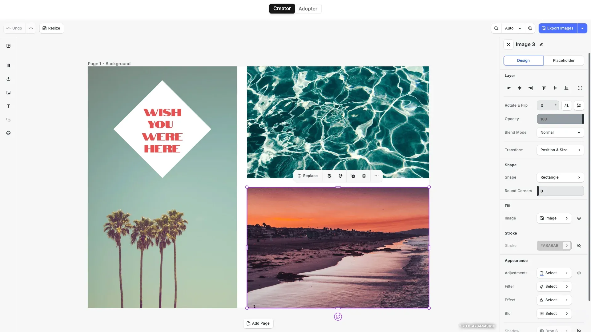
Ensure staying on brand and simplify the design process by defining placeholders and design constraints.
Prerequisites#
Before you begin, make sure you have the following:
- Node.js v22+ and npm installed locally – Download Node.js
- A supported browser – Chrome 114+, Edge 114+, Firefox 115+, Safari 15.6+
See Browser Support for the full list.
Get Started#
Start fresh with a standalone Design Placeholders Editor project. This creates a complete, ready-to-run application.
Step 1: Clone the Repository#
git clone https://github.com/imgly/starterkit-placeholders-react-web.gitgit clone https://github.com/imgly/starterkit-placeholders-react-web.gitnpx degit imgly/starterkit-placeholders-react-web starterkit-placeholders-react-webnpx degit imgly/starterkit-placeholders-react-web starterkit-placeholders-react-webThe src/ folder contains the editor code:
src/├── app/ # Demo application├── imgly/│ ├── config/│ │ ├── advanced-design-editor/│ │ │ ├── actions.ts # Export/import actions│ │ │ ├── features.ts # Feature toggles│ │ │ ├── i18n.ts # Translations│ │ │ ├── plugin.ts # Main configuration plugin│ │ │ ├── settings.ts # Engine settings│ │ │ └── ui/│ │ │ ├── canvas.ts # Canvas configuration│ │ │ ├── components.ts # Custom component registration│ │ │ ├── dock.ts # Dock layout configuration│ │ │ ├── index.ts # Combines UI customization exports│ │ │ ├── inspectorBar.ts # Inspector bar layout│ │ │ ├── navigationBar.ts # Navigation bar layout│ │ │ └── panel.ts # Panel configuration│ │ └── design-editor/ # Same structure as advanced-design-editor/│ └── index.ts # Editor initialization function└── index.tsx # Application entry pointStep 2: Install Dependencies#
Install the required packages:
cd starterkit-placeholders-react-web
npm install
cd starterkit-placeholders-react-web
npm installcd starterkit-placeholders-react-web
pnpm installcd starterkit-placeholders-react-web
pnpm installcd starterkit-placeholders-react-web
yarncd starterkit-placeholders-react-web
yarnStep 3: Download Assets#
CE.SDK requires engine assets (fonts, icons, UI elements) to function. These must be served as static files from your project’s public/ directory.
curl -O https://cdn.img.ly/packages/imgly/cesdk-js/1.77.1/imgly-assets.zip
unzip imgly-assets.zip -d public/
rm imgly-assets.zip
curl -O https://cdn.img.ly/packages/imgly/cesdk-js/1.77.1/imgly-assets.zip
unzip imgly-assets.zip -d public/
rm imgly-assets.zipconst config = { // ... baseURL: '/assets' // ...};Step 4: Run the Development Server#
npm run devnpm run devpnpm run devpnpm run devyarn devyarn devOpen http://localhost:5173 in your browser.
Get Started#
Integrate the Design Placeholders Editor into an existing Nuxt.js application. This adds the editor configuration to your current project structure.
Step 1: Clone#
cd your-projectcd your-projectClone the starter kit and copy the editor configuration to your project:
git clone https://github.com/imgly/starterkit-placeholders-react-web.git
cp -r starterkit-placeholders-react-web/app/imgly ./app/imgly
rm -rf starterkit-placeholders-react-webgit clone https://github.com/imgly/starterkit-placeholders-react-web.git
cp -r starterkit-placeholders-react-web/app/imgly ./app/imgly
rm -rf starterkit-placeholders-react-webnpx degit imgly/starterkit-placeholders-react-web/app/imgly ./app/imglynpx degit imgly/starterkit-placeholders-react-web/app/imgly ./app/imglyThe imgly/ folder contains the editor configuration:
imgly/├── config/│ ├── advanced-design-editor/│ │ ├── actions.ts # Export/import actions│ │ ├── features.ts # Feature toggles│ │ ├── i18n.ts # Translations│ │ ├── plugin.ts # Main configuration plugin│ │ ├── settings.ts # Engine settings│ │ └── ui/│ │ ├── canvas.ts # Canvas configuration│ │ ├── components.ts # Custom component registration│ │ ├── dock.ts # Dock layout configuration│ │ ├── index.ts # Combines UI customization exports│ │ ├── inspectorBar.ts # Inspector bar layout│ │ ├── navigationBar.ts # Navigation bar layout│ │ └── panel.ts # Panel configuration│ └── design-editor/ # Same structure as advanced-design-editor/└── index.ts # Editor initialization functionStep 2: Install Dependencies#
Install the required packages for the editor:
Core Editor#
Install the Creative Editor SDK:
npm install @cesdk/cesdk-js@1.77.1npm install @cesdk/cesdk-js@1.77.1pnpm add @cesdk/cesdk-js@1.77.1pnpm add @cesdk/cesdk-js@1.77.1yarn add @cesdk/cesdk-js@1.77.1yarn add @cesdk/cesdk-js@1.77.1Step 3: Download Assets#
CE.SDK requires engine assets (fonts, icons, UI elements) to function. For Nuxt.js projects, place these in your public/ directory which is served automatically.
curl -O https://cdn.img.ly/packages/imgly/cesdk-js/1.77.1/imgly-assets.zip
unzip imgly-assets.zip -d public/
rm imgly-assets.zipcurl -O https://cdn.img.ly/packages/imgly/cesdk-js/1.77.1/imgly-assets.zip
unzip imgly-assets.zip -d public/
rm imgly-assets.zipStep 4: Create the Editor Component#
Choose your editing mode and initialize the editor accordingly:
<template>  <CreativeEditor    :config="{{ baseURL: '/assets' }}"    :init="initPlaceholdersCreatorEditor"    width="100vw"    height="100vh"  /></template>
<script setup lang="ts">import { initPlaceholdersCreatorEditor } from '~/imgly';import CreativeEditor from '@cesdk/cesdk-js/vue';</script><template> <CreativeEditor :config="{{ baseURL: '/assets' }}" :init="initPlaceholdersAdopterEditor" width="100vw" height="100vh" /></template>
<script setup lang="ts">import { initPlaceholdersAdopterEditor } from '~/imgly';import CreativeEditor from '@cesdk/cesdk-js/vue';</script>Design Placeholders#
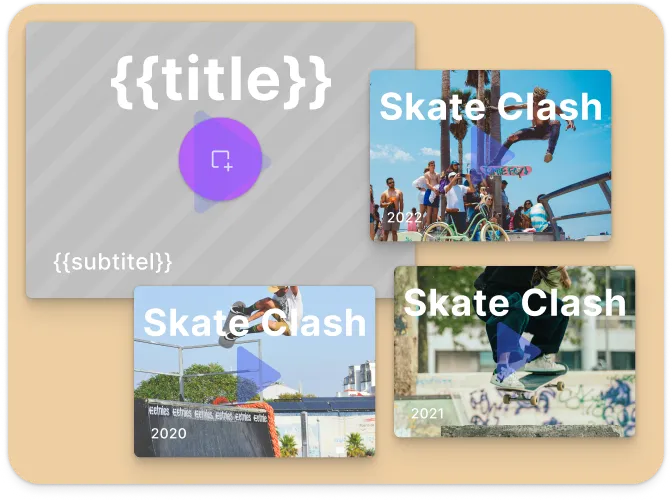
The Design Placeholders Editor uses a Creator/Adopter workflow for template-based design creation. This workflow separates template design from content filling, enabling scalable design production.
Creator Mode#
Creators design templates with placeholder regions using the Advanced Design Editor configuration:
- Full editing capabilities with advanced inspector panel
- Dark theme optimized for professional editing workflows
- Define placeholder regions for image, text, and graphic content
- Complete control over template structure and design
export async function initPlaceholdersCreatorEditor(cesdk: CreativeEditorSDK) {  // Use advanced design editor for full editing capabilities  await cesdk.addPlugin(new AdvancedEditorConfig());
  // Dark theme for professional editing  cesdk.ui.setTheme('dark');
  // Enable placeholder features for template creation  cesdk.feature.enable('ly.img.placeholder*');  cesdk.feature.enable('ly.img.inspector');
  // Set the Creator role  cesdk.engine.editor.setRole('Creator');}
Adopter Mode#
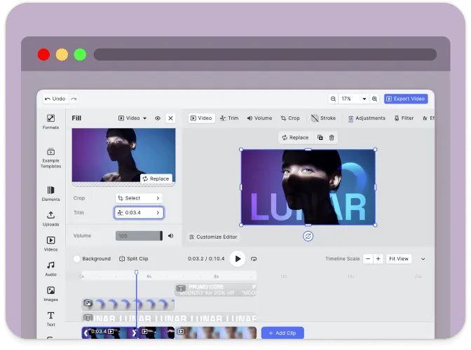
Adopters customize templates by filling placeholders using the simplified Design Editor configuration:
- Streamlined interface focused on content replacement
- Light theme for content editing workflows
- Replace placeholder content while maintaining template structure
- Limited editing to preserve design consistency
export async function initPlaceholdersAdopterEditor(cesdk: CreativeEditorSDK) {  // Use standard design editor for simplified experience  await cesdk.addPlugin(new DesignEditorConfig());
  // Light theme for content editing  cesdk.ui.setTheme('light');
// Set the Adopter role cesdk.engine.editor.setRole('Adopter');}Set Up a Scene#
CE.SDK offers multiple ways to load content into the editor. Choose the method that matches your use case:
// Create a blank design canvas - starts with an empty design sceneawait cesdk.actions.run('scene.create');
// Load from a template archive - restores a previously saved projectawait cesdk.loadFromArchiveURL('https://example.com/template.zip');
// Load from an image URL - creates a new scene with the imageawait cesdk.createFromImage('https://example.com/image.jpg');
// Load from a scene file - restores a scene from JSONawait cesdk.loadFromURL('https://example.com/scene.json');Customize Assets#
The editor uses asset source plugins to provide built-in libraries for templates, stickers, shapes, and fonts. The starter kit includes a curated selection—customize what’s included based on your needs.
Asset sources are added via plugins in src/imgly/index.ts. Enable or disable individual sources:
import {  FiltersAssetSource,  StickerAssetSource,  TextAssetSource,  VectorShapeAssetSource,  EffectsAssetSource,  // ...} from '@cesdk/cesdk-js/plugins';
// Add only the sources you needawait cesdk.addPlugin(new FiltersAssetSource());await cesdk.addPlugin(new StickerAssetSource());await cesdk.addPlugin(new TextAssetSource());await cesdk.addPlugin(new VectorShapeAssetSource());await cesdk.addPlugin(new EffectsAssetSource());// ...For production deployments, self-hosting assets is required—the IMG.LY CDN is intended for development only. See Serve Assets for downloading assets, configuring baseURL, and excluding unused sources to optimize load times.
Configure Actions#
Actions are functions that handle user interactions like exporting designs, saving scenes, and importing files. CE.SDK provides built-in actions that you can run directly or override with custom implementations.
Key built-in actions:
exportDesign– Export the current design to PNG, JPEG, PDF, or other formatssaveScene– Save the scene as a JSON string for later editingimportScene– Import a previously saved scene (supports.sceneand.cesdkformats)exportScene– Export the scene as a JSON file or.cesdkarchive with all assetsuploadFile– Handle file uploads with progress tracking
Use cesdk.actions.run() to execute any action:
// Run a built-in actionawait cesdk.actions.run('exportDesign', { mimeType: 'image/png' });Import from File Picker#
// Let users open images from their devicecesdk.actions.register('importImage', async () => { const blobURL = await cesdk.utils.loadFile({ accept: 'image/*', returnType: 'objectURL' }); await cesdk.createFromImage(blobURL);});Export and Save#
// Register export action that downloads the edited designcesdk.actions.register('exportDesign', async (exportOptions) => { const { blobs, options } = await cesdk.utils.export(exportOptions); await cesdk.utils.downloadFile(blobs[0], options.mimeType);});Customize (Optional)#
Theming#
CE.SDK supports light and dark themes out of the box, plus automatic system preference detection. Switch between themes programmatically:
// 'light' | 'dark' | 'system' | (() => 'light' | 'dark')cesdk.ui.setTheme('dark');See Theming for custom color schemes, CSS variables, and advanced styling options.
Localization#
Customize UI labels and add support for multiple languages. The i18n system supports translation keys for all UI elements:
// Override specific labelscesdk.i18n.setTranslations({  en: {    'actions.export.design': 'Download Design',    'common.cancel': 'Cancel',    'common.apply': 'Apply'  }});
// Set the active localecesdk.i18n.setLocale('en');
See Localization for supported languages, translation key reference, and right-to-left language support.
UI Layout#
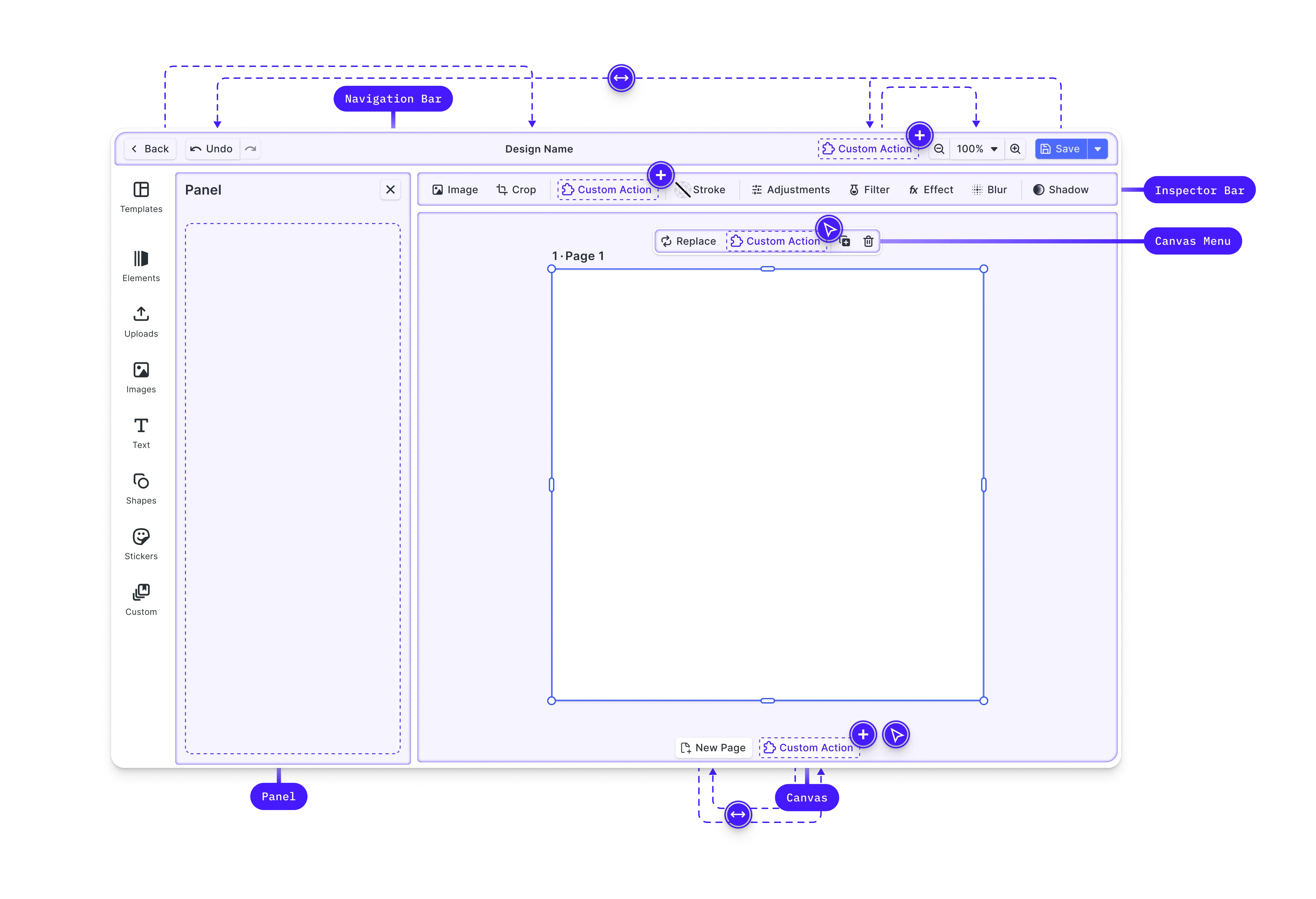
Customize the editor interface by modifying the dock, inspector bar, navigation bar, and canvas menu. CE.SDK provides Order APIs to control which components appear and in what sequence.
// Get current navigation bar componentsconst navOrder = cesdk.ui.getNavigationBarOrder();
// Add a custom button to the navigation barcesdk.ui.insertNavigationBarOrderComponent(  'ly.img.spacer',  { id: 'my-custom-action' },  'after');
See Dock, Inspector Bar, Navigation Bar, Canvas Menu, and Canvas for detailed layout customization options.
Custom Components#
Build custom UI components using the builder system and integrate them in the editor. Custom components receive reactive state updates and can interact with the engine API.
// Register a custom componentcesdk.ui.registerComponent('my-custom-button', ({ builder, engine }) => {  const selectedBlocks = engine.block.findAllSelected();
  builder.Button('apply-effect', {    label: 'Apply Effect',    isDisabled: selectedBlocks.length === 0,    onClick: () => {      // Apply custom logic to selected blocks    }  });});
// Add the component to the navigation barcesdk.ui.insertNavigationBarOrderComponent(  'ly.img.spacer',  'my-custom-button',  'after');
Custom components automatically re-render when the engine state they depend on changes—no manual subscription management required.
See Register New Component for the complete builder API and component patterns.
Settings & Features#
Fine-tune editor behavior through settings and features.
Settings configure core engine behavior—rendering, input handling, and history management:
cesdk.engine.editor.setSettingBool('page/dimOutOfPageAreas', true);cesdk.engine.editor.setSettingBool('mouse/enableZoomControl', true);cesdk.engine.editor.setSettingBool('features/undoHistory', true);Features toggle which editing tools and panels appear in the UI:
// Toggle editor featurescesdk.feature.enable('ly.img.crop', true);cesdk.feature.enable('ly.img.filter', true);cesdk.feature.enable('ly.img.adjustment', true);See Settings and Features for the complete reference.
Explore Plugins#
CE.SDK has a rich plugin ecosystem that extends the editor with powerful capabilities. Plugins can add new features, integrate third-party services, or customize editor behavior.
Background Removal#
Add AI-powered background removal that runs entirely client-side. The background removal plugin processes images directly in the browser without sending data to external servers.
import BackgroundRemovalPlugin from '@imgly/plugin-background-removal';
// Add background removal capabilityawait cesdk.addPlugin(BackgroundRemovalPlugin());
See Background Removal for setup instructions and configuration options.
Custom Asset Sources#
Connect external asset libraries like Unsplash, Getty Images, or your own content management system. Asset sources let users browse and insert content from any source.
import UnsplashAssetSource from '@imgly/plugin-unsplash';
// Add Unsplash integrationawait cesdk.addPlugin(UnsplashAssetSource({  accessKey: 'your-unsplash-access-key'}));
See Custom Asset Sources for integration patterns.
Discover More Plugins#
Explore the full plugin ecosystem in the IMG.LY plugins repository. Available plugins include:
- Vectorizer – Convert raster images to vectors
- AI Integration – Text-to-image generation and enhancement
- And more – Check the repository for the latest additions
Key Capabilities#
The Design Placeholders Editor enables template-based design creation at scale.
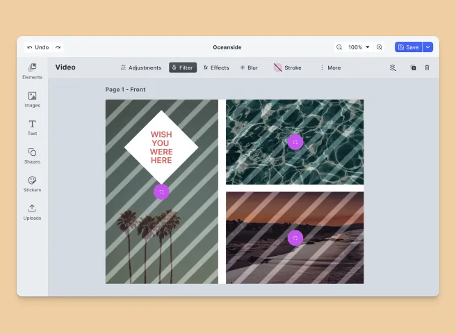
Image Placeholders
Define swappable image placeholder regions that users or scripts can customize with content.
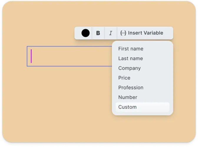
Text Placeholders
Create editable text areas that maintain styling while allowing content changes.
Creator/Adopter Workflow
Separate template design from content filling with dedicated Creator and Adopter modes.
Scalable Output
Generate multiple design variations by swapping placeholder content programmatically.
Design Export
Export finished designs in PNG, JPEG, or PDF format with customizable quality settings.
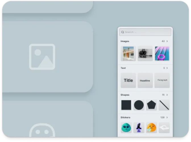
Media Library
Access built-in media assets or integrate custom asset libraries.
Troubleshooting#
Editor doesn’t load#
- Check the container element exists: Ensure your container element is in the DOM before calling
create() - Verify the baseURL: Assets must be accessible from the CDN or your self-hosted location
- Check console errors: Look for CORS or network errors in browser developer tools
Assets don’t appear#
- Check network requests: Open DevTools Network tab and look for failed requests to
cdn.img.ly - Self-host assets for production: See Serve Assets to host assets on your infrastructure
Watermark appears in production#
- Add your license key: Set the
licenseproperty in your configuration - Sign up for a trial: Get a free trial license at img.ly/forms/free-trial
Next Steps#
- Configuration – Complete list of initialization options
- Serve Assets – Self-host engine assets for production
- Actions – Build custom export and save workflows
- Theming – Customize colors and appearance
- Localization – Add translations and language support
- Placeholders – Create and manage placeholder regions