Create and customize font combinations (text components) that appear in CE.SDK’s asset library for users to insert into their designs.
Font combinations (also known as text components) are pre-designed text layouts stored as serialized blocks in the asset library. Users click on these components to insert them into their designs. CE.SDK ships with over 20 default components; this guide shows how to create custom ones programmatically.
This guide covers creating styled text components, serializing them for storage, generating thumbnails, and registering them as custom asset sources.
Setting Up the Editor#
We initialize CE.SDK with asset sources and create a design scene. The page provides a canvas where we build our text components.
// Initialize CE.SDK with Design mode and load asset sourcesawait cesdk.addDefaultAssetSources();await cesdk.addDemoAssetSources({  sceneMode: 'Design'});await cesdk.createDesignScene();
const engine = cesdk.engine;const page = engine.block.findByType('page')[0];
// Set page dimensionsengine.block.setWidth(page, 800);engine.block.setHeight(page, 600);
With the editor ready, we can create text blocks and configure them as reusable components.
Creating a Text Component#
We create a text block and configure its styling, dimensions, and position. The component uses fixed frame dimensions with clipping enabled to ensure consistent display. We set an explicit font using the setFont() API.
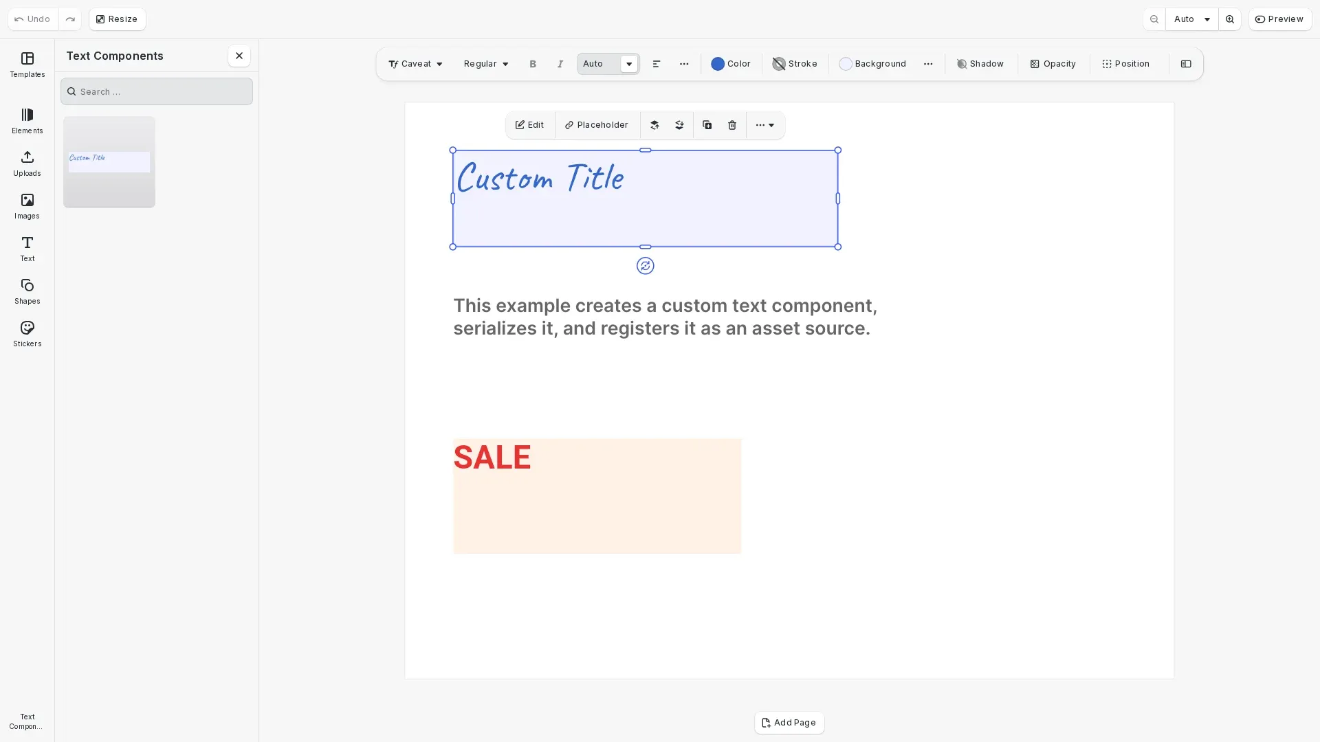
// Create a styled text block that will become our custom componentconst textComponent = engine.block.create('text');engine.block.appendChild(page, textComponent);
// Set text content and stylingengine.block.replaceText(textComponent, 'Custom Title');engine.block.setFloat(textComponent, 'text/fontSize', 72);
// Set text color to a brand colorengine.block.setTextColor(textComponent, {  r: 0.2,  g: 0.4,  b: 0.8,  a: 1.0});
// Configure dimensions - use fixed frame with clippingengine.block.setWidthMode(textComponent, 'Absolute');engine.block.setHeightMode(textComponent, 'Absolute');engine.block.setWidth(textComponent, 400);engine.block.setHeight(textComponent, 100);engine.block.setBool(textComponent, 'clipped', true);
// Position the component on the pageengine.block.setPositionX(textComponent, 50);engine.block.setPositionY(textComponent, 50);
// Define a custom typeface// With saveToArchive(), fonts are automatically bundled in the archive// You can use any font - CDN URLs, bundle:// URIs, or custom fontsconst caveatTypeface = {  name: 'Caveat',  fonts: [    {      uri: 'https://cdn.img.ly/assets/v3/ly.img.typeface/fonts/Caveat/Caveat-Regular.ttf',      subFamily: 'Regular'    },    {      uri: 'https://cdn.img.ly/assets/v3/ly.img.typeface/fonts/Caveat/Caveat-Bold.ttf',      subFamily: 'Bold'    }  ]};
// Set the font - saveToArchive() will include the font files in the archiveengine.block.setFont(  textComponent,  caveatTypeface.fonts[0].uri,  caveatTypeface);
The text block now has custom styling including font size, color, and fixed dimensions. The clipped property ensures text that exceeds the frame boundaries is hidden. With saveToArchive(), fonts are automatically bundled in the archive, so you can use any font source.
Configuring Constraints#
We configure the text component with automatic font sizing and constraints. This ensures the component adapts gracefully when users resize it while maintaining readability.
// Configure constraints for flexible resizing// These ensure the component maintains proper proportions when resized
// Enable automatic font sizing within constraintsengine.block.setBool(textComponent, 'text/automaticFontSizeEnabled', true);engine.block.setFloat(textComponent, 'text/minAutomaticFontSize', 24);engine.block.setFloat(textComponent, 'text/maxAutomaticFontSize', 120);
// Add a background to visualize the text frameengine.block.setBool(textComponent, 'backgroundColor/enabled', true);engine.block.setColor(textComponent, 'backgroundColor/color', {  r: 0.95,  g: 0.95,  b: 1.0,  a: 1.0});
The automatic font sizing scales text between 24pt and 120pt as the frame is resized.
Serializing the Component#
We serialize the text component using saveToArchive(). This creates a zip archive containing the blocks.blocks file and all referenced resources (fonts, images). The archive is self-contained and portable.
// Serialize the text component using saveToArchive()// This creates a zip archive containing blocks.blocks and all resources (fonts, images)const archiveBlob = await engine.block.saveToArchive([textComponent]);console.log('Archive size:', archiveBlob.size, 'bytes');
// Create a Blob URL for in-memory loading// In production, you would extract the archive and host the files on your serverconst archiveUrl = URL.createObjectURL(archiveBlob);
For production, extract the archive and host the files on your server. Use loadFromURL() pointing to the blocks.blocks file. In this example, we create a Blob URL for in-memory loading to demonstrate the workflow.
Legacy: Using saveToString()#
For backward compatibility, you can use saveToString() instead of saveToArchive(). This approach serializes the block as a string but requires external font URLs to remain accessible.
// Legacy approach - requires external font URLsconst serializedComponent = await engine.block.saveToString(  [textComponent],  ['bundle', 'buffer', 'http', 'https']  // Allowed resource schemes);
// Load with loadFromString()const loadedBlocks = await engine.block.loadFromString(serializedComponent);
Limitations of saveToString():
- Font URLs must remain accessible at load time
- No automatic resource bundling
- Requires
allowedResourceSchemesconfiguration
We recommend saveToArchive() for new implementations as it bundles all resources automatically.
Hosting for Production#
For production deployments, extract the archive and host the files on your web server. Maintain the following directory structure:
/ly.img.textComponents/├── content.json├── data/│ ├── customTitle/│ │ └── blocks.blocks│ ├── customHeading/│ │ ├── blocks.blocks│ │ ├── fonts/│ │ │ └── 59251598.ttf│ │ └── images/│ │ └── 3255389386.jpeg│ └── ...└── thumbnails/ ├── customTitle.png ├── customHeading.png └── ...Simple components contain only blocks.blocks. Components with custom fonts or images include additional subdirectories. The archive structure mirrors this layout - extract it directly to your server.
Update the uri paths in content.json to point to your hosted files:
{ "uri": "https://your-server.com/ly.img.textComponents/data/customTitle/blocks.blocks", "thumbUri": "https://your-server.com/ly.img.textComponents/thumbnails/customTitle.png"}Generating a Thumbnail#
Thumbnails help users preview components before inserting them. In production, generate 400x320px thumbnails using block.export() and host them on your server.
// In production, generate thumbnails using block.export()://// const thumbnailBlob = await engine.block.export(textComponent, {// mimeType: 'image/png',// targetWidth: 400,// targetHeight: 320// });//// For this example, we use a pre-generated thumbnail to avoid// watermarks when running without a license key.// Prepend origin to make it an absolute URL (CE.SDK prepends its base URL to relative paths)const thumbnailUri = window.location.origin + customTitleThumbnail;For this example, we use a pre-generated thumbnail imported as a static asset. In your production code, you would generate thumbnails dynamically or host them alongside your .blocks files.
Creating the Content.json Structure#
We create the content.json structure that defines the asset source. This file lists all components with their metadata, including paths to the serialized blocks and thumbnails.
// Create the content.json structure for the custom component// In production, you would host the serialized component and thumbnail on your serverconst contentJson = { version: '3.0.0', id: 'my.custom.textComponents', assets: [ { id: '//my.custom.textComponents/customTitle', label: { en: 'Custom Title' }, meta: { // In production, these would be URLs to your hosted files // uri: 'https://your-server.com/textComponents/data/CustomTitle.blocks', // thumbUri: 'https://your-server.com/textComponents/thumbnails/customTitle.png', mimeType: 'application/ubq-blocks-string' } } ], blocks: []};console.log( 'Content.json structure:', JSON.stringify(contentJson, null, 2));In production, the uri and thumbUri fields point to your hosted files. The mimeType must be "application/ubq-blocks-string" for text components.
Registering the Asset Source#
We register a custom asset source using addLocalSource() with a custom apply callback. The callback handles loading the block from the archive and inserting it into the scene when users click on a component.
// Register a custom asset source with an apply callback// The callback handles loading and inserting blocks when clicked
// Store archive URLs in a Map for lookup when applyingconst archiveUrls = new Map<string, string>();archiveUrls.set('customTitle', archiveUrl);
// Create local source with custom apply callbackengine.asset.addLocalSource(  'custom.textComponents',  undefined, // No MIME type filter  async (asset) => {    // Get the archive URL for this asset    const assetArchiveUrl = archiveUrls.get(asset.id);    if (!assetArchiveUrl) return undefined;
    // Load the block from the archive using loadFromArchiveURL()    const loadedBlocks = await engine.block.loadFromArchiveURL(      assetArchiveUrl    );    const newBlock = loadedBlocks[0];    if (!newBlock) return undefined;
    // Add to the current page and center it    const currentPage = engine.scene.getCurrentPage();    if (currentPage) {      engine.block.appendChild(currentPage, newBlock);      // Center the block on the page      const pageWidth = engine.block.getWidth(currentPage);      const pageHeight = engine.block.getHeight(currentPage);      const blockWidth = engine.block.getWidth(newBlock);      const blockHeight = engine.block.getHeight(newBlock);      engine.block.setPositionX(newBlock, (pageWidth - blockWidth) / 2);      engine.block.setPositionY(newBlock, (pageHeight - blockHeight) / 2);    }
    engine.editor.addUndoStep();    return newBlock;  });
// Add the text component asset to the sourceengine.asset.addAssetToSource('custom.textComponents', {  id: 'customTitle',  label: { en: 'Custom Title' },  meta: {    thumbUri: thumbnailUri,    mimeType: 'application/ubq-blocks-string'  }});console.log('Custom text components asset source registered');
The apply callback uses loadFromArchiveURL() to load the block from the archive and then appends it to the current page. This pattern provides custom handling for inserting text components with their bundled resources.
Displaying in the Asset Library#
After registering the asset source, we configure the UI to display the text components in an accessible panel. This involves adding translations, creating a library entry, and adding it to the dock navigation.
// Configure the asset library to display the custom text components// Add translation for the library entry labelcesdk.i18n.setTranslations({  en: { 'libraries.text-components-entry.label': 'Text Components' }});
// Add the text components source to the asset librarycesdk.ui.addAssetLibraryEntry({  id: 'text-components-entry',  sourceIds: ['custom.textComponents'],  sceneMode: 'Design',  previewLength: 2,  previewBackgroundType: 'contain',  gridBackgroundType: 'contain',  gridColumns: 2,  cardLabelPosition: () => 'below'});
// Add text components library to the dock for easy accesscesdk.ui.setDockOrder([  ...cesdk.ui.getDockOrder(),  'ly.img.spacer',  {    id: 'ly.img.assetLibrary.dock',    key: 'text-components-dock',    label: 'Text Components',    icon: '@imgly/Type',    entries: ['text-components-entry']  }]);
// Open the text components panel to showcase the resultcesdk.ui.openPanel('//ly.img.panel/assetLibrary', {  payload: { entries: ['text-components-entry'] }});
The addAssetLibraryEntry() method creates a panel that displays the components with their thumbnails. The setDockOrder() method adds a button to the dock so users can access the library. Finally, openPanel() opens the library to showcase the result.
Creating Additional Components#
We create a second component with different styling to demonstrate building a library of text components.
const promoComponent = engine.block.create('text');engine.block.appendChild(page, promoComponent);
engine.block.replaceText(promoComponent, 'SALE');engine.block.setFloat(promoComponent, 'text/fontSize', 96);
// Use a bold red color for the promo textengine.block.setTextColor(promoComponent, {  r: 0.9,  g: 0.2,  b: 0.2,  a: 1.0});
// Set a bold font for the promo componentconst robotoTypeface = {  name: 'Roboto',  fonts: [    {      uri: 'https://cdn.img.ly/assets/v3/ly.img.typeface/fonts/Roboto/Roboto-Bold.ttf',      subFamily: 'Bold'    }  ]};engine.block.setFont(  promoComponent,  robotoTypeface.fonts[0].uri,  robotoTypeface);
engine.block.setWidthMode(promoComponent, 'Absolute');engine.block.setHeightMode(promoComponent, 'Absolute');engine.block.setWidth(promoComponent, 300);engine.block.setHeight(promoComponent, 120);engine.block.setBool(promoComponent, 'clipped', true);
// Add backgroundengine.block.setBool(promoComponent, 'backgroundColor/enabled', true);engine.block.setColor(promoComponent, 'backgroundColor/color', {  r: 1.0,  g: 0.95,  b: 0.9,  a: 1.0});
engine.block.setPositionX(promoComponent, 50);engine.block.setPositionY(promoComponent, 350);
Each component can have unique styling, dimensions, and behavior. Build a library by creating multiple components and adding them to your content.json.
Troubleshooting#
Archive fails to load: Ensure the Blob URL is valid and the archive was created successfully. Check browser console for errors.
Components not appearing in library: Verify content.json structure, check that mimeType is “application/ubq-blocks-string”, and ensure the asset source is registered.
Thumbnails not loading: Confirm thumbUri paths are correct and accessible. Verify CORS settings if loading from a different origin.
Component scales incorrectly when inserted: Review constraint configuration. Ensure automatic font sizing is enabled with appropriate min/max values.
Fonts missing when component loads: With saveToArchive(), fonts are bundled automatically. If issues persist, verify the archive was created correctly.
API Reference#
| Method | Purpose |
|---|---|
engine.block.create() | Create a new block of specified type |
engine.block.replaceText() | Set text content on a text block |
engine.block.setFloat() | Set numeric properties like font size |
engine.block.setFont() | Set font with typeface definition and URI |
engine.block.setTextColor() | Set text color with RGBA values |
engine.block.setWidthMode() | Set width mode: ‘Absolute’, ‘Percent’, ‘Auto’ |
engine.block.setHeightMode() | Set height mode: ‘Absolute’, ‘Percent’, ‘Auto’ |
engine.block.setBool() | Enable/disable boolean properties |
engine.block.setColor() | Set color properties like background |
engine.block.saveToArchive() | Save blocks to zip archive with all resources |
engine.block.loadFromArchiveURL() | Load blocks from archive URL |
engine.block.saveToString() | Legacy: Save blocks as string (requires external resources) |
engine.block.loadFromString() | Legacy: Load blocks from string |
engine.block.export() | Export block as image blob |
engine.asset.addLocalSource() | Create asset source with custom apply callback |
engine.asset.addAssetToSource() | Add individual assets to a local source |
cesdk.ui.addAssetLibraryEntry() | Add custom entry to asset library UI |
cesdk.ui.setDockOrder() | Configure dock navigation buttons |
cesdk.ui.openPanel() | Open a panel programmatically |
cesdk.i18n.setTranslations() | Add translations for UI labels |