Customize the contextual popup menu through two distinct approaches: complete replacement for strict control or modification for flexible extension.
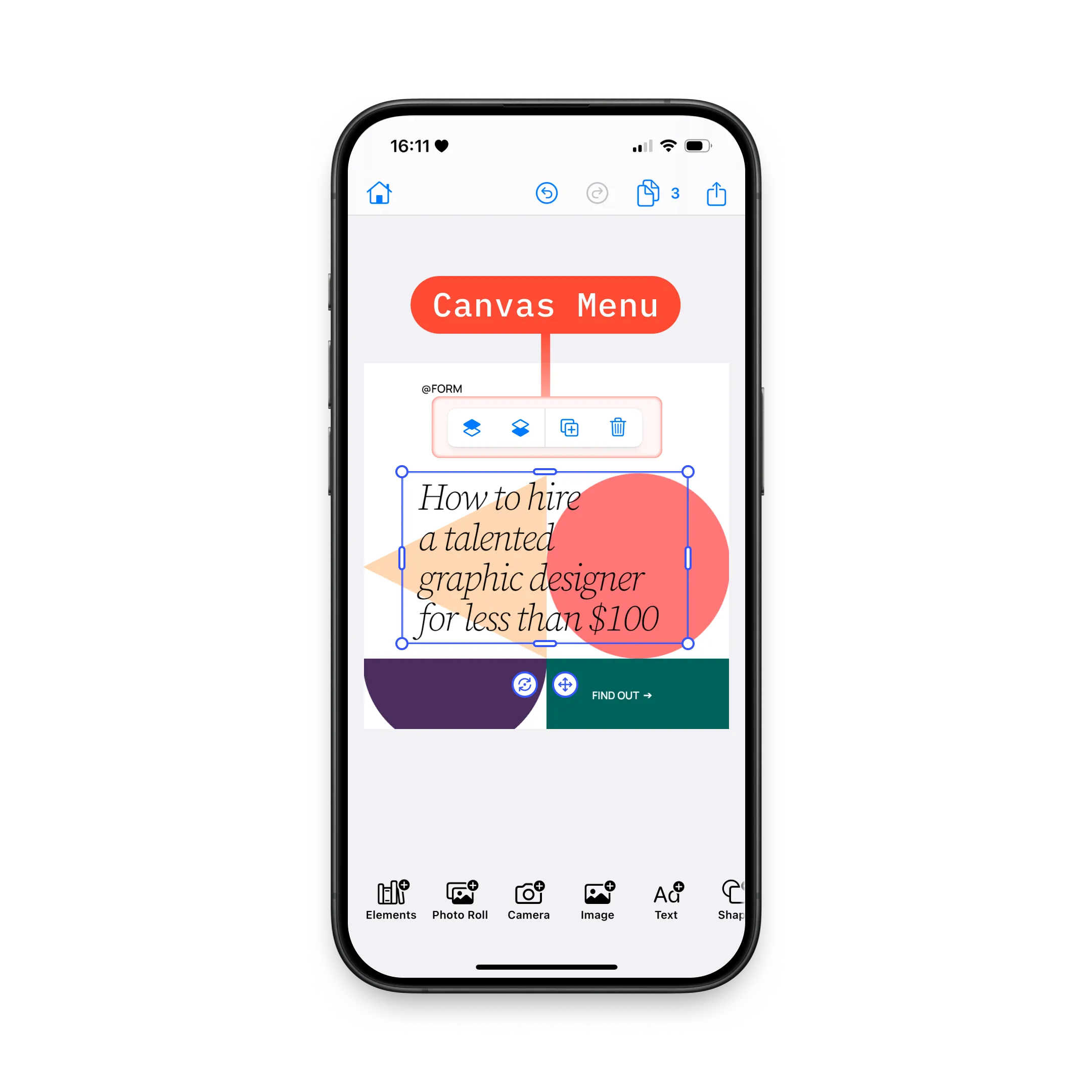
We configure the canvas menu to streamline editing workflows by controlling which actions appear when users select design elements.
Explore the complete code sample on GitHub.
Understanding Canvas Menu#
The canvas menu displays contextual editing actions when users select design elements. CE.SDK iOS provides two distinct approaches for customizing this menu, each suited for different use cases.
Architecture:
The canvas menu system consists of:
- Items - Protocol-based components (Button, Divider, custom Item)
- Context - Access to engine, assetLibrary, eventHandler, and cached selection
- Configuration - Two mutually exclusive approaches (replacement or modification)
Key Distinction:
| Approach | Method | Result | Version Safety |
|---|---|---|---|
| Complete Replacement | .imgly.canvasMenuItems | Exact control over items and order | ✅ Safe - you define everything |
| Modification | .imgly.modifyCanvasMenuItems | Extends defaults with flexible operations | ⚠️ Caution - default order may change between versions |
Context Properties:
The CanvasMenu.Context provides:
| Property | Type | Available | Description |
|---|---|---|---|
| engine | Engine | ✅ | Current editor engine instance |
| eventHandler | EditorEventHandler | ✅ | Handler for editor events |
| assetLibrary | any AssetLibrary | ✅ | Configured asset library |
| selection | Selection | ✅ | Cached selection info (optimized for UI) |
Selection Properties (cached for performance):
| Property | Type | Description |
|---|---|---|
| block | DesignBlockID | Currently selected block |
| parentBlock | DesignBlockID? | Parent of selected block |
| type | DesignBlockType? | Type of selected block (e.g., “//ly.img.ubq/text”) |
| fillType | FillType? | Fill type if applicable |
| kind | String? | Kind property of block |
| siblings | [DesignBlockID] | Reorderable siblings |
| canMove | Bool | Whether block can be reordered |
Critical: Use context.selection instead of querying the engine directly—it’s optimized for UI presentation timing.
Complete Replacement Approach#
We use .imgly.canvasMenuItems when we need strict control over the exact items and their order. This approach provides version-safe configuration by explicitly defining every item.
Use when:
- Need exact control over item ordering
- Building a minimal or custom menu from scratch
- Want version-safe configuration (default order won’t affect you)
- Creating a simplified interface for specific workflows
.imgly.canvasMenuItems { context in CanvasMenu.Buttons.selectGroup() CanvasMenu.Divider() CanvasMenu.Buttons.bringForward() CanvasMenu.Buttons.sendBackward() CanvasMenu.Divider() CanvasMenu.Buttons.duplicate() CanvasMenu.Buttons.delete()}Key Points:
- Complete control over items and order
- No default items included—build from scratch
- Builder pattern with
@CanvasMenu.Builder - Items only shown when
isVisiblereturnstrue - Version-safe: Changes to default menu won’t affect your configuration
Modification Approach#
We use .imgly.modifyCanvasMenuItems when we want to extend or adjust the default configuration without rebuilding from scratch. This approach provides flexibility through operations that add, remove, or reorder items.
Use when:
- Extending default configuration with custom buttons
- Removing unwanted default buttons
- Reordering a few items relative to defaults
- Quick customization without rebuilding entire menu
Modification Operations#
All modification operations work with the existing default item list:
| Operation | Purpose | Throws on Missing ID |
|---|---|---|
items.addFirst(_:) | Prepend items at beginning | No |
items.addLast(_:) | Append items at end | No |
items.addBefore(id:_:) | Insert before specific item | Yes ✅ |
items.addAfter(id:_:) | Insert after specific item | Yes ✅ |
items.replace(id:_:) | Replace existing item | Yes ✅ |
items.remove(id:) | Remove item by ID | Yes ✅ |
Important: Operations targeting specific IDs throw errors if the ID doesn’t exist or was already removed.
Adding Items#
We prepend custom actions at the beginning:
items.addFirst { CanvasMenu.Button(id: "my.package.canvasMenu.button.first") { context in print("First Button action") } label: { context in Label("First Button", systemImage: "arrow.backward.circle") }}We append custom actions at the end:
items.addLast { CanvasMenu.Button(id: "my.package.canvasMenu.button.last") { context in print("Last Button action") } label: { context in Label("Last Button", systemImage: "arrow.forward.circle") }}Positioning Relative to Existing Items#
We insert items before specific buttons:
items.addBefore(id: CanvasMenu.Buttons.ID.sendBackward) { CanvasMenu.Button(id: "my.package.canvasMenu.button.beforeSendBackward") { context in print("Before Send Backward action") } label: { context in Label("Before Send Backward", systemImage: "arrow.backward.square") }}We insert items after specific buttons:
items.addAfter(id: CanvasMenu.Buttons.ID.bringForward) { CanvasMenu.Button(id: "my.package.canvasMenu.button.afterBringForward") { context in print("After Bring Forward action") } label: { context in Label("After Bring Forward", systemImage: "arrow.forward.square") }}Replacing and Removing Items#
We replace default buttons with custom implementations:
items.replace(id: CanvasMenu.Buttons.ID.duplicate) { CanvasMenu.Button(id: "my.package.canvasMenu.button.replacedDuplicate") { context in print("Replaced Duplicate action") } label: { context in Label("Replaced Duplicate", systemImage: "arrow.uturn.down.square") }}We remove unwanted buttons:
items.remove(id: CanvasMenu.Buttons.ID.delete)Warning: Default item order may change between editor versions. Use complete replacement if strict ordering is required across versions.
How Replacement and Modification Interact#
The two approaches are mutually exclusive—use one or the other, not both. If both are specified, replacement takes precedence.
Decision Matrix:
| Need | Approach | Reason |
|---|---|---|
| Exact control over order | Replacement | Version-safe, explicit control |
| Extend default configuration | Modification | Builds on defaults, less code |
| Minimal menu from scratch | Replacement | Start with empty slate |
| Add one custom button | Modification | Quick, leverages defaults |
| Version-safe configuration | Replacement | Immune to default changes |
| Quick customization | Modification | Flexible operations |
When Replacement Wins:
DesignEditor(settings) .imgly.canvasMenuItems { _ in // This takes precedence CanvasMenu.Buttons.duplicate() CanvasMenu.Buttons.delete() } .imgly.modifyCanvasMenuItems { _, items in // This is ignored items.addFirst { /* ... */ } }Item Types and Creation#
The canvas menu supports three item types: predefined buttons, custom buttons, and fully custom items.
Predefined Buttons#
We use predefined buttons for common editing actions:
CanvasMenu.Buttons.duplicate()Available Predefined Buttons:
| Button | ID | Description | Default Visibility |
|---|---|---|---|
CanvasMenu.Buttons.bringForward | .bringForward | Brings selected block forward | selection.canMove |
CanvasMenu.Buttons.sendBackward | .sendBackward | Sends selected block backward | selection.canMove |
CanvasMenu.Buttons.duplicate | .duplicate | Duplicates selected block | Scope: lifecycle/duplicate |
CanvasMenu.Buttons.delete | .delete | Deletes selected block | Scope: lifecycle/destroy |
CanvasMenu.Buttons.selectGroup | .selectGroup | Selects parent group | Parent is group |
Customizing Predefined Buttons#
We override default parameters to customize behavior:
CanvasMenu.Buttons.delete( action: { context in context.eventHandler.send(.deleteSelection) }, label: { context in Label { Text("Delete") } icon: { Image.imgly.delete } }, isEnabled: { context in true }, isVisible: { context in try context.engine.block.isAllowedByScope(context.selection.block, key: "lifecycle/destroy") },)Available Parameters:
| Parameter | Type | Required | Default | Description |
|---|---|---|---|---|
| action | Context.To<Void> | ❌ | Default action | Closure executed when tapped |
| label | Context.To<Label> | ❌ | Default label | SwiftUI view for button |
| isEnabled | Context.To<Bool> | ❌ | { _ in true } | Whether button is enabled |
| isVisible | Context.To<Bool> | ❌ | Default logic | Whether button should be shown |
Creating New Buttons#
We create custom buttons when predefined options don’t meet our needs:
CanvasMenu.Button( id: "my.package.canvasMenu.button.newButton",) { context in print("New Button action")} label: { context in Label("New Button", systemImage: "star.circle")} isEnabled: { context in true} isVisible: { context in true}Required Parameters:
id- Unique identifier (use reverse domain notation:"my.app.canvas.button.favorite")action- Closure executed when button is tappedlabel- SwiftUI view describing the button
Optional Parameters:
isEnabled- Whether button is tappable (default:{ _ in true })isVisible- Whether button should be shown (default:{ _ in true })
Dividers#
We add dividers to visually separate groups:
.imgly.canvasMenuItems { _ in CanvasMenu.Buttons.duplicate() CanvasMenu.Divider() CanvasMenu.Buttons.delete()}Key Points:
- Adjacent dividers automatically collapse to a single divider
- Dangling dividers (at start/end) are automatically removed
- Use dividers to group related actions
Custom Items#
We create fully custom items by conforming to the CanvasMenu.Item protocol:
private struct CustomCanvasMenuItem: CanvasMenu.Item {  var id: EditorComponentID { "my.package.canvasMenu.newCustomItem" }
  func body(_ context: CanvasMenu.Context) throws -> some View {    ZStack {      RoundedRectangle(cornerRadius: 10)        .fill(.conicGradient(colors: [.red, .yellow, .green, .cyan, .blue, .purple, .red], center: .center))      Text("New Custom Item")        .padding(4)    }    .onTapGesture {      print("New Custom Item action")    }  }
  func isVisible(_ context: CanvasMenu.Context) throws -> Bool {    true  }}
Then use it in our configuration:
CustomCanvasMenuItem()Protocol Requirements:
var id: EditorComponentID { get }- Unique identifierfunc body(_:) throws -> some View- SwiftUI view contentfunc isVisible(_:) throws -> Bool- Visibility logic (default:true)
Common Use Cases#
Minimal Menu for Simple Workflows#
We create a minimal menu with only essential actions:
.imgly.canvasMenuItems { _ in CanvasMenu.Buttons.duplicate() CanvasMenu.Divider() CanvasMenu.Buttons.delete()}When to use: Simplified interfaces for beginners or focused workflows.
Adding Custom Brand Actions#
We extend the default menu with brand-specific actions:
.imgly.modifyCanvasMenuItems { context, items in items.addFirst { CanvasMenu.Button( id: "brand.canvas.button.template", action: { _ in /* Apply brand template */ }, label: { _ in Label("Apply Template", systemImage: "doc") } ) }}When to use: Adding brand-specific features while keeping defaults.
Simplifying for Beginners#
We remove advanced features to reduce complexity:
.imgly.modifyCanvasMenuItems { _, items in items.remove(id: CanvasMenu.Buttons.ID.bringForward) items.remove(id: CanvasMenu.Buttons.ID.sendBackward) items.remove(id: CanvasMenu.Buttons.ID.selectGroup)}When to use: Beginner-focused apps or simplified editing modes.
Type-Specific Menu Items#
We show buttons only for specific element types:
.imgly.modifyCanvasMenuItems { context, items in items.addFirst { CanvasMenu.Button( id: "custom.text.uppercase", action: { _ in /* Convert to uppercase */ }, label: { _ in Label("Uppercase", systemImage: "textformat") }, isVisible: { context in context.selection.type == "//ly.img.ubq/text" } ) }}When to use: Context-aware actions based on selection type.
Troubleshooting#
Menu Not Appearing#
Symptom: Canvas menu doesn’t show when selecting elements
Causes:
- All items have
isVisiblereturningfalse - No items configured in replacement mode
- Selection context returning
nilblock
Solutions:
// ✅ Ensure at least one item is always visible.imgly.canvasMenuItems { _ in  CanvasMenu.Buttons.duplicate() // Always visible by default}
// ✅ Check visibility logic.imgly.canvasMenuItems { context in  if context.selection.block != nil {    CanvasMenu.Buttons.duplicate()  }}
Button Not Visible#
Symptom: Added button doesn’t appear in menu
Causes:
isVisiblereturnsfalse- Scope permission denies access to button action
- Button was removed by earlier modification operation
Solutions:
// ✅ Explicit visibility for debuggingCanvasMenu.Button(  id: "debug.button",  action: { _ in print("Tapped") },  label: { _ in Label("Debug", systemImage: "star") },  isVisible: { _ in true } // Always visible)
// ✅ Check selection contextCanvasMenu.Button(  id: "conditional.button",  action: { _ in },  label: { _ in Label("Action", systemImage: "star") },  isVisible: { context in    print("Block: \(context.selection.block ?? -1)")    print("Type: \(context.selection.type ?? "nil")")    return context.selection.block != nil  })
Error: “ID Does Not Exist”#
Symptom: Runtime error stating The 'remove' operation was invoked with id '...' which does not exist
Causes:
- Typo in button ID
- Button already removed by earlier operation
- Using wrong ID constant
Solutions:
// ✅ Use predefined ID constantsitems.remove(id: CanvasMenu.Buttons.ID.duplicate)
// ❌ Wrong - string literals prone to typositems.remove(id: "duplicate")
// ✅ Verify ID exists before removing// Only remove if you're certain the button exists in defaults
Unexpected Button Order#
Symptom: Buttons appear in different order than expected
Causes:
- Using modification approach with version changes
- Misunderstanding operation order
- Multiple operations affecting same area
Solutions:
// ✅ For strict ordering, use replacement.imgly.canvasMenuItems { _ in  CanvasMenu.Buttons.duplicate()  CanvasMenu.Buttons.delete()} // Guaranteed order
// ℹ️ For modification, understand application order:// 1. remove operations// 2. addBefore operations// 3. replace operations// 4. addAfter operations// 5. addFirst/addLast wrap the array
Dividers Missing or Doubled#
Symptom: Dividers not appearing or appearing unexpectedly
Causes:
- Adjacent dividers collapse to one
- Dangling dividers at start/end removed automatically
- Divider between removed items
Solutions:
// Adjacent dividers collapse automatically.imgly.canvasMenuItems { _ in  CanvasMenu.Buttons.duplicate()  CanvasMenu.Divider()  CanvasMenu.Divider() // ← Collapses with above  CanvasMenu.Buttons.delete()}// Result: duplicate | delete (single divider)
// Dangling dividers removed.imgly.canvasMenuItems { _ in  CanvasMenu.Divider() // ← Removed (at start)  CanvasMenu.Buttons.duplicate()  CanvasMenu.Divider() // ← Removed (at end)}// Result: duplicate (no dividers)
Next Steps#
Explore related customization guides:
- Rearrange Buttons - Customize button order in UI components
- Inspector Bar - Configure the property inspector sidebar
- Dock - Customize the bottom toolbar
- Navigation Bar - Configure the top navigation bar