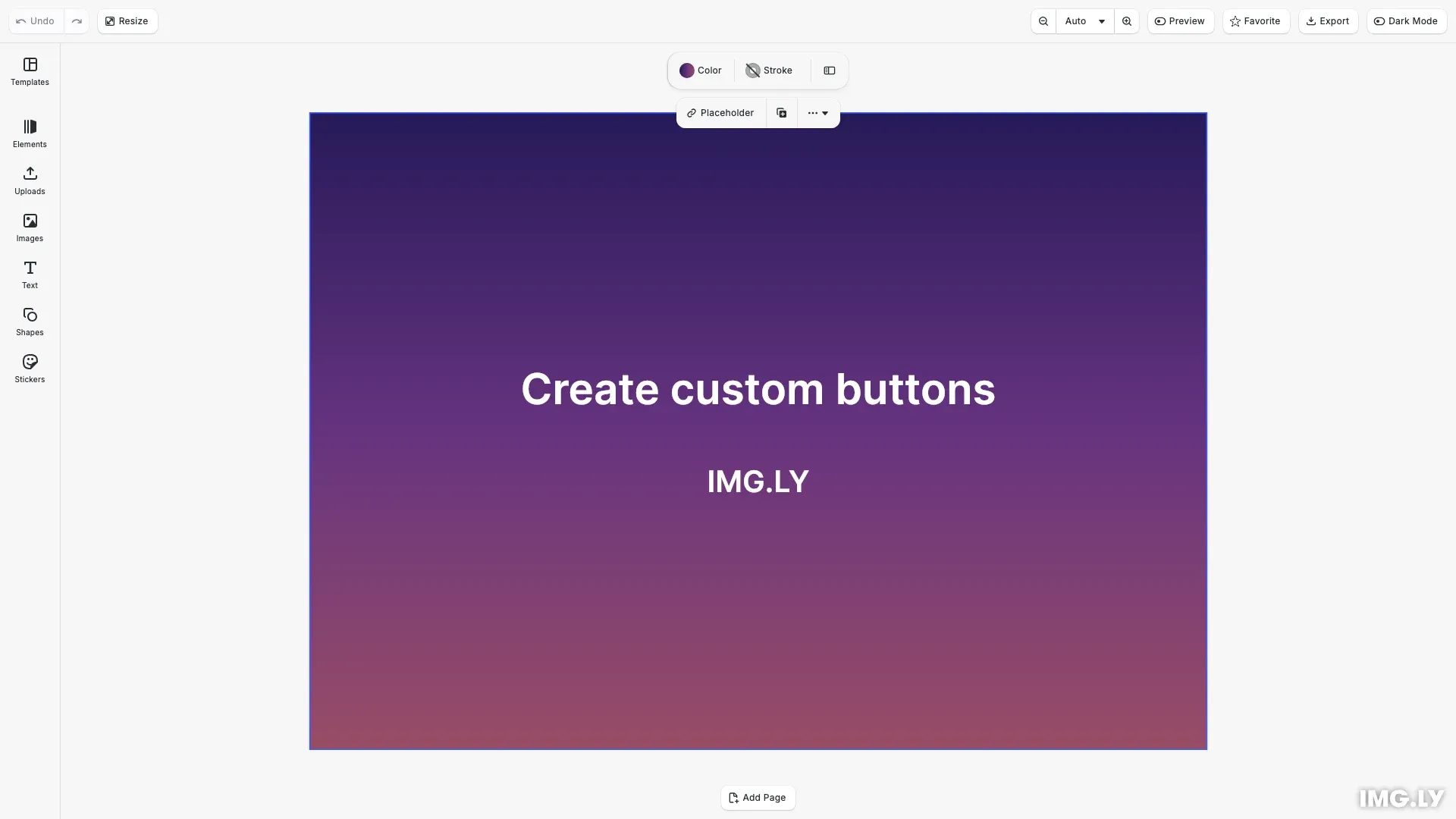
Add custom buttons to the CE.SDK editor to trigger actions, control panels, or implement custom workflows.

CE.SDK provides a component registration system for adding custom UI elements. The builder API ensures buttons match the editor’s look and feel while giving full control over behavior.
This guide demonstrates adding custom buttons to the navigation bar: a theme toggle, a favorite button with local state, and an export button that triggers a built-in action.
Register a Button Component#
Use cesdk.ui.registerComponent() to create the theme toggle button. The render function receives a builder object for creating UI elements. Use cesdk.ui.getTheme() to read the current theme and cesdk.ui.setTheme() to change it.
cesdk.ui.registerComponent('theme.toggle', ({ builder }) => {  const isDark = cesdk.ui.getTheme() === 'dark';
  builder.Button('toggle-theme', {    label: 'Dark Mode',    icon: isDark ? '@imgly/ToggleIconOn' : '@imgly/ToggleIconOff',    variant: 'regular',    isActive: isDark,    onClick: () => {      cesdk.ui.setTheme(isDark ? 'light' : 'dark');    }  });});
The render function re-runs when relevant state changes. Calling cesdk.ui.getTheme() tracks the theme state, so the component automatically re-renders when setTheme() is called.
Use Component State#
For buttons that need to maintain their own state, use the state() function provided in the render context. This creates reactive state that persists across re-renders and automatically triggers updates when changed.
cesdk.ui.registerComponent('favorite.toggle', ({ builder, state }) => {  const { value: isFavorite, setValue: setIsFavorite } = state(    'isFavorite',    false  );
  builder.Button('toggle-favorite', {    label: 'Favorite',    icon: '@imgly/ShapeStar',    variant: 'regular',    isActive: isFavorite,    onClick: () => {      setIsFavorite(!isFavorite);    }  });});
The state() function returns an object with value (the current state) and setValue (a function to update it). When setValue is called, the component re-renders with the new value. The isActive property provides visual feedback when the button state is active.
Trigger Built-in Actions#
Combine custom buttons with built-in actions to create streamlined workflows. Use cesdk.actions.run() to execute registered actions like export, save, or zoom operations.
cesdk.ui.registerComponent('quick.export', ({ builder }) => { builder.Button('quick-export', { label: 'Export', icon: '@imgly/Download', variant: 'regular', onClick: () => { cesdk.actions.run('exportDesign'); } });});The Actions API provides access to built-in operations (exportDesign, saveScene, zoom.in, etc.) and supports custom actions you register yourself.
Add to the Navigation Bar#
Use insertNavigationBarOrderComponent() to add buttons to the navigation bar. The first argument is a matcher ('first', 'last', a number, component ID, or function), and the second is your component ID.
cesdk.ui.insertNavigationBarOrderComponent('last', 'theme.toggle');You can add buttons to other UI locations using similar APIs:
| Location | Insert API | Set Order API |
|---|---|---|
| Navigation Bar | insertNavigationBarOrderComponent() | setNavigationBarOrder() |
| Dock | insertDockOrderComponent() | setDockOrder() |
| Canvas Menu | insertCanvasMenuOrderComponent() | setCanvasMenuOrder() |
| Inspector Bar | insertInspectorBarOrderComponent() | setInspectorBarOrder() |
| Canvas Bar | insertCanvasBarOrderComponent() | setCanvasBarOrder() |
Button Properties#
The builder’s Button method accepts these configuration options:
| Property | Type | Description |
|---|---|---|
label | string | string[] | Button text, supports i18n keys |
icon | CustomIcon | Icon from the icon set |
onClick | () => void | Click handler function |
isSelected | boolean | Highlight as selected |
isActive | boolean | Show active state styling |
isDisabled | boolean | Disable interaction |
isLoading | boolean | Show loading indicator |
loadingProgress | number | Loading progress (0-1) |
color | 'accent' | 'danger' | Color variant |
variant | 'regular' | 'plain' | Style variant |
tooltip | string | string[] | Hover tooltip text |
shortcut | string | Keyboard shortcut display |
API Reference#
| API | Description |
|---|---|
registerComponent() | Register a custom component with a render function |
state() | Create reactive component state that persists across re-renders |
insertNavigationBarOrderComponent() | Insert a component into the navigation bar |
getTheme() | Get the current editor theme ('light' or 'dark') |
setTheme() | Set the editor theme |
actions.run() | Execute a registered action by ID |
actions.list() | List all available action IDs |
Next Steps#
- Register a New Component — Learn the full component registration API for building complex UI elements
- Create a Custom Panel — Build panels with multiple interactive elements
- Configure the Panel — Control panel visibility and behavior