Build a custom UI component once and add it to the editor’s dock, inspector bar, navigation bar, and canvas menu through the editor configuration.
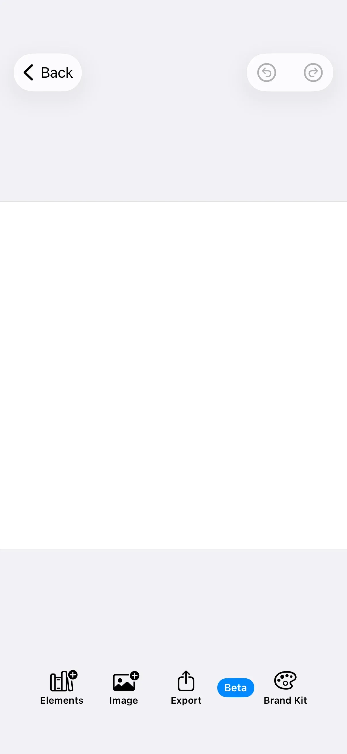
Custom components are typed values you add to the editor’s UI areas on the EditorConfiguration builder. You instantiate a component (a predefined button, a customized button, a new Dock.Button, or a fully custom item) inside the area’s builder closure. This guide teaches the component model and how to reuse one component across more than one area. For the full item lists and built-in buttons of each area, see the Dock, Inspector Bar, Navigation Bar, and Canvas Menu guides.
The example wraps the editor in GuideEditorConfiguration, a small helper class the iOS guides repository ships as a minimal baseline. Substitute your own editor configuration class — the area builders are available on every configuration. The Configuration guide covers how EditorConfiguration and EngineSettings set up the editor as a whole.
The Component Model#
Every UI component conforms to EditorComponent. The protocol has three parts:
id: EditorComponentID— A unique identifier, required for SwiftUI’sForEach.isVisible(_:)— A predicate deciding whether the component shows. Defaults totrue.body(_:)— The SwiftUI view, built from the area’s context.
Each area refines the protocol with its own context type: Dock.Item, InspectorBar.Item, NavigationBar.Item, and CanvasMenu.Item all set Context to that area’s context (Dock.Context, CanvasMenu.Context, and so on). The context exposes the engine, the eventHandler, and the configured asset library; the inspector bar and canvas menu add a cached selection. The same model powers all four areas — only the context differs.
The built-in Dock.Button and the fully custom Dock.Item you write both conform to Dock.Item, so they sit side by side in the same item list.
Configuration#
Configure each area on the editor configuration builder. Enter the dock with builder.dock { dock in … } and declare its contents with dock.items { context in … }. The same shape applies to inspectorBar, navigationBar, and canvasMenu.
dock.items is a setter — it replaces the entire list. GuideEditorConfiguration ships an empty dock, so the call below declares the full list. Include every component you want to appear.
Building a Component#
There are four ways to add a component to an area, in increasing order of control. Each goes inside the dock.items { _ in … } closure; the snippets isolate one at a time.
Use a Predefined Button#
The simplest option is a button from the Dock.Buttons namespace.
Dock.Buttons.elementsLibrary()Customize a Predefined Button#
Every parameter of a predefined button has a default, so you override only what you need — here the action, label, and icon.
Dock.Buttons.imagesLibrary( action: { context in context.eventHandler.send(.openSheet(type: .libraryAdd { context.assetLibrary.imagesTab })) }, title: { _ in Text("Image") }, icon: { _ in Image.imgly.addImage },)Create a New Button#
When no predefined button fits, build your own with Dock.Button. It takes a unique id, an action, and a label view, plus optional isEnabled and isVisible predicates.
Dock.Button( id: "my.package.dock.button.export", action: { _ in print("Export tapped") }, label: { _ in Label("Export", systemImage: "square.and.arrow.up") },)Create a Custom Item#
For full control over rendering, conform a type to Dock.Item and provide your own body.
private struct StatusBadgeItem: Dock.Item {  var id: EditorComponentID {    "my.package.dock.statusBadge"  }
  func body(_ context: Dock.Context) throws -> some View {    Text("Beta")      .font(.caption.weight(.semibold))      .foregroundStyle(.white)      .padding(.horizontal, 8)      .padding(.vertical, 4)      .background(.tint, in: Capsule())      .onTapGesture { print("Beta badge tapped") }  }}
Then add it to the dock like any other item:
StatusBadgeItem()Reusing One Component Across Areas#
The value of the component model is that you author a component’s view once and place it wherever you need it. Define the view as a plain SwiftUI View:
private struct BrandKitLabel: View { var body: some View { Label("Brand Kit", systemImage: "paintpalette") }}Use it as the label of a Dock.Button:
Dock.Button( id: "my.package.dock.button.brandKit", action: { _ in print("Brand Kit tapped") }, label: { _ in BrandKitLabel() },)Dock.Button and CanvasMenu.Button are both the same generic EditorComponents.Button, specialized for their area’s context. So the same BrandKitLabel view backs a canvas menu button without changes:
CanvasMenu.Button( id: "my.package.canvasMenu.button.brandKit", action: { _ in print("Brand Kit tapped") }, label: { _ in BrandKitLabel() },)The component’s view is reused; only the area builder you add it to changes. Read selection only where the area provides it — the dock and navigation bar have no selection, while the inspector bar and canvas menu do.
Controlling Visibility#
Gate a component with its isVisible predicate, reading the engine or the area context. This canvas menu button appears only when the selected block is text:
CanvasMenu.Button( id: "my.package.canvasMenu.button.editCopy", action: { _ in print("Edit Copy tapped") }, label: { _ in Label("Edit Copy", systemImage: "text.cursor") }, isVisible: { context in context.selection.type == .text },)Prefer the predicate over hiding a component by returning an empty view. To hide an entire area, supply an empty item list.
Troubleshooting#
- Component not appearing — Its
idmust be unique; a duplicate id drops it. Confirm it is added to the correct area’sitems. - Component visible in the wrong context — Gate it with
isVisible. The dock and navigation bar have noselectionto read. - Reused component looks different —
EditorComponents.Buttonis generic over the area context. A view that readsselectioncompiles only for the inspector bar and canvas menu; keep shared views context-independent or branch per area.
API Reference#
| Method | Purpose |
|---|---|
builder.dock { dock in … } |
Enter dock configuration (same shape for inspectorBar, navigationBar, canvasMenu). |
dock.items { context in … } |
Set the complete item list for an area (replaces existing items). |
Dock.Buttons.elementsLibrary() (and siblings) |
Predefined, customizable buttons. |
Dock.Button(id:action:label:isEnabled:isVisible:) |
A custom button with an action and a label view. |
CanvasMenu.Button(id:action:label:isVisible:) |
The same EditorComponents.Button, specialized for the canvas menu. |
Dock.Item / InspectorBar.Item / NavigationBar.Item / CanvasMenu.Item |
Per-area item protocols refining EditorComponent. |
EditorComponent |
The shared protocol every component conforms to (id, isVisible, body). |
EditorComponentID |
A unique component identifier. |
Next Steps#
- Dock — The bottom toolbar: full item list, modify operations, and built-in buttons.
- Inspector Bar — Context-sensitive controls for the current selection.
- Navigation Bar — The editor’s top bar and item placements.
- Canvas Menu — The floating toolbar for the current selection.