Communicate with users during editing by triggering the editor’s built-in alerts, sheets, and progress indicators, with native SwiftUI as the fallback for anything custom.
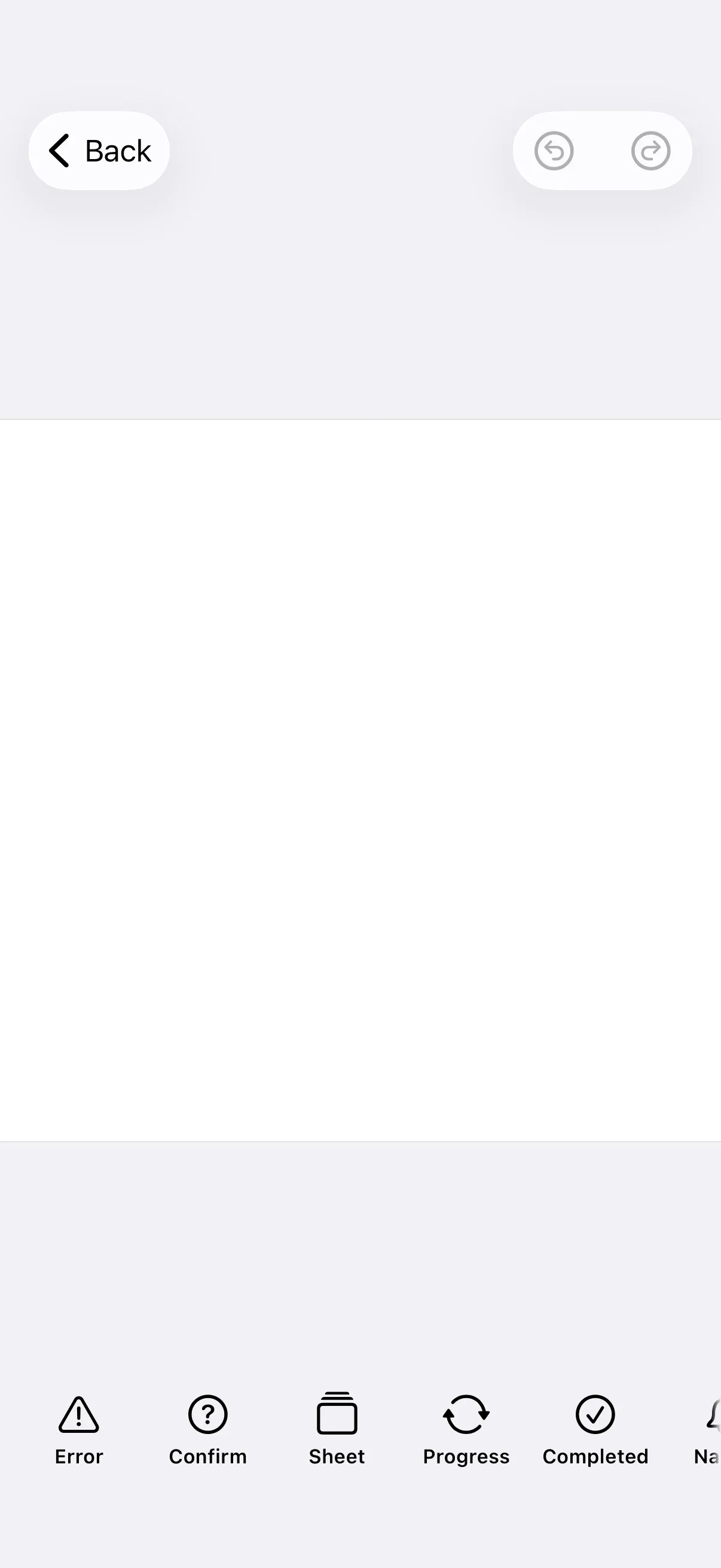
Overview#
Communicate with users by sending EditorEvents through an EditorEventHandler. These events drive the editor’s built-in alerts, modal sheets, and progress indicators. For anything the editor doesn’t provide — a non-blocking toast or a fully custom confirmation — you use native SwiftUI in your host app.
The examples build on GuideEditorConfiguration, a small helper class the iOS guides repository ships as a minimal baseline (source). Substitute your own editor configuration — the extension points shown here are available on every configuration.
Sending Editor Events#
Every editor-driven alert, sheet, and progress indicator is triggered by sending an EditorEvent on an EditorEventHandler. The protocol exposes a single send(_:) method.
You obtain a handler in two places:
- Every editor extension item — a
Dock.Buttonand the navigation bar, inspector bar, and canvas menu items — receives one on itscontextascontext.eventHandler. - The
onExport,onClose, andonErrorconfiguration callbacks each receive aneventHandlerparameter.
The dock button below sends the built-in error alert, the simplest event to send:
Dock.Button(id: "notifications.errorAlert") { context in let error = NSError( domain: "MyApp", code: 1, userInfo: [NSLocalizedDescriptionKey: "Could not save your design."], ) context.eventHandler.send(.showErrorAlert(error))} label: { _ in Label("Error", systemImage: "exclamationmark.triangle")}Showing Built-in Alerts#
The editor ships a small set of modal alerts. The error alert above is one. The close-confirmation alert — the prompt shown when the user leaves with unsaved changes — is another:
Dock.Button(id: "notifications.closeConfirm") { context in context.eventHandler.send(.showCloseConfirmationAlert)} label: { _ in Label("Confirm", systemImage: "questionmark.circle")}In a video scene, .showVideoMinLengthAlert(minimumVideoDuration:) presents the built-in too-short validation alert. These typed events are the only built-in alerts; there is no free-form alert builder. For anything else, present a custom sheet or a native SwiftUI alert.
Presenting Custom Modal Content#
For arbitrary modal UI — the closest equivalent to a custom dialog — send .openSheet(style:content:) with a SwiftUI content closure, and dismiss it with .closeSheet:
Dock.Button(id: "notifications.customSheet") { context in context.eventHandler.send(.openSheet( style: .default(isFloating: true, detent: .medium, detents: [.medium, .large]), content: { VStack(spacing: 16) { Text("Custom Dialog") .font(.headline) Text("Present any SwiftUI view as a modal sheet.") .multilineTextAlignment(.center) Button("Done") { context.eventHandler.send(.closeSheet) } .buttonStyle(.borderedProminent) } .padding() }, ))} label: { _ in Label("Sheet", systemImage: "rectangle.stack")}SheetStyle.default(isFloating:detent:detents:) controls the presentation. A floating sheet covers the canvas; a non-floating sheet zooms the canvas to stay visible and requires its content to be a List or NavigationView. The detents let people resize the sheet by dragging.
Showing Progress#
For long-running work, show the editor’s progress sheet with .exportProgress(_:) — pass .spinner for indeterminate work or .relative(_:) for a percentage:
Dock.Button(id: "notifications.progress") { context in context.eventHandler.send(.exportProgress(.relative(0.35)))} label: { _ in Label("Progress", systemImage: "arrow.triangle.2.circlepath")}When the work finishes, present the completion sheet with .exportCompleted(action:). The action closure runs after the sheet is dismissed:
Dock.Button(id: "notifications.completed") { context in context.eventHandler.send(.exportCompleted { print("Export sheet dismissed") })} label: { _ in Label("Completed", systemImage: "checkmark.circle")}Native SwiftUI Fallback#
When no built-in surface fits — a non-blocking notification, or a fully custom confirmation — drive native SwiftUI from your host app. Flip a @State flag from an editor extension, then present a native .alert (or .confirmationDialog, or a custom overlay) on the view that hosts the editor.
The dock button sets the flag:
Dock.Button(id: "notifications.nativeAlert") { _ in isSavedAlertPresented = true} label: { _ in Label("Native", systemImage: "bell")}isSavedAlertPresented is a @State flag on the view. The .alert modifier on the host view presents whenever it becomes true:
ModalEditor { editor}.alert("Saved", isPresented: $isSavedAlertPresented) { Button("OK", role: .cancel) {}} message: { Text("Your design has been saved.")}This is host-app code, not a CE.SDK API — use it whenever the editor’s built-in surfaces don’t cover your case.
API Reference#
| Method | Description |
|---|---|
EditorEventHandler.send(_:) |
Send an EditorEvent to drive editor UI |
EditorEvents.showErrorAlert(_:_:) |
Show the built-in error alert, with an optional onDismiss closure |
EditorEvents.showCloseConfirmationAlert |
Show the unsaved-changes confirmation alert |
EditorEvents.showVideoMinLengthAlert(minimumVideoDuration:) |
Show the built-in video-too-short validation alert |
EditorEvents.openSheet(style:associatedEditMode:content:) |
Present custom SwiftUI content as a modal sheet |
EditorEvents.closeSheet |
Dismiss the open sheet |
EditorEvents.exportProgress(_:) |
Show the progress sheet (.spinner or .relative(_:)) |
EditorEvents.exportCompleted(action:) |
Show the completion sheet, then run action on dismissal |
Next Steps#
- Add a New Button — Add custom buttons to the dock, canvas menu, inspector bar, and navigation bar.
- Create a Custom Panel — Design a custom sidebar panel to support unique workflows and user needs.
- Panel — Configure the editor’s built-in option panels.
- Dock — Customize the dock that hosts your action buttons.
- Custom Error Messages — Localize and override the copy shown in the error alert.
- Localization — Translate the editor’s UI strings.