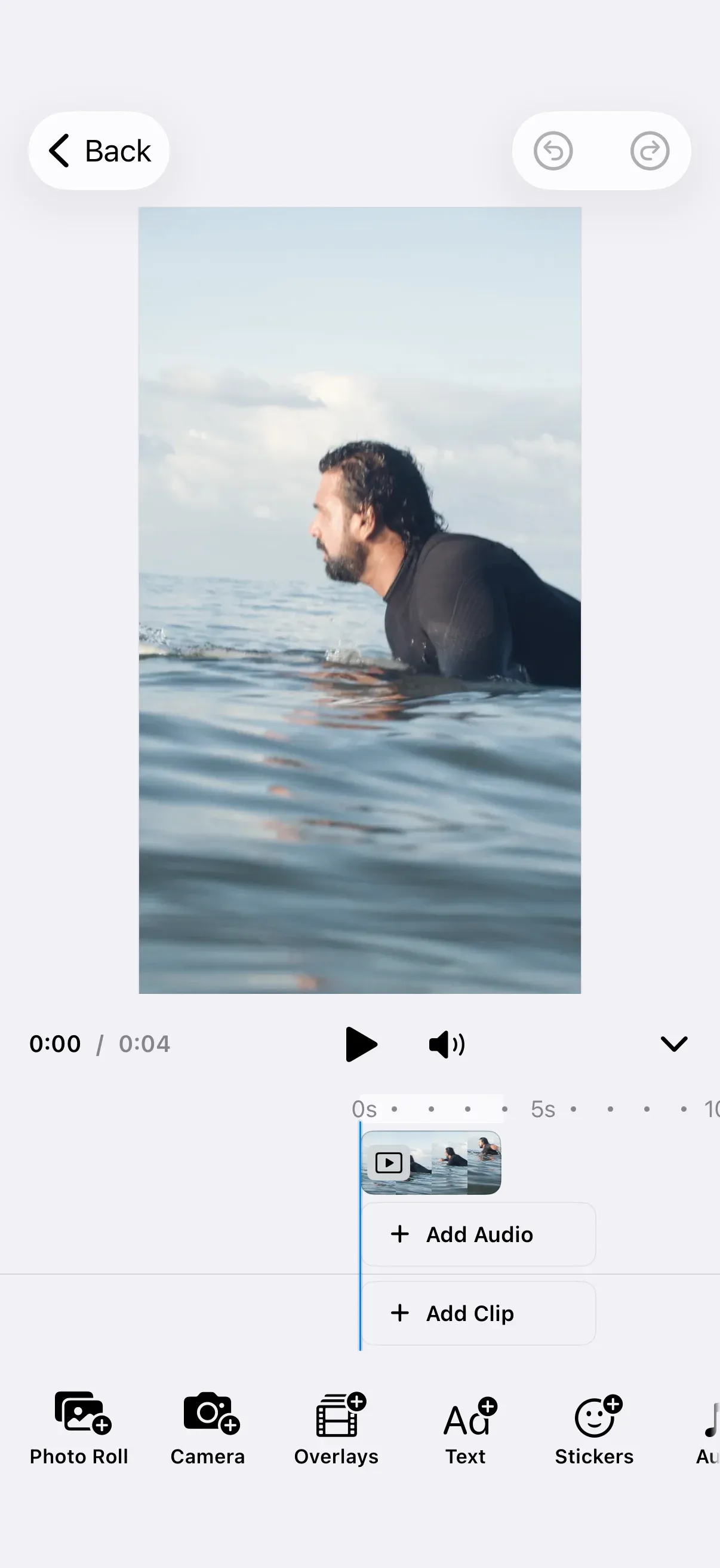
Customize the video timeline — the playback and arrangement surface below the canvas — by passing a Timeline.Configuration that adjusts its add-content buttons, header, height, and expanded state.
Timeline Architecture#
Timeline is both the component you mount and the namespace for everything that customizes it. It renders three configurable surfaces:
- The header above the ruler, holding the timecode, playback controls, and the expand/collapse toggle.
- The “Add Clip” button in the background lane, after the last clip of the main sequence.
- The “Add Audio” button at the foot of the overlay stack, below the overlay tracks.
Key types:
Timeline.Configuration— the value you pass to the component. Built with a closure over aBuilderthat exposesaddClip,addAudio,height,header(_:), andmodifyHeader(_:).Timeline.Item— the protocol every header item and lane button conforms to.Timeline.Customwraps any SwiftUI view as one.Timeline.ItemContext— passed to every closure. It exposes theengine, theeventHandler, the configuredassetLibrary, the editorstate, and theverticalSizeClass.Timeline.AddClipOption/Timeline.AddAudioOption— the entries the two lane buttons offer.
The item, option, and visibility closures are evaluated per render, so what the timeline shows can depend on the context — whether an export is running, the editor’s view mode, or the vertical size class.
Configuration#
Mount the timeline as the editor’s bottom-panel content and hand it a configuration. These examples build on GuideEditorConfiguration, a minimal baseline the iOS guides repository ships, which sets only a navigation bar. Substitute your own configuration class — builder.bottomPanel { … } is available on every EditorConfiguration. The Configuration guide covers how EditorConfiguration and EngineSettings set up the editor as a whole.
builder.bottomPanel { bottomPanel in // Built once here rather than inside `content`, which re-renders with the editor. let configuration = timelineConfiguration bottomPanel.content { context in Timeline( context: context, configuration: configuration, isExpanded: $isTimelineExpanded, ) }}The timeline renders its tracks and nothing else by default: no header, and no lane buttons. Each section below turns one of those surfaces on, and the video starter kit does the same. The isExpanded binding is optional and covered in Expanded State.
Build the configuration outside the content closure. The bottom panel evaluates content on every render, and the Timeline.Configuration initializer runs its configure closure each time it is called.
Device Permissions#
The default add-content options reach two capabilities iOS gates behind a privacy prompt. Timeline.AddClipOption.camera() opens the CE.SDK camera, and Timeline.AddAudioOption.voiceover() records through the microphone — in a video scene the camera captures audio too. Add both keys to your app’s Info.plist with user-facing descriptions. iOS terminates the app the first time CE.SDK requests access if a key is missing.
<key>NSCameraUsageDescription</key><string>We use the camera to record clips for your video projects.</string><key>NSMicrophoneUsageDescription</key><string>We use the microphone to record voiceovers and sound for your video projects.</string>The camera and recording sheets handle the permission prompts themselves and surface a Settings shortcut if the user denies access. Timeline.AddClipOption.photoRoll() needs no key — it uses the out-of-process system photo picker.
Add Clip Sources#
The “Add Clip” button opens a menu of sources that add to the background track. Timeline.Buttons.addClip(options:) decides which sources it offers. title and icon change the button’s own label. There are three built-in ones — camera(), library(), and photoRoll(). The button offers camera plus library by default.
The options closure is a result builder, so you list the sources you want, in display order. This example restates the two built-in sources alongside the photo picker and a custom stock-footage source:
configuration.addClip = Timeline.Buttons.addClip { _ in // Passing options replaces the menu, so the built-in sources are restated here. Timeline.AddClipOption.camera() Timeline.AddClipOption.library() Timeline.AddClipOption.photoRoll() Timeline.AddClipOption.custom( id: "my.package.timeline.addClip.stockFootage", action: { context in context.eventHandler.send(.openSheet(type: .libraryAdd { context.assetLibrary.videosTab })) }, title: { _ in Text("Stock Footage") }, icon: { _ in Image(systemName: "film.stack") }, )}A custom source’s action receives the Timeline.ItemContext, so it can reach the engine, the configured asset library, and the event handler.
Every built-in source carries a stable id under Timeline.AddClipOption.ID — and Timeline.AddAudioOption.ID for the audio ones. Use them to give a replacement the same identity as the source it stands in for.
Reorder, Relabel, and Replace Behavior#
List the sources yourself to control the order or drop one. Each built-in factory takes title, icon, and action, so a source can keep its behavior while its presentation changes, or keep its presentation while its behavior changes:
Timeline.Buttons.addClip { _ in Timeline.AddClipOption.photoRoll() // A built-in source keeps its behavior while its label and icon change. Timeline.AddClipOption.library( title: { _ in Text("Media") }, icon: { _ in Image(systemName: "square.stack.fill") }, ) // A built-in source keeps its label and icon while its action is replaced. Timeline.AddClipOption.camera(action: { context in context.eventHandler.send(.openSheet(type: .libraryAdd { context.assetLibrary.videosTab })) })}Hide a Source Conditionally#
isVisible gates a single source without removing it from the list:
Timeline.Buttons.addClip { _ in Timeline.AddClipOption.camera(isVisible: { !$0.state.isExporting }) Timeline.AddClipOption.library()}One Source Instead of a Menu#
When only one source is visible, the button performs it directly on tap instead of opening a menu, and shows that source’s own label rather than the generic “Add Clip”:
Timeline.Buttons.addClip { _ in Timeline.AddClipOption.photoRoll() }Returning no options — or options that are all hidden — hides the button entirely.
Add Audio Sources#
The “Add Audio” button works the same way. Timeline.Buttons.addAudio(options:) offers music() and voiceover() by default, and the same listing, reordering, relabeling, and single-source rules apply:
configuration.addAudio = Timeline.Buttons.addAudio { _ in Timeline.AddAudioOption.music() Timeline.AddAudioOption.voiceover() Timeline.AddAudioOption.custom( id: "my.package.timeline.addAudio.soundEffects", action: { context in context.eventHandler.send(.openSheet(type: .libraryAdd { context.assetLibrary.audioTab })) }, title: { _ in Text("Sound Effects") }, icon: { _ in Image(systemName: "waveform") }, )}Replace the Whole Button#
Assign a Timeline.Custom to addAudio to replace the button rather than its options:
Timeline.Custom(id: "my.package.timeline.button.addAudio", content: { context in Button { context.eventHandler.send(.openSheet(type: .voiceover())) } label: { Label("Record", systemImage: "mic.circle.fill") .font(.caption) .fontWeight(.semibold) } .buttonStyle(.plain) .padding(.horizontal) .fixedSize(horizontal: true, vertical: false)})The lane sizes a replacement to one track row and gives it no intrinsic width, so claim the width the label needs with fixedSize(horizontal:vertical:). The timeline reserves its height by row count and never measures the button, so a taller one overflows the lane.
Timeline.Custom also takes isEnabled and isVisible. Both are closures over the context, and isVisible is what removes the item from layout — do not encode visibility in the content view.
Timeline Header#
Header items are grouped by Timeline.ItemPlacement — .leading, .center, or .trailing. Placement alone only groups items; Timeline.Spacer() is what pushes them apart.
Modify the Built-in Header#
The header is empty until you set one. header(_:) declares it, and modifyHeader(_:) adjusts a header that was already set — the video starter kit’s, or your own — without restating it. modifyHeader(_:) on an empty header has nothing to adjust, and its id-anchored operations throw, so declare the header first:
// The timeline renders tracks alone, so the header is declared before it is adjusted.configuration.header { _ in Timeline.ItemGroup(placement: .leading) { Timeline.Labels.timecode() Timeline.Spacer() } Timeline.ItemGroup(placement: .center) { Timeline.Buttons.playPause() } Timeline.ItemGroup(placement: .trailing) { Timeline.Buttons.loop() Timeline.Spacer() Timeline.Buttons.toggleExpanded() }}Then adjust it. Four of its operations are anchored to an item id — addAfter(id:), addBefore(id:), replace(id:), and remove(id:) — and two to a placement edge: addFirst(placement:) and addLast(placement:). Header items are grouped, so the placement argument is required; the dock, inspector bar, and canvas menu take a bare addFirst/addLast instead.
configuration.modifyHeader { _, items in items.remove(id: Timeline.Buttons.ID.loop) items.addFirst(placement: .trailing) { Timeline.Custom(id: "my.package.timeline.button.mute", content: { _ in MuteButton() }) }}Prefer the placement-anchored operations over addAfter(id:) and addBefore(id:) when the position only has to be “at this edge”. The id-anchored operations throw when the item they name is absent, which is what happens once a built-in item you anchored on is removed or renamed.
Declare the Header Outright#
header(_:) replaces the header with the groups you declare:
configuration.header { _ in Timeline.ItemGroup(placement: .leading) { Timeline.Labels.timecode() Timeline.Spacer() } Timeline.ItemGroup(placement: .center) { Timeline.Buttons.playPause() } Timeline.ItemGroup(placement: .trailing) { Timeline.Spacer() Timeline.Buttons.toggleExpanded() }}The built-in items are timecode(), playPause(), loop(), toggleExpanded(), and Timeline.Spacer(). playPause, loop, and toggleExpanded each take an action that replaces the built-in behavior. playPause and loop take an icon, because neither renders any text. timecode and toggleExpanded take a whole label instead, because neither is a plain glyph. Every item takes an isEnabled and an isVisible. Pass nil — the default — to keep the built-in. toggleExpanded is visible in every size class by default.
Remove a Surface#
Each of the three surfaces can be removed outright. An empty header removes the player bar itself rather than leaving an empty strip, while the timeline body keeps rendering. Setting addClip or addAudio to nil removes that lane button:
configuration.addClip = nilconfiguration.addAudio = nilconfiguration.header { _ in }Timeline Height#
The timeline’s height is expressed in track rows. height is a closure returning a Timeline.HeightMode, resolved per render, so the height can depend on the context. Every case counts overlay tracks: the background track is always shown and is never counted.
dynamic(maximumTracks:) is the default in a regular vertical size class; in a compact one, such as an iPhone in landscape, the default is fixed(tracks: 1) so the canvas keeps its room. Under dynamic the timeline hugs its tracks and grows to at most that many:
configuration.height = { _ in .dynamic(maximumTracks: 2) }fixed(tracks:) sizes the timeline to show exactly that many tracks and stops auto-resizing. 0 still shows the background track, and negative values are clamped to 0:
configuration.height = { _ in .fixed(tracks: 2) }Because height is a closure, it can also follow the context rather than being a constant:
configuration.height = { context in context.verticalSizeClass == .compact ? .fixed(tracks: 1) : .dynamic(maximumTracks: 3)}The closure can throw, and a throwing closure resolves to the default dynamic(maximumTracks: 3) rather than surfacing the error.
A caption lane is a lane of its own rather than an overlay track. It adds a row on top of maximumTracks under dynamic, appearing with the first caption clip rather than with the caption track. Under fixed it adds nothing — fixed means fixed.
Expanded State#
By default the timeline owns its expanded state and starts expanded. Pass an isExpanded binding to own it yourself:
/// The timeline's expanded state, owned by this view rather than by the component.@State private var isTimelineExpanded = trueTimeline( context: context, configuration: configuration, isExpanded: $isTimelineExpanded,)The binding sets the initial state and stays in sync in both directions: writing to it expands or collapses the timeline, and the user’s own toggle writes back. Collapsing leaves the header visible and hides the tracks below it, which is also what happens while a sheet covers the timeline.
API Reference#
Methods#
| Method | Description |
|---|---|
Timeline(context:configuration:isExpanded:) |
The timeline component, mounted as bottom-panel content |
Timeline.Configuration(_:) |
Builds a configuration from a closure over its Builder |
Timeline.Configuration.Builder.header(_:) |
Replaces the header with the declared ItemGroups |
Timeline.Configuration.Builder.modifyHeader(_:) |
Adjusts the header without restating it |
Timeline.Buttons.addClip(options:title:icon:) |
The “Add Clip” button with the given sources |
Timeline.Buttons.addAudio(options:title:icon:) |
The “Add Audio” button with the given sources |
Timeline.Labels.timecode(label:isVisible:) |
Header label showing the playhead position and total duration |
Timeline.Buttons.playPause(action:icon:isVisible:) |
Header play/pause button |
Timeline.Buttons.loop(action:icon:isVisible:) |
Header looping toggle |
Timeline.Buttons.toggleExpanded(action:label:isVisible:) |
Header expand/collapse toggle |
Timeline.Spacer(isVisible:) |
Flexible space between header items |
Timeline.AddClipOption.camera(action:title:icon:isVisible:) |
Records a clip with the camera |
Timeline.AddClipOption.photoRoll(action:title:icon:isVisible:) |
Opens the privacy-friendly photo picker |
Timeline.AddClipOption.library(action:title:icon:isVisible:) |
Opens the asset library |
Timeline.AddClipOption.custom(id:action:title:icon:isVisible:) |
A custom clip source |
Timeline.AddAudioOption.music(action:title:icon:isVisible:) |
Opens the audio asset library |
Timeline.AddAudioOption.voiceover(action:title:icon:isVisible:) |
Starts a voiceover recording |
Timeline.AddAudioOption.custom(id:action:title:icon:isVisible:) |
A custom audio source |
Timeline.Custom(id:content:isEnabled:isVisible:) |
Wraps a SwiftUI view as a timeline item |
Timeline.ItemGroup(placement:items:) |
A group of header items with one placement |
Properties#
| Property | Type | Description |
|---|---|---|
addClip |
(any Timeline.Item)? |
The “Add Clip” button, or nil to remove it |
addAudio |
(any Timeline.Item)? |
The “Add Audio” button, or nil to remove it |
height |
Timeline.Height |
Closure returning a Timeline.HeightMode — .dynamic(maximumTracks:) (default, 3; .fixed(tracks: 1) in a compact vertical size class) or .fixed(tracks:) |
Timeline.ItemContext.engine |
Engine |
The engine of the current editor |
Timeline.ItemContext.eventHandler |
EditorEventHandler |
Sends EditorEvents |
Timeline.ItemContext.assetLibrary |
any AssetLibrary |
The configured asset library |
Timeline.ItemContext.state |
EditorState |
Whether the editor is creating or exporting, and its view mode |
Timeline.ItemContext.verticalSizeClass |
UserInterfaceSizeClass? |
The timeline’s vertical size class |
Timeline.Buttons.ID.addClip |
EditorComponentID |
ID constants for the built-in buttons |
Timeline.AddClipOption.ID.camera |
EditorComponentID |
ID constants for the built-in clip sources |
Timeline.AddAudioOption.ID.music |
EditorComponentID |
ID constants for the built-in audio sources |
Next Steps#
- Timeline Editor — Build and edit timelines programmatically with the engine.
- Record Voiceover — The recording flow behind the voiceover add-audio source.
- Disable or Enable Features — Gate editor items on selection, app state, or permissions.
- Dock — Bottom toolbar that opens asset libraries and sheets.
- Inspector Bar — Contextual toolbar for the selected block.
- Navigation Bar — Top bar configuration.