A panel is a UI layer that displays above the canvas and lets the user perform a scoped task such as picking an asset, adjusting a filter, or running a custom action.
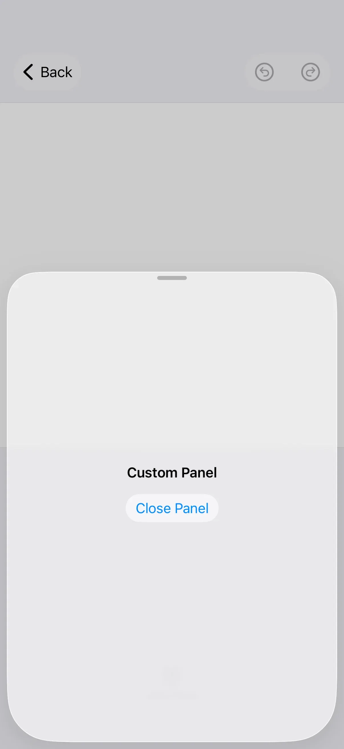
In CE.SDK on iOS, panels are implemented as sheets — non-modal overlays presented above the canvas. The editor ships with a set of built-in sheet types that cover the most common editing tasks, and you can also present your own SwiftUI content as a custom sheet. The same calls apply regardless of the editor configuration your app extends.
Controlling a Panel#
Panels are represented by conforming types of SheetType. Send the openSheet(type:) editor event from anywhere a context.eventHandler is in scope — for example a Dock.Button action — passing in the desired SheetType.
context.eventHandler.send( .openSheet(type: .libraryAdd { context.assetLibrary.elementsTab }),)The user can dismiss the sheet by dragging it down. To close it programmatically, send the parameterless closeSheet event.
context.eventHandler.send(.closeSheet)Creating a Custom Panel#
To render your own SwiftUI content inside a sheet, use the openSheet(style:content:) overload. The style controls how the sheet is presented, while content is any view builder.
context.eventHandler.send(.openSheet( style: .default( isFloating: false, detent: .fraction(0.7), detents: [.large, .fraction(0.7)], ), content: { VStack(spacing: 16) { Text("Custom Panel") .font(.headline) Button("Close Panel") { context.eventHandler.send(.closeSheet) } .buttonStyle(.bordered) } .padding() },))The style parameter accepts a SheetStyle. These are the parameters available on the .default(isFloating:detent:detents:) factory and what they change:
| Parameter | Default Value | Description |
|---|---|---|
isFloating |
false |
Whether the sheet floats over the canvas. When true the sheet covers the editor’s canvas and its content; when false the canvas zooms to adjust for the sheet so that its content is not covered. |
detent |
.imgly.medium |
The initial detent of the sheet. The value must match one of the detents provided to detents. |
detents |
[.imgly.medium, .imgly.large] |
The set of supported detents. If you provide more than one detent, users can drag the sheet to resize it between them. |
SheetStyle also exposes .only(isFloating:detent:) for a single fixed height and .addAsset(detent:detents:) for the floating asset-library style.
Default Sheet Types#
The editor provides several built-in sheet types for common editing tasks:
| Sheet Type Call | Required Parameters | Description |
|---|---|---|
.libraryAdd(content:) |
content (() -> any View) |
Add assets from the configured asset library; pass any SwiftUI view as content |
.libraryReplace(content:) |
content (() -> any View) |
Replace assets from the configured asset library; pass any SwiftUI view as content |
.voiceover() |
— | Record voiceover audio |
.reorder() |
— | Reorder videos on the background track |
.adjustments(id:) |
id (DesignBlockID) |
Make adjustments to design blocks with image and video fills |
.filter(id:) |
id (DesignBlockID) |
Set filters on design blocks with image and video fills |
.effect(id:) |
id (DesignBlockID) |
Set effects on design blocks with image and video fills |
.blur(id:) |
id (DesignBlockID) |
Set blurs on design blocks with image and video fills |
.crop(id:) |
id (DesignBlockID) |
Crop design blocks with image and video fills |
.resize() |
— | Resize pages |
.layer() |
— | Control the layering of design blocks |
.formatText() |
— | Control formatting of text blocks |
.shape() |
— | Control the shape of various blocks |
.fillStroke() |
— | Control the fill and/or stroke of various blocks |
.volume() |
— | Control the volume of audio and video |
.clipSpeed() |
— | Control playback speed of clips |
.textBackground() |
— | Control text background properties |
.animation() |
— | Configure in, out, and loop animations on design blocks |
.transition(id:) |
id (DesignBlockID) |
Configure the transition from an outgoing clip to its next eligible clip |
Full source code#
Both samples below use dock.items { ... }, which replaces the dock’s item list. When copying these snippets into a starter kit configuration with a default dock, switch to dock.modify { _, items in items.addLast { ... } } to preserve the existing buttons.
Default Panel Solution#
This example contains a single open_library_panel dock button that opens the built-in SheetType.libraryAdd panel via openSheet(type:).
import IMGLYEditorimport SwiftUI
struct DefaultPanelSolution: View {  let settings = EngineSettings(license: secrets.licenseKey, // pass nil for evaluation mode with watermark                                userID: "<your unique user id>")
  var editor: some View {    Editor(settings)      .imgly.configuration {        GuideEditorConfiguration { builder in          builder.dock { dock in            dock.items { _ in              Dock.Button(id: "open_library_panel") { context in                context.eventHandler.send(                  .openSheet(type: .libraryAdd { context.assetLibrary.elementsTab }),                )              } label: { _ in                Label("Open Library", systemImage: "arrow.up.circle")              }            }          }        }      }  }
  @State private var isPresented = false
  var body: some View {    Button("Use the Editor") {      isPresented = true    }    .fullScreenCover(isPresented: $isPresented) {      ModalEditor {        editor      }    }  }}
#Preview { DefaultPanelSolution()}Custom Panel Solution#
This example contains an open_panel dock button that presents a custom SwiftUI sheet with openSheet(style:content:) and closes it with closeSheet.
import IMGLYEditorimport SwiftUI
struct CustomPanelSolution: View {  let settings = EngineSettings(license: secrets.licenseKey, // pass nil for evaluation mode with watermark                                userID: "<your unique user id>")
  var editor: some View {    Editor(settings)      .imgly.configuration {        GuideEditorConfiguration { builder in          builder.dock { dock in            dock.items { _ in              Dock.Button(id: "open_panel") { context in                context.eventHandler.send(.openSheet(                  style: .default(                    isFloating: false,                    detent: .fraction(0.7),                    detents: [.large, .fraction(0.7)],                  ),                  content: {                    VStack(spacing: 16) {                      Text("Custom Panel")                        .font(.headline)                      Button("Close Panel") {                        context.eventHandler.send(.closeSheet)                      }                      .buttonStyle(.bordered)                    }                    .padding()                  },                ))              } label: { _ in                Label("Open Panel", systemImage: "arrow.up.circle")              }            }          }        }      }  }
  @State private var isPresented = false
  var body: some View {    Button("Use the Editor") {      isPresented = true    }    .fullScreenCover(isPresented: $isPresented) {      ModalEditor {        editor      }    }  }}
#Preview { CustomPanelSolution()}Next Steps#
- Inspector Bar — Customize the inspector bar for editing properties.
- Create a Custom Panel — Build a property editor panel with native SwiftUI controls.
- Asset Library — Configure which assets appear in library panels