Customize the inspector bar — the contextual toolbar that appears when a design block is selected — by declaring its full item list or modifying an existing one.
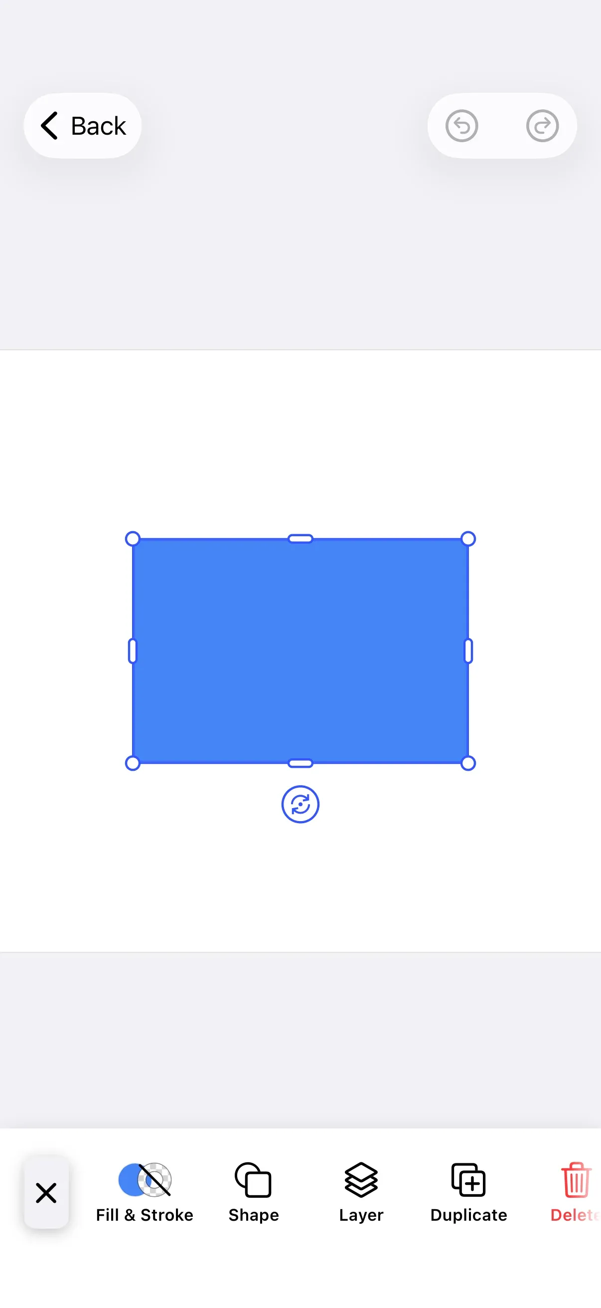
Inspector Bar Architecture#
The inspector bar is a horizontal toolbar that appears at the bottom of the editor when a design block is selected. Each item declares which block types it renders for, so the bar adapts its contents to the current selection — text formatting for text, crop and filters for images, volume for audio.
Key types:
InspectorBar.Item— the protocol every inspector bar item conforms to.InspectorBar.Button— the built-in button item, created through theInspectorBar.Buttonsfactories or directly with a customid,action, andlabel.InspectorBar.Context— passed to every closure. It exposes theengine, theeventHandler, the configuredassetLibrary, and the currentselection.
The context.selection property caches the selected block’s block, type, fillType, and kind for the inspector bar’s presentation lifecycle. Prefer it over querying the engine directly: the engine reflects changes immediately, while selection stays stable across the bar’s appear and disappear animations.
Configuration#
Configure the inspector bar inside an EditorConfiguration. These examples build on GuideEditorConfiguration, a minimal baseline that ships only a navigation bar (close, undo, redo) and leaves the dock, inspector bar, and canvas menu empty. Substitute your own configuration class — builder.inspectorBar { … } is available on every EditorConfiguration. The Configuration guide covers how EditorConfiguration and EngineSettings set up the editor as a whole.
| Approach | Method | Best for |
|---|---|---|
| Declaration | inspectorBar.items |
Exact control over the items and their order, version-safe |
| Modification | inspectorBar.modify |
Adjusting an item list you already declared |
Declaring the Item List#
GuideEditorConfiguration starts with an empty inspector bar, so declare the full list with inspectorBar.items. This setter replaces the entire list — include every button you want, in the order you want them.
inspectorBar.items { _ in InspectorBar.Buttons.replace() // Page, Video, Image, Audio InspectorBar.Buttons.editText() // Text InspectorBar.Buttons.formatText() // Text InspectorBar.Buttons.fillStroke() // Page, Video, Image, Shape, Text InspectorBar.Buttons.crop() // Video, Image InspectorBar.Buttons.adjustments() // Video, Image InspectorBar.Buttons.filter() // Video, Image InspectorBar.Buttons.shape() // Video, Image, Shape InspectorBar.Buttons.layer() // Video, Image, Sticker, Shape, Text InspectorBar.Buttons.duplicate() // Video, Image, Sticker, Shape, Text, Audio InspectorBar.Buttons.delete() // Video, Image, Sticker, Shape, Text, Audio}Each predefined button renders only for the block types it supports, listed in its Renders For set. A single declared list therefore adapts across selections: editText appears only for text, crop only for images and videos, and fillStroke for pages, shapes, text, images, and videos. Visibility can also depend on the selected block’s kind, not just its type — addVoiceoverRecording appears only for voiceover audio clips, and replace skips stickers. The Starter Kits configure their own inspector bar presets tuned to each editor; this guide focuses on the configuration mechanics rather than any one preset.
Modify Inspector Bar Items#
Use inspectorBar.modify to adjust an existing item list without rebuilding it from scratch.
inspectorBar.modify { _, items inThe closure receives the InspectorBar.Context and an InspectorBar.Modifier with six operations:
| Operation | Purpose |
|---|---|
items.addFirst(_:) |
Prepend at the beginning |
items.addLast(_:) |
Append at the end |
items.addBefore(id:_:) |
Insert before a specific item |
items.addAfter(id:_:) |
Insert after a specific item |
items.replace(id:_:) |
Replace an existing item |
items.remove(id:) |
Remove an item by ID |
Add items at the start or end of the list:
items.addFirst { InspectorBar.Button(id: "my.package.inspectorBar.button.first") { _ in print("First Button action") } label: { _ in Label("First Button", systemImage: "arrow.backward.circle") }}items.addLast { InspectorBar.Button(id: "my.package.inspectorBar.button.last") { _ in print("Last Button action") } label: { _ in Label("Last Button", systemImage: "arrow.forward.circle") }}Position items relative to an existing one by referencing its ID constant:
items.addAfter(id: InspectorBar.Buttons.ID.layer) { InspectorBar.Button(id: "my.package.inspectorBar.button.afterLayer") { _ in print("After Layer action") } label: { _ in Label("After Layer", systemImage: "arrow.forward.square") }}items.addBefore(id: InspectorBar.Buttons.ID.crop) { InspectorBar.Button(id: "my.package.inspectorBar.button.beforeCrop") { _ in print("Before Crop action") } label: { _ in Label("Before Crop", systemImage: "arrow.backward.square") }}Replace or remove an existing item:
items.replace(id: InspectorBar.Buttons.ID.formatText) { InspectorBar.Button(id: "my.package.inspectorBar.button.replacedFormatText") { _ in print("Replaced Format action") } label: { _ in Label("Replaced Format", systemImage: "arrow.uturn.down.square") }}items.remove(id: InspectorBar.Buttons.ID.delete)InspectorBar.Item Configuration#
Every item needs a unique id for SwiftUI’s ForEach rendering. You have four ways to build one, from predefined buttons to fully custom items.
Use Predefined Buttons#
Start with a button from the InspectorBar.Buttons namespace. Every available button ships sensible defaults for its action, label, and visibility.
InspectorBar.Buttons.layer()Customize Predefined Buttons#
Override any of a predefined button’s parameters to change its behavior or appearance:
InspectorBar.Buttons.formatText( action: { context in context.eventHandler.send(.openSheet(type: .formatText())) }, title: { _ in // Rebuild the button's default localized title so styling // changes keep the translated wording instead of a literal. Text(.imgly.localized("ly_img_editor_inspector_bar_button_format_text")) .fontWeight(.semibold) }, icon: { _ in Image.imgly.formatText }, isEnabled: { _ in true }, isVisible: { context in try context.selection.type == .text && context.engine.block.isAllowedByScope(context.selection.block, key: "text/character") },)action— the work performed when the user taps the button. This example opens the format text sheet.title— theViewthat labels the button. To restyle the default label, rebuild it withText(.imgly.localized("…"))and apply your styling, as shown above. Passing a string literal likeText("Format")instead would discard the button’s translations.icon— the iconView. Keep visibility logic out of the icon; useisVisiblefor that. TheImage.imglynamespace provides the built-in glyphs.isEnabled— whether the button is tappable. Use the context to compute state. Supplying this closure replaces the factory default, and a few defaults are not simplytrue:splitdisables itself for a caption unless the playhead sits inside it with more than 0.1 seconds to spare at each end, andvolumedisables itself for a video fill playing faster than 3×. Reproduce the default’s checks before adding your own conditions.isVisible— whether the button appears for the current selection. Supplying this closure replaces the factory default, so reproduce the default’s selection-type and scope checks before adding your own conditions.
Create New Buttons#
When the predefined buttons don’t fit, build an InspectorBar.Button with your own id, action, and label:
InspectorBar.Button( id: "my.package.inspectorBar.button.newButton",) { _ in print("New Button action")} label: { _ in Label("New Button", systemImage: "star.circle")} isEnabled: { _ in true} isVisible: { _ in true}id— the unique identifier of the button (required).action— the work performed when the user taps the button (required).label— aViewdescribing the button’s purpose (required). Keep visibility logic out of the label.isEnabled— whether the button is tappable. Defaults totrue.isVisible— whether the button appears. Prefer this for visibility logic. Defaults totrue.
Create New Custom Items#
For full control over rendering, conform a type to the InspectorBar.Item protocol:
private struct CustomInspectorBarItem: InspectorBar.Item {  var id: EditorComponentID {    "my.package.inspectorBar.newCustomItem"  }
  func body(_: InspectorBar.Context) throws -> some View {    ZStack {      RoundedRectangle(cornerRadius: 10)        .fill(.conicGradient(colors: [.red, .yellow, .green, .cyan, .blue, .purple, .red], center: .center))      Text("New Custom Item")        .padding(4)    }    .onTapGesture {      print("New Custom Item action")    }  }
  func isVisible(_: InspectorBar.Context) throws -> Bool {    true  }}
Then add it to your item list:
CustomInspectorBarItem()var id: EditorComponentID— the unique identifier of the item (required).func body(_: InspectorBar.Context) throws -> some View— the item’s view (required). Keep visibility logic out of the body.func isVisible(_: InspectorBar.Context) throws -> Bool— whether the item appears. Defaults totrue.
List of Available InspectorBar.Buttons#
Every predefined button is a static function in the InspectorBar.Buttons namespace, returning an InspectorBar.Button with the defaults described above. The Renders For column lists the block types each button appears for by default, derived from its built-in isVisible predicate.
| Button | ID | Description | Renders For |
|---|---|---|---|
InspectorBar.Buttons.replace |
InspectorBar.Buttons.ID.replace |
Opens a library sheet via editor event .openSheet. The selected asset replaces the content of the currently selected design block. The library is picked from the Asset Library based on the block’s type, fill type, and kind. |
Page, Video, Image, Audio |
InspectorBar.Buttons.editText |
InspectorBar.Buttons.ID.editText |
Enters text editing mode for the selected design block. | Text |
InspectorBar.Buttons.formatText |
InspectorBar.Buttons.ID.formatText |
Opens the format text sheet via editor event .openSheet. |
Text, Caption |
InspectorBar.Buttons.textPresets |
InspectorBar.Buttons.ID.textPresets |
Opens a restyle picker via editor event .openSheet. The picker offers three buckets — Plain, Styles, and Curved — that apply a new look to the selected text block in place. Visible when the ly.img.text.styles source is registered. |
Text |
InspectorBar.Buttons.textOnPath |
InspectorBar.Buttons.ID.textOnPath |
Opens the text-on-path sheet via editor event .openSheet. Reads curve presets from the ly.img.text.curves source. |
Text |
InspectorBar.Buttons.fillStroke |
InspectorBar.Buttons.ID.fillStroke |
Opens the fill & stroke sheet via editor event .openSheet. |
Page, Video, Image, Shape, Text, Caption |
InspectorBar.Buttons.textBackground |
InspectorBar.Buttons.ID.textBackground |
Opens the text background sheet via editor event .openSheet. |
Text, Caption |
InspectorBar.Buttons.editCaptions |
InspectorBar.Buttons.ID.editCaptions |
Opens the captions sheet via editor event .openSheet to edit the caption list. |
Caption |
InspectorBar.Buttons.captionStyle |
InspectorBar.Buttons.ID.captionStyle |
Opens the caption style preset sheet via editor event .openSheet. Visible when the ly.img.caption.presets source is registered. |
Caption |
InspectorBar.Buttons.addVoiceoverRecording |
InspectorBar.Buttons.ID.addVoiceoverRecording |
Starts a new voiceover recording on a fresh draft track via editor event .openSheet. |
Voiceover |
InspectorBar.Buttons.volume |
InspectorBar.Buttons.ID.volume |
Opens the volume sheet via editor event .openSheet. |
Video, Audio |
InspectorBar.Buttons.clipSpeed |
InspectorBar.Buttons.ID.clipSpeed |
Opens the clip speed sheet via editor event .openSheet. |
Video, Audio |
InspectorBar.Buttons.crop |
InspectorBar.Buttons.ID.crop |
Opens the crop sheet via editor event .openSheet. |
Video, Image |
InspectorBar.Buttons.adjustments |
InspectorBar.Buttons.ID.adjustments |
Opens the adjustments sheet via editor event .openSheet. |
Video, Image |
InspectorBar.Buttons.filter |
InspectorBar.Buttons.ID.filter |
Opens the filter sheet via editor event .openSheet. |
Video, Image |
InspectorBar.Buttons.effect |
InspectorBar.Buttons.ID.effect |
Opens the effect sheet via editor event .openSheet. |
Video, Image |
InspectorBar.Buttons.blur |
InspectorBar.Buttons.ID.blur |
Opens the blur sheet via editor event .openSheet. |
Video, Image |
InspectorBar.Buttons.shape |
InspectorBar.Buttons.ID.shape |
Opens the shape sheet via editor event .openSheet. Applies to star, polygon, and rectangle shapes. |
Video, Image, Shape |
InspectorBar.Buttons.animation |
InspectorBar.Buttons.ID.animation |
Opens the animation sheet via editor event .openSheet. |
Video, Image, Sticker, Shape, Text |
InspectorBar.Buttons.selectGroup |
InspectorBar.Buttons.ID.selectGroup |
Selects the group that contains the currently selected design block via editor event .selectGroupForSelection. |
Video, Image, Sticker, Shape, Text |
InspectorBar.Buttons.enterGroup |
InspectorBar.Buttons.ID.enterGroup |
Changes the selection from the selected group to a design block within it via editor event .enterGroupForSelection. |
Group |
InspectorBar.Buttons.layer |
InspectorBar.Buttons.ID.layer |
Opens the layer sheet via editor event .openSheet. |
Video, Image, Sticker, Shape, Text |
InspectorBar.Buttons.split |
InspectorBar.Buttons.ID.split |
Splits the currently selected design block via editor event .splitSelection in a video scene. For a caption, the split divides the text as well as the time: the playhead’s position within the caption picks the split point in the text, snapped outward to the nearest word gap, and the duration is divided in the same proportion. A caption is the one type the button greys itself out for: it stays disabled unless the playhead sits more than 0.1 seconds past the caption’s start and more than 0.1 seconds before its end, so it is disabled on any caption 0.2 seconds or shorter, and right after you create a caption or tap into a row in the captions sheet — both park the playhead on that caption’s start. Selecting a caption clip in the timeline leaves the playhead where it is. Every other block type stays enabled. That margin guards the button only: sending .splitSelection yourself still splits anywhere strictly inside the caption, and is a silent no-op that leaves the scene unchanged when the playhead sits on or outside the caption’s edges, or when the snapped cut would leave either half empty. |
Video, Image, Sticker, Shape, Text, Audio, Caption |
InspectorBar.Buttons.moveAsClip |
InspectorBar.Buttons.ID.moveAsClip |
Moves the currently selected design block into the background track as a clip via editor event .moveSelectionAsClip. |
Video, Image, Sticker, Shape, Text |
InspectorBar.Buttons.moveAsOverlay |
InspectorBar.Buttons.ID.moveAsOverlay |
Moves the currently selected design block from the background track to an overlay via editor event .moveSelectionAsOverlay. |
Video, Image, Sticker, Shape, Text |
InspectorBar.Buttons.reorder |
InspectorBar.Buttons.ID.reorder |
Opens the reorder sheet via editor event .openSheet for clips in the background track. |
Video, Image, Sticker, Shape, Text |
InspectorBar.Buttons.duplicate |
InspectorBar.Buttons.ID.duplicate |
Duplicates the currently selected design block via editor event .duplicateSelection. |
Video, Image, Sticker, Shape, Text, Audio |
InspectorBar.Buttons.delete |
InspectorBar.Buttons.ID.delete |
Deletes the currently selected design block via editor event .deleteSelection. |
Video, Image, Sticker, Shape, Text, Audio, Voiceover, Caption |
Next Steps#
- Dock — Customize the bottom toolbar that opens asset libraries and sheets.
- Navigation Bar — Configure the top bar.
- Canvas Menu — Customize the floating selection toolbar.
- Asset Library — Configure the sheets that buttons like
replaceopen.