The dock is the horizontal toolbar along the bottom of the editor. Declare its buttons from scratch for strict control, or adjust an existing list to add, replace, and remove individual entries.
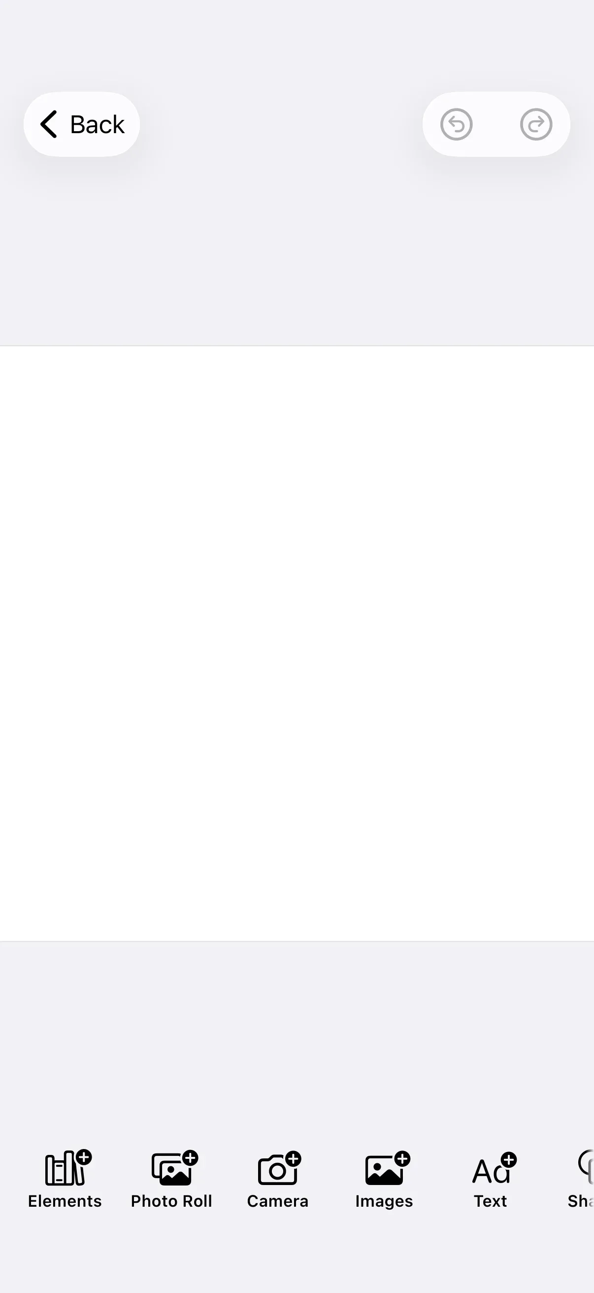
The dock gives users quick access to content libraries (images, text, shapes, stickers) and editing tools (resize, crop, adjustments). You configure it on the EditorConfiguration builder’s dock property — the same place you configure the navigation bar, inspector bar, and canvas menu. The Configuration guide covers how EditorConfiguration and EngineSettings set up the editor as a whole.
The example wraps the editor in GuideEditorConfiguration, a small helper class the iOS guides repository ships as a minimal baseline. Substitute your own editor configuration class — the dock builder is available on every configuration, so the rest of the call stays the same.
Dock Architecture#
The dock displays horizontally at the bottom of the editor and is always present regardless of what is selected on the canvas. Its contents come entirely from configuration.
Key types:
Dock.Item— The protocol every dock entry conforms to (id,body,isVisible).Dock.Button— The built-in button implementation, with an action plus a label and icon.Dock.Context— Passed to each item closure. It exposes theengine, theeventHandler, and the configuredassetLibrary. Unlike the canvas menu and inspector bar, the dock is selection-independent, so its context carries no selection.- Custom items — Any type that conforms to
Dock.Itemto render fully custom UI.
Configuration#
Configure the dock on the editor configuration builder’s dock property — builder.dock { dock in … } inside the imgly.configuration closure. Two methods drive the configuration:
dock.items— Sets the complete list of dock items and their order. This is a setter: it replaces whatever was there before, so include every button you want to appear.dock.modify— Adjusts an existing list by adding, replacing, or removing specific items without rebuilding the whole configuration.
GuideEditorConfiguration ships an empty dock, so dock.items is the entry point for these examples. dock.modify then operates on the list you declared (or on the defaults a starter kit provides).
Declaring the Item List#
Pass dock.items a closure that returns the items in display order. The dock starts empty on GuideEditorConfiguration, so this declares the full list. Each item appears only while its isVisible(_:) returns true.
Editor(settings) .imgly.configuration { GuideEditorConfiguration { builder in builder.dock { dock in dock.items { _ in Dock.Buttons.elementsLibrary() Dock.Buttons.photoRoll() Dock.Buttons.systemCamera() Dock.Buttons.imagesLibrary() Dock.Buttons.textLibrary() Dock.Buttons.shapesLibrary() Dock.Buttons.stickersLibrary() Dock.Buttons.resize() } } } }Because dock.items replaces the entire list, you reorder by changing the order of the factory calls — what you write is exactly what renders, in that order.
Permissions for Device Capabilities#
Some dock buttons reach a device capability that iOS gates behind a privacy prompt. The list above includes Dock.Buttons.systemCamera(), which opens the camera. Add NSCameraUsageDescription to your app’s Info.plist, or iOS terminates the app the first time the button is used.
<key>NSCameraUsageDescription</key><string>Capture photos and videos to add to your design.</string>Dock.Buttons.photoRoll() uses the system photo picker, which runs out of process and needs no photo-library key. The voiceover button (Dock.Buttons.voiceover()) records audio, so add NSMicrophoneUsageDescription if you include it.
Modify Dock Items#
Use dock.modify to adjust an existing list — the one declared with dock.items above, or a starter kit’s defaults — without rebuilding it. The closure receives the Dock.Context and a mutable items collection:
dock.modify { _, items inThe items collection supports six operations. addFirst prepends new items:
items.addFirst { Dock.Button(id: "my.package.dock.button.first") { _ in print("First Button action") } label: { _ in Label("First Button", systemImage: "arrow.backward.circle") }}addLast appends new items:
items.addLast { Dock.Button(id: "my.package.dock.button.last") { _ in print("Last Button action") } label: { _ in Label("Last Button", systemImage: "arrow.forward.circle") }}addAfter inserts new items right after the item with the given id:
items.addAfter(id: Dock.Buttons.ID.photoRoll) { Dock.Button(id: "my.package.dock.button.afterPhotoRoll") { _ in print("After Photo Roll action") } label: { _ in Label("After Photo Roll", systemImage: "arrow.forward.square") }}addBefore inserts new items right before the item with the given id:
items.addBefore(id: Dock.Buttons.ID.systemCamera) { Dock.Button(id: "my.package.dock.button.beforeSystemCamera") { _ in print("Before Camera action") } label: { _ in Label("Before Camera", systemImage: "arrow.backward.square") }}replace swaps the item with the given id for new items:
items.replace(id: Dock.Buttons.ID.textLibrary) { Dock.Button(id: "my.package.dock.button.replacedTextLibrary") { _ in print("Replaced Text action") } label: { _ in Label("Replaced Text", systemImage: "arrow.uturn.down.square") }}remove deletes the item with the given id:
items.remove(id: Dock.Buttons.ID.shapesLibrary)Target existing items by their Dock.Buttons.ID constants. An id-based operation (addAfter, addBefore, replace, remove) throws an error when no item with that id is present at the time the modifications are applied, so every id you reference must exist in the list.
Dock.Item Configuration#
Every dock item conforms to Dock.Item, and its id must be unique (a requirement of the underlying SwiftUI ForEach). There are several ways to define an item, shown here in increasing order of complexity. Each item type below goes inside the dock.items { _ in … } closure shown above (or a dock.modify block); the snippets isolate one item at a time to focus on how it’s built.
Use Predefined Buttons#
The simplest option is a predefined button from the Dock.Buttons namespace. The full list is below.
Dock.Buttons.elementsLibrary()Customize Predefined Buttons#
Every parameter of a predefined button has a default, so you can override only the ones you need to fine-tune its behavior and appearance:
Dock.Buttons.imagesLibrary( action: { context in context.eventHandler.send(.openSheet(type: .libraryAdd { context.assetLibrary.imagesTab })) }, title: { _ in Text("Image") }, icon: { _ in Image.imgly.addImage }, isEnabled: { _ in true }, isVisible: { _ in true },)action— The work performed when the button is triggered. Here the event handler opens a library sheet with the Asset Library’s images tab.title— The labelView. This example replaces the wording with a customText. Don’t encode visibility here — useisVisibleinstead.icon— The iconView. Use any custom icon, a system image, or one of the icons in theImage.imglynamespace. Don’t encode visibility here either.isEnabled— Whether the button is interactive.isVisible— Whether the button is shown. Prefer this over hiding the button through an emptytitleoricon.
Create New Buttons#
When no predefined button fits, build your own with Dock.Button:
Dock.Button( id: "my.package.dock.button.newButton",) { _ in print("New Button action")} label: { _ in Label("New Button", systemImage: "star.circle")} isEnabled: { _ in true} isVisible: { _ in true}id— The unique id of the button (required).action— The work performed when the button is triggered (required).label— AViewdescribing the button’s action (required). Don’t encode visibility here — useisVisible.isEnabled— Whether the button is interactive. Defaults totrue.isVisible— Whether the button is shown. Defaults totrue.
Create Custom Items#
For full control over rendering, conform a type to the Dock.Item protocol and provide your own body:
private struct CustomDockItem: Dock.Item {  var id: EditorComponentID {    "my.package.dock.newCustomItem"  }
  func body(_ context: Dock.Context) throws -> some View {    ZStack {      RoundedRectangle(cornerRadius: 10)        .fill(.conicGradient(colors: [.red, .yellow, .green, .cyan, .blue, .purple, .red], center: .center))      Text("New Custom Item")        .padding(4)    }    .onTapGesture {      print("New Custom Item action")    }  }
  func isVisible(_ context: Dock.Context) throws -> Bool {    true  }}
Then add it to the dock like any other item:
CustomDockItem()var id: EditorComponentID { get }— The unique id of the item (required).func body(_: Dock.Context) throws -> some View— The item’s view (required). Don’t encode visibility here — useisVisible.func isVisible(_: Dock.Context) throws -> Bool— Whether the item is shown. Defaults totrue.
List of Available Dock Buttons#
Predefined buttons are static factory functions in the Dock.Buttons namespace. Each returns a Dock.Item with default parameters you can customize as shown in Customize Predefined Buttons. Target them in dock.modify operations with the matching Dock.Buttons.ID constant.
| Button | ID | Description |
|---|---|---|
Dock.Buttons.elementsLibrary |
Dock.Buttons.ID.elementsLibrary |
Opens the elements library. The content is sourced from the Asset Library. |
Dock.Buttons.imagesLibrary |
Dock.Buttons.ID.imagesLibrary |
Opens the images library. |
Dock.Buttons.textLibrary |
Dock.Buttons.ID.textLibrary |
Opens the text library. |
Dock.Buttons.shapesLibrary |
Dock.Buttons.ID.shapesLibrary |
Opens the shapes library. |
Dock.Buttons.stickersLibrary |
Dock.Buttons.ID.stickersLibrary |
Opens the stickers library. |
Dock.Buttons.overlaysLibrary |
Dock.Buttons.ID.overlaysLibrary |
Opens the overlays library. |
Dock.Buttons.stickersAndShapesLibrary |
Dock.Buttons.ID.stickersAndShapesLibrary |
Opens the combined stickers and shapes library. |
Dock.Buttons.audioLibrary |
Dock.Buttons.ID.audioLibrary |
Opens the audio library. |
Dock.Buttons.assetLibrary |
Dock.Buttons.ID.assetLibrary |
Opens the full asset library. |
Dock.Buttons.photoRoll |
Dock.Buttons.ID.photoRoll |
Adds media from the photo roll. |
Dock.Buttons.systemCamera |
Dock.Buttons.ID.systemCamera |
Captures media with the system camera. |
Dock.Buttons.imglyCamera |
Dock.Buttons.ID.imglyCamera |
Captures media with the IMG.LY camera. |
Dock.Buttons.voiceover |
Dock.Buttons.ID.voiceover |
Opens the voiceover recording sheet. |
Dock.Buttons.captions |
Dock.Buttons.ID.captions |
Opens the captions sheet. Intended for video scenes. |
Dock.Buttons.reorder |
Dock.Buttons.ID.reorder |
Opens the reorder sheet. Shown only when the background track holds more than one clip. |
Dock.Buttons.adjustments |
Dock.Buttons.ID.adjustments |
Opens the adjustments sheet. |
Dock.Buttons.filter |
Dock.Buttons.ID.filter |
Opens the filter sheet. |
Dock.Buttons.effect |
Dock.Buttons.ID.effect |
Opens the effect sheet. |
Dock.Buttons.blur |
Dock.Buttons.ID.blur |
Opens the blur sheet. |
Dock.Buttons.crop |
Dock.Buttons.ID.crop |
Opens the crop sheet. |
Dock.Buttons.resize |
Dock.Buttons.ID.resize |
Opens the resize sheet. |
The editing buttons (adjustments, filter, effect, blur, crop) hide themselves by default when the matching capability is not allowed on the current page, so they appear only where the corresponding edit is permitted.
API Reference#
| Method | Purpose |
|---|---|
builder.dock { dock in … } |
Enter dock configuration on the editor configuration builder. |
dock.items { context in … } |
Set the complete item list (replaces any existing items). |
dock.modify { context, items in … } |
Adjust an existing item list with addFirst/addLast/addAfter/addBefore/replace/remove. |
Dock.Buttons.imagesLibrary() (and siblings) |
Predefined library and editing buttons. |
Dock.Button(id:action:label:) |
A custom button with an action, label, and optional isEnabled/isVisible. |
Dock.Buttons.ID.textLibrary (and siblings) |
ID constants used to target items in dock.modify. |
Dock.Item |
The protocol for fully custom items (id, body, isVisible). |
Next Steps#
- Inspector Bar — Context-sensitive editing controls for the selected block.
- Navigation Bar — Configure the editor’s top bar.
- Canvas Menu — The floating toolbar for the current selection.
- Asset Library — The sources behind the dock’s library buttons.