Control which features are available to your users by disabling, enabling, or conditionally toggling the editor’s components.
Overview#
CE.SDK controls feature availability directly on each editor component — the dock, navigation bar, inspector bar, and canvas menu. Every button and item accepts an isEnabled and an isVisible closure that runs with the component’s Context, so you can toggle features statically or react to the current selection and conditions in your own app.
| Goal | API | Effect |
|---|---|---|
| Disable a feature | isEnabled: { _ in false } |
Control stays visible but greyed out and inactive |
| Conditionally enable a feature | isEnabled: { context in ... } |
Active only when the closure returns true |
| Show or hide a feature | isVisible: { context in ... } |
Removed from the layout when the closure returns false |
| Define which features exist | [component].items { _ in ... } |
Sets the component’s full item set |
isEnabled defaults to { _ in true } for nearly every button, so a feature is active unless you say otherwise. Default isVisible closures vary: dock buttons are usually always visible, while many canvas menu and inspector bar buttons gate visibility on scopes or the current selection. Because supplying an override replaces the default rather than extending it, check the factory default before overriding — and reproduce it in your override when it carries logic you want to keep. To remove features entirely rather than toggle them, see Hide Elements.
Disable a Feature#
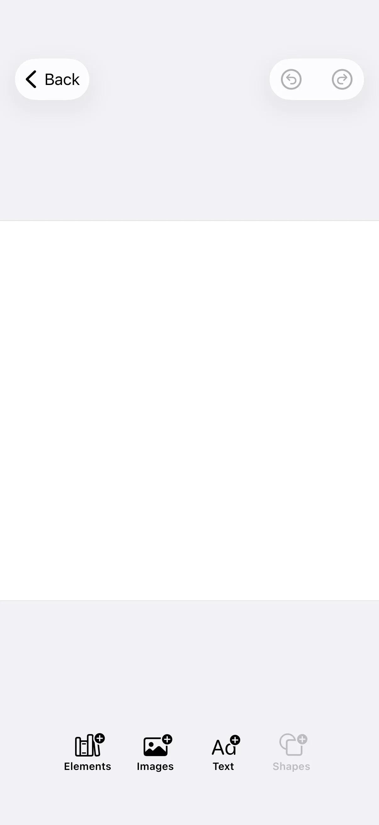
Pass isEnabled: { _ in false } to a component’s button factory to keep the control on screen while making it inactive. The dock.items closure sets the dock’s full button list, so include every button you want and mark the disabled one. If your configuration already populates the dock, use dock.modify to disable a single button without redefining the rest:
var editorWithDisabledFeature: some View { Editor(settings) .imgly.configuration { GuideEditorConfiguration { builder in builder.dock { dock in dock.items { _ in Dock.Buttons.elementsLibrary() Dock.Buttons.imagesLibrary() Dock.Buttons.textLibrary() // Visible but greyed out and non-interactive. Dock.Buttons.shapesLibrary(isEnabled: { _ in false }) } } } }}Conditionally Enable from Selection#
The inspector bar and canvas menu appear only while a block is selected, so their Context exposes a selection describing that block. Gate isEnabled on the selection’s type, kind, or fillType rather than on whether anything is selected. Here the canvas menu’s duplicate button is active only for text blocks:
var editorWithConditionalEnable: some View { Editor(settings) .imgly.configuration { GuideEditorConfiguration { builder in builder.canvasMenu { canvasMenu in canvasMenu.items { _ in // Enabled only when the selected block is a text block. CanvasMenu.Buttons.duplicate(isEnabled: { context in context.selection.type == .text }) CanvasMenu.Buttons.delete() } } } }}The selection is the single selected block, not a list. Its properties let you tailor each feature to the block at hand:
| Property | Type | Description |
|---|---|---|
block |
DesignBlockID |
The selected block |
type |
DesignBlockType? |
The block’s type, such as .text or .graphic |
fillType |
FillType? |
The block’s fill type, such as .image or .color |
kind |
String? |
The block’s kind, such as "sticker" |
parentBlock |
DesignBlockID? |
The block’s parent |
Show or Hide from Selection#
isVisible removes a control from the layout when its closure returns false. Many predefined buttons already encode logic in their default isVisible — CanvasMenu.Buttons.delete is visible only when the block’s lifecycle/destroy scope is allowed. Since an override replaces that default, reproduce the factory’s scope check and add your own condition on top, rather than discarding the built-in check. Here the delete button keeps its scope check and is additionally hidden for text blocks:
var editorWithConditionalVisibility: some View { Editor(settings) .imgly.configuration { GuideEditorConfiguration { builder in builder.canvasMenu { canvasMenu in canvasMenu.items { _ in CanvasMenu.Buttons.delete(isVisible: { context in try context.engine.block.isAllowedByScope(context.selection.block, key: "lifecycle/destroy") && context.selection.type != .text }) CanvasMenu.Buttons.duplicate() } } } }}Gate on App Conditions#
The closures run with your view in scope, so a feature can react to your app’s own conditions, such as a setting or a feature flag, not just the engine selection. Here the stickers library button is enabled only when your app’s stickersEnabled flag is on:
var editorWithAppStateGate: some View { // In a real app, derive this from your settings, feature flags, or workflow mode. let stickersEnabled = false return Editor(settings) .imgly.configuration { GuideEditorConfiguration { builder in builder.dock { dock in dock.items { _ in Dock.Buttons.elementsLibrary() Dock.Buttons.imagesLibrary() Dock.Buttons.stickersLibrary(isEnabled: { _ in stickersEnabled }) } } } }}For user permissions, prefer CE.SDK’s built-in role and scope system over gating buttons by hand. Switch the editor to the Adopter role with engine.editor.setRole(_:) and restrict capabilities with engine.editor.setGlobalScope(key:value:); controls tied to a restricted capability, like delete or crop, enforce it automatically — so one change applies wherever that capability appears.
Context Properties#
Each component’s Context provides the engine plus the data relevant to that surface. Knowing what’s available tells you which conditions a feature can react to:
| Component | engine |
selection |
state |
|---|---|---|---|
| Dock | Yes | — | — |
| Navigation Bar | Optional | — | Yes |
| Inspector Bar | Yes | Yes | — |
| Canvas Menu | Yes | Yes | — |
Only the inspector bar and canvas menu expose selection, because only they are presented for a selected block. The navigation bar exposes the editor’s state instead, and its engine is optional because the bar can render before the editor’s onCreate callback runs.
Next Steps#
- Hide Elements - Remove items entirely instead of disabling them
- Canvas Menu - Customize the canvas context menu
- Inspector Bar - Customize the inspector bar
- Navigation Bar - Customize navigation bar buttons