Pin every CE.SDK color picker to a set of brand-approved swatches so fills, strokes, and text color all draw from the same palette your team controls.
The editor’s color palette is one of several knobs you can configure on EditorConfiguration.Builder — alongside the dock, inspector bar, navigation bar, and theme. Setting a custom palette gives users a curated list of brand colors everywhere CE.SDK surfaces a color picker, instead of the generic seven defaults.
The example wraps the editor in GuideEditorConfiguration, a small helper class the iOS guides repository ships as a minimal baseline. Substitute your own editor configuration class — the colorPalette(_:) builder method is exposed on every configuration, so the rest of the call stays the same.
Defining the Brand Palette#
The palette is an array of NamedColor values. Each entry pairs an accessibility name — used as the VoiceOver label for the swatch — with the CGColor displayed in the picker. Define the array somewhere your editor configuration can reach it; the example uses a static let on the SwiftUI view.
static let palette: [NamedColor] = [ .init("Blue", .imgly.blue), .init("Green", .imgly.green), .init("Yellow", .imgly.yellow), .init("Red", .imgly.red), .init("Black", .imgly.black), .init("White", .imgly.white), .init("Gray", .imgly.gray),]Provide exactly seven entries. How many swatches actually render depends on the picker:
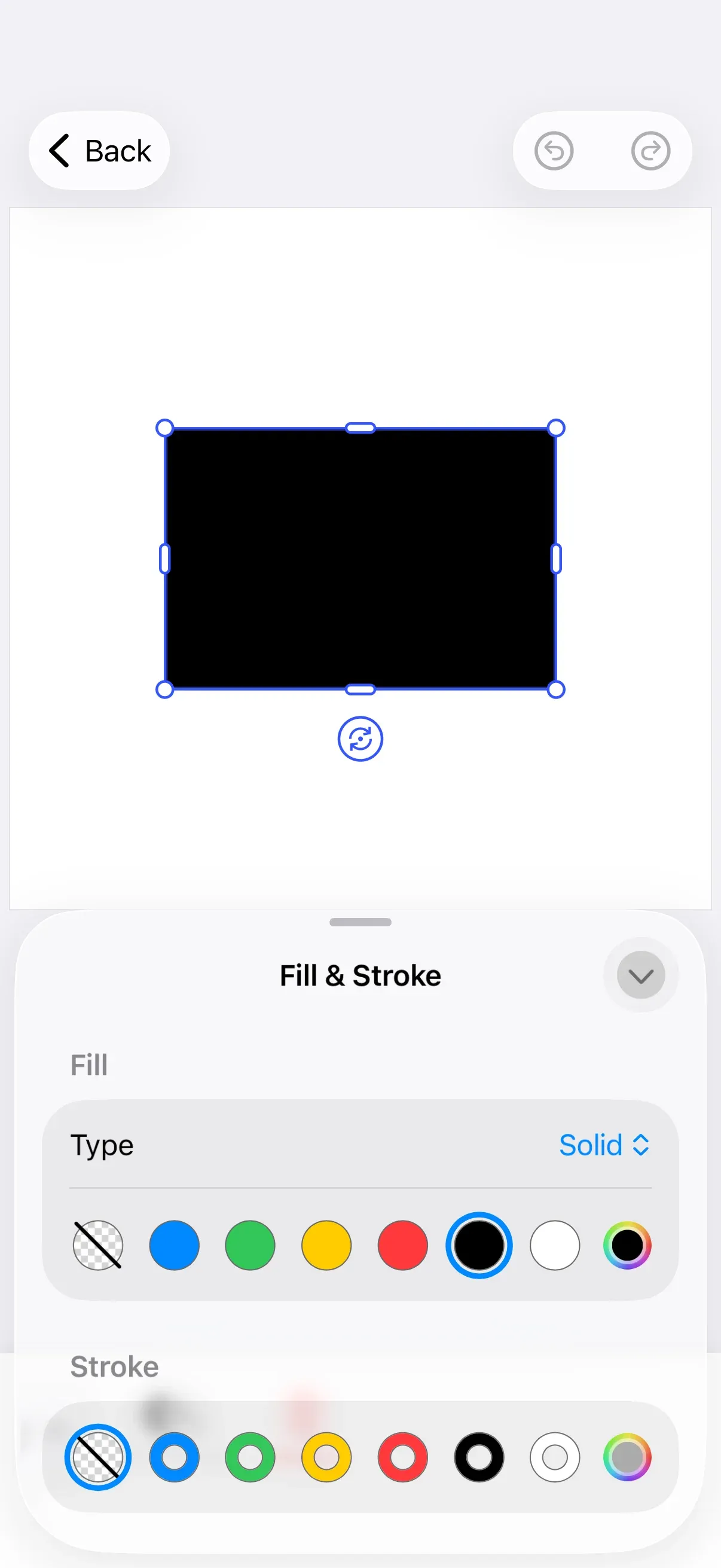
- Six swatches appear in pickers that support a “no color” state (Fill, Stroke, and similar controls that can be disabled). The seventh slot is taken by a
No Colorbutton, so only the first six entries from your palette are drawn — the hero above shows this layout. - Seven swatches appear in pickers that always require a color (for example, Text Color), where no
No Colorbutton is shown.
Order the array so the most important brand colors come first. Entries past the sixth position only surface in pickers that always require a color.
The example uses the IMG.LY system colors (.imgly.blue, .imgly.green, .imgly.yellow, .imgly.red, .imgly.black, .imgly.white, .imgly.gray). Any CGColor works — substitute your brand colors directly, build them with CGColor.imgly.hex(_:), or convert from a UIColor via cgColor.
Applying the Palette via the Editor Configuration#
Pass the array to builder.colorPalette(_:) inside the editor configuration closure. The new colors take effect in every CE.SDK color-aware control — Fill, Stroke, Text Color, and similar pickers — the moment the editor mounts.
Editor(settings) .imgly.configuration { GuideEditorConfiguration { builder in builder.colorPalette(Self.palette) } }The palette is not exposed back to app code, so custom UI you build alongside the editor should reference your own NamedColor array directly instead of trying to read the configured palette from the SDK.
If you’d rather keep the default IMG.LY colors visible, omit the colorPalette(_:) call — CE.SDK falls back to its built-in palette when none is configured.
API Reference#
| Symbol | Description |
|---|---|
EditorConfiguration.Builder.colorPalette(_:) |
Sets the palette of NamedColor values used by CE.SDK’s built-in color pickers. |
NamedColor(_:_:) |
Pairs a VoiceOver accessibility name (LocalizedStringResource) with a CGColor. |
CGColor.imgly.* |
IMG.LY-defined system colors (blue, green, yellow, red, black, white, gray). |
CGColor.imgly.hex(_:) |
Builds a CGColor from a hexadecimal string (e.g. "#1A73E8"). |
Next Steps#
- Color Basics — Review CE.SDK’s color spaces and where they apply
- Apply Colors — Set fills, strokes, and text color programmatically
- Theming — Customize the editor’s appearance and color tokens
- Dock — Configure the editor’s primary navigation
- Inspector Bar — Tailor which controls appear when a block is selected