The canvas menu is the floating toolbar that appears next to a selected design block. Declare its items from scratch for exact control, or adjust a list you already declared.
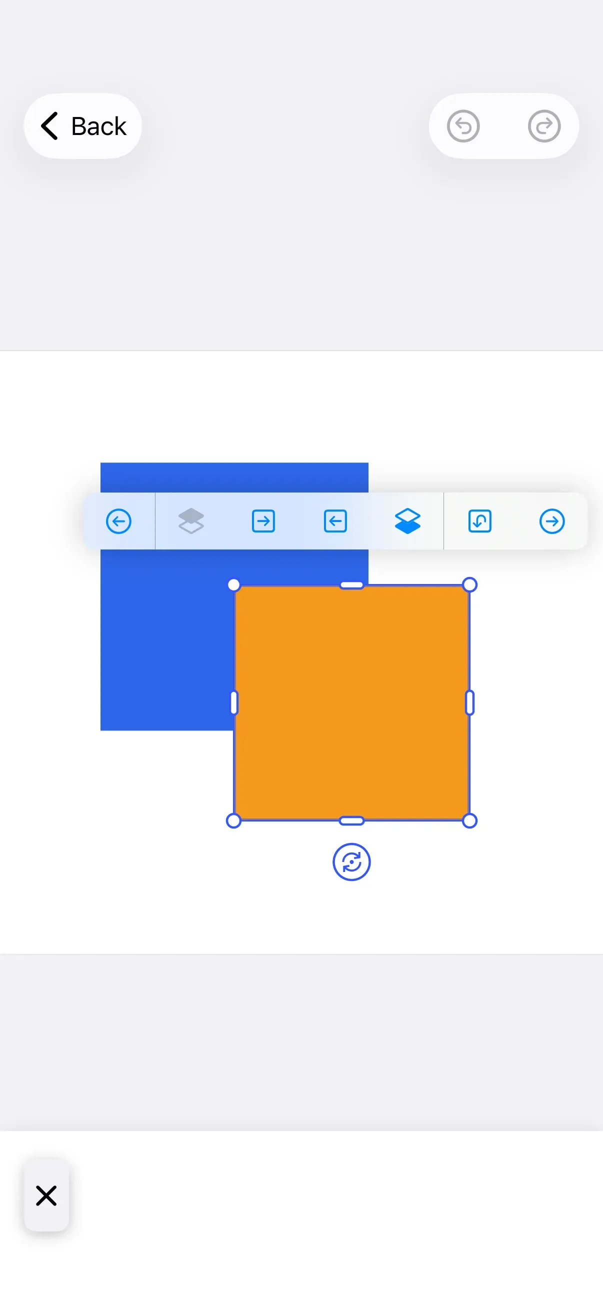
Canvas Menu Architecture#
The canvas menu is a floating toolbar that the editor positions next to the currently selected design block, surfacing quick actions like duplicate, delete, and layer reordering without leaving the canvas.
You assemble it from a small set of types:
CanvasMenu.Item— the protocol every menu entry conforms to. Buttons, dividers, and your own custom views are all items.CanvasMenu.Button— a button entry. Use the predefined factories (CanvasMenu.Buttons.duplicate(), …) or construct one with a custom action and label.CanvasMenu.Divider— a visual separator. Adjacent dividers collapse into one, and a leading or trailing divider is dropped automatically.CanvasMenu.Context— passed to every closure. Its cachedselectionexposes the selectedblock, itstype,fillType, andkind. Prefer reading fromselectionover querying the engine directly, since it stays stable for the menu’s presentation lifecycle, including its appear and disappear animations.
Configuration#
The canvas menu is part of the editor configuration. Enter it through builder.canvasMenu { canvasMenu in … } and choose one of two approaches:
| Approach | Modifier | Best for |
|---|---|---|
| Replacement | canvasMenu.items |
Declaring the exact set of items and their order — version-safe |
| Modification | canvasMenu.modify |
Adding to, replacing, or removing entries from a list you already declared |
The example builds on GuideEditorConfiguration, a small helper class the iOS guides repository ships as a minimal baseline. Substitute your own editor configuration — the canvasMenu builder is exposed on every configuration, so the rest of the call stays the same. Because this baseline starts with an empty canvas menu, canvasMenu.items is the primary path; canvasMenu.modify then adjusts the list that items established.
The Configuration guide covers how EditorConfiguration and EngineSettings set up the editor as a whole; this guide focuses on the canvas menu surface within it.
Declaring the Item List#
Use canvasMenu.items to declare the full list from scratch. The closure returns the items in display order, and the list you return is the complete menu — include every entry you want, since this call replaces the canvas menu’s contents rather than adding to them.
canvasMenu.items { _ in CanvasMenu.Buttons.selectGroup() CanvasMenu.Divider() CanvasMenu.Buttons.bringForward() CanvasMenu.Buttons.sendBackward() CanvasMenu.Divider() CanvasMenu.Buttons.duplicate() CanvasMenu.Buttons.delete()}- The closure receives a
CanvasMenu.Contextcarrying the currentselection. CanvasMenu.Divider()groups related actions; adjacent and dangling dividers are removed automatically.- Because you spell out the entire list, item order is guaranteed across editor versions.
Modify Canvas Menu Items#
Use canvasMenu.modify to adjust the list you declared with canvasMenu.items without redefining it. The modifier exposes six positional operations:
canvasMenu.modify { _, items in| Operation | Purpose |
|---|---|
items.addFirst(_:) |
Prepend at the beginning |
items.addLast(_:) |
Append at the end |
items.addBefore(id:_:) |
Insert before a specific item |
items.addAfter(id:_:) |
Insert after a specific item |
items.replace(id:_:) |
Replace an existing item |
items.remove(id:) |
Remove an item by ID |
Add items at the start or end:
items.addFirst { CanvasMenu.Button(id: "my.package.canvasMenu.button.first") { _ in print("First Button action") } label: { _ in Label("First Button", systemImage: "arrow.backward.circle") }}items.addLast { CanvasMenu.Button(id: "my.package.canvasMenu.button.last") { _ in print("Last Button action") } label: { _ in Label("Last Button", systemImage: "arrow.forward.circle") }}Position items relative to existing ones using their ID constants:
items.addAfter(id: CanvasMenu.Buttons.ID.bringForward) { CanvasMenu.Button(id: "my.package.canvasMenu.button.afterBringForward") { _ in print("After Bring Forward action") } label: { _ in Label("After Bring Forward", systemImage: "arrow.forward.square") }}items.addBefore(id: CanvasMenu.Buttons.ID.sendBackward) { CanvasMenu.Button(id: "my.package.canvasMenu.button.beforeSendBackward") { _ in print("Before Send Backward action") } label: { _ in Label("Before Send Backward", systemImage: "arrow.backward.square") }}Replace or remove items:
items.replace(id: CanvasMenu.Buttons.ID.duplicate) { CanvasMenu.Button(id: "my.package.canvasMenu.button.replacedDuplicate") { _ in print("Replaced Duplicate action") } label: { _ in Label("Replaced Duplicate", systemImage: "arrow.uturn.down.square") }}items.remove(id: CanvasMenu.Buttons.ID.delete)CanvasMenu.Item Configuration#
Items range from predefined buttons to fully custom views.
Predefined Buttons#
CE.SDK ships factory functions for the common canvas actions. Each returns a CanvasMenu.Item with sensible defaults:
CanvasMenu.Buttons.duplicate()| Button | ID constant |
|---|---|
CanvasMenu.Buttons.bringForward() |
CanvasMenu.Buttons.ID.bringForward |
CanvasMenu.Buttons.sendBackward() |
CanvasMenu.Buttons.ID.sendBackward |
CanvasMenu.Buttons.duplicate() |
CanvasMenu.Buttons.ID.duplicate |
CanvasMenu.Buttons.delete() |
CanvasMenu.Buttons.ID.delete |
CanvasMenu.Buttons.selectGroup() |
CanvasMenu.Buttons.ID.selectGroup |
Customize Predefined Buttons#
Each factory accepts optional action, label, isEnabled, and isVisible closures. Supplying any one of them replaces the factory default, so reproduce the behavior you want to keep. The example overrides all four on the delete button while preserving its defaults: it rebuilds the localized title with Text(.imgly.localized("ly_img_editor_canvas_menu_button_delete")), keeps the Image.imgly.delete icon, and reproduces the default lifecycle/destroy scope check in isVisible so the button still hides when deletion isn’t permitted.
CanvasMenu.Buttons.delete( action: { context in context.eventHandler.send(.deleteSelection) }, label: { _ in Label { Text(.imgly.localized("ly_img_editor_canvas_menu_button_delete")) } icon: { Image.imgly.delete } }, isEnabled: { _ in true }, isVisible: { context in try context.engine.block.isAllowedByScope(context.selection.block, key: "lifecycle/destroy") },)Create New Buttons#
When the predefined buttons don’t cover your action, construct a CanvasMenu.Button with a unique ID in reverse-domain notation, an action, and a label. isEnabled and isVisible are optional and default to always-true:
CanvasMenu.Button( id: "my.package.canvasMenu.button.newButton",) { _ in print("New Button action")} label: { _ in Label("New Button", systemImage: "star.circle")} isEnabled: { _ in true} isVisible: { _ in true}Dividers#
Insert CanvasMenu.Divider() between groups of related actions. Adjacent dividers collapse into a single line, and a divider left dangling at the start or end of the list (because the items around it are hidden) is removed. See the Declaring the Item List example for placement.
Create Custom Items#
For full control over rendering, conform a type to CanvasMenu.Item. Provide a unique id, a body that returns your view, and an isVisible predicate:
private struct CustomCanvasMenuItem: CanvasMenu.Item {  var id: EditorComponentID {    "my.package.canvasMenu.newCustomItem"  }
  func body(_ context: CanvasMenu.Context) throws -> some View {    ZStack {      RoundedRectangle(cornerRadius: 10)        .fill(.conicGradient(colors: [.red, .yellow, .green, .cyan, .blue, .purple, .red], center: .center))      Text("New Custom Item")        .padding(4)    }    .onTapGesture {      print("New Custom Item action")    }  }
  func isVisible(_ context: CanvasMenu.Context) throws -> Bool {    true  }}
Then place the custom item in the list like any other entry:
CustomCanvasMenuItem()List of Available Canvas Menu Buttons#
The predefined buttons live in the CanvasMenu.Buttons namespace. Each returns a button whose default isVisible already gates it to the situations where the action makes sense.
| Button | ID constant | Default visibility |
|---|---|---|
CanvasMenu.Buttons.bringForward() |
.bringForward |
When the selected block can be reordered. Audio and captions have no z-order, so they never show it |
CanvasMenu.Buttons.sendBackward() |
.sendBackward |
When the selected block can be reordered. Audio and captions have no z-order, so they never show it |
CanvasMenu.Buttons.duplicate() |
.duplicate |
When the block’s lifecycle/duplicate scope is allowed, except for captions |
CanvasMenu.Buttons.delete() |
.delete |
When the block’s lifecycle/destroy scope is allowed |
CanvasMenu.Buttons.selectGroup() |
.selectGroup |
When the block belongs to a group |
API Reference#
| Symbol | Category | Purpose |
|---|---|---|
builder.canvasMenu { canvasMenu in … } |
Config | Enter canvas menu configuration |
canvasMenu.items { context in … } |
Config | Declare the full item list (replaces the contents) |
canvasMenu.modify { context, items in … } |
Config | Adjust an existing item list in place |
CanvasMenu.Buttons.duplicate() (and siblings) |
Item | Predefined buttons |
CanvasMenu.Button(id:action:label:) |
Item | Custom button |
CanvasMenu.Divider() |
Layout | Separator (collapses when adjacent or dangling) |
CanvasMenu.Buttons.ID.duplicate (and siblings) |
Item | ID constant used to target modify operations |
CanvasMenu.Context.selection |
Context | Cached selection (block, type, fillType, kind) |
CanvasMenu.Item |
Item | Protocol for fully custom items (id, body, isVisible) |
Next Steps#
- Dock — The bottom toolbar that opens asset libraries and sheets.
- Inspector Bar — Context-sensitive controls for the selected block.
- Navigation Bar — The top bar with close, undo, and redo.
- Asset Library — The sources shared across editor components.