Replace the icons used throughout the CE.SDK editor with SF Symbols, asset catalog images, or any SwiftUI view.
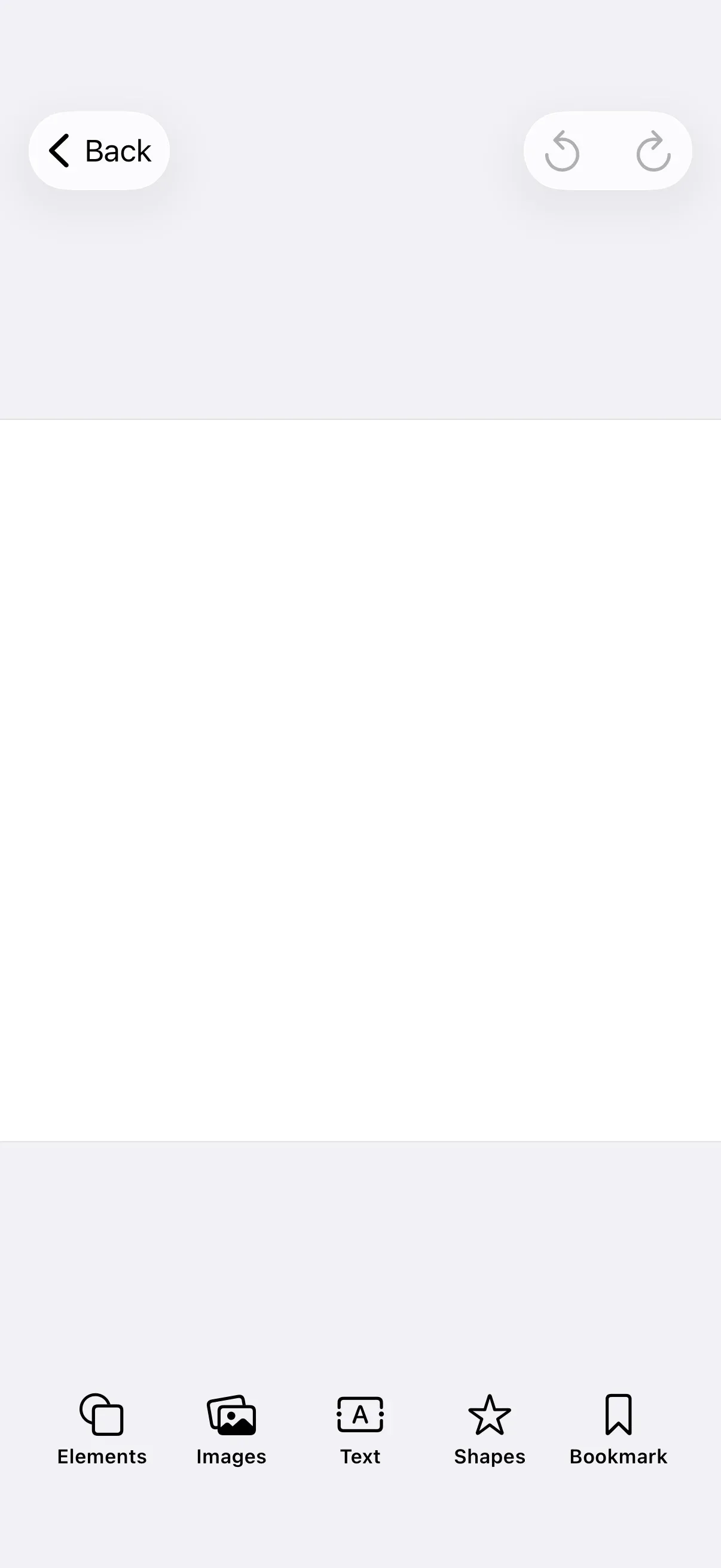
How Icons Work#
Every button factory in CE.SDK — Dock.Buttons.*, NavigationBar.Buttons.*, InspectorBar.Buttons.*, CanvasMenu.Buttons.* — accepts an icon: (or label:) closure that returns a SwiftUI View. The default icons live on the Image.imgly namespace (for example, Image.imgly.crop, Image.imgly.export). You replace any default by passing your own Image:
| Source | Initializer | When to use |
|---|---|---|
| SF Symbol | Image(systemName: "crop") |
Built-in iOS symbols that match the system style and respect Dynamic Type |
| Asset catalog | Image("MyBrandIcon") |
PDF or PNG assets you’ve added to your app’s asset catalog |
| Built-in CE.SDK icon | Image.imgly.crop |
Default icon set shipped with the editor (use as a starting point or in custom components) |
Because the parameter accepts any View, you can also return composed SwiftUI hierarchies (an Image stacked with a badge, for example) when a single glyph isn’t enough.
Customizing Dock Icons#
Dock.Buttons.* factories expose title: and icon: as separate parameters, so you can override one without rewriting the other. The example below defines the dock items and passes a custom icon: closure to each builder:
builder.dock { dock in dock.items { _ in Dock.Buttons.elementsLibrary(icon: { _ in Image(systemName: "square.on.circle") }) Dock.Buttons.imagesLibrary(icon: { _ in Image(systemName: "photo.on.rectangle.angled") }) Dock.Buttons.textLibrary(icon: { _ in Image(systemName: "character.textbox") }) Dock.Buttons.shapesLibrary(icon: { _ in Image(systemName: "star") }) }}Customizing Navigation Bar Icons#
NavigationBar.Buttons.* factories take a combined label: closure rather than separate title: and icon: parameters. Return a Label { Text(...) } icon: { Image(...) } and apply the .imgly.adaptiveIconOnly label style to keep the icon-only look the editor uses by default:
builder.navigationBar { navigationBar in navigationBar.modify { _, items in items.replace(id: NavigationBar.Buttons.ID.undo) { NavigationBar.Buttons.undo(label: { context in Label { Text("Undo") } icon: { Image(systemName: "arrow.counterclockwise") } .opacity(context.state.viewMode == .preview ? 0 : 1) .labelStyle(.imgly.adaptiveIconOnly) }) } items.replace(id: NavigationBar.Buttons.ID.redo) { NavigationBar.Buttons.redo(label: { context in Label { Text("Redo") } icon: { Image(systemName: "arrow.clockwise") } .opacity(context.state.viewMode == .preview ? 0 : 1) .labelStyle(.imgly.adaptiveIconOnly) }) } }}This example uses items.replace(id:) because the navigation bar already has undo and redo items set by the base GuideEditorConfiguration. items.replace(id:) swaps an existing item with the given ID for a new item — it throws at apply time if the ID isn’t present, so it only fits the “modify a default” case. If you build the navigation bar from scratch with navigationBar.items { _ in ... }, pass your custom label: closure to each button as you construct it.
Customizing Inspector Bar Icons#
InspectorBar.Buttons.* follow the same title: / icon: shape as Dock.Buttons.*:
builder.inspectorBar { inspectorBar in inspectorBar.items { _ in InspectorBar.Buttons.crop(icon: { _ in Image(systemName: "crop") }) InspectorBar.Buttons.adjustments(icon: { _ in Image(systemName: "slider.horizontal.3") }) InspectorBar.Buttons.filter(icon: { _ in Image(systemName: "camera.filters") }) InspectorBar.Buttons.duplicate(icon: { _ in Image(systemName: "plus.square.on.square") }) InspectorBar.Buttons.delete(icon: { _ in Image(systemName: "trash") }) }}Using Icons in Custom Components#
When you add a new button with items.addLast { Dock.Button(...) }, pass any SwiftUI Label (or other View) for the button’s label: parameter. The icon is whatever you put inside that label:
builder.dock { dock in dock.modify { _, items in items.addLast { Dock.Button( id: EditorComponentID("my.app.dock.bookmark"), action: { _ in // Open a custom panel, present a sheet, etc. }, label: { _ in Label { Text("Bookmark") } icon: { Image(systemName: "bookmark") } }, ) } }}The same pattern applies to NavigationBar.Button, InspectorBar.Button, and CanvasMenu.Button — each accepts an arbitrary label closure.
Built-In Icons#
CE.SDK ships a set of icons on the Image.imgly namespace. Use them as defaults when constructing custom buttons, or as a starting point you augment with SwiftUI modifiers (.foregroundColor, .symbolRenderingMode, etc.). The table below summarizes the icons most commonly referenced from guide code:
| Category | Properties |
|---|---|
| Adding content | addElement, addImage, addVideo, addAudio, addText, addShape, addSticker, addAsset |
| Photo Roll & Camera | addPhotoRollBackground, addPhotoRollForeground, addCameraBackground, addCameraForeground, addVoiceover |
| Editing tools | adjustments, filter, effect, blur, volume, clipSpeed, animation, crop, resize, reorder |
| Block actions | duplicate, delete, replace, layer, split, moveAsClip, moveAsOverlay, enterGroup, selectGroup, editText, formatText, shape |
| Navigation & export | undo, redo, export, preview, pages, bringForward, sendBackward |
Reference each entry as Image.imgly.<name> — for example, Image.imgly.crop or Image.imgly.addImage.
API Reference#
| API | Purpose |
|---|---|
Image(systemName: String) |
Reference an SF Symbol by name (see Apple’s SF Symbols app for the full catalog). |
Image(_ name: String) |
Load an image from the app’s asset catalog by name. |
Image.imgly.<name> |
Reference one of CE.SDK’s built-in icons (e.g. Image.imgly.crop). |
Dock.Buttons.imagesLibrary(icon: ...) |
Customize the icon on a default dock button. title: and icon: are independent. |
NavigationBar.Buttons.undo(label: ...) |
Customize the label (icon + text) on a default navigation bar button. |
InspectorBar.Buttons.crop(icon: ...) |
Customize the icon on a default inspector bar button. |
items.replace(id:) |
Swap an existing item with the given ID for a new item. Throws if the ID isn’t present at apply time. |
Dock.Button(id:action:label:) |
Construct a custom dock button. The label view embeds your icon. |
Next Steps#
- Dock — Full dock customization patterns
- Navigation Bar — Navigation bar configuration
- Inspector Bar — Inspector bar configuration
- Add a New Button — Add custom buttons with custom icons to any component
- Theming — Match the editor’s color scheme to your brand