Add AI-powered image generation to your editor so users can create visuals from text prompts or transform existing images.
The AIImageGenerationPlugin adds two integration points to the editor: a dock button for text-to-image generation (creates new image blocks) and an inspector bar button for image-to-image enhancement (transforms selected images). Both connect to the IMG.LY Gateway for AI model access.
This guide builds on the Design Editor Starter Kit. The same plugin works with any editor configuration that hosts a dock and inspector bar.
Prerequisites#
You need an IMG.LY Gateway API key to use image generation. Once you have a key, configure the models it has access to (bfl/flux-2, openai/gpt-image-2, etc.).
Install the Plugin#
Add the IMGLYPluginAIImageGeneration Swift package to your project. The package depends on IMGLYUI and is available via Swift Package Manager:
https://github.com/imgly/IMGLYPluginAIImageGeneration-swiftUse the Plugin#
Import IMGLYEditor and the plugin module in the file where you set up the editor:
import IMGLYEditorimport IMGLYPluginAIImageGenerationRegister the plugin as an EditorConfiguration alongside your editor configuration. Pass your Gateway API key to AIGatewayService:
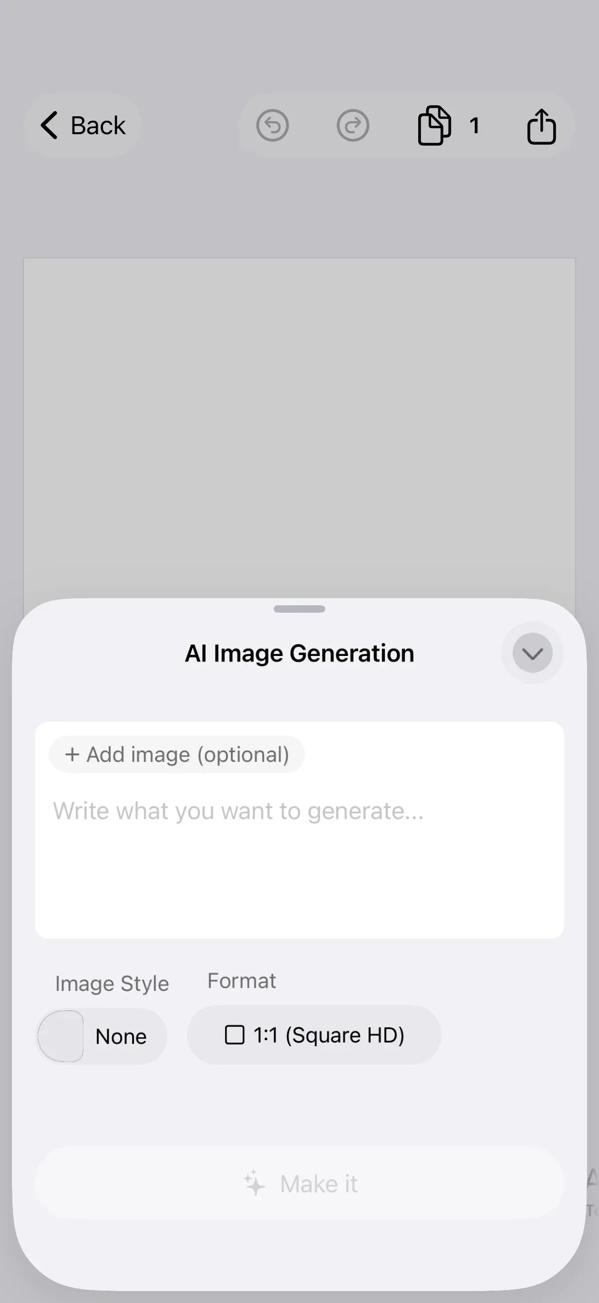
Editor(settings) .imgly.configuration { DesignEditorConfiguration() AIImageGenerationPlugin(options: .init( service: AIGatewayService(apiKey: secrets.gatewayApiKey), )) }The plugin adds a “Generate” button to the dock and an “Edit” button to the inspector bar. Users enter a text prompt, choose a style and format, and the generated image appears on the canvas. The “Edit” button appears only when a compatible image block (non-sticker with an image fill) is selected.
Configure the Plugin#
The following sections show each public configuration option.
Choosing a Model#
AIGatewayService defaults to FLUX.2 (bfl/flux-2). To use GPT Image 2 instead, pass .gptImage2 as the model parameter:
Editor(settings) .imgly.configuration { DesignEditorConfiguration() AIImageGenerationPlugin(options: .init( service: AIGatewayService( apiKey: secrets.gatewayApiKey, model: .gptImage2, ), )) }| Model | Text-to-Image ID | Image-to-Image ID |
|---|---|---|
| FLUX.2 (default) | bfl/flux-2 |
bfl/flux-2-edit |
| GPT Image 2 | openai/gpt-image-2 |
openai/gpt-image-2-edit |
The model your key has access to must match the scopes configured in the IMG.LY Dashboard.
Customizing Styles#
The plugin ships with 14 curated prompt styles (Anime, Cyberpunk, Watercolor, Dark Fantasy, etc.). Each style appends a prompt snippet to the user’s text before sending the request. Pass a custom array to replace the built-in styles:
Editor(settings) .imgly.configuration { DesignEditorConfiguration() AIImageGenerationPlugin(options: .init( service: AIGatewayService(apiKey: secrets.gatewayApiKey), styles: [ PromptStyle( id: "watercolor", displayName: "Watercolor", promptSnippet: "loose watercolor washes, gentle gradients, dreamy storybook feel", ), PromptStyle( id: "cyberpunk", displayName: "Cyberpunk", promptSnippet: "cyberpunk cityscape, glowing neon signage, dark atmosphere", ), ], )) }Each PromptStyle has three fields:
| Property | Purpose |
|---|---|
id |
Stable identifier for the style |
displayName |
Name shown in the style picker |
promptSnippet |
Text appended to the user’s prompt (e.g., “anime cel-shaded, bright pastel palette”) |
To hide the style picker entirely, pass an empty array:
Editor(settings) .imgly.configuration { DesignEditorConfiguration() AIImageGenerationPlugin(options: .init( service: AIGatewayService(apiKey: secrets.gatewayApiKey), styles: [], )) }Handling Errors#
By default, generation errors trigger the editor’s built-in error alert. To keep the editor open and present a custom alert, pass an onError closure:
Editor(settings) .imgly.configuration { DesignEditorConfiguration() AIImageGenerationPlugin(options: .init( service: AIGatewayService(apiKey: secrets.gatewayApiKey), onError: { error in errorMessage = error.localizedDescription }, )) } .alert("Generation Error", isPresented: .constant(errorMessage != nil)) { Button("OK") { errorMessage = nil } } message: { Text(errorMessage ?? "") }Common errors include authentication failures (HTTP 401/403 when the API key is invalid) and generation failures (model-side errors or timeouts).
Customizing Button Placement#
The dock and inspector bar buttons are prepended by default. Use dockModifier and inspectorBarModifier to control placement:
Editor(settings) .imgly.configuration { DesignEditorConfiguration() AIImageGenerationPlugin(options: .init( service: AIGatewayService(apiKey: secrets.gatewayApiKey), dockModifier: { items, button in items.addLast { button } }, inspectorBarModifier: { items, button in items.addLast { button } }, )) }Custom Providers#
AIGatewayService is the default provider, but you can implement the AIImageService protocol to connect to any image generation backend. Your custom service receives an ImageGenerationRequest (prompt, size, style, source image) and returns a GeneratedImage with the result URL.
How Generation Works#
Text-to-image (dock button): The plugin creates a pending block on the canvas, sends the prompt to the Gateway via SSE streaming, and applies the generated image URL to the block when the response completes.
Image-to-image (inspector bar button): The plugin reads the selected image block’s fill URI, uploads local images via a presigned PUT to /v1/uploads, and sends both the prompt and image URL to the Gateway’s image-to-image model.
API Reference#
| API | Purpose |
|---|---|
AIImageGenerationPlugin(options:) |
Register the plugin with an editor configuration |
AIImageService |
Protocol for custom image generation providers |
AIGatewayService(apiKey:model:gatewayURL:) |
Create a Gateway service instance |
AIGatewayImageModel.fluxV2 |
FLUX.2 model family (default) |
AIGatewayImageModel.gptImage2 |
GPT Image 2 model family |
PromptStyle(id:displayName:promptSnippet:thumbnailURL:) |
Define a custom prompt style |
PromptStyle.curated |
Built-in prompt styles (13 styles + None) |
Options.onError |
Custom error handler closure |
Options.dockModifier |
Control dock button placement |
Options.inspectorBarModifier |
Control inspector bar button placement |
Options.styles |
Custom style array (empty array hides the picker) |
Next Steps#
- Dock — Customize dock items and ordering.
- Inspector Bar — Customize inspector bar actions and ordering.
- Design Editor Starter Kit — The editor preset that hosts this plugin.