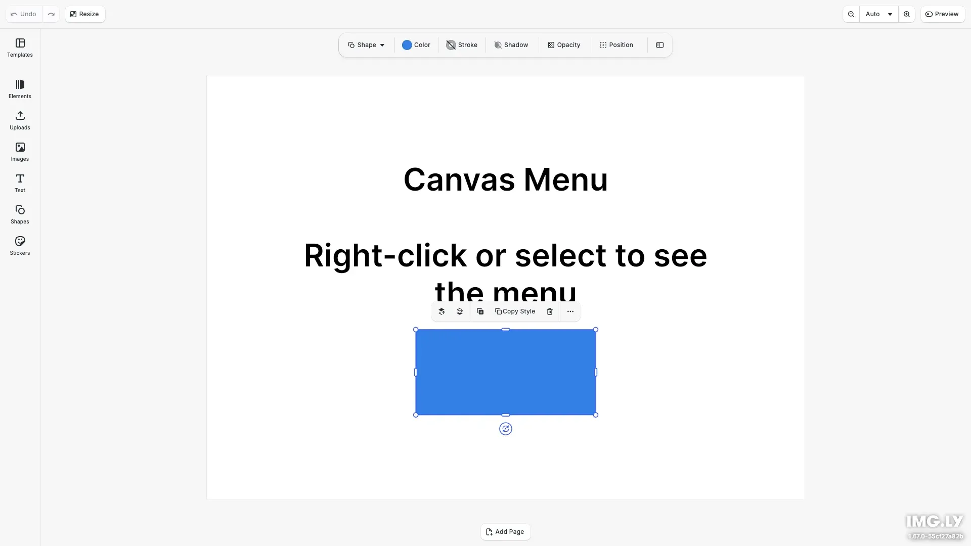
The canvas menu is the floating toolbar that appears when a block is selected on the canvas. This guide covers canvas menu-specific features like edit mode context, custom actions, the options submenu, and how the menu adapts to different block types.

For general component manipulation (reordering, inserting, removing), see the Component Order API Reference.
This guide covers showing and hiding the canvas menu, configuring edit mode-specific menus, adding custom actions, configuring the options submenu, and viewing the default component order.
Show or Hide the Canvas Menu#
Use the Feature API to control canvas menu visibility:
// Hide the canvas menucesdk.feature.disable('ly.img.canvas.menu');
// Show the canvas menu (default)cesdk.feature.enable('ly.img.canvas.menu');
For more on the Feature API, see Show/Hide Components.
Edit Mode Context#
The canvas menu supports different component orders for different edit modes. Use the when option in setComponentOrder to define layouts that activate only in a specific mode. The following example sets a text formatting toolbar for Text edit mode and a simplified action layout for Transform mode.
// Set a custom canvas menu for Text edit modecesdk.ui.setComponentOrder(  { in: 'ly.img.canvas.menu', when: { editMode: 'Text' } },  [    'ly.img.text.color.canvasMenu',    'ly.img.separator',    'ly.img.text.bold.canvasMenu',    'ly.img.text.italic.canvasMenu',    'ly.img.separator',    'ly.img.text.variables.canvasMenu'  ]);
// Set a custom canvas menu for Transform modecesdk.ui.setComponentOrder(  { in: 'ly.img.canvas.menu', when: { editMode: 'Transform' } },  [    'ly.img.text.edit.canvasMenu',    'ly.img.replace.canvasMenu',    'ly.img.separator',    'ly.img.bringForward.canvasMenu',    'ly.img.sendBackward.canvasMenu',    'ly.img.separator',    'ly.img.duplicate.canvasMenu',    'ly.img.delete.canvasMenu',    'ly.img.separator',    'ly.img.options.canvasMenu'  ]);
Available edit modes: 'Transform' (default), 'Text', 'Crop', 'Trim', or any custom value. Edit modes without specific configurations fall back to the Transform mode order. All Component Order API methods accept an optional when context. See the Component Order API Reference for details.
Custom Context Menu Actions#
Add custom actions to the canvas menu using ly.img.action.canvasMenu. Each action requires a unique key, a label, and an onClick handler. Use insertOrderComponent to place the action at a specific position.
// Add a custom action button to the canvas menucesdk.ui.insertOrderComponent( { in: 'ly.img.canvas.menu', after: 'ly.img.duplicate.canvasMenu' }, { id: 'ly.img.action.canvasMenu', key: 'copy-style', label: 'Copy Style', icon: '@imgly/Copy', onClick: () => { const selected = engine.block.findAllSelected()[0]; if (selected != null) { console.log('Copying style from block:', selected); } } });Custom actions support optional properties like icon, variant, isDisabled, and shortcut for keyboard shortcut display.
Options Submenu#
The ly.img.options.canvasMenu component is a dropdown for additional actions. Since it’s already in the canvas menu by default, use updateOrderComponent to modify its children without replacing the entire menu order.
// Configure the options submenu children using updateOrderComponent// This modifies only the children of an existing dropdown without replacing the entire menucesdk.ui.updateOrderComponent( { in: 'ly.img.canvas.menu', match: { id: 'ly.img.options.canvasMenu' } }, { children: [ 'ly.img.flipX.canvasMenu', 'ly.img.flipY.canvasMenu', 'ly.img.separator', 'ly.img.copy.canvasMenu', 'ly.img.paste.canvasMenu' ] });The options submenu typically contains flip, copy, and paste actions. Use updateOrderComponent with match: { id: '...' } to target existing components and modify their properties like children.
Block-Type Specific Behavior#
The canvas menu automatically shows and hides components based on the selected block type. Components only render when their associated controls are relevant.
| Block Type | Relevant Components |
|---|---|
| Text | Text edit, text color, bold, italic, variables |
| Image/Shape | Replace, flip, bring forward, send backward |
| Group | Enter group, select group |
| Page | Move page up, move page down |
This means a single component order can include controls for all block types. When a text block is selected, only text-relevant components appear. When a shape is selected, only shape-relevant components appear.
Default Component Order#
Retrieve the current canvas menu order with getComponentOrder to inspect the default layout. For detailed descriptions of each component ID, see the Component Reference.
// Retrieve and log the current canvas menu orderconst currentOrder = cesdk.ui.getComponentOrder({ in: 'ly.img.canvas.menu'});console.log('Current canvas menu order:', currentOrder);Block Actions#
| Component ID | Description |
|---|---|
ly.img.delete.canvasMenu | Delete selected block |
ly.img.duplicate.canvasMenu | Duplicate selected block |
ly.img.replace.canvasMenu | Replace block content |
ly.img.placeholder.canvasMenu | Placeholder toggle |
Edit Actions#
| Component ID | Description |
|---|---|
ly.img.copy.canvasMenu | Copy to clipboard |
ly.img.paste.canvasMenu | Paste from clipboard |
ly.img.flipX.canvasMenu | Flip horizontally |
ly.img.flipY.canvasMenu | Flip vertically |
Layer Ordering#
| Component ID | Description |
|---|---|
ly.img.bringForward.canvasMenu | Bring forward one layer |
ly.img.sendBackward.canvasMenu | Send backward one layer |
Text Actions (Text Edit Mode)#
| Component ID | Description |
|---|---|
ly.img.text.edit.canvasMenu | Enter text edit mode |
ly.img.text.color.canvasMenu | Text color picker |
ly.img.text.bold.canvasMenu | Toggle bold |
ly.img.text.italic.canvasMenu | Toggle italic |
ly.img.text.variables.canvasMenu | Insert variable |
Group & Page Actions#
| Component ID | Description |
|---|---|
ly.img.group.enter.canvasMenu | Enter group for editing |
ly.img.group.select.canvasMenu | Select parent group |
ly.img.page.moveUp.canvasMenu | Move page up |
ly.img.page.moveDown.canvasMenu | Move page down |
Layout & Containers#
| Component ID | Description |
|---|---|
ly.img.separator | Visual divider between groups |
ly.img.options.canvasMenu | Options dropdown submenu |
Troubleshooting#
- Menu not appearing - Ensure a block is selected and
cesdk.feature.disable('ly.img.canvas.menu')hasn’t been called elsewhere. - Custom action not showing - Verify the
keyis unique and the action was inserted at a valid position. - Edit mode actions missing - Check that the
when: { editMode: '...' }value matches exactly (case-sensitive). - Options submenu empty - Ensure the
childrenarray contains valid component IDs.
Next Steps#
- Reorder Components - Quick start for rearranging canvas menu controls
- Component Order API - Full API documentation with
whencontext - Component Reference - All canvas menu component IDs
- Inspector Bar - Another area with edit mode context