Connect Android editor UI components to custom application logic with editor events, Compose state, custom sheets, and runtime theme changes.
Android behavior customization is built around the Base Editor configuration
layer. You keep UI state in Compose, use editor-scoped state for values updated
from editor callbacks, send EditorEvents from editor components, handle those
events in EditorConfiguration.onEvent, and collect engine flows when the
editor is loaded.
For a complete ready-made surface, start with the Design
Editor Starter Kit and apply the same event and state patterns where
your app renders Editor.
Understanding UI Customization Approaches#
Use static configuration for the UI structure that should exist when the editor starts, such as custom dock buttons or overlays. Use event handling and Compose state for behavior that changes while the editor is running.
The sample groups its runtime UI state in one data object. Components read this state, while callbacks update it after user actions or engine events.
data class CustomizeBehaviourState( val latestEvent: String = "No scene changes observed yet.", val dialogMessage: String? = null,)Because the event subscription runs in the editor coroutine scope, store the
state with editorContext.mutableStateOf(...). This keeps callback-updated
values alive across Android configuration changes until the editor closes.
var state by editorContext.mutableStateOf( key = "customize_behaviour_state", initial = CustomizeBehaviourState(),)Listening to Editing Events#
Use onLoaded for long-running subscriptions because the editor engine is ready
at that point. engine.event.subscribe(blocks = emptyList()) listens to block
lifecycle changes for the whole scene, and launchIn(editorContext.coroutineScope)
keeps the collection tied to the editor lifetime.
onLoaded = { editorContext.engine.event .subscribe(blocks = emptyList()) .onEach { events -> if (events.isNotEmpty()) { state = state.copy( latestEvent = "Received ${events.size} block event(s).", ) } } .launchIn(editorContext.coroutineScope)}Use this pattern when external UI should react to scene edits, selection changes, or block updates. For deeper block-event patterns, see Events.
Programmatic Sheet Management#
Android editor panels are represented as sheets. Create a SheetType.Custom
when your workflow needs a focused UI surface, then open or close it by sending
sheet events through the editor event handler.
private fun workflowSheet(latestEvent: String): SheetType = SheetType.Custom( style = SheetStyle( isFloating = false, minHeight = Height.Exactly(0.dp), maxHeight = Height.Fraction(0.45F), isHalfExpandingEnabled = false, isHalfExpandedInitially = true, ), content = { Column( modifier = Modifier .fillMaxWidth() .navigationBarsPadding() .padding(16.dp), horizontalAlignment = Alignment.CenterHorizontally, ) { Text("Latest editor event") Spacer(modifier = Modifier.height(12.dp)) Text(latestEvent) Spacer(modifier = Modifier.height(16.dp)) Button( onClick = { editorContext.eventHandler.send(EditorEvent.Sheet.Close(animate = true)) }, ) { Text("Close") } } },)The sample opens the sheet from onEvent after a custom event is sent from the
dock. This keeps panel behavior centralized with the rest of the guide’s runtime
logic.
Showing Feedback with Compose#
On Android, feedback UI is regular Compose content that you render through the
editor overlay. Store the message in Compose state, then show a dialog from
overlay.
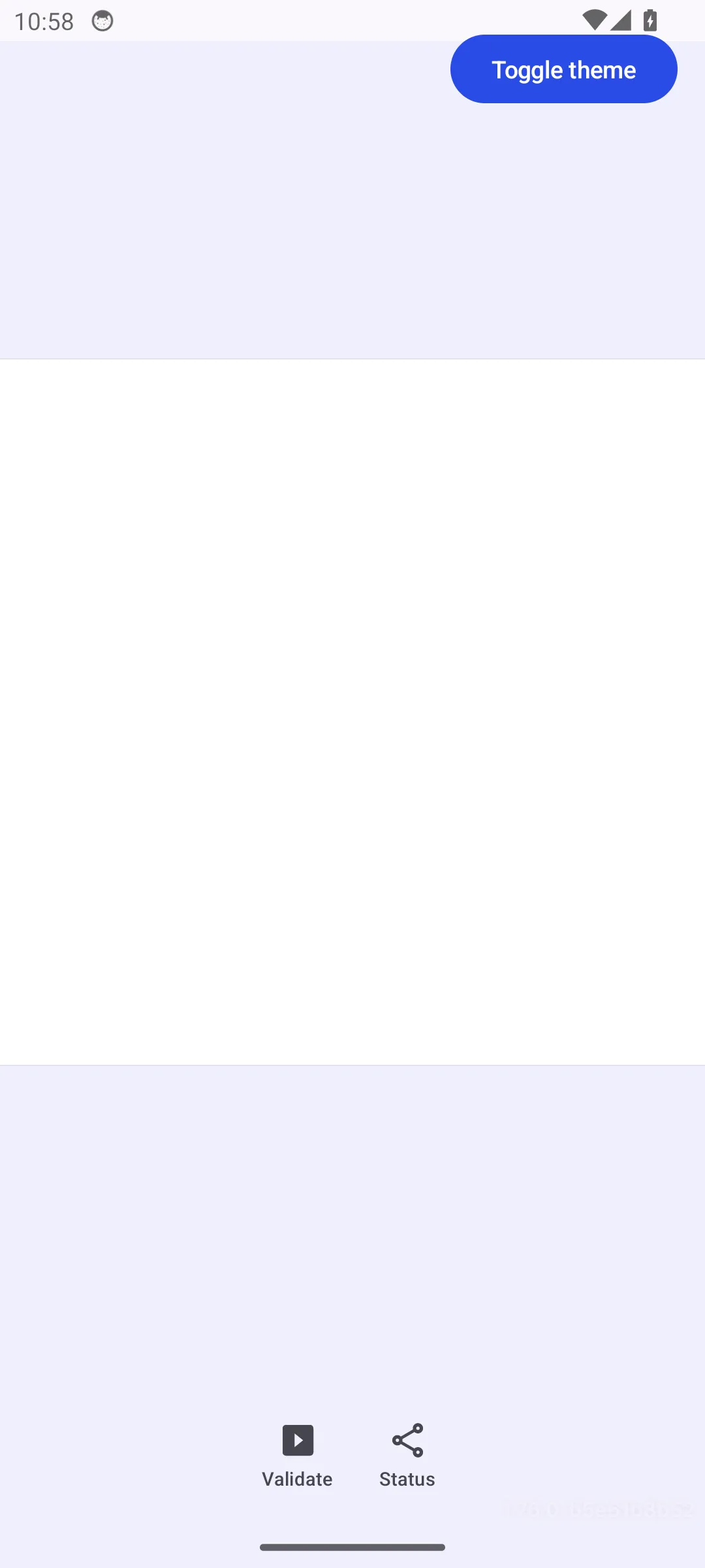
overlay = {    EditorComponent.remember {        decoration = {            Box(modifier = Modifier.fillMaxSize()) {                Button(                    modifier = Modifier                        .align(Alignment.TopEnd)                        .padding(16.dp),                    onClick = {                        uiMode = if (uiMode == EditorUiMode.DARK) {                            EditorUiMode.LIGHT                        } else {                            EditorUiMode.DARK                        }                    },                ) {                    Text("Toggle theme")                }            }
            state.dialogMessage?.let { message ->                AlertDialog(                    onDismissRequest = {                        state = state.copy(dialogMessage = null)                    },                    title = { Text("Workflow update") },                    text = { Text(message) },                    confirmButton = {                        TextButton(                            onClick = {                                state = state.copy(dialogMessage = null)                            },                        ) {                            Text("OK")                        }                    },                )            }        }    }}
This approach lets your app use normal Android accessibility, theming, and lifecycle behavior while still placing the feedback above the editor.
Registering Custom Actions#
Define custom actions as EditorEvent implementations. Send those events from
buttons, sheets, or overlay controls, then handle them in onEvent.
object ValidateSelection : EditorEvent
object OpenWorkflowSheet : EditorEvent
The handler can inspect the engine, update app state, or send built-in editor events. In this sample, one custom event validates the current selection, while another opens a custom status sheet.
onEvent = { event ->    when (event) {        is ValidateSelection -> {            val selectedCount = editorContext.engine.block.findAllSelected().size            state = state.copy(                dialogMessage = if (selectedCount == 0) {                    "Select a block before running this workflow."                } else {                    "Workflow can run for $selectedCount selected block(s)."                },            )        }
        is OpenWorkflowSheet -> {            editorContext.eventHandler.send(                EditorEvent.Sheet.Open(                    type = workflowSheet(latestEvent = state.latestEvent),                ),            )        }    }}
Dynamic Theme Control#
The Editor composable accepts uiMode, so you can hoist the selected mode
into Compose state and change it at runtime.
uiMode = uiMode,The sample toggles this state from an overlay button. Any custom components that
read MaterialTheme.colorScheme update with the active editor theme.
Feature Management at Runtime#
For custom Android editor components, feature availability is regular component
state. Read app permissions, dialog state, or engine state inside enabled or
visible lambdas so controls stay in sync with your app.
dock = { Dock.remember { horizontalArrangement = { Arrangement.Center } listBuilder = { Dock.ListBuilder.remember { add { Dock.Button.remember { id = { EditorComponentId("customize_behaviour_validate") } textString = { "Validate" } vectorIcon = { IconPack.PlayBox } enabled = { state.dialogMessage == null } onClick = { editorContext.eventHandler.send(ValidateSelection) } } } add { Dock.Button.remember { id = { EditorComponentId("customize_behaviour_panel") } textString = { "Status" } vectorIcon = { IconPack.Export } onClick = { editorContext.eventHandler.send(OpenWorkflowSheet) } } } } } }}For built-in editing permissions, keep using engine roles and scopes. Use UI component state for the controls you add yourself.
Integrating with External State#
The same state object can bridge CE.SDK and your app. Engine subscriptions
update latestEvent, editor components send custom events, onEvent translates
those events into state changes, and the overlay renders the result.
This keeps the editor integration one-directional: user interactions send events, callbacks update state, and Compose redraws the UI.
Troubleshooting#
Event Handlers Do Not Run#
Verify that custom controls call editorContext.eventHandler.send(...) and that
onEvent handles the event type. Built-in and custom events are both forwarded
to onEvent.
Sheets Do Not Open#
Make sure you send EditorEvent.Sheet.Open(type = ...) with a concrete
SheetType. To dismiss a custom sheet from its content, send
EditorEvent.Sheet.Close(animate = true).
UI State Resets Unexpectedly#
Hoist state above Editor when the value should survive recomposition. Use
editorContext.mutableStateOf(...) for state that must survive editor
configuration changes until the editor closes.
Theme Changes Do Not Apply#
Pass the current EditorUiMode through Editor(uiMode = ...). If custom
components use hard-coded colors, replace them with MaterialTheme.colorScheme
values so they respond to the active theme.
API Reference#
| API | Description |
|---|---|
Editor(uiMode=_) |
Renders the editor with the selected light, dark, or system theme mode. |
EditorConfiguration.remember(builder=_) |
Creates the Android editor configuration used by callbacks and components. |
editorContext.mutableStateOf(key=_, initial=_) |
Stores custom state in the editor scope so callback-updated values survive configuration changes. |
onLoaded = _ |
Runs after the editor engine is ready and is the right place to collect long-lived engine flows. |
engine.event.subscribe(blocks=_) |
Subscribes to block lifecycle events, optionally filtered by block list. |
onEvent = _ |
Receives built-in and custom EditorEvents sent through the editor event handler. |
editorContext.engine.block.findAllSelected() |
Reads the current editor selection so custom event handlers can validate selected blocks. |
editorContext.eventHandler.send(event=_) |
Sends a built-in or custom editor event. |
EditorEvent.Sheet.Open(type=_) |
Opens a built-in or custom editor sheet. |
EditorEvent.Sheet.Close(animate=_) |
Closes the currently active editor sheet. |
SheetType.Custom(style=_, content=_) |
Defines a custom Android sheet with Compose content. |
Dock.remember(builder=_) |
Configures the editor dock. |
Dock.ListBuilder.remember(builder=_) |
Builds the list of dock items. |
Dock.ListBuilder.add(block=_) |
Adds a dock item to the list. |
Dock.Button.remember(builder=_) |
Creates a custom dock button. |
EditorComponent.remember(builder=_) |
Creates custom overlay or component content. |
Next Steps#
- Create a Custom Panel — Design a custom sidebar panel to support unique workflows and user needs.
- Hide Elements — Learn how to hide and show UI elements in CE.SDK using the Feature API, ordering APIs, and panel management across different platforms.