Build a functional custom panel — a property editor that opens from an inspector bar button, edits the selected block, and writes changes back to the scene.
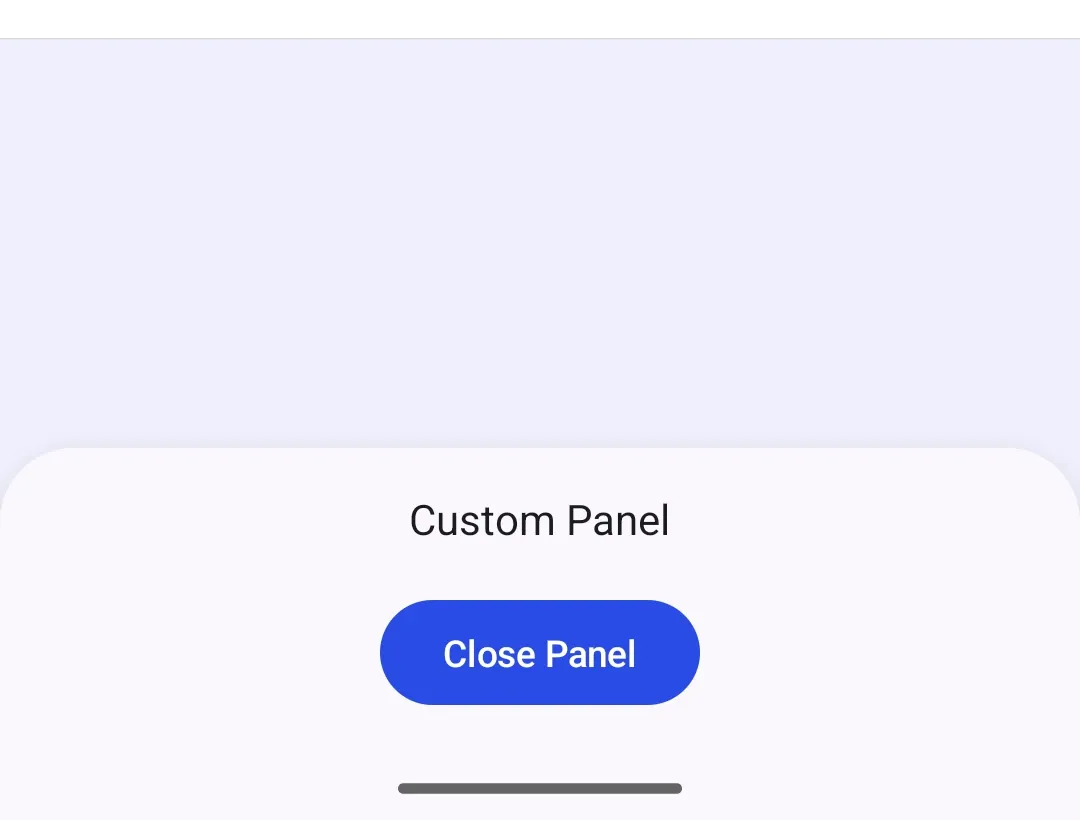
Overview#
Custom panels on Android are editor sheets whose content you build with native Jetpack Compose. You present your own composable and wire it to the engine directly — there is no panel registration step and no component catalog. This guide builds a property editor: a button in the inspector bar opens a sheet that edits the selected block’s name, opacity, and visibility.
The example builds on EditorConfiguration.remember { ... }, the standard
Android editor configuration entry point. Substitute your own editor
configuration as needed — the inspectorBar slot is exposed on every
configuration. The Configuration guide covers how
editor configuration sets up the editor as a whole, and the
Panel guide covers the sheet mechanism — sheet types,
presentation styles, and the built-in sheets — that this guide builds on.
Opening the Panel from the Inspector Bar#
The inspector bar is the surface the editor shows for the current selection,
which makes it the natural home for a panel that edits the selected block. Add
an inspector bar button whose action opens the sheet. The button has access to
editorContext, including the engine, the eventHandler, and the current
selection. Read the selected block from editorContext.selection.designBlock,
then open a SheetType.Custom that renders the property panel.
InspectorBar.Button.remember { id = { EditorComponentId("open_create_custom_panel") } text = { Text("Properties") } icon = { Icon(IconPack.Preview, contentDescription = "Open properties panel") } onClick = { val selectedBlock = editorContext.selection.designBlock editorContext.eventHandler.send( EditorEvent.Sheet.Open(createCustomPanelSheetType(selectedBlock)), ) }}- Replacing
inspectorBar.listBuilderreplaces the inspector bar’s contents; include any other items your app needs in the same list builder. - A panel that is not tied to a selection — like the built-in sheets in the Panel guide — can fit a dock button instead. See Add a New Button for both surfaces.
Building the Panel Content#
Panel content is regular Compose UI. Because the SheetType.Custom content
lambda runs in the editor scope, it can read editorContext.engine directly.
SheetStyle controls whether the sheet floats and how tall it can become, while
the content lambda supplies the app-provided panel UI. The
Panel guide documents the other sheet options.
fun createCustomPanelSheetType(block: DesignBlock): SheetType = SheetType.Custom( style = SheetStyle( isFloating = false, minHeight = Height.Exactly(0.dp), maxHeight = Height.Fraction(0.7F), isHalfExpandingEnabled = false, isHalfExpandedInitially = false, animateInitialValue = true, ), content = { CreateCustomPanelPropertyPanel(editorContext = editorContext, block = block) },)Use Compose state with remember { mutableStateOf(...) } to seed transient
controls from the selected block. The sample reads the current name with
engine.block.getName(), opacity with engine.block.getOpacity(), and
visibility with engine.block.isVisible(), then renders native controls such as
OutlinedTextField, Slider, and Switch.
For state that should survive configuration changes, use
editorContext.mutableStateOf(key, initial) instead. It stores the value for the
lifetime of the editor, so give each state value a unique key. Use regular
Compose state when the value only needs to live with the panel content.
@Composablefun CreateCustomPanelPropertyPanel(    editorContext: EditorContext,    block: DesignBlock,) {    val engine = editorContext.engine    var name by remember(block) {        mutableStateOf(runCatching { engine.block.getName(block) }.getOrDefault(""))    }    var opacity by remember(block) {        mutableStateOf(runCatching { engine.block.getOpacity(block) }.getOrDefault(1F))    }    var isVisible by remember(block) {        mutableStateOf(runCatching { engine.block.isVisible(block) }.getOrDefault(true))    }
    Column(        modifier = Modifier            .fillMaxWidth()            .navigationBarsPadding()            .padding(16.dp),        horizontalAlignment = Alignment.Start,    ) {        Text("Block properties")        Spacer(modifier = Modifier.height(16.dp))        OutlinedTextField(            modifier = Modifier.fillMaxWidth(),            value = name,            onValueChange = { name = it },            label = { Text("Name") },            singleLine = true,        )        Spacer(modifier = Modifier.height(24.dp))        Text("Opacity")        Slider(            value = opacity,            onValueChange = { opacity = it },            valueRange = 0F..1F,        )        Spacer(modifier = Modifier.height(16.dp))        Row(verticalAlignment = Alignment.CenterVertically) {            Switch(                checked = isVisible,                onCheckedChange = { isVisible = it },            )            Spacer(modifier = Modifier.width(12.dp))            Text("Visible")        }
Applying Changes and Closing the Panel#
The Done button writes the edited values back to the scene with
engine.block.setName(), engine.block.setOpacity(), and
engine.block.setVisible(), then dismisses the sheet by sending
EditorEvent.Sheet.Close. The user can also drag the sheet down to dismiss it.
Button( modifier = Modifier.align(Alignment.End), onClick = { engine.block.setName(block, name = name) engine.block.setOpacity(block = block, value = opacity) engine.block.setVisible(block = block, visible = isVisible) editorContext.eventHandler.send(EditorEvent.Sheet.Close(animate = true)) },) { Text("Done")}API Reference#
| Method | Description |
|---|---|
EditorConfiguration.remember { inspectorBar = { ... } } |
Declare the inspector bar in the editor configuration |
InspectorBar.Button.remember { ... } |
Create an inspector bar button whose onClick can open the panel |
editorContext.selection.designBlock |
The selected block inside the button action |
editorContext.engine |
Engine access inside the button action and sheet content |
editorContext.mutableStateOf(key=_, initial=_) |
Store Compose state in the editor scope so it survives configuration changes |
editorContext.eventHandler.send(EditorEvent.Sheet.Open(...)) |
Present custom Compose content as a sheet |
editorContext.eventHandler.send(EditorEvent.Sheet.Close(...)) |
Dismiss the current sheet |
SheetType.Custom(style=_, content=_) |
Define a custom editor sheet with app-provided Compose content |
engine.block.getName(block=_) |
Read a block’s name |
engine.block.setName(block=_, name=_) |
Write a block’s name |
engine.block.getOpacity(block=_) |
Read a block’s opacity |
engine.block.setOpacity(block=_, value=_) |
Write a block’s opacity |
engine.block.isVisible(block=_) |
Read whether a block is visible |
engine.block.setVisible(block=_, visible=_) |
Write a block’s visibility |
Next Steps#
- Panel — sheet types, presentation styles, and the built-in sheets this guide builds on.
- Add a New Button — full options for dock, canvas menu, inspector bar, and navigation bar buttons.
- Dock — configure the dock area and item order.
- Inspector Bar — the built-in surface for editing properties of the selected block.