Add app-specific buttons to existing editor UI areas so users can trigger your own actions from the CE.SDK editor.
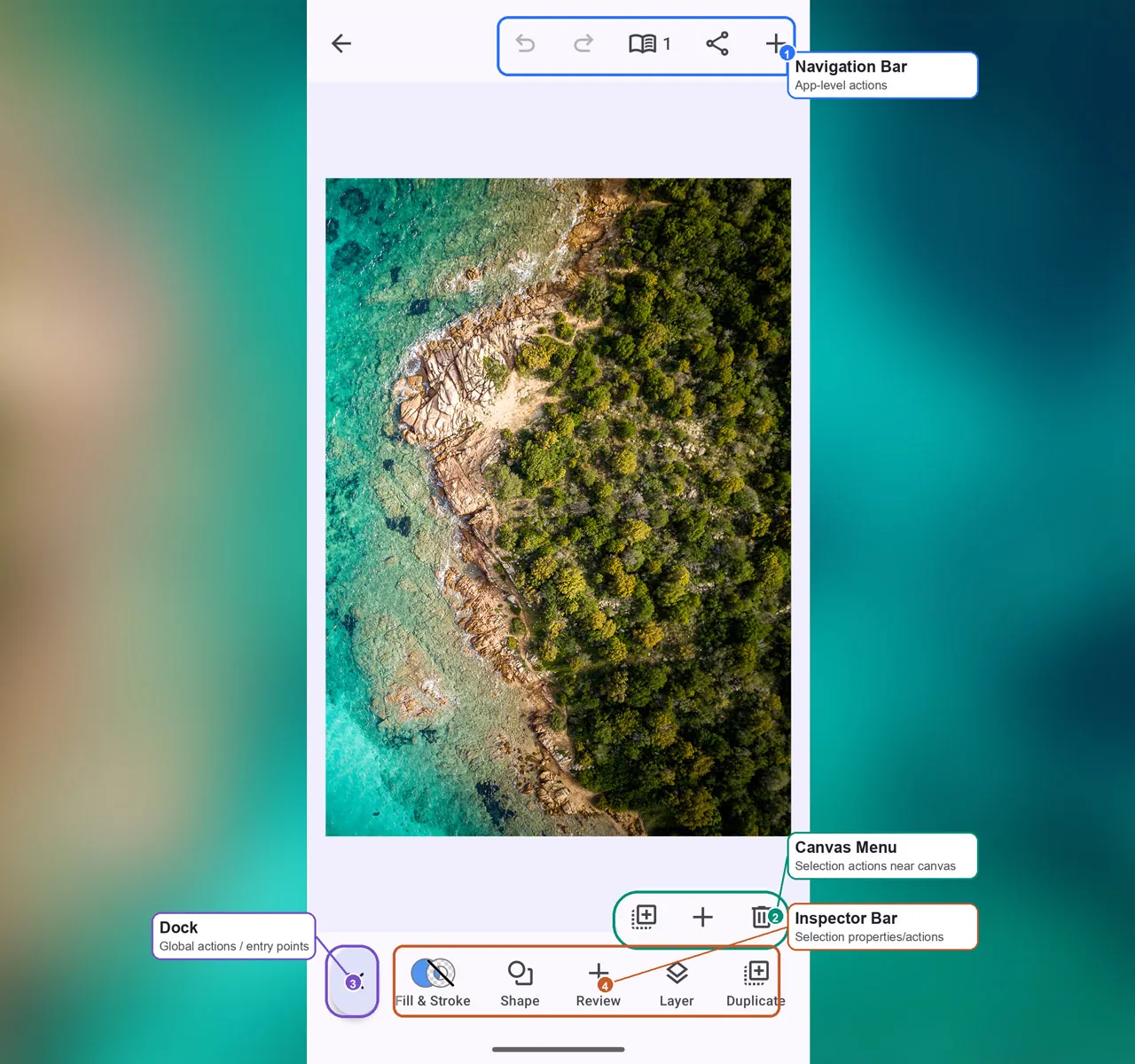
Overview#
Android editor UI extensions use Compose components and list builders. Start
with the component from parentConfiguration, call listBuilder.modify, then
insert your custom button with a stable EditorComponentId.
| Component | Selection Context | Best For |
|---|---|---|
| Dock | None | Global actions and asset entry points |
| Canvas Menu | editorContext.safeSelection |
Selection-specific actions near the selected block |
| Inspector Bar | editorContext.safeSelection |
Property or selection-specific actions |
| Navigation Bar | None | App-level actions |
For a complete product surface, start with the Design Editor Starter Kit.
The snippets below use the same EditorConfiguration component system, so you
can apply the pattern to your own editor setup.
Adding to Dock#
Add a dock button for global actions that should always be available at the bottom of the editor. Use reverse domain notation for custom IDs so your button does not collide with built-in component IDs.
dock = dockComponent@{ val sourceDock = parentConfiguration?.dock as? Dock ?: return@dockComponent null val updatedListBuilder = sourceDock.listBuilder.modify { addFirst { Dock.Button.remember { id = { EditorComponentId("com.example.guides.addButton.dock.create") } vectorIcon = { IconPack.Plus } textString = { "Create" } contentDescription = { "Create item" } onClick = { Toast .makeText(editorContext.activity, "Create item", Toast.LENGTH_SHORT) .show() } } } } remember(sourceDock, updatedListBuilder) { sourceDock.copy(listBuilder = updatedListBuilder) }}idgives the custom button a stable identity for later reordering or replacement.vectorIconandtextStringdefine the button content.onClickruns the app-specific action when the user taps the button.
Adding to Canvas Menu#
Add canvas menu buttons for actions that belong next to the selected block. Use
selection-aware visible and enabled predicates when the action only applies
to certain selected elements.
canvasMenu = canvasMenuComponent@{ val sourceCanvasMenu = parentConfiguration?.canvasMenu as? CanvasMenu ?: return@canvasMenuComponent null val updatedListBuilder = sourceCanvasMenu.listBuilder.modify { addAfter(id = CanvasMenu.Button.Id.duplicate, failIfNotFound = false) { CanvasMenu.Button.remember { id = { EditorComponentId("com.example.guides.addButton.canvasMenu.note") } vectorIcon = { IconPack.Plus } contentDescription = { "Add note" } visible = { editorContext.safeSelection != null } enabled = { editorContext.safeSelection?.designBlock?.let { editorContext.engine.block.isAllowedByScope(it, LIFECYCLE_DUPLICATE_SCOPE) } == true } onClick = { Toast .makeText(editorContext.activity, "Add note", Toast.LENGTH_SHORT) .show() } } } } remember(sourceCanvasMenu, updatedListBuilder) { sourceCanvasMenu.copy(listBuilder = updatedListBuilder) }}The example inserts the button after the built-in duplicate action when that
item exists. failIfNotFound = false keeps the customization compatible with
editor configurations that do not include that built-in button.
Adding to Inspector Bar#
Add inspector bar buttons for actions that change or inspect the selected element. The inspector bar shares the same button builder properties, but its scope follows the current selection at the bottom of the editor.
inspectorBar = inspectorBarComponent@{ val sourceInspectorBar = parentConfiguration?.inspectorBar as? InspectorBar ?: return@inspectorBarComponent null val updatedListBuilder = sourceInspectorBar.listBuilder.modify { addBefore(id = InspectorBar.Button.Id.layer, failIfNotFound = false) { InspectorBar.Button.remember { id = { EditorComponentId("com.example.guides.addButton.inspector.review") } vectorIcon = { IconPack.Plus } textString = { "Review" } contentDescription = { "Review selection" } visible = { editorContext.safeSelection != null } enabled = { editorContext.safeSelection?.designBlock?.let { editorContext.engine.block.isAllowedByScope(it, LIFECYCLE_DUPLICATE_SCOPE) } == true } onClick = { Toast .makeText(editorContext.activity, "Review selection", Toast.LENGTH_SHORT) .show() } } } } remember(sourceInspectorBar, updatedListBuilder) { sourceInspectorBar.copy(listBuilder = updatedListBuilder) }}visiblehides the button completely when the predicate returnsfalse.enabledkeeps the button visible but disables interaction when the predicate returnsfalse.
Adding to Navigation Bar#
Add navigation bar buttons for app-level actions at the top of the editor. When
the existing navigation bar uses aligned groups, pass the target alignment to
addFirst or addLast.
navigationBar = navigationBarComponent@{ val sourceNavigationBar = parentConfiguration?.navigationBar as? NavigationBar ?: return@navigationBarComponent null val updatedListBuilder = sourceNavigationBar.listBuilder.modify { addLast(alignment = Alignment.End) { NavigationBar.Button.remember { id = { EditorComponentId("com.example.guides.addButton.navigation.create") } vectorIcon = { IconPack.Plus } contentDescription = { "Create draft" } onClick = { Toast .makeText(editorContext.activity, "Create draft", Toast.LENGTH_SHORT) .show() } } } } remember(sourceNavigationBar, updatedListBuilder) { sourceNavigationBar.copy(listBuilder = updatedListBuilder) }}| Alignment | Position |
|---|---|
Alignment.Start |
Leading side |
Alignment.CenterHorizontally |
Center |
Alignment.End |
Trailing side |
Button Parameters#
All four button types use the same base builder properties. Assign them as scoped lambdas inside the button builder block.
| Parameter | Builder Assignment | Required | Default | Description |
|---|---|---|---|---|
id |
id = { EditorComponentId(...) } |
Recommended | Random ID | Stable component identity for list operations |
vectorIcon |
vectorIcon = { IconPack.Plus } |
No | null |
Icon rendered with the component tint |
textString |
textString = { "Create" } |
No | null |
Text label rendered by the button |
contentDescription |
contentDescription = { "Create item" } |
Recommended | null |
Accessibility label for icon-only buttons |
onClick |
onClick = { ... } |
No | No-op | Action invoked when the button is tapped |
visible |
visible = { editorContext.safeSelection != null } |
No | true |
Hides the button when false |
enabled |
enabled = { ... } |
No | true |
Disables the button when false |
API Reference#
| API | Purpose |
|---|---|
EditorConfiguration.remember(builderFactory=_) |
Creates the base editor configuration. |
EditorConfiguration.then(builder=_) |
Extends an existing editor configuration. |
Dock.remember(builder=_) |
Creates the dock component. |
Dock.ListBuilder.remember(builder=_) |
Builds dock items. |
Dock.Button.remember(builder=_) |
Creates a custom dock button. |
CanvasMenu.remember(builder=_) |
Creates the canvas menu component. |
CanvasMenu.ListBuilder.remember(builder=_) |
Builds canvas menu items. |
CanvasMenu.Button.remember(builder=_) |
Creates a custom canvas menu button. |
InspectorBar.remember(builder=_) |
Creates the inspector bar component. |
InspectorBar.ListBuilder.remember(builder=_) |
Builds inspector bar items. |
InspectorBar.Button.remember(builder=_) |
Creates a custom inspector bar button. |
NavigationBar.remember(builder=_) |
Creates the navigation bar component. |
NavigationBar.ListBuilder.remember(builder=_) |
Builds navigation bar items. |
NavigationBar.Button.remember(builder=_) |
Creates a custom navigation bar button. |
listBuilder.modify(builder=_) |
Applies list-builder changes without replacing the whole component. |
addFirst(block=_) |
Inserts an item at the beginning of an unaligned list. |
addAfter(id=_, failIfNotFound=_, block=_) |
Inserts an item after a matching component ID. |
addBefore(id=_, failIfNotFound=_, block=_) |
Inserts an item before a matching component ID. |
addLast(alignment=_, block=_) |
Inserts an item at the end of an aligned group. |
EditorComponentId(id=_) |
Assigns a stable unique ID to a custom editor component. |
engine.block.isAllowedByScope(block=_, key=_) |
Checks whether the selected block allows the scoped action. |
ButtonBuilder.id |
Sets the button component ID. |
ButtonBuilder.vectorIcon |
Supplies the ImageVector rendered by the button. |
ButtonBuilder.textString |
Supplies the visible text label. |
ButtonBuilder.contentDescription |
Supplies the accessibility label. |
ButtonBuilder.onClick |
Handles the button tap. |
ButtonBuilder.visible |
Controls whether the button is rendered. |
ButtonBuilder.enabled |
Controls whether the rendered button accepts interaction. |
Next Steps#
- Rearrange Buttons - Customize button order in UI components
- Customize Dock - Full dock customization patterns
- Customize Navigation Bar - Navigation bar configuration
- Canvas Menu - Contextual menu customization