Use the ready-to-use Android editor UI, adapt it to your product, or build a completely custom interface on top of CreativeEngine.
CE.SDK gives your Android app a complete editor UI for creating, editing, and exporting scenes. You can ship the default experience, configure its Jetpack Compose components, extend it with custom actions and panels, or bypass it and drive the engine from your own UI.
Explore Demos
Get Started
Architecture#
The Android editor separates the UI layer from the CreativeEngine. The engine owns scene data, block manipulation, rendering, playback, and export, while the UI layer presents controls and forwards user actions through configuration callbacks and editor events.
At a high level, the editor consists of:
- CreativeEngine APIs — The underlying APIs for scenes, blocks, assets, playback, and rendering.
- Compose UI components — Bars, menus, sheets, overlays, and buttons configured through
EditorConfiguration. - Events and callbacks — Hooks that let your app react to lifecycle, export, upload, close, and custom UI events.
This separation lets you keep the default UI where it fits, replace selected surfaces, or build your own interface without changing how the engine stores and renders content.
Default Android UI#
The default Android editor is optimized for touch-first editing. Its component layout is Android-specific, so use the Android component guides when you need exact customization APIs.
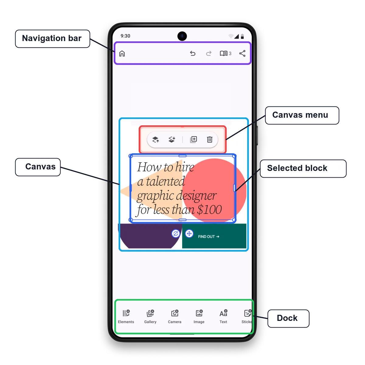
| Area | Purpose |
|---|---|
| Canvas | Shows the engine-rendered scene and handles direct manipulation of selected content. |
| Navigation bar | Hosts top-level actions such as close, undo, redo, page navigation, and export. |
| Dock | Provides bottom access to asset libraries, capture flows, and common editing tools. |
| Canvas menu | Appears near the selected block with immediate contextual actions such as duplicate, delete, reorder, or group. |
| Inspector bar | Shows selection-specific editing controls at the bottom of the editor. |
| Panels and sheets | Present focused workflows such as asset libraries, crop, filters, layer controls, and custom task UIs. |
Customizing the UI#
Use customization when the default editor flow is close to what you need, but your product needs different branding, ordering, or feature availability.
- Appearance — Match your brand with themes, labels, fonts, icons, and color-related UI.
- Layout — Reorder, replace, hide, or show component items in the navigation bar, dock, canvas menu, inspector bar, and panels.
- Behavior — Enable features by context, react to selections, and connect editor callbacks to your app state.
Most Android UI surfaces are configured through Compose builders on EditorConfiguration. You can start from the default component, modify its item list, or provide a replacement component when you need full control.
Extending the UI#
Use extensions when the editor should expose functionality that is specific to your product or workflow. Common examples include:
- Adding a custom dock, navigation bar, canvas menu, or inspector bar button.
- Opening a custom panel or sheet for a multi-step workflow.
- Connecting an action to your backend, content management system, or AI service.
- Packaging reusable configuration as a plugin-style
EditorConfigurationBuilder.
Extensions still run inside the editor UI. They can access the editor scope, send editor events, and call engine APIs when the user triggers them.
Building Your Own UI#
You can also skip the default editor UI and build a custom Android interface around CreativeEngine. This is useful when your app needs a highly specialized workflow, a unique layout, or a focused editing surface that does not match the default editor structure.
In that setup, your app owns the UI and uses the engine for scene loading, block editing, selection state, rendering, playback, and export. You are also responsible for lifecycle, app navigation, and any accessibility or localization behavior in your custom controls.
Integrating with Custom Workflows#
The editor UI can work with application state and business logic instead of acting as a closed editing surface. Use callbacks and events to:
- Prepare scenes, asset sources, and settings when the editor loads.
- Route export, upload, and close actions through your own product flow.
- Update external state when selections or editor modes change.
- Open custom panels, dialogs, or overlays for app-specific tasks.
This makes the default Android UI suitable for embedded editors, template personalization flows, product customizers, and automation-assisted creative tools.
Next Steps#
- Customization — Control which features are available and how UI components behave, appear, or are arranged in the editor.
- Appearance — Customize the visual style of the editor UI, including themes, fonts, labels, and icons.
- UI Extensions — Extend the editor interface with custom components, panels, actions, and dialogs tailored to your workflow.
- UI Events — Connect editor callbacks and UI events to your app logic.