Customize the video timeline — the playback and arrangement surface below the canvas — by configuring its add-content buttons, header, height, and expanded state instead of rebuilding it.
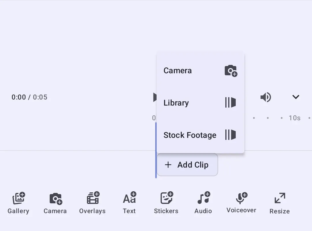
Timeline Architecture#
Timeline is both the component you mount and the namespace for everything that customizes it. It renders three configurable surfaces:
- The header above the ruler, holding the timecode, playback controls, and the expand/collapse toggle.
- The “Add Clip” button in the background lane, after the last clip of the main sequence.
- The “Add Audio” button at the foot of the overlay stack, below the overlay tracks.
Key types:
TimelineBuilder— the builderTimeline.rememberhands you. It exposesaddClipButton,addAudioButton,headerListBuilder,height, andscope.Timeline.Scope— the timeline scope, constructed with its parent scope and aMutableState<Boolean>for the expanded state.Timeline.ItemScope— the scope every header item and lane button is built in.editorContextreaches the engine, the event handler, and the editor state from there.Timeline.AddClipOption/Timeline.AddAudioOption— the entries the two lane buttons offer. Each is an ordinary editor component, so it takes the samevectorIcon,textString,enabledandvisibleproperties as a dock button.Timeline.AddClipButtonBuilder/Timeline.AddAudioButtonBuilder— configure each lane button, including itsoptionsBuilder. UseUnalignedListBuilder.rememberandadd { ... }to declare the menu entries.TimelineHeight—DynamicorFixed, counted in track rows.
Each property is a lambda evaluated during composition, so what the timeline shows can follow editor state rather than being fixed when the editor is created.
Configuration#
Mount the timeline as the editor’s bottom panel. Timeline.remember builds the component, which renders its tracks and nothing else: no header, and no lane buttons. Each section below turns one of those surfaces on. The video starter kit does the same, so its timeline is a configuration rather than a separate component.
bottomPanel = { rememberCustomizedTimeline(expandedState = isTimelineExpanded) }That timeline is built by a Timeline.remember block, and every section below sets one property on its builder:
@Composableprivate fun rememberCustomizedTimeline(expandedState: MutableState<Boolean>) = Timeline.remember {The builder block runs once, so avoid reassigning properties conditionally inside it. Read changing values inside the individual property lambdas instead — those re-evaluate on recomposition. The Configuration guide covers how EditorConfiguration sets up the editor as a whole, and the Video Editor Starter Kit shows the complete editor surface this timeline sits in.
Device Permissions#
The default add-content options reach two capabilities Android gates behind a runtime prompt: Timeline.AddClipOption.rememberCamera() records through the camera, and Timeline.AddAudioOption.rememberVoiceover() records through the microphone.
The CE.SDK camera module declares android.permission.CAMERA and android.permission.RECORD_AUDIO in its own manifest, so manifest merging adds them to your app and you do not declare them yourself. The camera and voiceover flows request the runtime grant when the user first opens them.
Device media is your app’s responsibility. Timeline.AddClipOption.rememberGallery() opens the library’s gallery source, which reads the device’s media store, so declare the READ_MEDIA_IMAGES, READ_MEDIA_VIDEO, and READ_MEDIA_AUDIO permissions your minimum SDK requires — plus READ_MEDIA_VISUAL_USER_SELECTED to support partial access, where the user grants only selected items rather than the whole library.
Add Clip Sources#
The “Add Clip” button opens a menu of sources that add to the background track. Timeline.Button.rememberAddClip decides which sources it offers. There are three built-in ones — rememberCamera(), rememberGallery(), and rememberLibrary(). The button offers camera plus library by default.
To customize the menu, set optionsBuilder to an UnalignedListBuilder.remember block and declare each entry with add { ... }, in display order. Menu entries do not use the header’s aligned { ... } groups. This example includes camera, library, and a custom stock-footage source:
addClipButton = { Timeline.Button.rememberAddClip { optionsBuilder = { UnalignedListBuilder.remember { add { Timeline.AddClipOption.rememberCamera() } add { Timeline.AddClipOption.rememberLibrary() } add { Timeline.AddClipOption.remember { id = { EditorComponentId("my.company.timeline.addClip.stockFootage") } vectorIcon = { IconPack.LibraryElements } textString = { "Stock Footage" } onClick = { editorContext.eventHandler.send(AddStockFootage) } } } } } }}A custom source’s onClick runs in the editor scope, so it can reach the engine, the configured asset library, and the event handler through editorContext. Sending your own event keeps the picker logic in your configuration:
object AddStockFootage : EditorEventEvery built-in source carries a stable id — Timeline.AddClipOption.Id.camera, .gallery, .library, and Timeline.AddAudioOption.Id.music / .voiceover for the audio ones. Use them to find a source in a list, or to give a replacement the same identity.
Reorder, Relabel, and Replace Behavior#
List the sources yourself to control the order or drop one. Each built-in factory accepts a builder with icon, vectorIcon, text, textString, and onClick properties, so a source can keep its behavior while its presentation changes, or keep its presentation while its behavior changes:
@Composablefun rememberRestatedAddClipButton() = Timeline.Button.rememberAddClip { optionsBuilder = { UnalignedListBuilder.remember { add { // Reordered, and the gallery source keeps its icon while its label changes. Timeline.AddClipOption.rememberGallery { textString = { "From Device" } } } add { // A built-in source keeps its label and icon while its behavior is replaced. Timeline.AddClipOption.rememberCamera { onClick = { editorContext.eventHandler.send(AddStockFootage) } } } add { Timeline.AddClipOption.rememberLibrary() } } }}Hide a Source Conditionally#
Read editor state inside optionsBuilder and conditionally call add { ... } to include a source:
@Composablefun rememberConditionalAddClipButton() = Timeline.Button.rememberAddClip { optionsBuilder = { val state by editorContext.state.collectAsState() UnalignedListBuilder.remember { // The options lambda is re-evaluated on recomposition, so read state inside it // rather than capturing a value from the caller. if (state.viewMode is EditorViewMode.Edit) { add { Timeline.AddClipOption.rememberCamera() } } add { Timeline.AddClipOption.rememberLibrary() } } }}One Source Instead of a Menu#
When only one source remains, the button performs it directly on tap instead of opening a menu and uses that source’s text as its label. Set the button’s textString to override this automatic label. This example opens the asset library directly:
@Composablefun rememberSingleSourceAddClipButton() = Timeline.Button.rememberAddClip { optionsBuilder = { UnalignedListBuilder.remember { add { Timeline.AddClipOption.rememberLibrary() } } }}An UnalignedListBuilder.remember block with no entries hides the button entirely.
Add Audio Sources#
The “Add Audio” button works the same way. Timeline.Button.rememberAddAudio offers rememberMusic() and rememberVoiceover() by default. Override optionsBuilder to change its sources. This example includes only music, so the button uses the music source’s label and opens the audio library directly:
addAudioButton = { Timeline.Button.rememberAddAudio { optionsBuilder = { UnalignedListBuilder.remember { add { Timeline.AddAudioOption.rememberMusic() } } } }}Replace the Whole Button#
Create a custom button with Button.remember(Timeline::ButtonBuilder) to give it a Timeline.ItemScope. Assign the component returned by rememberCustomAddAudioButton() to addAudioButton:
// The lane sizes a replacement to one track row, so drop the header button's square touch target.@Composablefun rememberCustomAddAudioButton() = Button.remember(Timeline::ButtonBuilder) { modifier = { Modifier.size(width = 96.dp, height = 40.dp) } id = { EditorComponentId("my.company.timeline.button.soundtrack") } vectorIcon = { IconPack.Music } textString = { "Soundtrack" } onClick = { editorContext.eventHandler.send(AddStockFootage) }}The lane sizes a replacement to one track row and reserves its height by row count, so a taller button overflows the lane. Set modifier in the button’s builder to give it an explicit size, as the example does with 96.dp by 40.dp.
Timeline Header#
Header items are grouped by alignment — Alignment.Start, Alignment.CenterHorizontally, or Alignment.End. Each group is positioned independently, so an item’s alignment decides which edge it hugs; there is no separate spacer item.
The header is empty until you declare it. The ready-made items are Timeline.Label.rememberTimecode(), Timeline.Button.rememberPlayPause(), rememberLoop(), and rememberToggleExpanded(). Each is an editor component with a configurable builder. Play/pause and loop use Timeline.ButtonBuilder, which exposes onClick and icon properties. Timecode and expand/collapse use Timeline.ItemBuilder; customize their rendered content through decoration or hide them with visible. The timecode displays a value and has no action, so it sits under Timeline.Label rather than Timeline.Button.
Declare the Header#
Declare the items you want, grouped by alignment. A centered group is centered as a whole, so keep one item in it — otherwise that item will not sit in the middle of the header:
// The timeline renders tracks alone, so the header is declared rather than modified.headerListBuilder = { Timeline.HeaderListBuilder.remember { aligned(alignment = Alignment.Start) { add { Timeline.Label.rememberTimecode() } } aligned(alignment = Alignment.CenterHorizontally) { add { Timeline.Button.rememberPlayPause() } } aligned(alignment = Alignment.End) { add { rememberMuteButton() } add { Timeline.Button.rememberToggleExpanded() } } }}Prefer the alignment-anchored operations over addAfter(id=) and addBefore(id=) when the position only has to be “at this edge”. The id-anchored operations fail when the item they name is absent, which is what happens once a built-in item you anchored on is removed or renamed. Pass failIfNotFound = false to make an anchored operation tolerate that.
A custom header item is an ordinary editor component, so it can hold its own state:
@Composableprivate fun rememberMuteButton(): Button<Timeline.ItemScope> {    var muted by remember { mutableStateOf(false) }    return Button.remember(::timelineHeaderButtonBuilder) {        id = { EditorComponentId("my.company.timeline.button.mute") }        vectorIcon = { IconPack.VolumeHigh }        contentDescription = { if (muted) "Unmute" else "Mute" }        onClick = { muted = muted.not() }    }}
private fun timelineHeaderButtonBuilder() = Timeline.ButtonBuilder()
Declare the Header Outright#
Assign a list builder to headerListBuilder to declare the header from the groups you want:
@Composablefun rememberDeclaredHeader(): HorizontalListBuilder<EditorComponent<*>> = Timeline.HeaderListBuilder.remember { aligned(alignment = Alignment.Start) { add { Timeline.Label.rememberTimecode() } } aligned(alignment = Alignment.CenterHorizontally) { add { Timeline.Button.rememberPlayPause() } } aligned(alignment = Alignment.End) { add { Timeline.Button.rememberLoop() } add { Timeline.Button.rememberToggleExpanded() } }}Remove a Surface#
None of the three surfaces is present until you add it, so the bare component already renders tracks alone. Leaving addAudioButton unset also lets the timeline reclaim the row that button would occupy, and an empty header renders no player bar rather than an empty strip:
// The defaults are already bare: no header, and no lane buttons. An empty header removes the// player bar with it, and the tracks keep rendering.@Composablefun rememberBareTimeline() = Timeline.remember()Timeline Height#
The timeline’s height is expressed in track rows rather than pixels. The count covers the rows stacked above the background track — the overlay tracks, plus the caption lane when the scene has one. The background track is always shown and is never counted.
TimelineHeight.Dynamic is the default. The timeline hugs its rows and grows to at most maximumTracks. TimelineHeight.Fixed sizes the timeline to show exactly that many rows and stops auto-resizing — 0 still shows the background track, and negative values are clamped to 0:
// Grow to at most three overlay tracks. This is the default.height = { TimelineHeight.Dynamic(maximumTracks = 3) }// Or pin the timeline to exactly two overlay tracks:// height = { TimelineHeight.Fixed(tracks = 2) }Because height is a lambda, it can follow editor state rather than being a constant.
Expanded State#
By default the editor owns the expanded state, which starts expanded and survives configuration changes. To provide your own MutableState<Boolean>, override the builder’s scope and construct Timeline.Scope(parentScope = this, expandedState = expandedState). Remember that scope using the parent scope as its key:
// Your own state decides whether the timeline starts expanded. The expand/collapse toggle// writes back to it, so this value keeps matching what is on screen.scope = { remember(this) { Timeline.Scope(parentScope = this, expandedState = expandedState) }}The example passes a state initialized to false, so the timeline starts collapsed. Within the timeline and its item scopes, editorContext.expandedState exposes that same state. It stays in sync in both directions: writing to it expands or collapses the timeline, and the user’s own toggle writes back. Collapsing leaves the header visible and hides the tracks below it.
The example creates this state with remember. Use rememberSaveable instead if your custom expanded state should survive configuration changes.
API Reference#
Methods#
| Method | Description |
|---|---|
Timeline.remember(builder=_) |
Builds the timeline component, mounted as bottom-panel content |
Timeline.Button.rememberAddClip(builder=_) |
The “Add Clip” button with the given sources |
Timeline.Button.rememberAddAudio(builder=_) |
The “Add Audio” button with the given sources |
Timeline.Label.rememberTimecode(builder=_) |
Header label showing the playhead position and total duration |
Timeline.Button.rememberPlayPause(builder=_) |
Header play/pause button |
Timeline.Button.rememberLoop(builder=_) |
Header looping toggle |
Timeline.Button.rememberToggleExpanded(builder=_) |
Header expand/collapse toggle |
Timeline.HeaderListBuilder.remember(builder=_) |
Declares the header from alignment groups |
UnalignedListBuilder.remember(builder=_) |
Declares a lane button’s menu entries |
add(block=_) |
Appends a menu entry or header item |
Timeline.Scope(parentScope=_, expandedState=_) |
Creates a timeline scope using the supplied expanded state |
Button.remember(builderFactory=_, builder=_) |
Builds a custom header or lane button |
Timeline.AddClipOption.rememberCamera(builder=_) |
Records a clip with the camera |
Timeline.AddClipOption.rememberGallery(builder=_) |
Opens the asset library’s device gallery |
Timeline.AddClipOption.rememberLibrary(builder=_) |
Opens the asset library |
Timeline.AddClipOption.remember(builder=_) |
A custom clip source |
Timeline.AddAudioOption.rememberMusic(builder=_) |
Opens the audio asset library |
Timeline.AddAudioOption.rememberVoiceover(builder=_) |
Starts a voiceover recording |
Timeline.AddAudioOption.remember(builder=_) |
A custom audio source |
remove(id=_, failIfNotFound=_) |
Removes a header item by id |
addFirst(alignment=_, block=_) |
Prepends a header item to an alignment group |
editorContext.eventHandler.send(event=_) |
Sends an editor event from an option or button |
Properties#
Builder properties below are assigned through composable lambdas; the types shown are their return values.
| Property | Type | Description |
|---|---|---|
addClipButton |
EditorComponent<*>? |
The “Add Clip” button. null, the default, shows none |
addAudioButton |
EditorComponent<*>? |
The “Add Audio” button. null, the default, shows none |
headerListBuilder |
HorizontalListBuilder<EditorComponent<*>> |
The header above the ruler. Empty by default |
height |
TimelineHeight |
Dynamic(maximumTracks=3) by default, or Fixed(tracks=_) |
scope |
Timeline.Scope |
The timeline scope. Construct it with your own expanded state to drive and observe expansion |
The following properties belong to the lane button builders and timeline scopes:
| Property | Type | Description |
|---|---|---|
Timeline.AddClipButtonBuilder.optionsBuilder |
UnalignedListBuilder<Timeline.AddClipOption> |
Clip menu entries; camera plus library by default |
Timeline.AddAudioButtonBuilder.optionsBuilder |
UnalignedListBuilder<Timeline.AddAudioOption> |
Audio menu entries; music plus voiceover by default |
textString |
String |
Lane button label override; otherwise a single source supplies its own label |
editorContext.expandedState |
MutableState<Boolean> |
Expanded state available within Timeline.Scope and Timeline.ItemScope |
Built-in components expose stable ids:
| Property | Type | Description |
|---|---|---|
Timeline.Button.Id.loop |
EditorComponentId |
Id constants for the built-in header items |
Timeline.AddClipOption.Id.camera |
EditorComponentId |
Id constants for the built-in clip sources |
Timeline.AddAudioOption.Id.music |
EditorComponentId |
Id constants for the built-in audio sources |
Next Steps#
- Timeline Editor — Build and edit timelines programmatically with the engine.
- Record Voiceover — The recording flow behind the voiceover add-audio source.
- Hide Elements — Remove editor items your integration does not need
- Dock — Bottom toolbar that opens asset libraries and sheets.
- Inspector Bar — Contextual toolbar for the selected block.
- Navigation Bar — Top bar configuration.