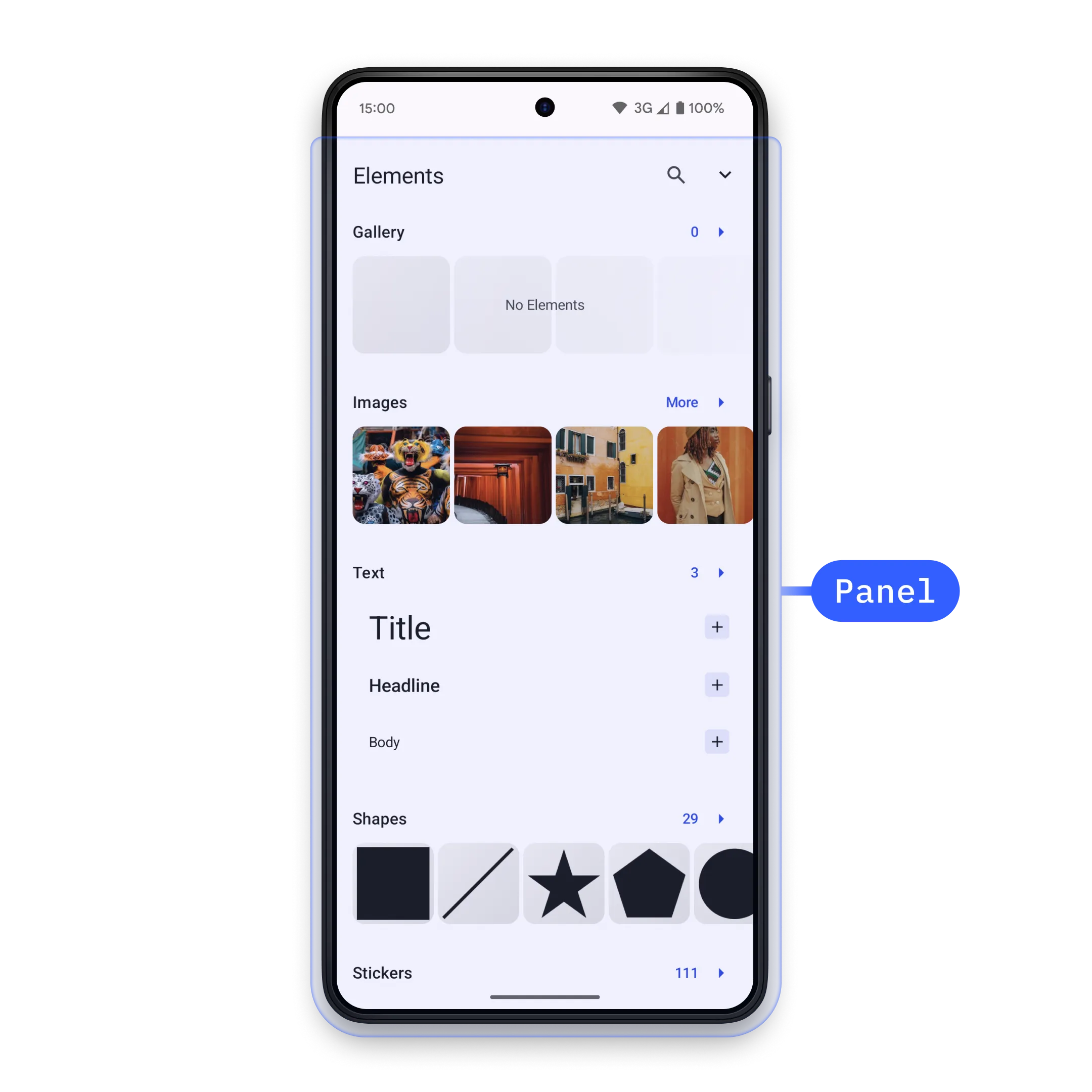
Use sheets to show built-in editor panels or your own Compose content in the editor UI.
In Android integrations, panels are implemented as editor sheets. You open a concrete SheetType through EditorEvent.Sheet.Open, and you close the currently displayed sheet with EditorEvent.Sheet.Close.
The same Base Editor sheet system is used by Starter Kits. See the Design Editor Starter Kit for a complete editor surface that uses these components in context.
Controlling a Panel#
Send an EditorEvent.Sheet.Open event from a component that has access to editorContext. This example adds a dock button that opens the built-in asset library sheet.
editorContext.eventHandler.send( EditorEvent.Sheet.Open( SheetType.LibraryAdd(), ),)To dismiss the active sheet from code, send EditorEvent.Sheet.Close. The animate argument controls whether the close transition is animated.
@Composablefun ClosePanelButton(editorContext: EditorContext) { Button( onClick = { editorContext.eventHandler.send( EditorEvent.Sheet.Close(animate = true), ) }, ) { Text("Close Panel") }}Android sheets are selected by type instead of string IDs. If your workflow needs a different panel, open the matching SheetType rather than searching for or closing panels by ID.
Creating a Custom Panel#
Use SheetType.Custom when you need app-specific UI inside a sheet. The content lambda is regular Compose content in EditorScope, so it can render controls and send editor events.
SheetType.Custom( style = SheetStyle( isFloating = false, minHeight = Height.Exactly(0.dp), maxHeight = Height.Fraction(0.7F), isHalfExpandingEnabled = false, isHalfExpandedInitially = false, animateInitialValue = true, ), content = { Column( modifier = Modifier .fillMaxWidth() .navigationBarsPadding() .padding(16.dp), horizontalAlignment = Alignment.CenterHorizontally, ) { Text("Custom Panel") Spacer(modifier = Modifier.height(16.dp)) ClosePanelButton(editorContext = editorContext) } },)Open the custom sheet type with the same event flow as a built-in sheet.
editorContext.eventHandler.send( EditorEvent.Sheet.Open(customSheetType),)The SheetStyle controls how the sheet is presented:
| Parameter | Default Value | Description |
|---|---|---|
isFloating |
false |
Renders the sheet over the editor when true; adjusts the canvas around the sheet when false. |
minHeight |
Height.Exactly(0.dp) |
Sets the minimum sheet height. |
maxHeight |
Height.Fraction(0.5F) |
Sets the maximum sheet height. Use null when the sheet should not cap its height. |
isHalfExpandingEnabled |
false |
Adds a half-expanded state between hidden and expanded. |
isHalfExpandedInitially |
false |
Opens the sheet half-expanded first when half expansion is enabled. |
animateInitialValue |
true |
Animates the initial expanded or half-expanded state. |
If custom content needs to scroll after it reaches maxHeight, add the scrolling behavior to your Compose content.
Default Sheet Types#
The editor provides built-in sheet types for common editing tasks:
| Sheet Type | Description |
|---|---|
SheetType.LibraryAdd() |
Add assets from the configured asset library. |
SheetType.LibraryReplace(libraryCategory = category) |
Replace the selected block’s asset with assets from a library category. |
SheetType.Reorder() |
Reorder videos on the background track. |
SheetType.Adjustments() |
Make adjustments to image and video fills. |
SheetType.Filter() |
Set filters on image and video fills. |
SheetType.Effect() |
Set effects on image and video fills. |
SheetType.Blur() |
Set blur effects on image and video fills. |
SheetType.Crop(mode = SheetType.Crop.Mode.ImageCrop) |
Crop the selected image or video fill. |
SheetType.ResizeAll() |
Resize all pages in the design. |
SheetType.Layer() |
Control the layering of design blocks. |
SheetType.FormatText() |
Format selected text blocks. |
SheetType.Shape() |
Change the shape of selected blocks. |
SheetType.FillStroke() |
Edit fill and stroke properties. |
SheetType.Speed() |
Control video clip playback speed. |
SheetType.Volume() |
Control audio and video volume. |
SheetType.Voiceover() |
Record voice-over audio in video scenes. |
SheetType.Animation() |
Configure in, out, and loop animations. |
SheetType.TextBackground() |
Configure text background properties. |
API Reference#
| API | Use |
|---|---|
editorContext.eventHandler.send(event=_) |
Sends an editor event from a UI component that has access to editorContext. |
EditorEvent.Sheet.Open(type=_) |
Opens the sheet described by a SheetType. |
EditorEvent.Sheet.Close(animate=_) |
Closes the active sheet, optionally animating the transition. |
SheetType.Custom(style=_, content=_) |
Defines a sheet with app-specific Compose content. Add scrolling inside content when needed. |
SheetType.LibraryAdd(style=_, libraryCategory=_, addToBackgroundTrack=_) |
Opens the configured asset library for adding assets to the scene. |
SheetStyle(isFloating=_, minHeight=_, maxHeight=_, isHalfExpandingEnabled=_, isHalfExpandedInitially=_, animateInitialValue=_) |
Controls placement, height limits, half-expanded state, and initial animation. |
Height.Exactly(size=_) |
Sets an exact sheet height for SheetStyle.minHeight or SheetStyle.maxHeight. |
Height.Fraction(fraction=_) |
Sets a sheet height as a fraction of the editor height. |
Next Steps#
- Asset Library - Manage the assets users browse, preview, and insert.
- Inspector Bar - Customize the inspector bar for editing properties.