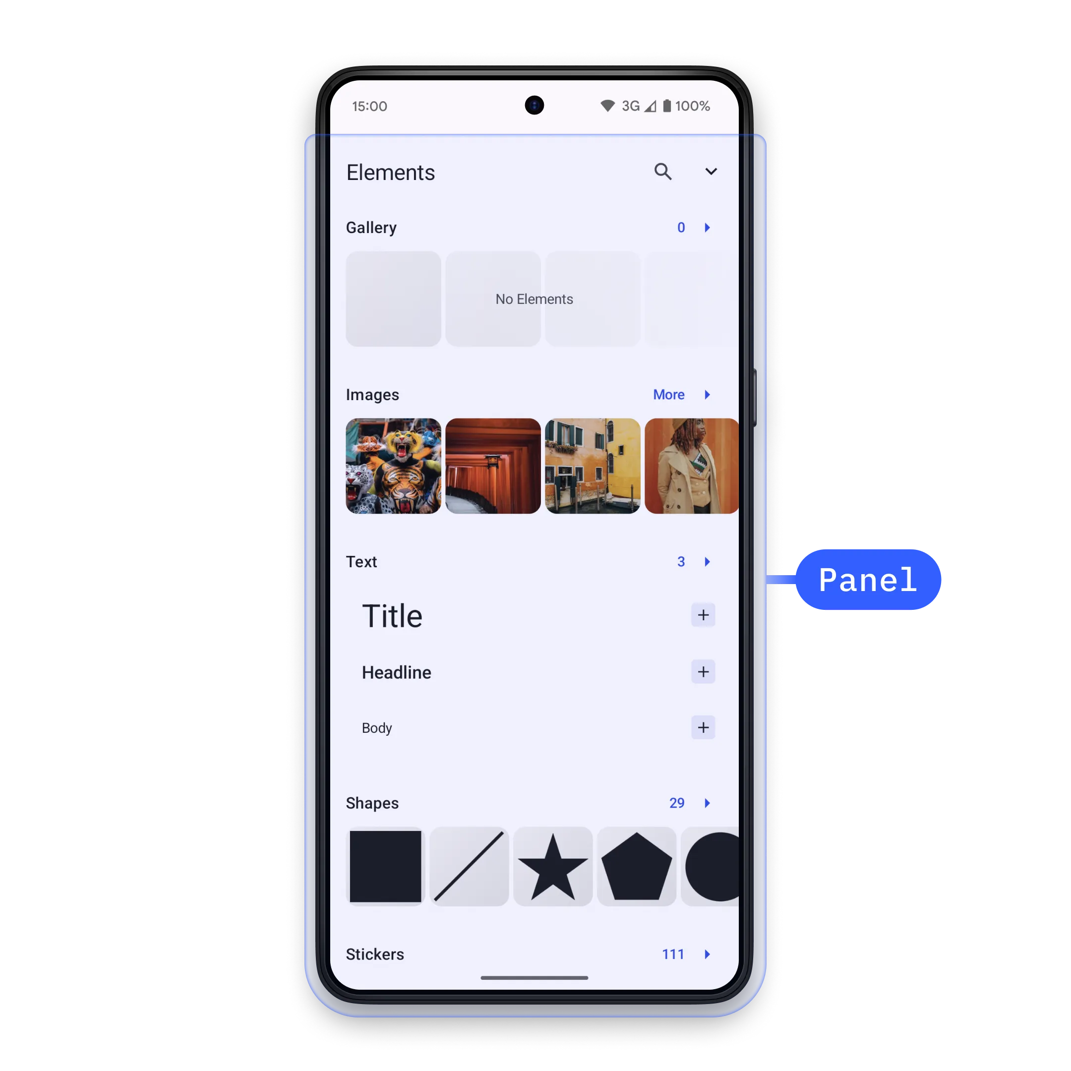
A panel is a UI layer that displays above the canvas, and allows the user perform a scoped task like accessing asset library, selecting filters, or any custom action.
Controlling a Panel#
Panels are implemented as different types of SheetType that allow you to display content in standard sheet overlays. Panels are opened using the EditorEvent.Sheet.Open event, and passing in the desired sheetType
editorContext.eventHandler.send( EditorEvent.Sheet.Open( SheetType.LibraryAdd(), ),)After use, they can be closed using the EditorEvent.Sheet.Close event.
editorContext.eventHandler.send( EditorEvent.Sheet.Close(animate = true),)The boolean parameter indicates whether the panel should be closed with animation.
Creating a Custom Panel#
To create a custom panel, you can make a new SheetType.Custom() and define your UI inside the content parameter.
SheetType.Custom( style = SheetStyle( isFloating = false, minHeight = Height.Exactly(0.dp), maxHeight = Height.Fraction(0.7F), isHalfExpandingEnabled = true, isHalfExpandedInitially = true, animateInitialValue = true, ), content = { Column { Text("Custom Panel") Button( onClick = { editorContext.eventHandler.send( EditorEvent.Sheet.Close(animate = true), ) }, ) { Text("Close Panel") } } },)In the style parameter, you can define how the sheet will look like.
These are the parameters available for SheetStyle constructor, and what they change:
| Parameter | Default Value | Description |
|---|---|---|
isFloating | false | whether the sheet should be floating. If true the sheet will be rendered over the editor, if false then the canvas will be zoomed to adjust the sheet. |
minHeight | Height.Exactly(0.dp) | the minimum height of the sheet. |
maxHeight | Height.Fraction(0.5f) | the maximum height of the sheet. If null, then there is no limit to the height. Once the maximum height is reached, the content of the sheet becomes vertically scrollable, if it is supported. Note that if you need the content to be scrollable in SheetType.Custom, then you need to add it manually. |
isHalfExpandingEnabled | false | whether the sheet should have a half expanded state. If false, then the sheet gets only 2 states: hidden and expanded. |
isHaldExpandedInitially | false | whether the sheet should be opened as half expanded initially. This flag takes effect only if isHalfExpandingEnabled is true. |
animateInitialValue | true | whether initial expanded or half-expanded state should be animated. |
Default Sheet Types#
The editor provides several built-in sheet types for common functionality:
| Panel Type | Description |
|---|---|
SheetType.LibraryAdd() | Display LibraryCategory in order to add assets to the scene |
SheetType.LibraryReplace() | Display LibraryCategory in order to replace assets in the scene |
SheetType.Reorder() | Reorder videos on the background track |
SheetType.Adjustments() | Make adjustments to design blocks with image and video fills |
SheetType.Filter() | Set filters to design blocks with image and video fills |
SheetType.Effect() | Set effects to design blocks with image and video fills |
SheetType.Blur() | Set blurs to design blocks with image and video fills |
SheetType.Crop() | Crop design blocks with image and video fills |
SheetType.Layer() | Control the layering of design blocks |
SheetType.FormatText() | Control formatting of text blocks |
SheetType.Shape() | Control the shape of various blocks |
SheetType.FillStroke() | Control the fill and/or stroke of various blocks |
SheetType.Volume() | Control the volume of audio/video |
SheetType.Animation() | Set in/out/loop animation to design blocks |
Full source code#
Default Panel Solution#
import androidx.compose.material.icons.Iconsimport androidx.compose.material.icons.rounded.KeyboardArrowUpimport androidx.compose.material3.Iconimport androidx.compose.material3.Textimport androidx.compose.runtime.Composableimport androidx.navigation.NavHostControllerimport ly.img.editor.DesignEditorimport ly.img.editor.EditorConfigurationimport ly.img.editor.EngineConfigurationimport ly.img.editor.core.component.Dockimport ly.img.editor.core.component.EditorComponent.ListBuilder.Companion.modifyimport ly.img.editor.core.component.EditorComponentIdimport ly.img.editor.core.component.rememberForDesignimport ly.img.editor.core.event.EditorEventimport ly.img.editor.core.sheet.SheetTypeimport ly.img.editor.rememberForDesign
@Composablefun DefaultPanelSolution(navController: NavHostController) {    val engineConfig = EngineConfiguration.rememberForDesign(        license = "<your license here>", // pass null or empty for evaluation mode with watermark    )
    val editorConfig = EditorConfiguration.rememberForDesign(        dock = {            Dock.rememberForDesign(                listBuilder = Dock.ListBuilder.rememberForDesign().modify {                    addFirst {                        openPanelDockButton                    }                },            )        },    )
    DesignEditor(        engineConfiguration = engineConfig,        editorConfiguration = editorConfig,    ) {        navController.popBackStack()    }}
val openPanelDockButton @Composable get() = Dock.Button.remember( id = EditorComponentId("open_library_panel"), text = { Text("Open Library") }, icon = { Icon(Icons.Rounded.KeyboardArrowUp, null) }, onClick = { editorContext.eventHandler.send( EditorEvent.Sheet.Open( SheetType.LibraryAdd(), ), ) }, )Custom Panel Solution#
import androidx.compose.foundation.layout.Columnimport androidx.compose.material.icons.Iconsimport androidx.compose.material.icons.rounded.KeyboardArrowUpimport androidx.compose.material3.Buttonimport androidx.compose.material3.Iconimport androidx.compose.material3.Textimport androidx.compose.runtime.Composableimport androidx.compose.ui.unit.dpimport androidx.navigation.NavHostControllerimport ly.img.editor.DesignEditorimport ly.img.editor.EditorConfigurationimport ly.img.editor.EngineConfigurationimport ly.img.editor.core.component.Dockimport ly.img.editor.core.component.EditorComponent.ListBuilder.Companion.modifyimport ly.img.editor.core.component.EditorComponentIdimport ly.img.editor.core.component.data.Heightimport ly.img.editor.core.component.rememberForDesignimport ly.img.editor.core.event.EditorEventimport ly.img.editor.core.sheet.SheetStyleimport ly.img.editor.core.sheet.SheetTypeimport ly.img.editor.rememberForDesign
@Composablefun CustomPanelSolution(navController: NavHostController) {    val engineConfig = EngineConfiguration.rememberForDesign(        license = null, // evaluation mode with watermark    )
    val editorConfig = EditorConfiguration.rememberForDesign(        dock = {            Dock.rememberForDesign(                listBuilder = Dock.ListBuilder.rememberForDesign().modify {                    addFirst {                        openCustomPanelDockButton                    }                },            )        },    )
    DesignEditor(        engineConfiguration = engineConfig,        editorConfiguration = editorConfig,    ) {        navController.popBackStack()    }}
val openCustomPanelDockButton    @Composable get() = Dock.Button.remember(        id = EditorComponentId("open_panel"),        text = { Text("Open Panel") },        icon = { Icon(Icons.Rounded.KeyboardArrowUp, null) },        onClick = {            editorContext.eventHandler.send(                EditorEvent.Sheet.Open(                    customSheetType,                ),            )        },    )
val customSheetType: SheetType    get() =        SheetType.Custom(            style = SheetStyle(                isFloating = false,                minHeight = Height.Exactly(0.dp),                maxHeight = Height.Fraction(0.7F),                isHalfExpandingEnabled = true,                isHalfExpandedInitially = true,                animateInitialValue = true,            ),            content = {                Column {                    Text("Custom Panel")                    Button(                        onClick = {                            editorContext.eventHandler.send(                                EditorEvent.Sheet.Close(animate = true),                            )                        },                    ) { Text("Close Panel") }                }            },        )