The navigation bar serves as the primary control interface at the top of the editor, housing essential functions like session management (close/save), editing operations (undo/redo), mode switching, and export capabilities. This guide shows you how to customize the navigation layout, button placement, and functionality to align with your app’s information architecture and user flow patterns. While examples use the Design Editor, the same configuration principles apply to all editor solutions.
Explore a complete code sample on GitHub.
Navigation Bar Architecture#
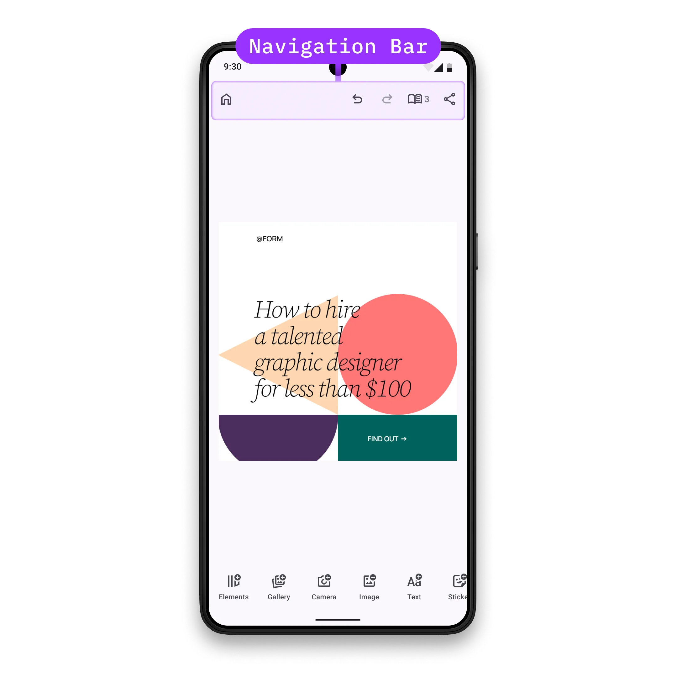
The navigation bar displays horizontally at the top of the editor, with items organized into alignment groups: start (left), center, and end (right).
Key Components:
NavigationBar.Item- Abstract class that all navigation bar items inherit fromNavigationBar.Button- Pre-built button implementation with icon and textNavigationBar.Custom- Fully custom component for arbitrary content renderingNavigationBar.Scope- Provides access to the engine, event handler, and editor state- Alignment Groups - Container system that positions items by alignment (start, center, end)
Configuration#
Navigation bar customization is part of the EditorConfiguration, therefore, in order to configure the navigation bar we need to configure the EditorConfiguration. Below you can find the list of available configurations of the navigation bar. To demonstrate the default values, all parameters are assigned to their default values.
Available configuration parameters:
-
scope- the scope of this component. Every new value will trigger recomposition of all the lambda parameters below. If you need to accessEditorScopeto construct the scope, useLocalEditorScope. Consider using ComposeStateobjects in the lambda parameters below for granular recompositions over updating the scope, since scope change triggers full recomposition of the navigation bar. Prefer updating individualNavigationBar.Items over updating the whole navigation bar. Ideally, scope should be updated when the parent scope (scope of the parent component) is updated and when you want to observe changes from theEngine. By default the scope is updated only when the parent scope (accessed viaLocalEditorScope) is updated. -
visible- Control navigation bar visibility. Default value is always true. -
enterTransition- Animation for when the navigation bar appears. Default value is always no enter transition. -
exitTransition- Animation for when the navigation bar disappears. Default value is always no exit transition. -
decoration- Apply custom styling like background, shadows, and padding. Default value is always no decoration. -
listBuilder- Define the complete list of navigation bar items and their alignment groups. Items are only displayed whenvisiblereturnstrue. By default,listBuilderdoes not add anything to the navigation bar. -
horizontalArrangement- Layout arrangement for navigation bar items. Controls spacing and alignment of items within the navigation bar. Default value isArrangement.SpaceEvenly. -
itemDecoration- decoration of the items in the navigation bar. Useful when you want to add custom background, foreground, shadow, paddings etc to the items. Prefer using this decoration when you want to apply the same decoration to all the items, otherwise set decoration to individual items. Default value is always no decoration.
val editorConfiguration = EditorConfiguration.rememberForDesign( navigationBar = { NavigationBar.remember( scope = LocalEditorScope.current.run { remember(this) { NavigationBar.Scope(parentScope = this) } }, visible = { true }, enterTransition = { EnterTransition.None }, exitTransition = { ExitTransition.None }, decoration = { // Also available via NavigationBar.DefaultDecoration Box( modifier = Modifier .fillMaxWidth() .heightIn(min = 64.dp) .background(MaterialTheme.colorScheme.surface) .padding(PaddingValues(horizontal = 4.dp)), contentAlignment = Alignment.Center, ) { it() } }, listBuilder = NavigationBar.ListBuilder.remember { }, horizontalArrangement = { Arrangement.SpaceEvenly }, // default value is { it() } itemDecoration = { Box(modifier = Modifier.padding(2.dp)) { it() } }, ) },)ListBuilder Configuration#
You can configure the complete item list or modify the default items using two main approaches:
Available approaches:
-
NavigationBar.ListBuilder.rememberForDesign()- Use the recommended default configuration for your editor solution (Design, Photo, Video, Apparel, Postcard). Each solution has optimized defaults for its workflow. -
NavigationBar.ListBuilder.rememberForDesign().modify()- Modify the default item list by adding, replacing, or removing specific items without rebuilding the entire configuration. Use this when you want to keep most defaults but make targeted changes.
The NavigationBar.Scope provides access to the engine, event handler, and editor state. Use this for advanced customization logic and to maintain consistency with the current editor state. Items are organized into alignment groups for consistent positioning across different screen sizes.
Default Navigation Bar Items#
Each editor solution has its own default navigation bar configuration optimized for its workflow:
Design Editor:
@Composablefun NavigationBar.ListBuilder.rememberForDesign() = NavigationBar.ListBuilder.remember { aligned(alignment = Alignment.Start) { add { NavigationBar.Button.rememberCloseEditor() } } aligned(alignment = Alignment.End) { add { NavigationBar.Button.rememberUndo() } add { NavigationBar.Button.rememberRedo() } add { NavigationBar.Button.rememberTogglePagesMode() } add { NavigationBar.Button.rememberExport() } }}Photo Editor:
@Composablefun NavigationBar.ListBuilder.rememberForPhoto() = NavigationBar.ListBuilder.remember { aligned(alignment = Alignment.Start) { add { NavigationBar.Button.rememberCloseEditor() } } aligned(alignment = Alignment.End) { add { NavigationBar.Button.rememberUndo() } add { NavigationBar.Button.rememberRedo() } add { NavigationBar.Button.rememberTogglePreviewMode() } add { NavigationBar.Button.rememberExport() } }}Video Editor:
@Composablefun NavigationBar.ListBuilder.rememberForVideo() = NavigationBar.ListBuilder.remember { aligned(alignment = Alignment.Start) { add { NavigationBar.Button.rememberCloseEditor() } } aligned(alignment = Alignment.End) { add { NavigationBar.Button.rememberUndo() } add { NavigationBar.Button.rememberRedo() } add { NavigationBar.Button.rememberExport() } }}Apparel Editor:
@Composablefun NavigationBar.ListBuilder.rememberForApparel() = NavigationBar.ListBuilder.remember { aligned(alignment = Alignment.Start) { add { NavigationBar.Button.rememberCloseEditor() } } aligned(alignment = Alignment.CenterHorizontally) { add { NavigationBar.Button.rememberUndo() } add { NavigationBar.Button.rememberRedo() } add { NavigationBar.Button.rememberTogglePreviewMode() } } aligned(alignment = Alignment.End) { add { NavigationBar.Button.rememberExport() } }}Postcard Editor:
@Composablefun NavigationBar.ListBuilder.rememberForPostcard() = NavigationBar.ListBuilder.remember {    aligned(alignment = Alignment.Start) {        add { NavigationBar.Button.rememberCloseEditor() }        add {            NavigationBar.Button.rememberPreviousPage(                text = { stringResource(R.string.ly_img_editor_navigation_bar_button_design) },            )        }    }
    aligned(alignment = Alignment.CenterHorizontally) {        add { NavigationBar.Button.rememberUndo() }        add { NavigationBar.Button.rememberRedo() }        add { NavigationBar.Button.rememberTogglePreviewMode() }    }
    aligned(alignment = Alignment.End) {        add {            NavigationBar.Button.rememberNextPage(                text = { stringResource(R.string.ly_img_editor_navigation_bar_button_write) },            )        }        add { NavigationBar.Button.rememberExport() }    }}
Modify Navigation Bar Items#
Use the modify function to adjust the default item list without rebuilding the entire configuration:
listBuilder = NavigationBar.ListBuilder.rememberForDesign().modify {Available modification operations:
addFirst- prepends a new item at the beginning of an alignment group:
addFirst(alignment = Alignment.End) { NavigationBar.Button.remember( id = EditorComponentId("my.package.navigationBar.button.endAligned.first"), vectorIcon = { IconPack.Music }, text = { "First Button" }, onClick = {}, )}addLast- appends a new item at the end of an alignment group:
addLast(alignment = Alignment.End) { NavigationBar.Button.remember( id = EditorComponentId("my.package.navigationBar.button.endAligned.last"), vectorIcon = { IconPack.Music }, text = { "Last Button" }, onClick = {}, )}addAfter- adds a new item right after a specific item:
addAfter(id = NavigationBar.Button.Id.redo) { NavigationBar.Button.remember( id = EditorComponentId("my.package.navigationBar.button.afterRedo"), vectorIcon = { IconPack.Music }, text = { "After Redo" }, onClick = {}, )}addBefore- adds a new item right before a specific item:
addBefore(id = NavigationBar.Button.Id.undo) { NavigationBar.Button.remember( id = EditorComponentId("my.package.navigationBar.button.beforeUndo"), vectorIcon = { IconPack.Music }, text = { "Before Undo" }, onClick = {}, )}replace- replaces an existing item with a new item:
replace(id = NavigationBar.Button.Id.export) { NavigationBar.Button.remember( id = EditorComponentId("my.package.navigationBar.button.replacedExport"), vectorIcon = null, text = { "Replaced Export" }, onClick = {}, )}remove- removes an existing item:
remove(id = NavigationBar.Button.Id.togglePagesMode)NavigationBar.Item Configuration#
Each NavigationBar.Item is an EditorComponent. Its id must be unique which is a requirement for proper component management. Items must be organized within alignment groups when using the aligned layout system.
Use Predefined Buttons#
Start with predefined buttons which are provided as composable functions. All available predefined buttons are listed below.
Create New Buttons#
Create custom buttons when predefined options don’t meet your needs:
@Composablefun rememberNavigationBarButton() = NavigationBar.Button.remember( id = EditorComponentId("my.package.navigationBar.button.newButton"), scope = LocalEditorScope.current.run { remember(this) { NavigationBar.ButtonScope(parentScope = this) } }, visible = { true }, enterTransition = { EnterTransition.None }, exitTransition = { ExitTransition.None }, // default value is { it() } decoration = { Surface(color = MaterialTheme.colorScheme.background) { it() } }, onClick = { editorContext.eventHandler.send(EditorEvent.Sheet.Open(SheetType.Volume())) }, // default value is null icon = { Icon( imageVector = IconPack.Music, contentDescription = null, ) }, // default value is null text = { Text( text = "Hello World", ) }, enabled = { true },)Required and optional parameters:
-
id- the id of the button. Note that it is highly recommended that every uniqueEditorComponenthas a unique id. Parameter does not have a default value. -
scope- the scope of this component. Every new value will trigger recomposition of all the lambda parameters below. If you need to accessEditorScopeto construct the scope, useLocalEditorScope. Consider using ComposeStateobjects in the lambda parameters below for granular recompositions over updating the scope, since scope change triggers full recomposition of the button. Ideally, scope should be updated when the parent scope (scope of the parent componentNavigationBar-NavigationBar.Scope) is updated and when you want to observe changes from theEngine. By default the scope is updated only when the parent component scope (accessed viaLocalEditorScope) is updated. -
visible- whether the button should be visible. Default value is always true. -
enterTransition- transition of the button when it enters the parent composable. Default value is always no enter transition. -
exitTransition- transition of the button when it exits the parent composable. Default value is always no exit transition. -
decoration- decoration of the button. Useful when you want to add custom background, foreground, shadow, paddings etc. Default value is always no decoration. -
onClick- the callback that is invoked when the button is clicked. Parameter does not have a default value. -
icon- the icon content of the button. If null, it will not be rendered. Default value is null. -
text- the text content of the button. If null, it will not be rendered. Default value is null. -
tint- the tint color of the content. If null, then no tint is applied. Default value is null. -
enabled- whether the button is enabled. Default value is always true.
Other than the main NavigationBar.Button.remember function, there is one more convenience overload that has three differences:
iconis replaced withvectorIconlambda, that returnsVectorIconinstead of drawing the icon content.textis replaced withtextlambda, that returnsStringinstead of drawing the text content.- An extra parameter
contentDescriptionis added that is used by accessibility services to describe what the button does. Note that it is not required to provide value whentextis not null, since its value will be used by accessibility services, however having bothtextandcontentDescriptionas null will cause a crash.
Create Custom Items#
For completely custom implementations, use NavigationBar.Custom to render arbitrary content:
@Composablefun rememberNavigationBarCustomItem() = NavigationBar.Custom.remember( id = EditorComponentId("my.package.navigationBar.newCustomItem"), scope = LocalEditorScope.current.run { remember(this) { NavigationBar.ItemScope(parentScope = this) } }, visible = { true }, enterTransition = { EnterTransition.None }, exitTransition = { ExitTransition.None },) { Box( modifier = Modifier .fillMaxHeight() .clickable { Toast .makeText(editorContext.activity, "Hello World Clicked!", Toast.LENGTH_SHORT) .show() }, ) { Text( modifier = Modifier.align(Alignment.Center), text = "Hello World", ) }}Required and optional parameters:
-
id- the unique id of the custom item. Note that it is highly recommended that every uniqueEditorComponenthas a unique id. Parameter does not have a default value. -
scope- the scope of this component. Every new value will trigger recomposition of all the lambda parameters below. If you need to accessEditorScopeto construct the scope, useLocalEditorScope. Consider using ComposeStateobjects in the lambda parameters below for granular recompositions over updating the scope, since scope change triggers full recomposition of the custom item. Ideally, scope should be updated when the parent scope (scope of the parent componentNavigationBar-NavigationBar.Scope) is updated and when you want to observe changes from theEngine. Parameter does not have a default value. -
visible- whether the custom item should be visible. Default value is always true. -
enterTransition- transition of the custom item when it enters the parent composable. Default value is always no enter transition. -
exitTransition- transition of the custom item when it exits the parent composable. Default value is always no exit transition. -
content- the content of the custom item. You are responsible for drawing it, handling clicks etc. Parameter does not have a default value.
Alignment Groups#
When using alignment groups, items are positioned in three areas:
Alignment.Start- Items aligned to the start (left) of the navigation barAlignment.CenterHorizontally- Items centered in the navigation barAlignment.End- Items aligned to the end (right) of the navigation bar
aligned(alignment = Alignment.Start) { add { NavigationBar.Button.rememberCloseEditor() }}aligned(alignment = Alignment.End) { add { NavigationBar.Button.rememberExport() }}List of Available NavigationBar.Buttons#
All predefined buttons are available as composable functions in the NavigationBar.Button namespace. Each function returns a NavigationBar.Button with default parameters that you can customize as shown in the Create New Buttons section.
| Button | Id | Description |
|---|---|---|
NavigationBar.Button.rememberCloseEditor | NavigationBar.Button.Id.closeEditor | Triggers EngineConfiguration.onClose callback via EditorEvent.OnClose. |
NavigationBar.Button.rememberUndo | NavigationBar.Button.Id.undo | Does undo operation in the editor via EditorApi.undo engine API. |
NavigationBar.Button.rememberRedo | NavigationBar.Button.Id.redo | Does redo operation in the editor via EditorApi.redo engine API. |
NavigationBar.Button.rememberExport | NavigationBar.Button.Id.export | Triggers EngineConfiguration.onExport callback via EditorEvent.Export. |
NavigationBar.Button.rememberTogglePreviewMode | NavigationBar.Button.Id.togglePreviewMode | Updates editor view mode via EditorEvent.SetViewMode: when current view mode is EditorViewMode.Edit, then EditorViewMode.Preview is set and vice versa. Note that this button is intended to be used in Photo Editor, Apparel Editor and Postcard Editor and may cause unexpected behaviors when used in other solutions. |
NavigationBar.Button.rememberTogglePagesMode | NavigationBar.Button.Id.togglePagesMode | Updates editor view mode via EditorEvent.SetViewMode: when current view mode is EditorViewMode.Edit, then EditorViewMode.Pages is set and vice versa. Note that this button is intended to be used in Design Editor and may cause unexpected behaviors when used in other solutions. |
NavigationBar.Button.rememberPreviousPage | NavigationBar.Button.Id.previousPage | Navigates to the previous page via EditorEvent.Navigation.ToPreviousPage. |
NavigationBar.Button.rememberNextPage | NavigationBar.Button.Id.nextPage | Navigates to the next page via EditorEvent.Navigation.ToNextPage. |