The inspector bar provides context-sensitive editing controls that appear when you select a design element, offering tools specific to that element type like text formatting, image adjustments, or shape properties. This guide shows you how to customize these editing controls to match your app’s feature set and user experience goals.
Explore a complete code sample on GitHub.
Inspector Bar Architecture#
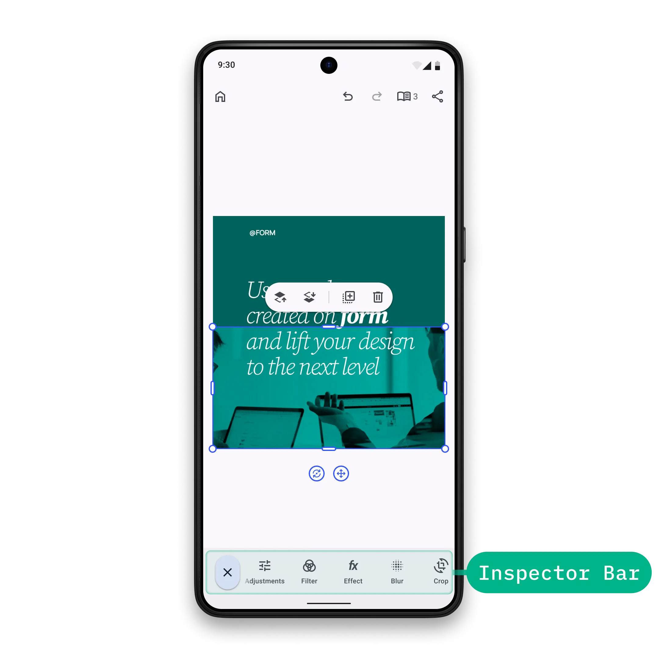
The inspector bar displays horizontally at the bottom when a design element is selected. It contains context-sensitive editing tools that adapt based on the selected element type (text, image, video, etc.).
Key Components:
InspectorBar.Button- Pre-built button implementation with icon and textInspectorBar.Scope- Provides access to the engine, event handler, and editor context
Configuration#
Inspector bar customization is part of the EditorConfiguration, therefore, in order to configure the inspector bar we need to configure the EditorConfiguration. Below you can find the list of available configurations of the inspector bar. To demonstrate the default values, all properties are assigned to their default values unless specified otherwise.
Available configuration properties:
-
scope- Scope of this component. Every new value will trigger recomposition of allScopedPropertys such asvisible,enterTransition,exitTransitionetc. Consider using Composeandroidx.compose.runtime.Stateobjects in the lambdas for granular recompositions over updating the scope, since scope change triggers full recomposition of the component. Ideally, scope should be updated when the parent scope (scope of the parent component) is updated and when you want to observe changes from theEngine. By default, the scope is updated when the parent scope is updated, when selection is changed to a different design block (or unselected), and when the parent of the currently selected design block is changed to a different design block. -
modifier- Jetpack Compose modifier of this component. By default empty modifier is applied. -
visible- Control inspector bar visibility based on selection state. By default it istrueonly while a design block is selected and the current edit mode is notCrop. -
enterTransition- Animation for when the inspector bar appears. By default, a vertical slide in animation is used. -
exitTransition- Animation for when the inspector bar disappears. By default, a vertical slide out animation is used. -
decoration- Apply custom styling like background, shadows, and padding. By defaultInspectorBar.DefaultDecorationadds a surface-colored background and horizontal padding. -
listBuilder- Define the complete list of inspector bar items and their order. Items are only displayed whenvisiblereturnstrue. -
horizontalArrangement- Layout arrangement for inspector bar items. Controls spacing and alignment of items within the inspector bar. Default value isArrangement.Start. -
itemDecoration- decoration of the items in the inspector bar. Useful when you want to add custom background, foreground, shadow, paddings etc to the items. Prefer using this decoration when you want to apply the same decoration to all the items, otherwise set decoration to individual items. Default value is always no decoration. -
itemsRowEnterTransition- Animation for when the items row appears. By default, a horizontal slide in animation is used. -
itemsRowExitTransition- Animation for when the items row disappears. Default value is always no exit transition.
The InspectorBar.Scope (this instance in all lambdas) provides access to the engine, event handler, and editor context. Use this for advanced customization logic and to maintain consistency with the current editor state.
EditorConfiguration.remember { inspectorBar = { InspectorBar.remember { // Implementation is too large, check the implementation of InspectorBar.rememberDefaultScope scope = { InspectorBar.rememberDefaultScope(parentScope = this) } modifier = { Modifier } visible = { editorContext.safeSelection != null } // Also available via InspectorBar.defaultEnterTransition enterTransition = { remember { slideInVertically( animationSpec = tween( durationMillis = 400, easing = CubicBezierEasing(0.05f, 0.7f, 0.1f, 1f), ), initialOffsetY = { it }, ) } } // Also available via InspectorBar.defaultExitTransition exitTransition = { remember { slideOutVertically( animationSpec = tween( durationMillis = 150, easing = CubicBezierEasing(0.3f, 0f, 0.8f, 0.15f), ), targetOffsetY = { it }, ) } } // Implementation is too large, check the implementation of InspectorBar.DefaultDecoration decoration = { InspectorBar.DefaultDecoration(scope = this) { it() } } listBuilder = { InspectorBar.ListBuilder.remember { /* Add items */ } } horizontalArrangement = { Arrangement.Start } // Also available via InspectorBar.defaultItemsRowEnterTransition itemsRowEnterTransition = { remember { slideInHorizontally( animationSpec = tween(400, easing = CubicBezierEasing(0.05F, 0.7F, 0.1F, 1F)), initialOffsetX = { it / 3 }, ) } } // Also available via InspectorBar.defaultItemsRowExitTransition itemsRowExitTransition = { ExitTransition.None } // Default value is { it() } itemDecoration = { Box(modifier = Modifier.padding(2.dp)) { it() } } } }}ListBuilder Configuration#
You can configure the items of the inspector bar using two main approaches:
New List Builder#
The simplest approach is to create a new list builder from scratch. In this example, we add both already declared and custom buttons:
InspectorBar.ListBuilder.remember { add { InspectorBar.Button.remember { id = { EditorComponentId("my.package.inspectorBar.button.custom") } onClick = {} vectorIcon = null textString = { "Custom Button" } } } add { InspectorBar.Button.rememberDuplicate() } add { InspectorBar.Button.rememberDelete() } add { InspectorBar.Button.rememberAdjustments() } add { InspectorBar.Button.rememberEffect() } add { InspectorBar.Button.rememberBlur() } add { InspectorBar.Button.rememberReplace() } add { InspectorBar.Button.rememberEditText() } add { InspectorBar.Button.rememberFormatText() } add { InspectorBar.Button.rememberFillStroke() } add { InspectorBar.Button.rememberTextBackground() } add { InspectorBar.Button.rememberVolume() } add { InspectorBar.Button.rememberCrop() } add { InspectorBar.Button.rememberShape() } add { InspectorBar.Button.rememberLayer() } add { InspectorBar.Button.rememberSplit() } add { InspectorBar.Button.rememberMoveAsClip() } add { InspectorBar.Button.rememberMoveAsOverlay() }}All available predefined buttons are listed below.
Modify Existing List Builder#
In case you already have an existing list builder and want to make simple modifications on it (prepend, append, replace, insert or remove an item) without touching the order invoke modify on the ListBuilder.
// Makes sense to use only with builders that are already available and cannot be modified by you directly.val existingListBuilder = InspectorBar.ListBuilder.remember { add { InspectorBar.Button.rememberLayer() } add { InspectorBar.Button.rememberCrop() } add { InspectorBar.Button.rememberFormatText() } add { InspectorBar.Button.rememberDelete() }}existingListBuilder.modify { addFirst { InspectorBar.Button.remember { id = { EditorComponentId("my.package.inspectorBar.button.first") } vectorIcon = null textString = { "First Button" } onClick = {} } } addLast { InspectorBar.Button.remember { id = { EditorComponentId("my.package.inspectorBar.button.last") } vectorIcon = null textString = { "Last Button" } onClick = {} } } addAfter(id = InspectorBar.Button.Id.layer, failIfNotFound = true) { InspectorBar.Button.remember { id = { EditorComponentId("my.package.inspectorBar.button.afterLayer") } vectorIcon = null textString = { "After Layer" } onClick = {} } } addBefore(id = InspectorBar.Button.Id.crop, failIfNotFound = true) { InspectorBar.Button.remember { id = { EditorComponentId("my.package.inspectorBar.button.beforeCrop") } vectorIcon = null textString = { "Before Crop" } onClick = {} } } replace(id = InspectorBar.Button.Id.formatText, failIfNotFound = true) { InspectorBar.Button.remember { id = { EditorComponentId("my.package.inspectorBar.button.replacedFormatText") } vectorIcon = null textString = { "Replaced Format Text" } onClick = {} } } remove(id = InspectorBar.Button.Id.delete, failIfNotFound = true)}Available modification operations:
addFirst- prepends a new item at the beginning:
addFirst { InspectorBar.Button.remember { id = { EditorComponentId("my.package.inspectorBar.button.first") } vectorIcon = null textString = { "First Button" } onClick = {} }}addLast- appends a new item at the end:
addLast { InspectorBar.Button.remember { id = { EditorComponentId("my.package.inspectorBar.button.last") } vectorIcon = null textString = { "Last Button" } onClick = {} }}addAfter- adds a new item right after a specific item. IffailIfNotFoundistrue, then the operation will crash ifidis not found in the original list:
addAfter(id = InspectorBar.Button.Id.layer, failIfNotFound = true) { InspectorBar.Button.remember { id = { EditorComponentId("my.package.inspectorBar.button.afterLayer") } vectorIcon = null textString = { "After Layer" } onClick = {} }}addBefore- adds a new item right before a specific item. IffailIfNotFoundistrue, then the operation will crash ifidis not found in the original list:
addBefore(id = InspectorBar.Button.Id.crop, failIfNotFound = true) { InspectorBar.Button.remember { id = { EditorComponentId("my.package.inspectorBar.button.beforeCrop") } vectorIcon = null textString = { "Before Crop" } onClick = {} }}replace- replaces an existing item with a new item. IffailIfNotFoundistrue, then the operation will crash ifidis not found in the original list:
replace(id = InspectorBar.Button.Id.formatText, failIfNotFound = true) { InspectorBar.Button.remember { id = { EditorComponentId("my.package.inspectorBar.button.replacedFormatText") } vectorIcon = null textString = { "Replaced Format Text" } onClick = {} }}remove- removes an existing item. IffailIfNotFoundistrue, then the operation will crash ifidis not found in the original list:
remove(id = InspectorBar.Button.Id.delete, failIfNotFound = true)InspectorBar.Item Configuration#
Each InspectorBar.Item is an EditorComponent. Its id must be unique which is a requirement for proper component management.
You have multiple options for creating inspector bar items, from simple predefined buttons to fully custom implementations.
Use Predefined Buttons#
Start with predefined buttons which are provided as composable functions. All available predefined buttons are listed below.
Create New Buttons#
If our predefined buttons don’t fit your needs you can create your own. To demonstrate the default values, all properties are assigned to their default values unless specified otherwise:
@Composablefun rememberInspectorBarButton() = InspectorBar.Button.remember { id = { EditorComponentId("my.package.inspectorBar.button.newButton") } scope = { val parentScope = this as Scope rememberLastValue(parentScope) { if (editorContext.safeSelection == null) lastValue else InspectorBar.ItemScope(parentScope = parentScope) } } modifier = { Modifier } visible = { true } enterTransition = { EnterTransition.None } exitTransition = { ExitTransition.None } // Default value is { it() } decoration = { Surface(color = MaterialTheme.colorScheme.background) { it() } } onClick = { editorContext.eventHandler.send(EditorEvent.Sheet.Open(SheetType.Volume())) } // Default value is null icon = { Icon( imageVector = IconPack.Music, contentDescription = null, ) } // Default value is null text = { Text( text = "Hello World", ) } enabled = { true }}Required and optional properties:
-
id- the id of the button. Note that it is highly recommended that every uniqueEditorComponenthas a unique id. By default property contains a random value. -
scope- scope of this component. Every new value will trigger recomposition of allScopedPropertys such asvisible,enterTransition,exitTransitionetc. Consider using Composeandroidx.compose.runtime.Stateobjects in the lambdas for granular recompositions over updating the scope, since scope change triggers full recomposition of the component. Ideally, scope should be updated when the parent scope (scope of the parent component) is updated and when you want to observe changes from theEngine. By default the scope is updated only when the parent component scope is updated. -
modifier- Jetpack Compose modifier of this component. By default empty modifier is applied. -
visible- whether the button should be visible. Default value is always true. -
enterTransition- transition of the button when it enters the parent composable. Default value is always no enter transition. -
exitTransition- transition of the button when it exits the parent composable. Default value is always no exit transition. -
decoration- decoration of the button. Useful when you want to add custom background, foreground, shadow, paddings etc. Default value is always no decoration. -
onClick- the callback that is invoked when the button is clicked. By default it is a no-op. -
icon- the icon content of the button. If null, it will not be rendered. Default value is null. -
text- the text content of the button. If null, it will not be rendered. Default value is null. -
tint- the tint color of the content. By default it isMaterialTheme.colorScheme.onSurfaceVariant. -
enabled- whether the button is enabled. Default value is always true.
This gives full control over the content of the button. However, there are simpler configuration options if you do not want to fully customize text and icon composables. Let’s have a look at this example:
@Composablefun rememberInspectorBarButtonSimple() = InspectorBar.Button.remember { id = { EditorComponentId("my.package.inspectorBar.button.newButton") } scope = { val parentScope = this as Scope rememberLastValue(parentScope) { if (editorContext.safeSelection == null) lastValue else InspectorBar.ItemScope(parentScope = parentScope) } } modifier = { Modifier } onClick = { editorContext.eventHandler.send(EditorEvent.CloseEditor()) } visible = { true } enterTransition = { EnterTransition.None } exitTransition = { ExitTransition.None } // Default value is { it() } decoration = { Surface(color = MaterialTheme.colorScheme.background) { it() } } // Default value is null vectorIcon = { IconPack.Music } // Default value is null textString = { "Hello World" } tint = { MaterialTheme.colorScheme.onSurfaceVariant } enabled = { true } contentDescription = null}It has three differences:
iconis replaced withvectorIconlambda, that returnsImageVectorinstead of drawing the icon content.textis replaced withtextStringlambda, that returnsStringinstead of drawing the text content.contentDescriptionproperty is added that is used by accessibility services to describe what the button does. Provide it whenever the button does not contain visible text explaining its action.
Create Custom Items#
For completely custom implementations, use EditorComponent.remember and render your custom UI inside decoration. To demonstrate the default values, all properties are assigned to their default values unless specified otherwise:
@Composablefun rememberInspectorBarCustomItem() = EditorComponent.remember { id = { EditorComponentId("my.package.inspectorBar.newCustomItem") } scope = { val parentScope = this as Scope rememberLastValue(parentScope) { if (editorContext.safeSelection == null) lastValue else InspectorBar.ItemScope(parentScope = parentScope) } } modifier = { Modifier } visible = { true } enterTransition = { EnterTransition.None } exitTransition = { ExitTransition.None } decoration = { Box( modifier = Modifier .fillMaxHeight() .clickable { Toast .makeText(editorContext.activity, "Hello World Clicked!", Toast.LENGTH_SHORT) .show() }, ) { Text( modifier = Modifier.align(Alignment.Center), text = "Hello World", ) } }}Required and optional properties:
-
id- the id of the custom item. Note that it is highly recommended that every uniqueEditorComponenthas a unique id. By default it contains a random value. -
scope- scope of this component. Every new value will trigger recomposition of allScopedPropertys such asvisible,enterTransition,exitTransitionetc. Consider using Composeandroidx.compose.runtime.Stateobjects in the lambdas for granular recompositions over updating the scope, since scope change triggers full recomposition of the component. Ideally, scope should be updated when the parent scope (scope of the parent component) is updated and when you want to observe changes from theEngine. By default it is derived from the parent component scope. -
modifier- Jetpack Compose modifier of this component. By default empty modifier is applied. -
visible- whether the custom item should be visible. Default value is always true. -
enterTransition- transition of the custom item when it enters the parent composable. Default value is always no enter transition. -
exitTransition- transition of the custom item when it exits the parent composable. Default value is always no exit transition. -
decoration- render your custom item here. You are responsible for drawing the UI, handling clicks, and applying any custom styling. Default value is always no decoration.
List of Available InspectorBar.Buttons#
As you often saw in the previous sections, there are composable functions that look like this: InspectorBar.Button.remember{name}. All these functions return an InspectorBar.Button, they are public and can be used in your application. Note that all the properties of these functions have default values, therefore, you do not need to provide any values, however, if you want to modify any of the properties, it is exactly the same as described in Create New Buttons section.
| Button | ID | Description | Renders For |
|---|---|---|---|
InspectorBar.Button.rememberReplace | InspectorBar.Button.Id.replace | Opens library sheet via EditorEvent.Sheet.Open. By default, DesignBlockType, FillType and kind of the selected design block are used to find the library in the Asset Library. Selected asset will replace the content of the currently selected design block. | Video, Image, Sticker, Audio |
InspectorBar.Button.rememberEditText | InspectorBar.Button.Id.editText | Enters text editing mode for the selected design block. | Text |
InspectorBar.Button.rememberFormatText | InspectorBar.Button.Id.formatText | Opens format text sheet via EditorEvent.Sheet.Open. | Text |
InspectorBar.Button.rememberTextPresets | InspectorBar.Button.Id.textPresets | Opens a restyle picker with EditorEvent.Sheet.Open. The picker offers three buckets — Plain, Styles and Curved — that apply a new look to the selected text block in place. | Text blocks with text/character scope when any of the ly.img.text, ly.img.text.styles, or ly.img.text.curves sources is registered |
InspectorBar.Button.rememberTextOnPath | InspectorBar.Button.Id.textOnPath | Opens the text-on-path sheet with EditorEvent.Sheet.Open. Reads curve presets from the ly.img.text.curves source. | Text blocks with text/character scope |
InspectorBar.Button.rememberFillStroke | InspectorBar.Button.Id.fillStroke | Opens fill & stroke sheet via EditorEvent.Sheet.Open. | Page, Video, Image, Shape, Text |
InspectorBar.Button.rememberTextBackground | InspectorBar.Button.Id.textBackground | Opens text background sheet via EditorEvent.Sheet.Open. | Text |
InspectorBar.Button.rememberEditVoiceover | InspectorBar.Button.Id.editVoiceover | Opens voiceover sheet via EditorEvent.Sheet.Open. | Video, Audio, Voiceover |
InspectorBar.Button.rememberVolume | InspectorBar.Button.Id.volume | Opens volume sheet via EditorEvent.Sheet.Open. | Video, Audio, Voiceover |
InspectorBar.Button.rememberCrop | InspectorBar.Button.Id.crop | Opens crop sheet via EditorEvent.Sheet.Open. | Video, Image |
InspectorBar.Button.rememberAdjustments | InspectorBar.Button.Id.adjustments | Opens adjustments sheet via EditorEvent.Sheet.Open. | Video, Image |
InspectorBar.Button.rememberFilter | InspectorBar.Button.Id.filter | Opens filter sheet via EditorEvent.Sheet.Open. | Video, Image |
InspectorBar.Button.rememberEffect | InspectorBar.Button.Id.effect | Opens effect sheet via EditorEvent.Sheet.Open. | Video, Image |
InspectorBar.Button.rememberBlur | InspectorBar.Button.Id.blur | Opens blur sheet via EditorEvent.Sheet.Open. | Video, Image |
InspectorBar.Button.rememberShape | InspectorBar.Button.Id.shape | Opens shape sheet via EditorEvent.Sheet.Open. | Video, Image, Shape |
InspectorBar.Button.rememberSelectGroup | InspectorBar.Button.Id.selectGroup | Selects the group design block that contains the currently selected design block via EditorEvent.selectGroupForSelection. | Video, Image, Sticker, Shape, Text |
InspectorBar.Button.rememberEnterGroup | InspectorBar.Button.Id.enterGroup | Changes selection from the selected group design block to a design block within that group via EditorEvent.enterGroupForSelection. | Group |
InspectorBar.Button.rememberLayer | InspectorBar.Button.Id.layer | Opens layer sheet via EditorEvent.Sheet.Open. | Video, Image, Sticker, Shape, Text |
InspectorBar.Button.rememberSplit | InspectorBar.Button.Id.split | Splits currently selected design block via EditorEvent.splitSelection in a video scene. | Video, Image, Sticker, Shape, Text, Audio |
InspectorBar.Button.rememberMoveAsClip | InspectorBar.Button.Id.moveAsClip | Moves currently selected design block into the background track as clip via EditorEvent.moveSelectionAsClip. | Video, Image, Sticker, Shape, Text |
InspectorBar.Button.rememberMoveAsOverlay | InspectorBar.Button.Id.moveAsOverlay | Moves currently selected design block from the background track to an overlay via EditorEvent.moveSelectionAsOverlay. | Video, Image, Sticker, Shape, Text |
InspectorBar.Button.rememberReorder | InspectorBar.Button.Id.reorder | Opens reorder sheet via EditorEvent.Sheet.Open. | Video, Image, Sticker, Shape, Text |
InspectorBar.Button.rememberDuplicate | InspectorBar.Button.Id.duplicate | Duplicates currently selected design block via EditorEvent.duplicateSelection. | Video, Image, Sticker, Shape, Text, Audio |
InspectorBar.Button.rememberDelete | InspectorBar.Button.Id.delete | Deletes currently selected design block via EditorEvent.deleteSelection. | Video, Image, Sticker, Shape, Text, Audio, Voiceover |