Configure the Android editor to follow the system appearance or force a light or dark theme.
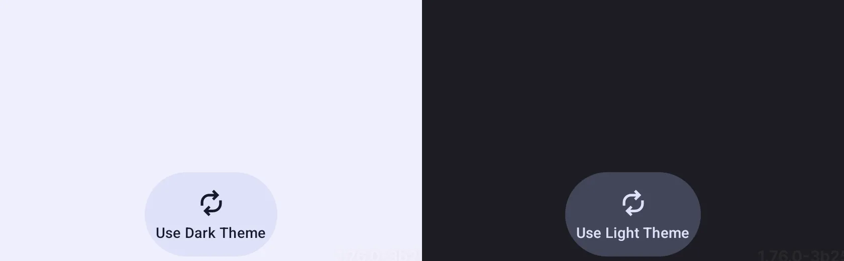
The Android editor applies CE.SDK’s Compose EditorTheme inside the Editor composable. Use uiMode when your app needs to override the device theme, then style custom editor components from MaterialTheme.colorScheme so they stay aligned with the active light or dark palette.
For a complete ready-made surface, start with the Design Editor Starter Kit and apply the same uiMode setting where your app renders Editor.
Built-in Themes#
The Editor composable accepts uiMode and defaults to EditorUiMode.SYSTEM.
| Mode | Behavior |
|---|---|
EditorUiMode.SYSTEM |
Follows the operating system light or dark setting. |
EditorUiMode.LIGHT |
Always renders the editor with the light palette. |
EditorUiMode.DARK |
Always renders the editor with the dark palette. |
Pass the selected mode directly to Editor:
uiMode = uiMode,Switching Themes at Runtime#
Hoist the selected mode into Compose state when users should change the theme from your UI.
var uiMode by remember { mutableStateOf(EditorUiMode.LIGHT) }The sample starts with EditorUiMode.LIGHT so the theme-toggle button and screenshot show a deterministic light-to-dark switch. In production, initialize this state from your app’s theme preference, or use EditorUiMode.SYSTEM when the editor should follow the device setting.
The sample adds a dock button that toggles between the light and dark palettes. Its label, icon tint, and container color are read from the current Compose theme, so the custom button updates with the editor theme.
configuration = { EditorConfiguration.remember { dock = { Dock.remember { horizontalArrangement = { Arrangement.Center } listBuilder = { Dock.ListBuilder.remember { add { Dock.Button.remember { textString = { if (uiMode == EditorUiMode.DARK) { "Use Light Theme" } else { "Use Dark Theme" } } vectorIcon = { IconPack.Replace } tint = { MaterialTheme.colorScheme.onSecondaryContainer } containerColor = { MaterialTheme.colorScheme.secondaryContainer } onClick = { uiMode = if (uiMode == EditorUiMode.DARK) { EditorUiMode.LIGHT } else { EditorUiMode.DARK } } } } } } } } }},Custom Styling Scope#
Android theming is implemented through Jetpack Compose. uiMode selects the editor’s light or dark palette, while app-specific controls you add through editor configuration should read the active Compose theme instead of hard-coding colors.
Use component configuration for app-specific UI that you add to the editor:
- Read colors and typography from
MaterialThemeinside configuration lambdas. - Apply brand colors to the custom components you own, such as dock buttons, panels, or actions.
- Test any custom tint, container, or text color in both light and dark modes.
Best Practices#
- Use
EditorUiMode.SYSTEMunless your app has its own appearance preference. - Persist a user-selected theme in your app state and pass it back through
uiMode. - Prefer
MaterialTheme.colorSchemevalues for custom editor components so contrast stays tied to the active palette. - Validate custom component colors against real editor content in light and dark modes.
Troubleshooting#
- The editor keeps following the system theme: pass
EditorUiMode.LIGHTorEditorUiMode.DARKthroughuiModeinstead of leaving the default. - A runtime toggle updates text but not the editor palette: keep the selected
EditorUiModein Compose state aboveEditorso changing it recomposes the editor. - Custom buttons look wrong in one mode: avoid hard-coded colors and read
MaterialTheme.colorSchemefrom inside the component configuration.
API Reference#
| API | Description |
|---|---|
Editor(uiMode=_) |
Selects whether the editor follows the system theme or renders a fixed light or dark palette. |
EditorConfiguration.remember(builder=_) |
Provides the editor component configuration used by the sample dock button. |
Dock.remember(builder=_) |
Configures the editor dock that hosts custom dock items. |
Dock.ListBuilder.remember(builder=_) |
Builds the ordered list of items shown in the dock. |
Dock.ListBuilder.add(block=_) |
Adds a custom dock item to the dock list. |
Dock.Button.remember(builder=_) |
Creates the custom theme-toggle button shown in the dock. |
Next Steps#
- Custom Labels — Override default UI text with your own labels for full control over the editor’s wording.
- UI Extensions - Extend the editor interface with custom components, panels, actions, and dialogs tailored to your workflow.
- Customize Behaviour — Define how UI components behave when interacting with your custom logic.