Customize the editor’s icons by passing Compose ImageVector values to editor components.
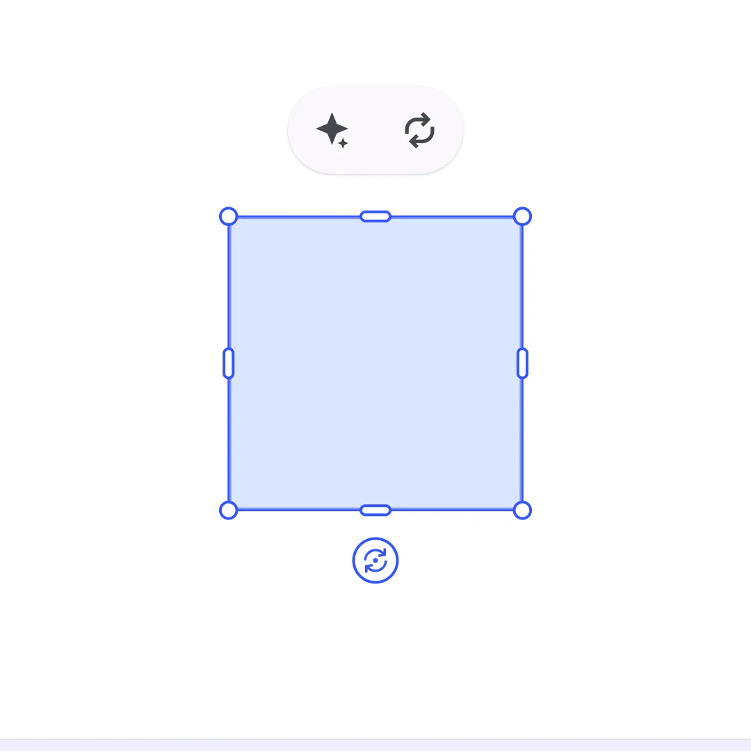
The Android editor UI renders icons through Jetpack Compose. Use built-in IconPack vectors for common editor actions, or convert your own SVGs into ImageVector properties and pass them to component builders.
For a complete product surface, start with the Design Editor Starter Kit. The snippets below use the same EditorConfiguration component system so you can apply the pattern to your own editor setup.
Creating Custom Icon Vectors#
Android does not register runtime SVG sprite strings. Convert each trusted SVG into a Compose vector and expose it from your app’s icon pack, then import the generated property where you configure the editor UI.
Generate vectors from source SVG files during development and commit the generated Kotlin source. Use an SVG-to-Compose generator such as svg-to-compose so the result is a Compose ImageVector property that works with vectorIcon. Use currentColor-friendly SVGs when possible so Material tinting can style the icon consistently.
SVG Source Requirements#
- Start from trusted SVG files that your team owns or has reviewed.
- Include a
viewBoxso the generated vector scales correctly in editor buttons. - Avoid hardcoded width and height values that fight Compose sizing.
- Prefer paths that can be tinted by the receiving component.
Security Considerations#
Because Android icon vectors are compiled Kotlin source, the editor does not inject arbitrary SVG markup at runtime. Do not add a runtime SVG parser for untrusted content just to mirror web integrations; sanitize and review SVGs before generating Kotlin vectors.
Replacing Dock Entry Icons#
Override a predefined dock button’s vectorIcon when you want to keep the button behavior but change how it looks. This example keeps the Images library action and swaps only its icon.
Dock.Button.rememberImagesLibrary { vectorIcon = { BrandIcons.BrandSpark }}The builder override runs inside the existing Dock.Button.rememberImagesLibrary helper, so the button still opens the Images library. Only the ImageVector changes.
Using Icons in Custom Components#
Create a custom editor component when your app owns both the icon and the action. This example adds a branded canvas menu button with a stable app-owned component ID, a generated ImageVector, an accessibility label, and a click handler for the app action.
CanvasMenu.Button.remember { id = { EditorComponentId("com.example.guides.icons.canvasMenu.brandAction") } vectorIcon = { BrandIcons.BrandSpark } contentDescription = { "Show brand action" } onClick = { Toast.makeText( editorContext.activity, "Brand action", Toast.LENGTH_SHORT, ).show() }}The button uses BrandIcons.BrandSpark through vectorIcon, so CE.SDK still applies the canvas menu button tint. Use the lower-level icon composable only when your component needs custom Compose content instead of a single vector.
Built-In Icons#
CE.SDK ships generated Compose vectors in ly.img.editor.core.iconpack.IconPack. Import the extension property you need, then pass it anywhere an editor component accepts an ImageVector.
For example, import ly.img.editor.core.iconpack.IconPack and the specific extension property, such as ly.img.editor.core.iconpack.Replace, before using IconPack.Replace in an editor component:
CanvasMenu.Button.remember { id = { EditorComponentId("com.example.guides.icons.canvasMenu.replace") } vectorIcon = { IconPack.Replace } contentDescription = { "Replace selection" } onClick = { Toast.makeText( editorContext.activity, "Replace selection", Toast.LENGTH_SHORT, ).show() }}| Icon |
|---|
IconPack.AddAudio |
IconPack.AddCameraBackground |
IconPack.AddCameraForeground |
IconPack.AddGalleryBackground |
IconPack.AddGalleryForeground |
IconPack.AddImageForeground |
IconPack.AddOverlay |
IconPack.AddShape |
IconPack.AddSticker |
IconPack.AddText |
IconPack.Adjustments |
IconPack.Animation |
IconPack.ArrowBack |
IconPack.ArrowForward |
IconPack.AsClip |
IconPack.AsOverlay |
IconPack.Blur |
IconPack.BringForward |
IconPack.Close |
IconPack.CloudAlertOutline |
IconPack.CropRotate |
IconPack.Delete |
IconPack.Duplicate |
IconPack.Effect |
IconPack.Elements |
IconPack.ExpandMore |
IconPack.Export |
IconPack.Filter |
IconPack.GroupEnter |
IconPack.Image |
IconPack.ImageOutline |
IconPack.Keyboard |
IconPack.LayersOutline |
IconPack.LibraryElementsOutline |
IconPack.LibraryElements |
IconPack.Minus |
IconPack.Music |
IconPack.Pages |
IconPack.PlayBox |
IconPack.PlayBoxOutline |
IconPack.Plus |
IconPack.Preview |
IconPack.PreviewToggled |
IconPack.Rabbit |
IconPack.Redo |
IconPack.ReorderHorizontally |
IconPack.Replace |
IconPack.Resize |
IconPack.SelectGroup |
IconPack.SendBackward |
IconPack.ShapeIcon |
IconPack.Shapes |
IconPack.ShapesOutline |
IconPack.SizeL |
IconPack.SizeLCircled |
IconPack.SizeM |
IconPack.SizeMCircled |
IconPack.SizeS |
IconPack.SizeSCircled |
IconPack.Split |
IconPack.StickerEmoji |
IconPack.StickerEmojiOutline |
IconPack.TextFields |
IconPack.Typeface |
IconPack.Undo |
IconPack.VoiceoverAdd |
IconPack.VolumeHigh |
IconPack.WifiCancel |
Troubleshooting#
Custom Icon Not Appearing#
- Verify the generated icon property is imported from the package where your vector was generated.
- Confirm the editor component uses
vectorIconor draws the vector through theiconcomposable. - Keep custom component IDs stable and unique so the component list can manage replacements correctly.
Icon Not Scaling Correctly#
- Check the source SVG
viewBoxbefore generating the Compose vector. - Avoid hardcoded dimensions in custom
Iconcomposables unless the surrounding component expects them. - Test the icon in both light and dark UI modes when the vector contains multiple paths.
Icon Color Not Matching Theme#
- Prefer the
vectorIconbuilder property so CE.SDK applies the component tint. - If you use the lower-level
iconcomposable, pass the desired tint toIcon. - Avoid generated vectors with hardcoded brand colors unless the icon must ignore the theme.
API Reference#
| API | Description |
|---|---|
Dock.remember(builder=_) |
Creates the dock component that owns dock items. |
Dock.ListBuilder.remember(builder=_) |
Defines the dock item list and order. |
Dock.Button.rememberImagesLibrary(builder=_) |
Creates the predefined Images library dock button and lets you override builder properties such as vectorIcon. |
CanvasMenu.remember(builder=_) |
Creates the canvas menu component that appears for selected blocks. |
CanvasMenu.ListBuilder.remember(builder=_) |
Defines the canvas menu item list and order. |
CanvasMenu.Button.remember(builder=_) |
Creates a custom canvas menu button for app-owned actions. |
CanvasMenu.ButtonBuilder.id |
Assigns a stable component ID to the custom canvas menu button. |
EditorComponentId(id=_) |
Assigns a stable unique ID to a custom editor component. |
IconPack.Replace |
Provides the built-in Replace icon vector after importing ly.img.editor.core.iconpack.Replace. |
Dock.ButtonBuilder.vectorIcon |
Supplies the ImageVector rendered by a dock button. |
Dock.ButtonBuilder.icon |
Supplies custom Compose icon content for a dock button when a single ImageVector is not enough. |
CanvasMenu.ButtonBuilder.vectorIcon |
Supplies the ImageVector rendered by a canvas menu button. |
CanvasMenu.ButtonBuilder.icon |
Supplies custom Compose icon content for a canvas menu button when a single ImageVector is not enough. |
CanvasMenu.ButtonBuilder.contentDescription |
Supplies the accessibility label for the canvas menu button icon. |
CanvasMenu.ButtonBuilder.onClick |
Handles the custom canvas menu button action. |